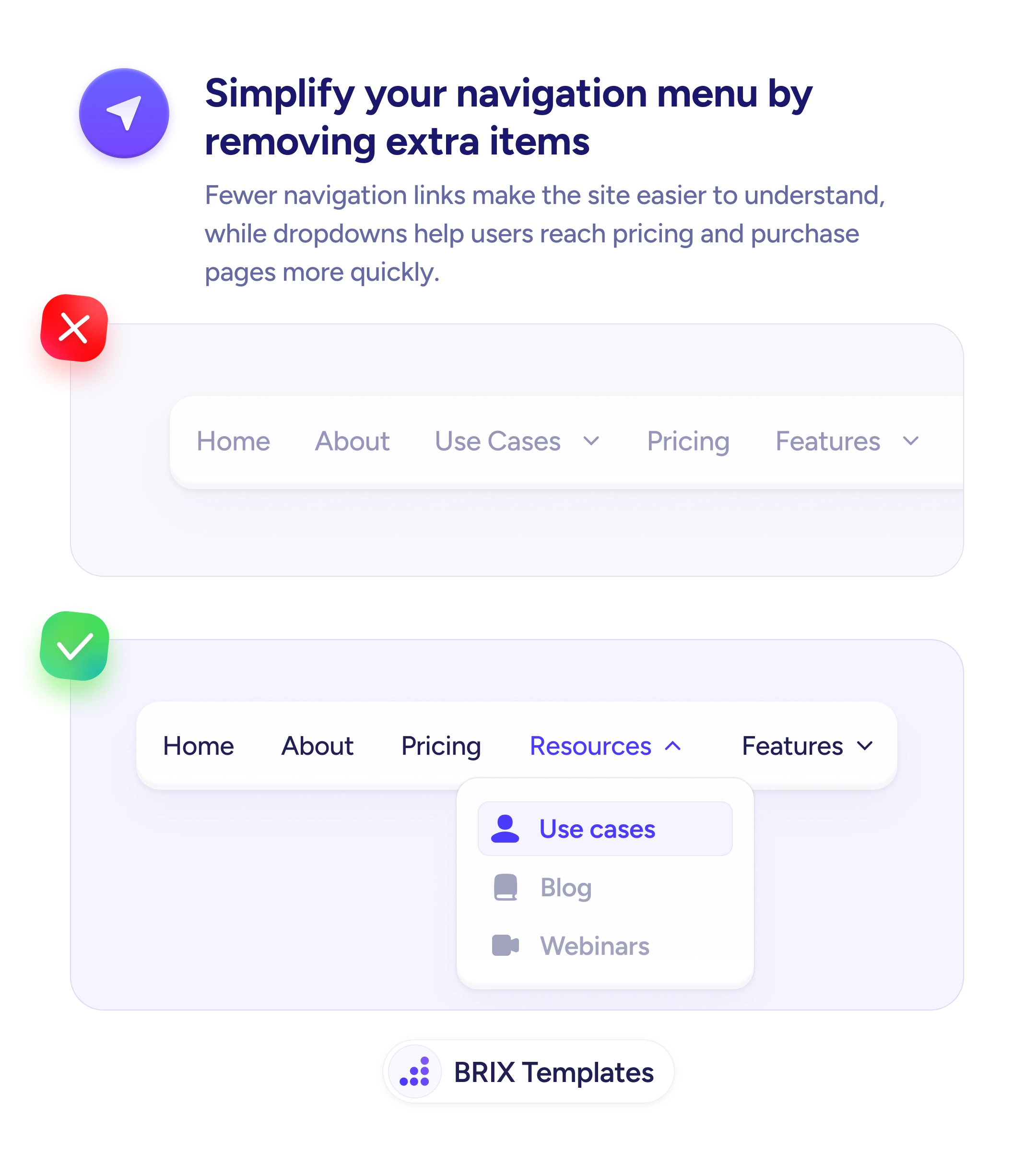
Navigation
Breadcrumbs tell users where they are — and how to get back
Deep pages without breadcrumbs leave users lost. Add breadcrumb navigation so visitors see where they are and can explore parent categories.
Navigation
Breadcrumbs tell users where they are — and how to get back
Deep pages without breadcrumbs leave users lost. Add breadcrumb navigation so visitors see where they are and can explore parent categories.
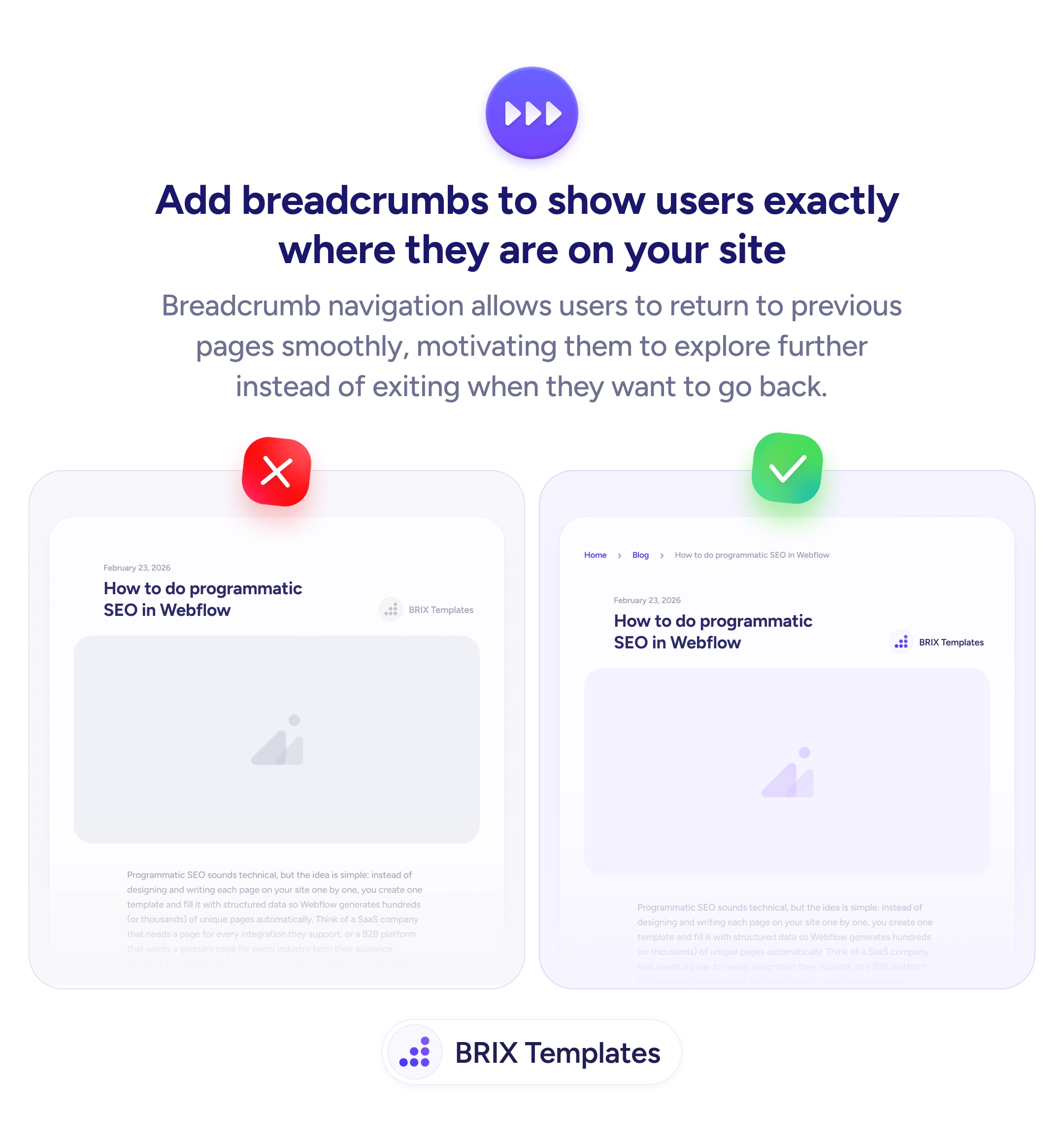
When a user lands deep inside a site — on a blog post, case study, or individual product page — without breadcrumbs, they have no clear way to see where they are in the site hierarchy. To go back to a category page or related section, they have to guess, use the browser back button, or navigate from the main menu. Each of those adds friction and often leads users to leave instead of exploring further.
A more effective approach is to add breadcrumb navigation at the top of the page. Breadcrumbs show the user’s current location in the site hierarchy — like “Home > Blog > How to do programmatic SEO in Webflow” — and let them jump to any parent level in a single click. This turns deep pages from potential dead ends into entry points for further exploration.
Place breadcrumbs at the top of the content, below any main navigation or hero. Use the site’s actual hierarchy — breadcrumbs should reflect how content is organized, not arbitrary categories. Make every segment except the current page clickable so users can jump up the hierarchy. Keep the styling subtle but legible — breadcrumbs should aid navigation without competing with page content for attention.
Breadcrumb navigation can reduce the friction of exploring deeper content. Users who know where they are and how to get back typically explore more pages — because the cost of backing up and trying a different path drops to a single click.
At the top of the content, below the main navigation. This is where users look for location context before reading the page. Avoid placing them inside the hero or below the fold — they need to be visible on arrival.
A right angle bracket ('>') or a forward slash ('/') is standard. Whichever you choose, stay consistent across the site. The separator should be subtle — a muted gray color — so users focus on the label text, not the punctuation.
No. The current page should appear as plain text (or bold/highlighted) without a link. Only parent levels should be clickable, since those are where users would navigate to.
All levels from the home page to the current page. For most sites, that's 2-4 levels. If the hierarchy is very deep, consider truncating middle levels with an ellipsis that expands on click.