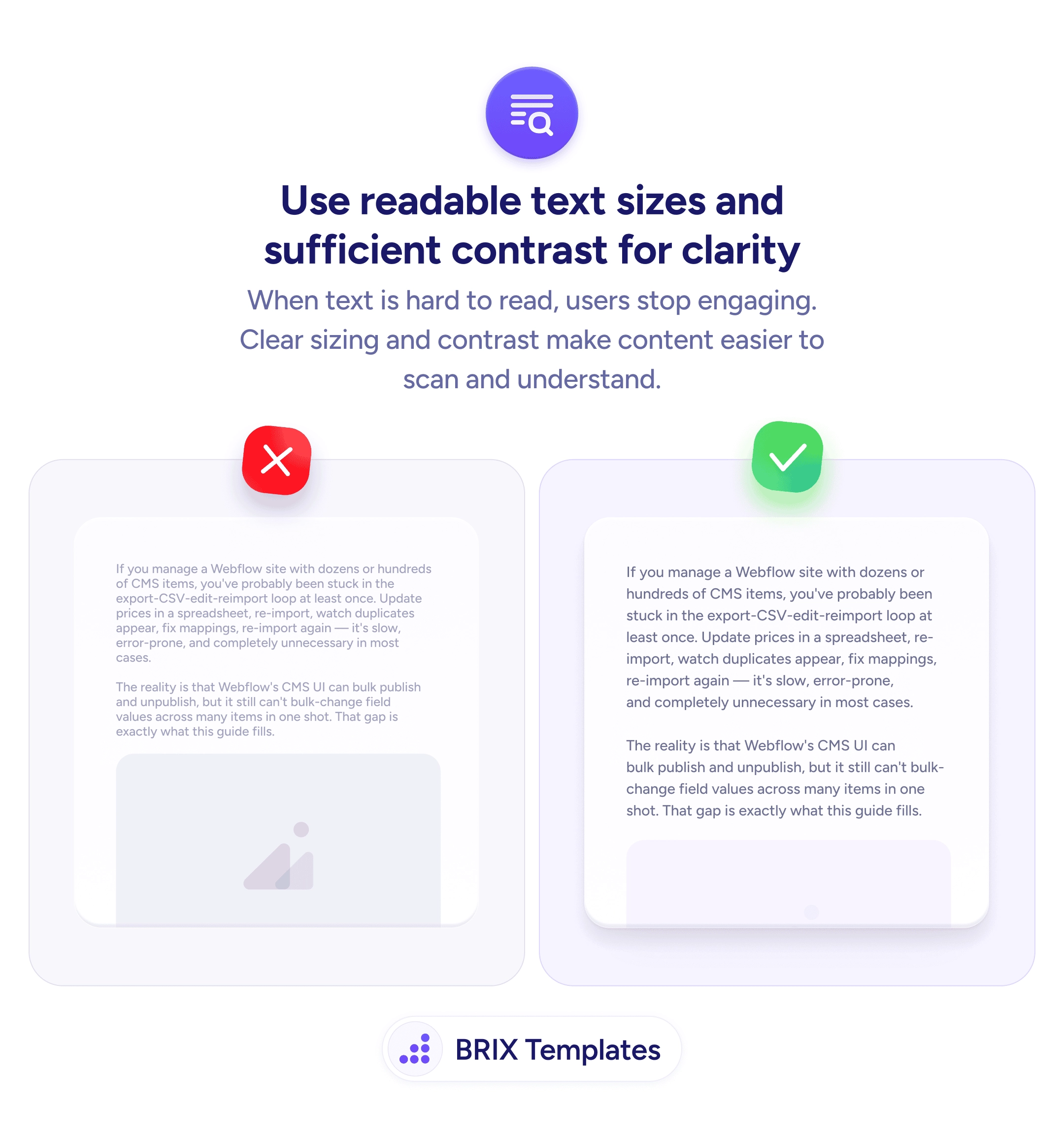
Readability
Most users skim — bullet lists let them actually get the message
Dense paragraphs hide value behind prose. Use bullet lists with benefit-first copy so visitors can scan key features in seconds.
Readability
Most users skim — bullet lists let them actually get the message
Dense paragraphs hide value behind prose. Use bullet lists with benefit-first copy so visitors can scan key features in seconds.
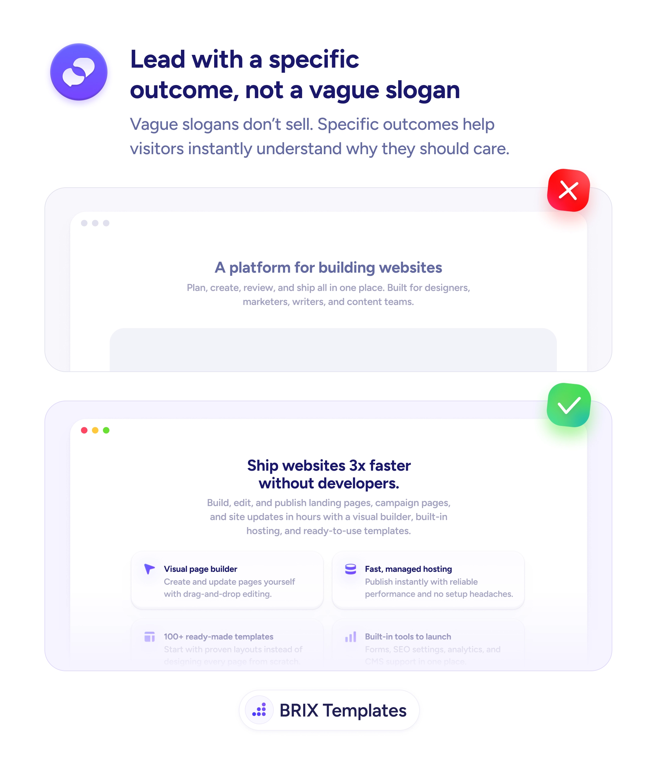
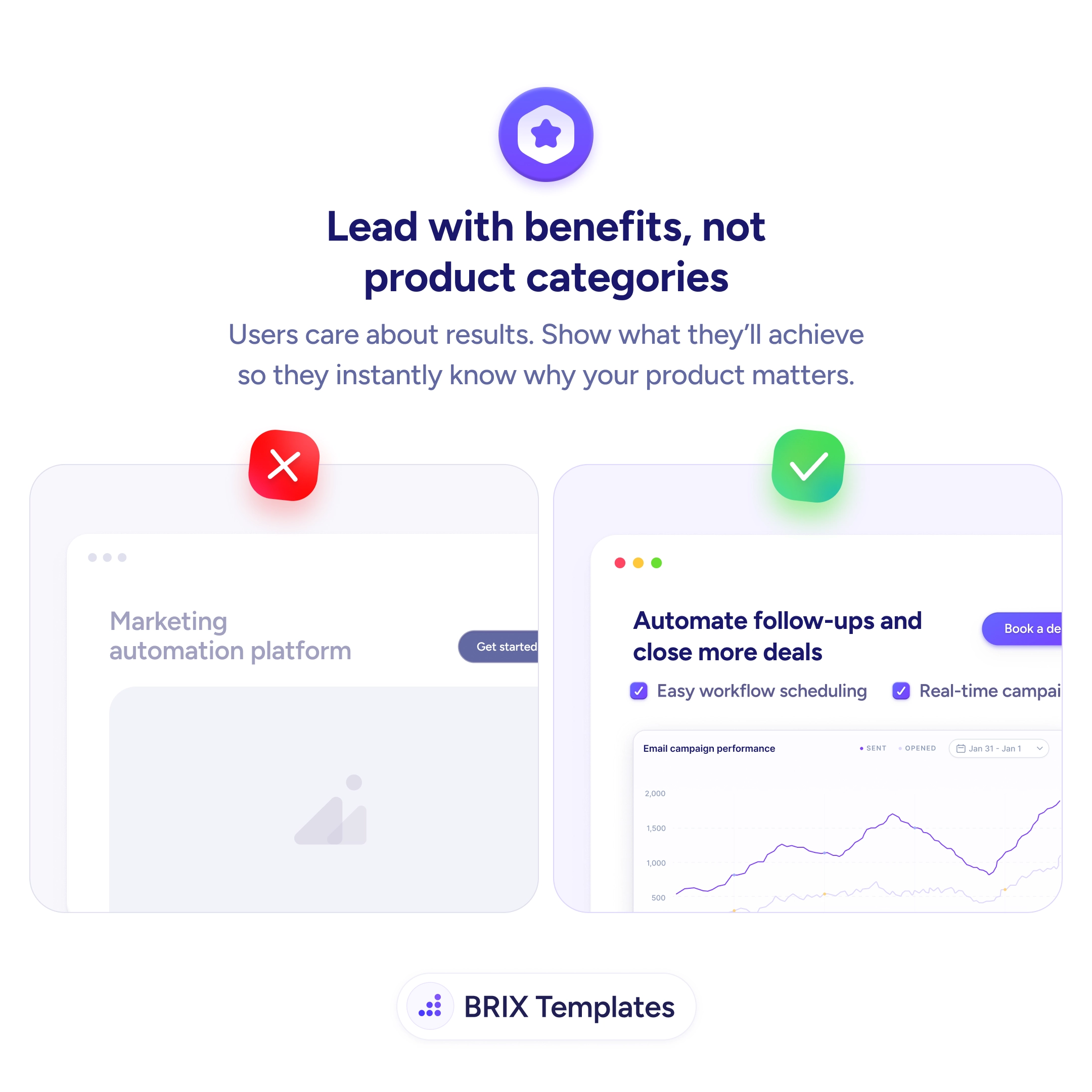
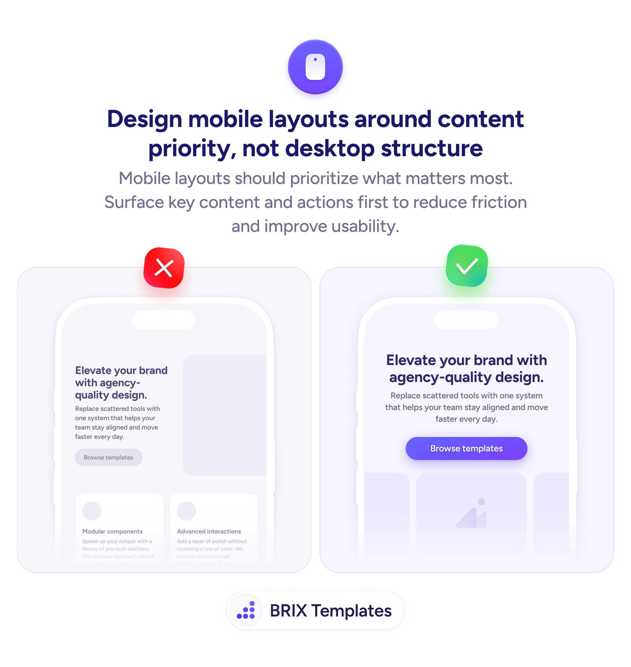
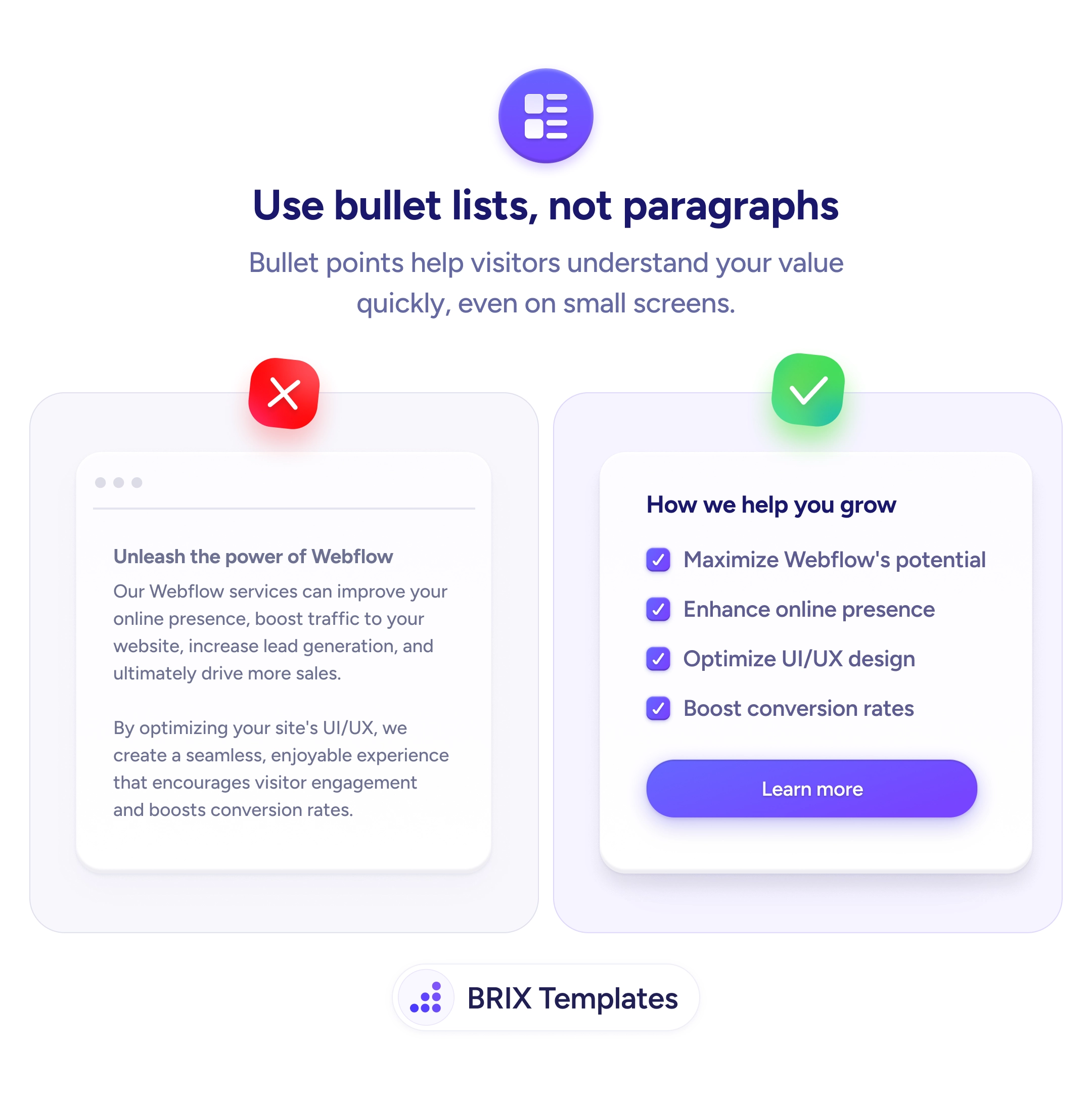
When a product section uses dense paragraph text to describe features, users have to read every sentence to understand the value. On small screens especially, long prose feels like a wall of text — users skim, miss key points, and often leave before the benefit lands. Paragraphs work for storytelling, but they’re slow to communicate when scanning is the default reading pattern.
A more effective approach is to replace feature paragraphs with scannable bullet lists. Bullet points let users extract value in seconds — each bullet is a standalone claim that can be understood independently. Paired with checkmark icons or visual markers, bullet lists communicate benefits at the speed users actually read on the web, especially on mobile.
Break feature descriptions into 3-5 bullet points, each focused on a single benefit. Start each bullet with the benefit, not the feature — “Maximize Webflow’s potential” reads faster than “Our Webflow services can improve your potential.” Use checkmark icons or colored dots to reinforce that each item is a positive, concrete capability. Keep bullets short — a single line each is ideal for scanning.
Scannable bullet lists can make feature sections feel faster and more digestible. Users who can extract key points in a glance typically engage more than users who hit a wall of text — because bullets respect how people actually read on the web.
For storytelling, case studies, or content where narrative flow matters. Paragraphs work when ideas build on each other. Bullets work when ideas are parallel items in a set — like features, benefits, or steps.
Yes, and often should. A short intro paragraph frames the section, bullets list the key points, and a brief outro ties them together. Pure bullets without context can feel like a datasheet; pure paragraphs bury the scannable value.
Yes. B2B buyers skim just as much as B2C shoppers — maybe more, given how many pages they research. The format difference is less about audience and more about content type: parallel benefits fit bullets; narratives fit paragraphs.
Yes. Search engines parse lists for featured snippets, especially for 'how to' and 'best of' queries. Well-structured bullet lists can win featured snippet placements, which drive traffic and visibility.