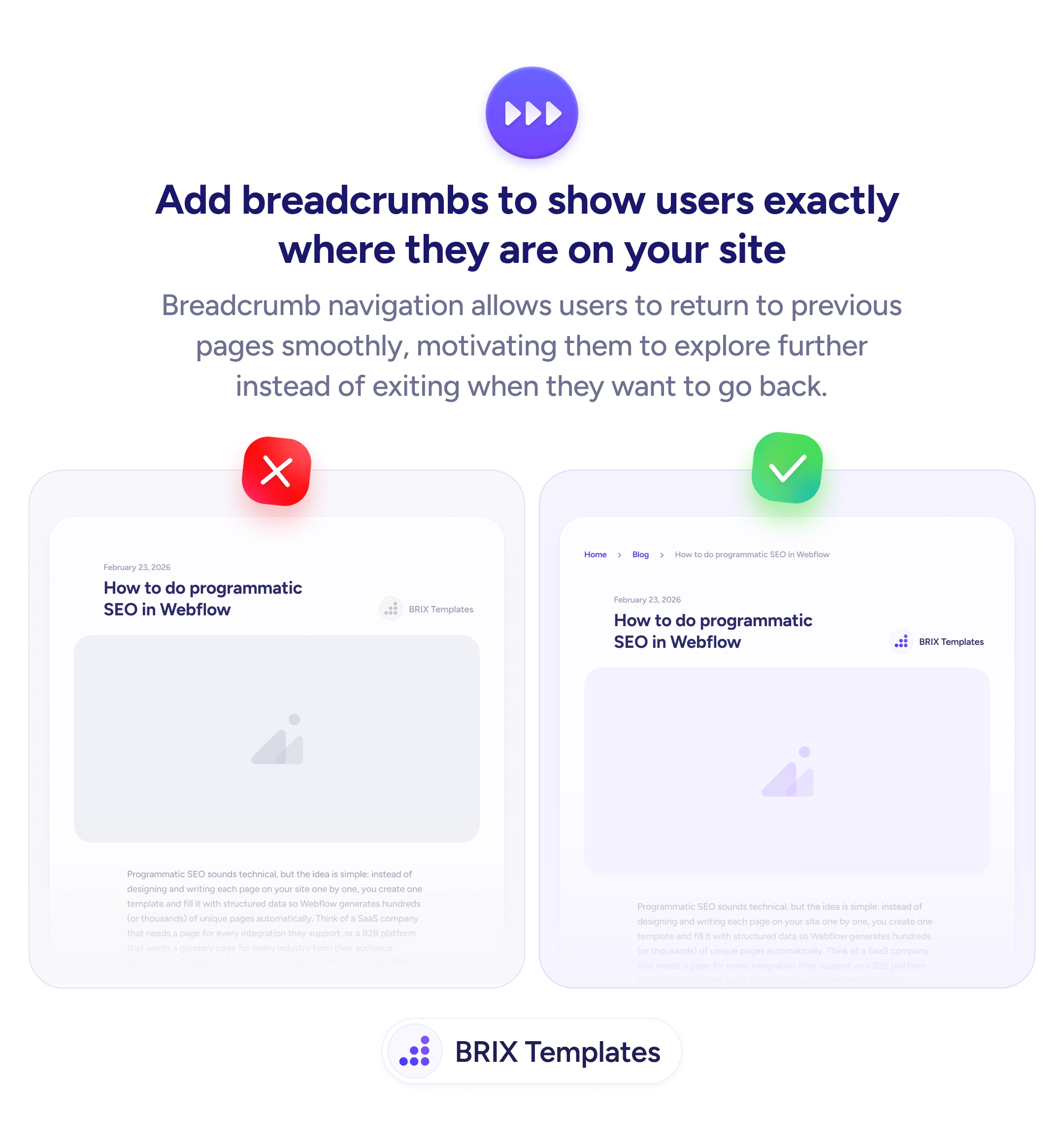
Navigation
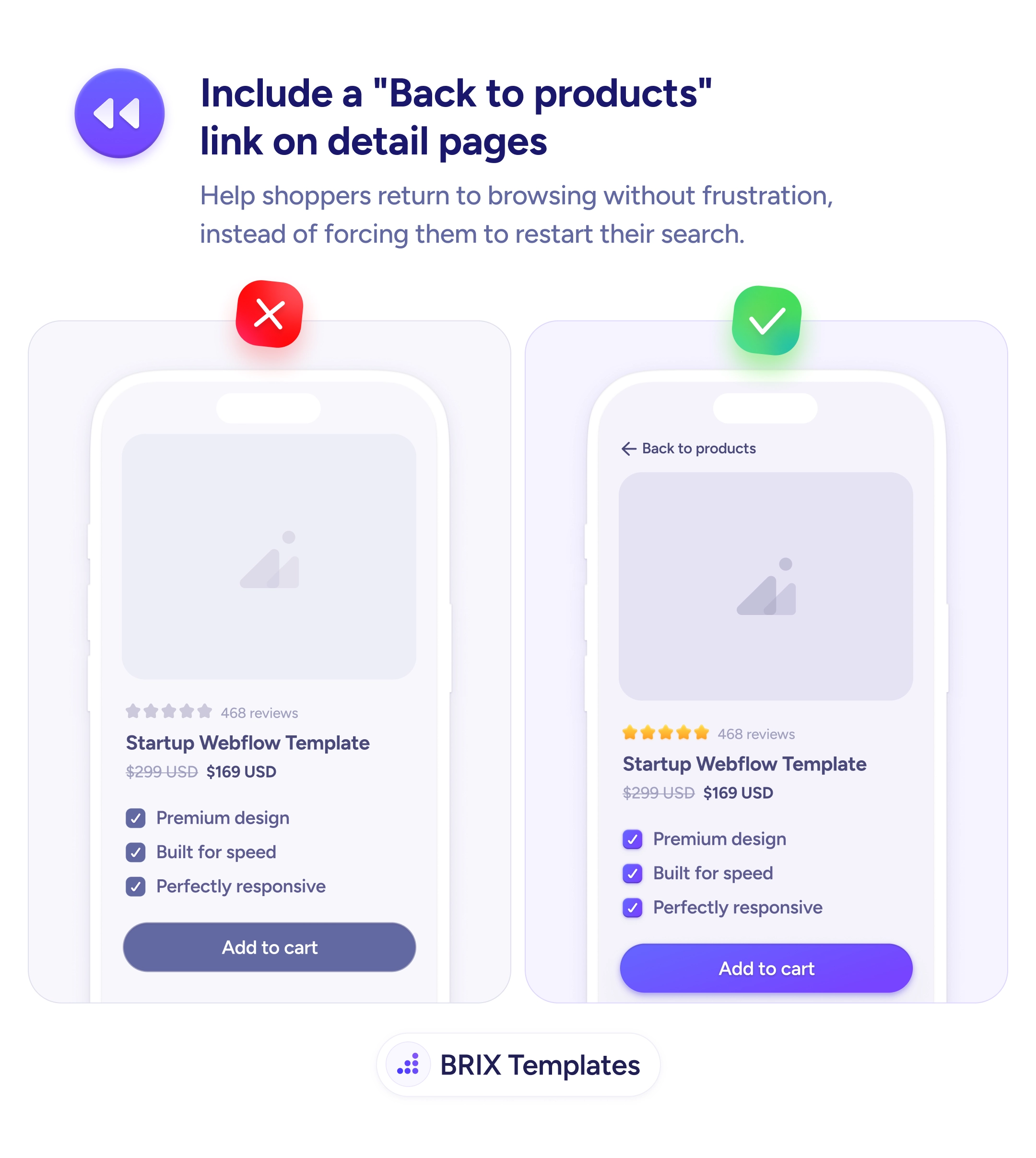
Every detail page needs a one-tap way back to the catalog
When users land on a product page with no return path, many leave instead of going back. Add a clear "Back to products" link to keep them browsing.
Navigation
Every detail page needs a one-tap way back to the catalog
When users land on a product page with no return path, many leave instead of going back. Add a clear "Back to products" link to keep them browsing.
When a user lands on a product detail page without a clear way back to the listing they came from, returning to browsing becomes its own task. They have to use the browser back button, the main menu, or start a new search — each an interruption that often ends with the user leaving instead of continuing to compare options. Shoppers who came in to browse and decide often need to view several products before committing, and any friction in moving between them quietly reduces how many they’ll actually consider.
A more effective pattern is to include a clearly labeled “Back to products” link at the top of every detail page. A back-link like ”← Back to products” or ”← Back to templates” signals an obvious return path and keeps browsing context intact. Users who decide a product isn’t right can return to the listing in one tap and keep exploring — instead of restarting their search or, worse, abandoning the visit entirely.
Place the back link near the top of the page so it’s visible the moment users finish reading the product details. Use a directional cue like an arrow (”←”) so the link reads as navigation, not a regular text link. Name the destination — “Back to products,” “Back to templates,” “Back to results” — so users know exactly where they’ll land. Preserve the listing’s state (filters, scroll position) when the user returns, so they don’t have to re-apply choices.
A clear back-to-products link can keep shoppers in the browsing loop instead of pushing them to restart their search or leave entirely. When return is a single tap, users typically compare more items — and the items they consider become the items they’re more likely to buy.
At the top of the content, above the product image or title. Users look for navigation cues before reading the product details, so the link needs to be visible on arrival without scrolling.
No. The browser back button is unreliable across navigation patterns (popups, modals, deep links) and users don't always associate it with returning to the listing. An explicit in-page link is more predictable.
Name the destination — 'Back to products,' 'Back to templates,' or 'Back to results.' Generic labels like 'Back' miss the chance to confirm where the user will land.
Yes. If a user filtered by price or scrolled to item 30, returning them to the top of an unfiltered list breaks the flow. Preserving state keeps the browsing session intact.