UX tip graphic titled 'Use a collapsible header on scroll.' The left panel marked with a red X shows a page where a tall header — logo, full navigation, and a 'Trusted by SaaS companies' logo strip — stays at full height even after the user scrolls, pushing the content down and leaving little visible. The right panel marked with a green checkmark shows the same page after scrolling with the header collapsed into a slim bar holding just the logo and a menu icon, freeing the screen to show the content and an inline trust strip. BRIX Templates branding at the bottom.

Navigation

A header earns its full size once — after that, it's just space the content needs

A tall header that never shrinks eats the screen as users scroll. Collapse it to a slim bar so navigation stays available without stealing room from content.

How to use a collapsible header on scroll

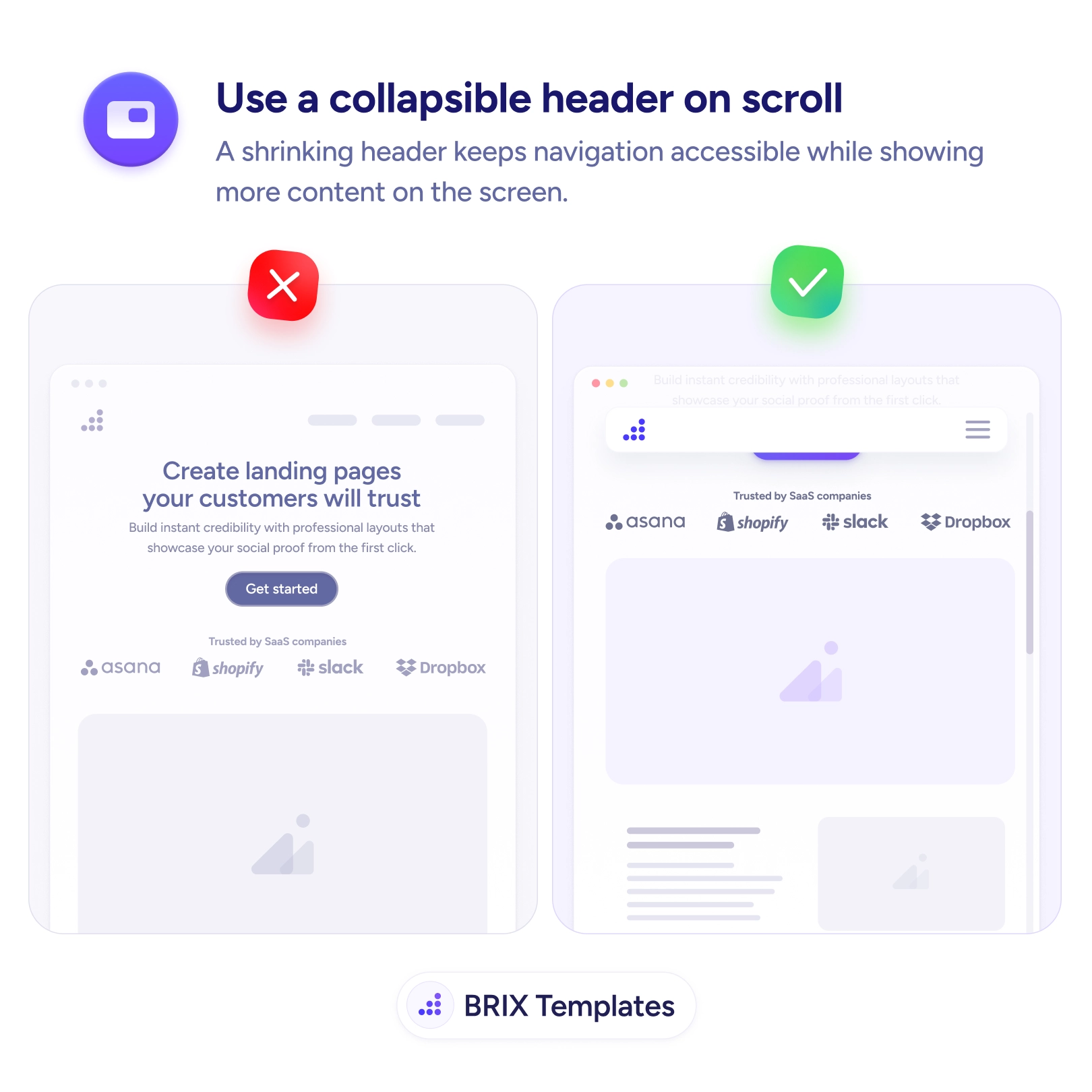
A header has one job at the top of the page: orient the visitor and offer navigation. It earns its full height once, on arrival — logo, full menu, maybe a trust strip. But if it stays that tall as the user scrolls, it stops being an introduction and becomes a permanent tax on the screen, pinning a thick band across the top while the content the user actually scrolled to read gets squeezed into what’s left. The bigger the header, the worse the toll, and it’s heaviest exactly where space is scarcest — on mobile.

The fix is to collapse the header once scrolling begins. After the full version has made its first impression, it shrinks to a slim bar — logo and menu icon — that keeps navigation one tap away while handing most of the screen back to the content. Navigation stays available without staying large. This is how a sticky header earns its place rather than adding to clutter, the same restraint behind reducing the number of sticky elements.

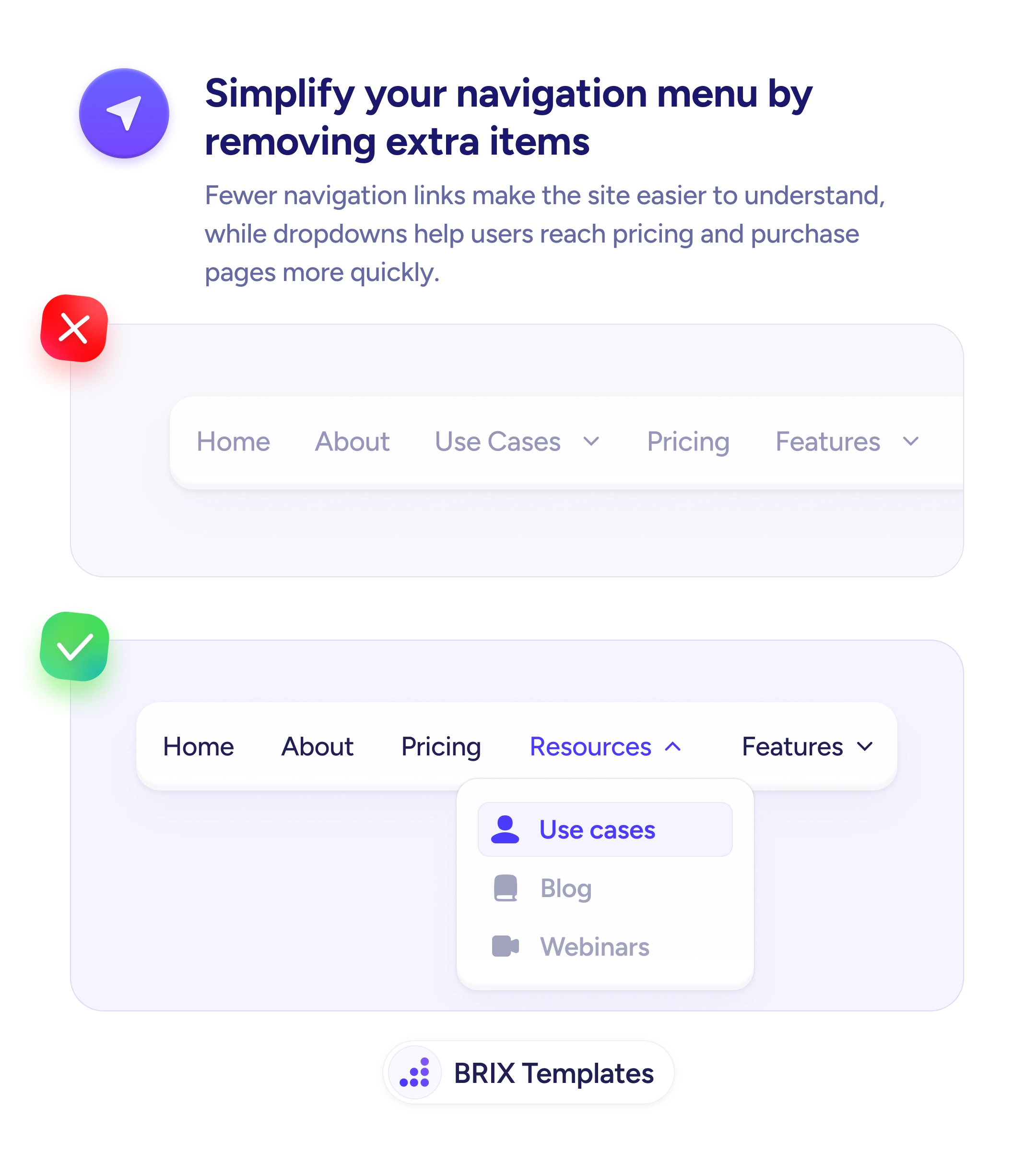
Start by deciding what the collapsed state keeps — the home logo and a path to the menu — and what it sheds, like taglines, trust strips, and expanded nav. Trigger the collapse a little after the user scrolls down, and consider revealing the fuller header when they scroll up, which signals intent to navigate. Animate the height change smoothly so content doesn’t jump, and account for the bar’s height so nothing hides beneath it. A header that collapses gracefully is easier to build when the navigation inside it is already simplified.

  • Collapse the header after the first scroll, once it’s done its introductory job.
  • Keep the logo and menu access in the slim state; drop taglines and trust strips.
  • Reveal the fuller header on scroll-up to match the user’s intent to navigate.
  • Animate the height change smoothly so content doesn’t jump or hide beneath the bar.
  • Favor collapsing over fully hiding, so navigation stays reachable without scrolling back up.

The top of the page deserves attention on arrival, not occupation forever. Let the header shrink once it’s introduced the site, keep navigation a tap away in a slim bar, and you give the content room to breathe while never making the user hunt for the menu.

Frequently asked questions

What should a collapsed header keep?

Keep the essentials for orientation and navigation: the logo as a home link and a way to reach the menu. Drop the secondary elements — taglines, trust strips, expanded nav, search fields — that were useful on arrival but don't need permanent space. The collapsed state should be a slim, functional bar, not a stripped header that loses the ability to navigate.

When should the header collapse and expand?

Collapse it shortly after the user begins scrolling down, once the full header has done its first-impression job. A common, pleasant pattern is to reveal the full or compact header again when the user scrolls up — signaling intent to navigate — and shrink it as they scroll down to read. Avoid collapsing and expanding on tiny scroll jitters, which feels twitchy.

Is a collapsible header better than a static or fully hidden one?

It's usually the middle path that wins. A static tall header wastes space; a header that disappears entirely forces users to scroll back up to navigate. Collapsing keeps navigation one tap away while returning most of the screen to content — you get persistent access without the permanent footprint.

Does a shrinking header cause layout problems?

It can if the height change shifts the content abruptly or covers text under a sticky bar. Animate the collapse smoothly, account for the header's height so content isn't hidden beneath it, and keep the transition subtle. Test on mobile where vertical space is tightest and an abrupt jump is most jarring.