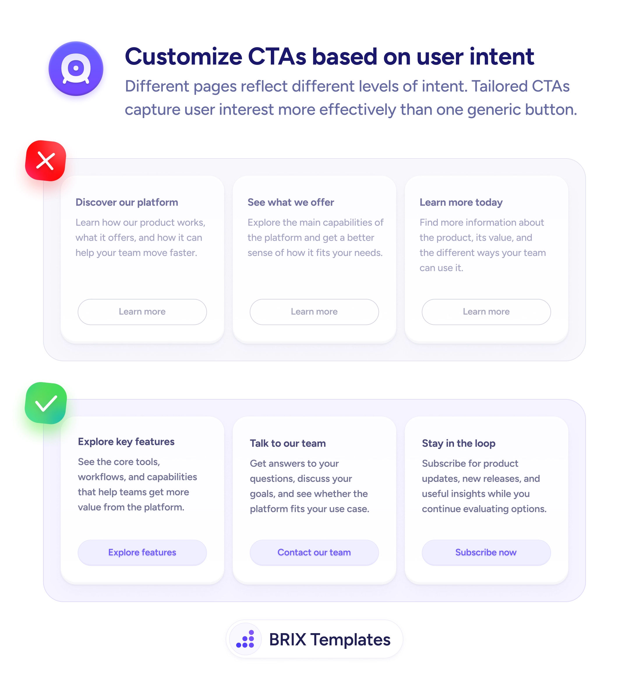
Actions & CTAs
The best CTA labels remind users why they came in the first place
Benefit-focused CTA copy reminds users why they're acting. Replace mechanical labels with specific value statements to increase conversion rates.
Actions & CTAs
The best CTA labels remind users why they came in the first place
Benefit-focused CTA copy reminds users why they're acting. Replace mechanical labels with specific value statements to increase conversion rates.
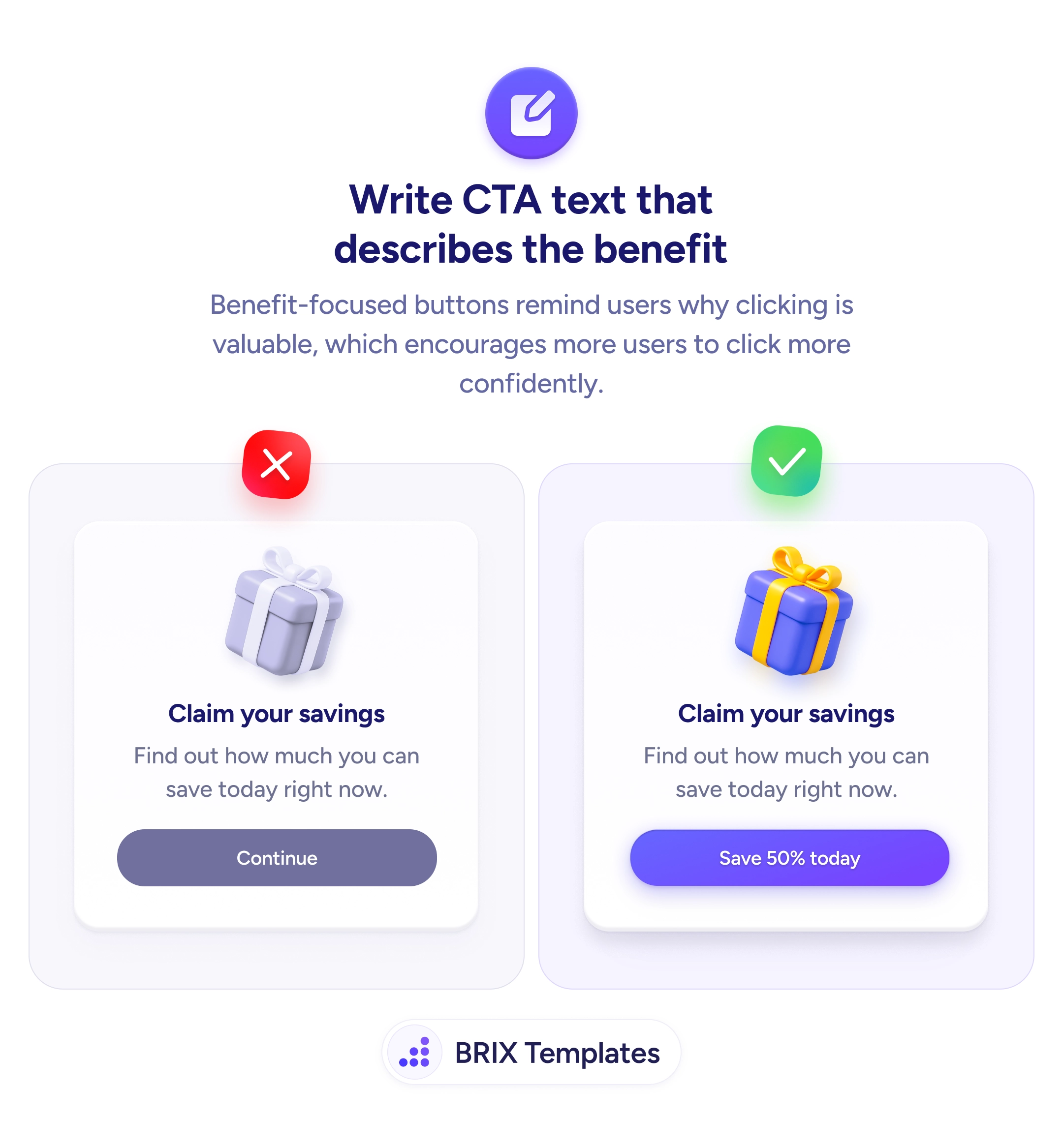
When a CTA button uses generic labels like “Continue,” “Submit,” or “Next,” users have to read the surrounding context to understand what the click does. The button becomes a mechanical step rather than a motivating action — and at moments of hesitation, that lack of clarity can tip users toward not clicking at all.
A stronger approach is to write CTA text that describes the benefit the user gets from clicking. Benefit-focused button copy like “Save 50% today,” “Get my free template,” or “See my savings” reminds users of the value waiting on the other side of the click. The button stops being a transition and starts being a reinforcement of the offer.
Identify the specific value the user receives from each action. Lead with an action verb that ties to the benefit — “Save,” “Get,” “See,” “Claim” — followed by the concrete outcome. Avoid labels that describe the click mechanics (“Continue,” “Submit”); users already know what a button does. Test benefit-focused variants against generic alternatives — even small copy changes can shift click-through rates because the button becomes a reminder of why the user came in the first place.
Benefit-focused CTA copy can increase click-through by reminding users why they’re acting. Buttons that describe the reward — not the mechanic — typically perform better because they keep the offer’s value top of mind right up until the moment of the click.
At the moment of the click, users pause — even briefly — to evaluate. A benefit-focused label gives them a reason to proceed instead of hesitate. 'Save 50%' reactivates the offer in their mind; 'Continue' offers nothing to overcome last-minute doubt.
Only when the urgency is fake. 'Save 50% today' is honest if the offer actually ends today. Fabricated countdown timers or artificial scarcity can damage trust and create long-term skepticism even if they drive short-term clicks.
If you can, and it adds value. 'Get my template' (first-person) feels more personal than 'Get your template' (second-person). For known-user contexts, personalization with names or past actions can increase clicks — but always test to confirm.
Yes, but the benefit needs to match the action. 'Book my free 30-min strategy call' works because it names the commitment and the reward. For high-stakes actions, specificity beats generic benefit claims.