Navigation
Menus with too many items slow users down
Too many nav items create decision fatigue. Condense top-level navigation by grouping related content under clearly labeled dropdown categories.
Navigation
Menus with too many items slow users down
Too many nav items create decision fatigue. Condense top-level navigation by grouping related content under clearly labeled dropdown categories.
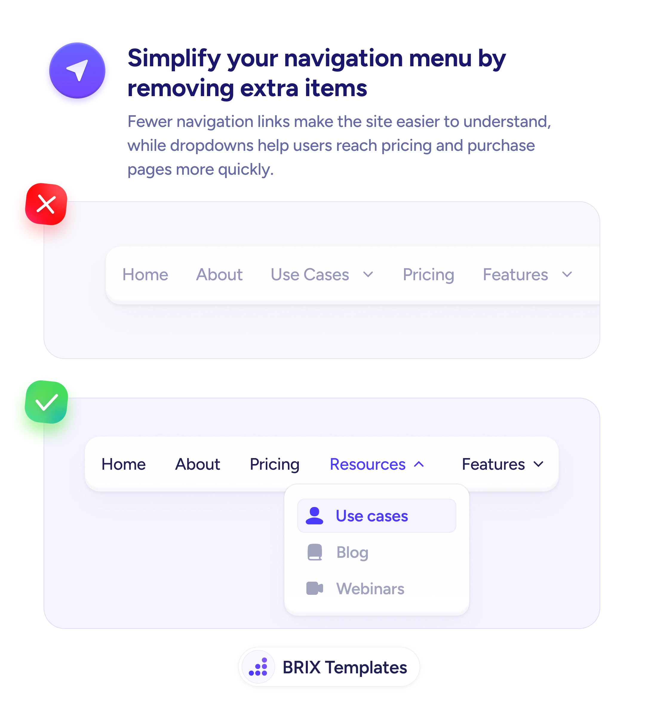
When a navigation menu stretches across the screen with many top-level items — Home, About, Use Cases, Pricing, Features, Resources, Blog, Support — users are forced to scan every option before choosing. The cognitive load of parsing a wide menu adds friction at the exact moment users are trying to find their way. Wide menus often look comprehensive but actually slow down decision-making.
A cleaner approach is to reduce top-level items to the essentials — typically 3-5 categories — and group related pages into dropdowns. A grouped navigation pattern like “Resources” → [Use cases, Blog, Webinars] gives users a single scanning target with nested detail, which feels faster than comparing many equal-weight options at the top level.
Audit your current nav items and identify which are genuinely top-level and which belong nested under a category. Group by user intent — “Resources” captures content discovery, “Product” captures features and use cases. Keep the primary conversion paths visible — Pricing should usually stay as a top-level item because it’s a high-intent destination. Use clear dropdown labels so users can scan categories and only drill in when they’ve narrowed their intent.
A simplified navigation can reduce the cognitive load of site exploration. Users who face fewer choices at the top level typically make faster decisions about where to go — and grouping related items under clear categories means nothing gets lost, it just becomes easier to find.
Aim for 3-5 top-level items. This keeps the menu scannable and reduces the cognitive load of parsing each option. More than 7 items often creates decision fatigue and slows navigation.
High-intent destinations like 'Pricing' and 'Contact' usually stay top-level because users expect them there. Content sections (blog, use cases, resources) group well under dropdowns organized by user intent.
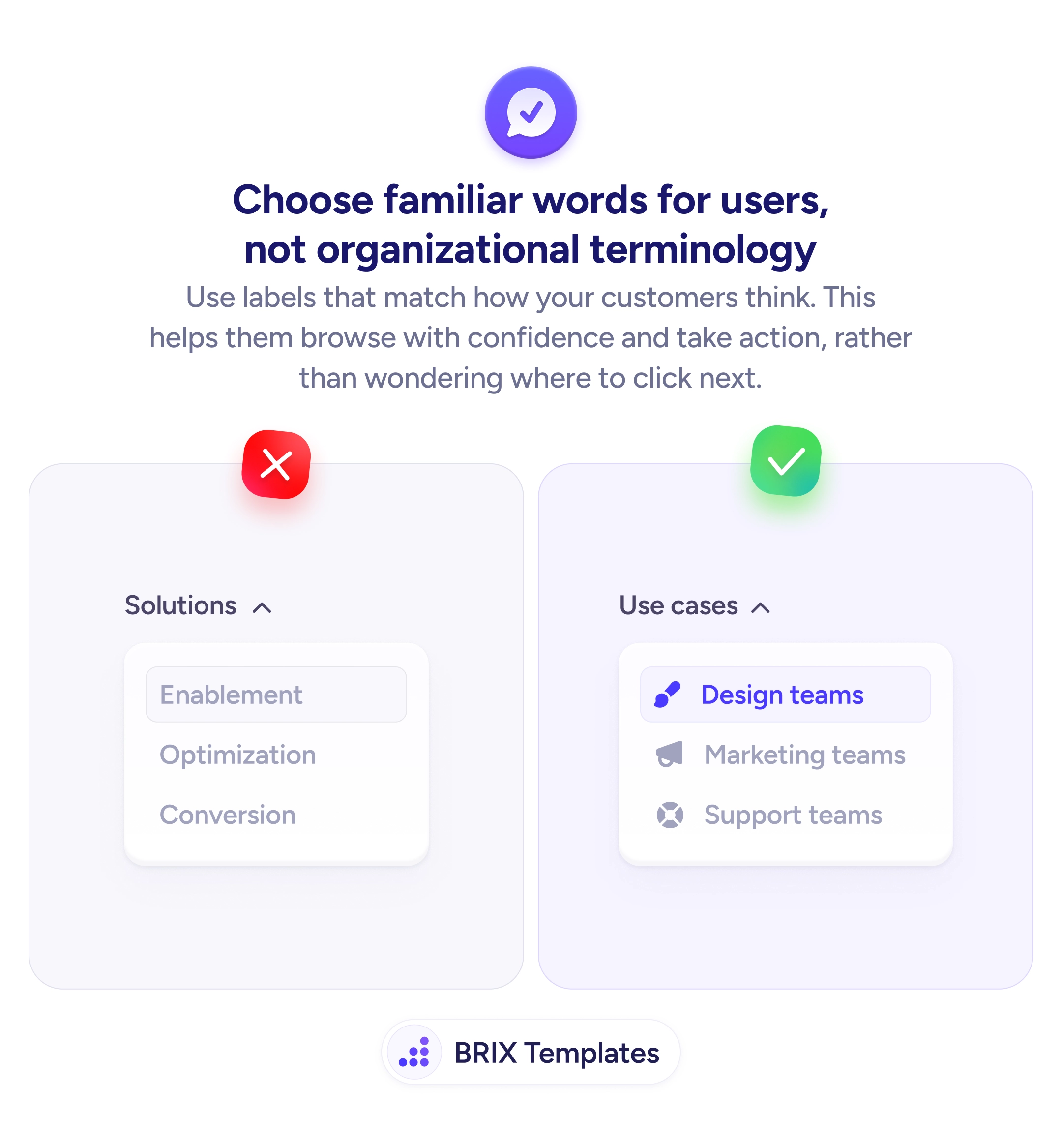
Use user-facing terms that describe the type of content inside — 'Resources,' 'For teams,' 'Learn.' Avoid vague umbrella terms like 'More' or 'Company,' which don't signal what's inside.
If you have many items per dropdown, yes. Multi-column dropdowns with subheadings help users scan quickly. But don't pad the dropdown with sub-categories just to fill columns — stay focused on what's actually useful.