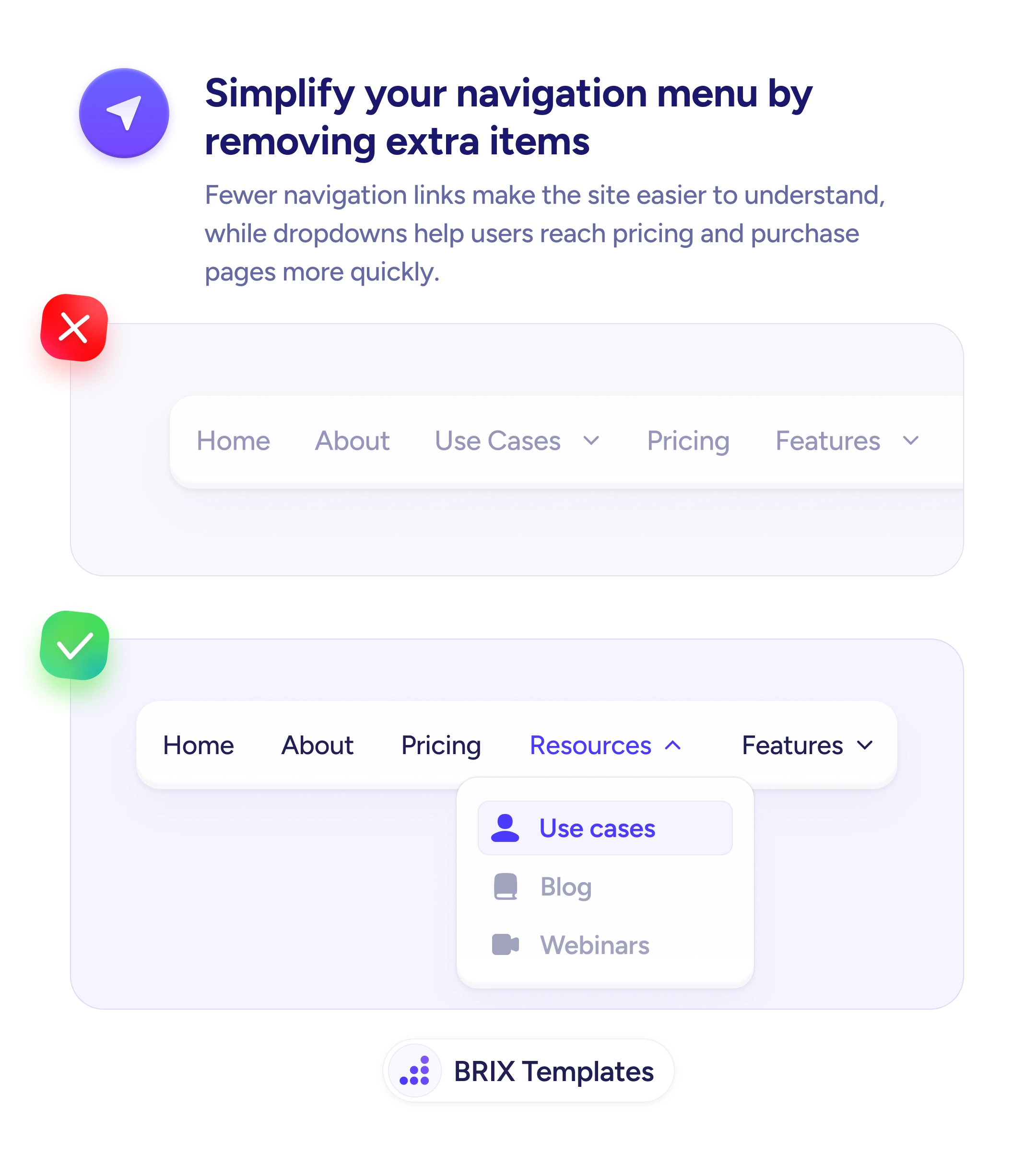
Navigation
Users don't click labels that sound like internal meeting jargon
Internal labels like 'Solutions' or 'Enablement' confuse users. Use familiar, outcome-oriented words that match how customers think about their goals.
Navigation
Users don't click labels that sound like internal meeting jargon
Internal labels like 'Solutions' or 'Enablement' confuse users. Use familiar, outcome-oriented words that match how customers think about their goals.
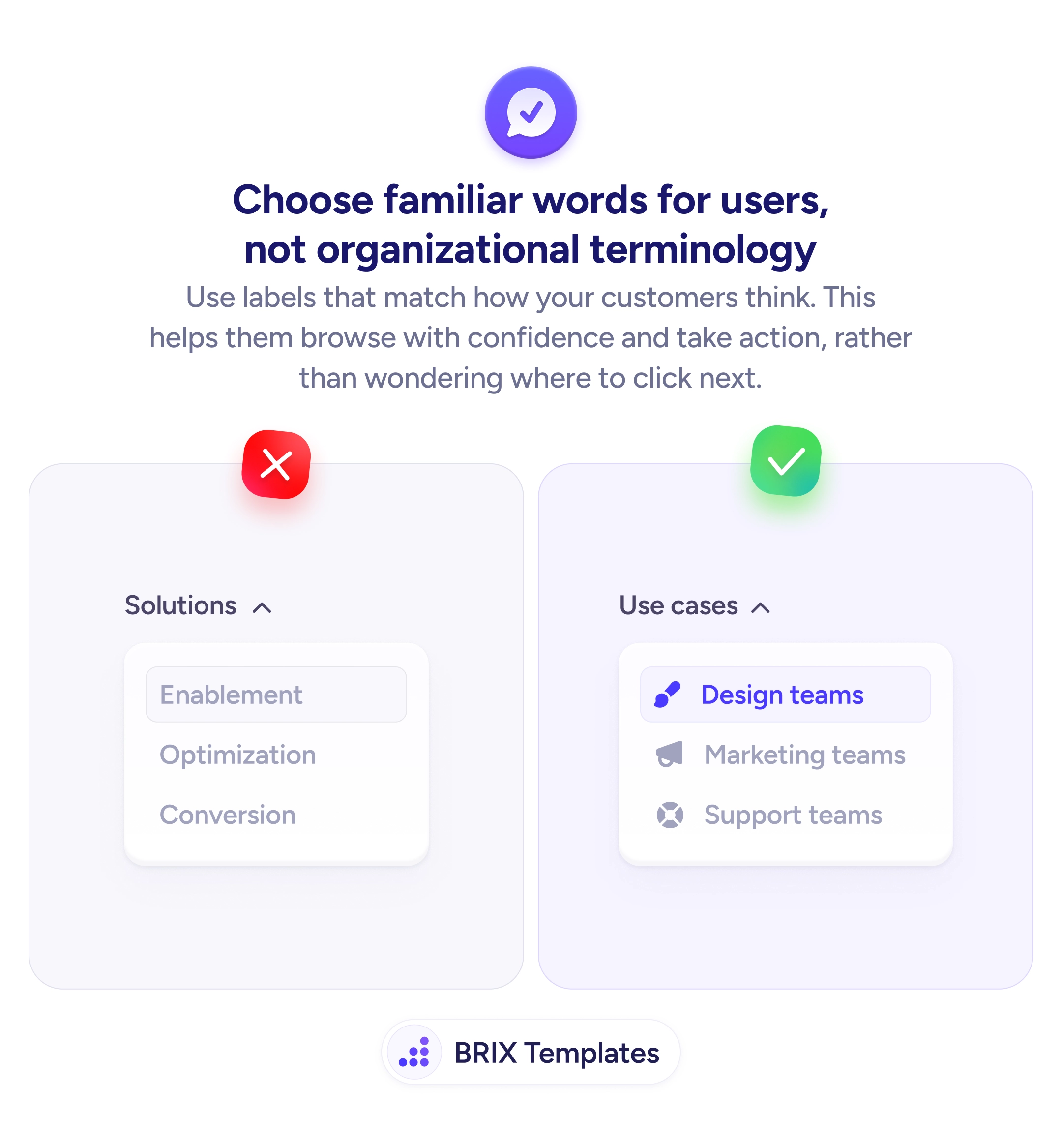
When a navigation menu uses internal or organizational language — labels like “Solutions,” “Enablement,” or “Optimization” — users often struggle to figure out which link leads to what they need. These terms make sense inside the company but don’t match how visitors describe their own goals. Users hesitate, click around blindly, or leave rather than guess.
A better approach is to label navigation items using the words your customers actually use. Familiar, outcome-oriented labels like “Use cases,” “Design teams,” or “Support teams” match how visitors think about their own problems. Users can scan the menu once and immediately know which link is relevant to them, which turns navigation from a puzzle into a direct path.
Audit your current navigation labels and check each one against how your audience talks. Interview customers or check support tickets to find the language they use for the same concepts. Replace abstract labels with concrete ones — “Design teams” is clearer than “Enablement” because it names the audience, not the internal product category. Test with users who haven’t seen your site before to confirm the labels make sense without explanation.
User-friendly navigation labels can significantly reduce the time it takes visitors to find what they need. When users see language they recognize, they typically navigate more confidently and reach the right page faster — because the menu speaks their language, not yours.
Internal labels reflect how a company organizes itself, not how customers think about their problems. Users don't know your product categories — they know their own goals. When labels don't match user intent, users have to mentally translate each option.
Yes. Confusing navigation adds friction at the top of the funnel. Users who can't quickly find relevant pages often bounce before reaching product details or pricing, which reduces both engagement and conversions.
Because internal teams speak that way daily. Over time, product category names and department labels start to feel universal inside the company. Without outside testing, teams often don't realize those terms are invisible to new visitors.
User-friendly language uses words customers already know. Dumbed-down language strips nuance and can feel condescending. The goal is vocabulary that matches the audience's expertise — which may be technical or simple, depending on who they are.