Readability
Long pages aren't read top to bottom — they're scanned for the one part that matters
Walls of detail bury what each reader actually wants. Collapse sections behind clear labels so users scan the headings and expand only what's relevant.
Readability
Long pages aren't read top to bottom — they're scanned for the one part that matters
Walls of detail bury what each reader actually wants. Collapse sections behind clear labels so users scan the headings and expand only what's relevant.
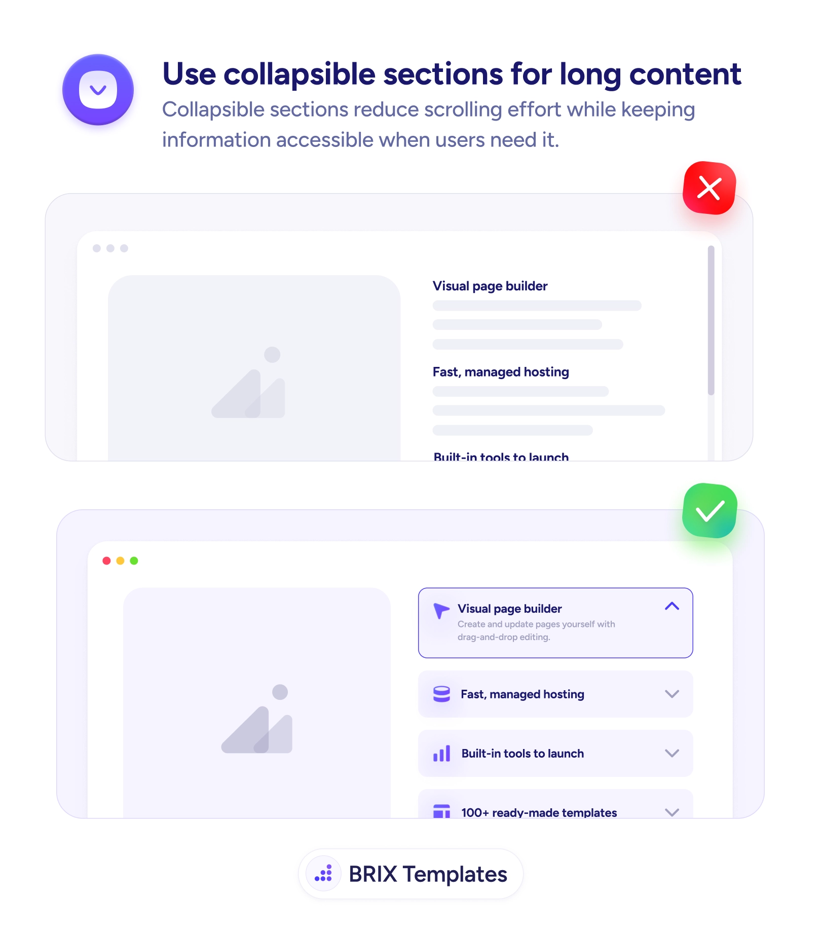
A long page that shows everything at once assumes the reader will go through it top to bottom. They won’t. Most visitors arrive looking for one specific thing — a particular feature, a single answer — and a wall of fully expanded sections forces them to scroll past everything else to find it. The information is all there, but it’s organized for completeness rather than retrieval, so the reader does the work of skimming a long block when they only wanted one part of it.
The fix is to collapse independent sections behind clear labels. An accordion turns a wall of text into a scannable list of headings — Visual page builder, Fast managed hosting, Built-in tools — that the reader can survey in seconds and expand only where relevant. The labels carry the structure; the detail stays one tap away. This is the same space-reclaiming idea as a collapsible header on scroll, applied to the body of the page instead of the top.
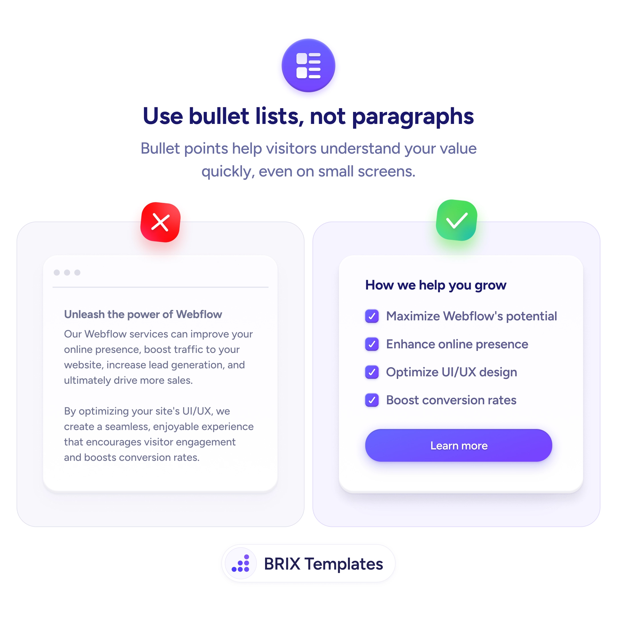
Start by grouping content into chunks readers care about differently and giving each a clear, descriptive label. Default-open the most important section so the pattern is obvious and the page doesn’t feel empty. Keep anything decision-critical — pricing, the core pitch, primary CTAs — always visible, and render collapsed content in the markup so it stays reachable for search and screen readers. For dense feature copy, pair this with replacing feature paragraphs with bullet lists so even the expanded view scans fast.
Long content works when the reader can find their part without wading through everyone else’s. Fold the page into labeled, expandable sections, keep the essentials always visible, and you turn an exhausting scroll into a quick scan that lands each visitor exactly where they meant to go.
Use them when content is naturally divided into independent chunks that different readers care about differently — feature details, FAQs, specs, documentation. If most users only need a subset, collapsing lets them scan the labels and open just their part. They're the wrong choice for content meant to be read in sequence or for anything critical that everyone must see, which should stay visible.
Anything decision-critical or universally needed: pricing, the core value proposition, key warnings, primary CTAs. Collapsing those buries information users shouldn't have to hunt for and can hurt both conversions and trust. Reserve collapsing for secondary detail that supports the page rather than carries it — and never hide content that users or search engines must reliably reach.
Often yes — opening the first or most important section gives the reader an immediate example of what's inside and signals that the rows are expandable. Leaving everything collapsed can make a page feel empty or hide the fact that there's content to open. Default-expand the most relevant section, and let users collapse it if they want the compact view.
They can if done carelessly. Render the content in the page markup so it's present even when visually collapsed, rather than loading it only on click, so search engines and screen readers can reach it. Use proper button semantics and expanded/collapsed states for the toggles so assistive tech announces them correctly. Done right, collapsing is purely a visual convenience and costs nothing in discoverability.