Checkout & payments
Limits written as a paragraph get skimmed; limits shown as a gauge get understood
Plan limits buried in dense text leave users unsure what they've used. Show usage as visual meters so people see what's left and when to upgrade.
Checkout & payments
Limits written as a paragraph get skimmed; limits shown as a gauge get understood
Plan limits buried in dense text leave users unsure what they've used. Show usage as visual meters so people see what's left and when to upgrade.
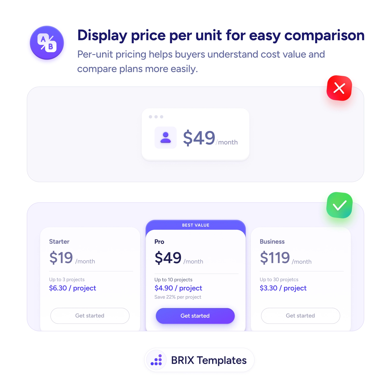
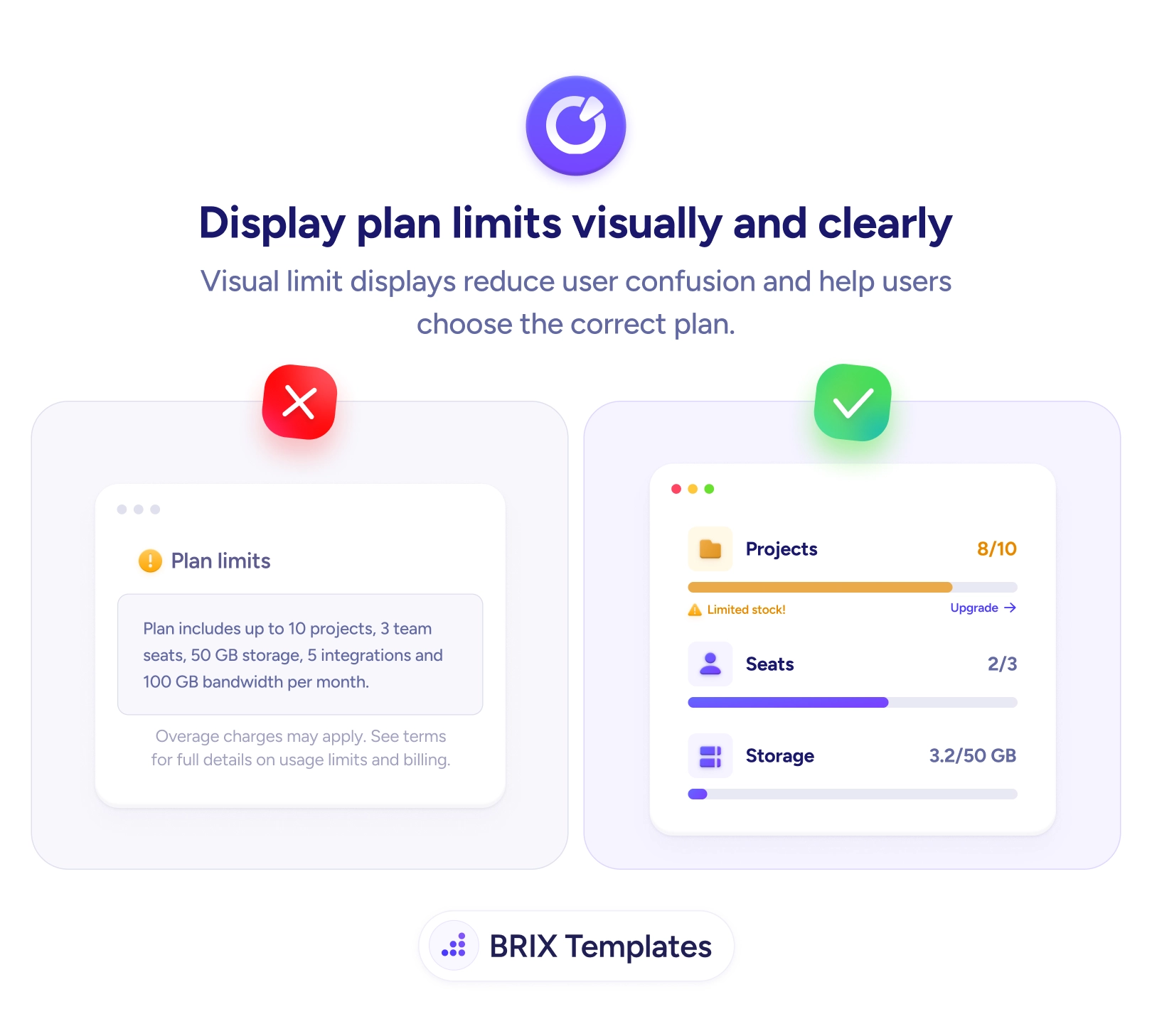
Plan limits written as a paragraph technically tell the user everything — “up to 10 projects, 3 seats, 5 integrations, 100 GB per month” — and answer almost nothing they’re actually wondering. The real question is never “what’s the cap?” but “how much do I have left?”, and dense text forces the user to recall their current usage and subtract in their head. So they skim it, lose track, and find out they’ve hit a limit only when something suddenly stops working — which feels like a penalty, not a plan.
The fix is to show usage as visual meters. A bar reading Projects 8/10, Seats 2/3, Storage 3.2/50 GB answers the cap and the current level in a single glance, so remaining capacity is obvious without any math. A near-full bar can shift color and surface an inline Upgrade prompt right when it’s relevant. This is the same legibility win as showing price per unit for easy comparison — turning numbers the user would otherwise have to compute into something they can simply read.
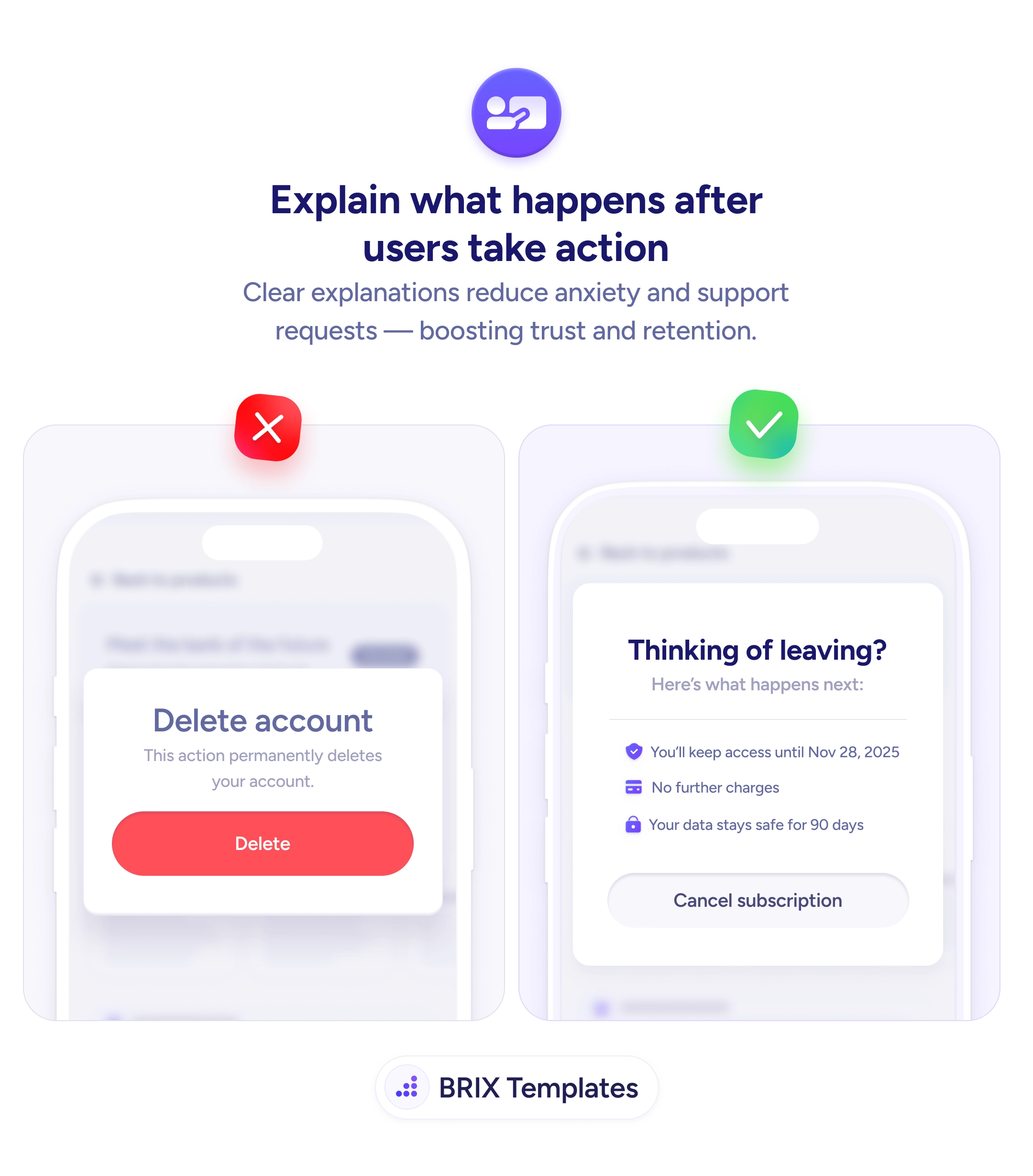
Start by replacing limit text with a gauge for each metered resource, showing used-against-total. Warn as usage approaches the cap, while the user still has room to act, rather than at the moment it breaks. Place the meters where the limit is felt — a projects gauge on the projects screen — so it works as ongoing feedback, the same way explaining what happens after user actions keeps people oriented. Tie any upgrade prompt to genuine need so it reads as help, the moment a recommended plan is meant to catch.
Users manage their plan well only when they can see where they stand. Trade the paragraph of limits for meters that show usage against capacity, warn before the ceiling rather than at it, and the upgrade moment arrives as a helpful nudge instead of an unwelcome wall.
Because the question users actually have isn't 'what's the limit' — it's 'how much do I have left'. A paragraph states the ceiling but forces the user to remember their current usage and do the subtraction. A meter answers both at once: it shows the cap and the current level together, so remaining capacity is obvious without any mental math.
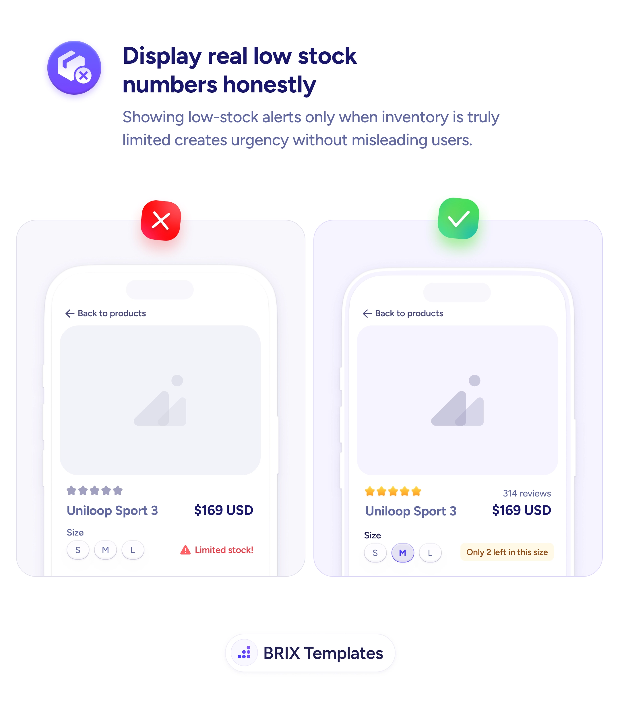
Before it bites. As usage approaches the cap — a near-full bar, a color shift, a short 'limited capacity' note — give the user a heads-up while they still have room to act, whether that's upgrading or cleaning up. A warning that only appears at 100%, when something has already broken or stopped working, feels like a penalty rather than help.
Wherever the user feels the limit. A global usage summary in account or billing settings gives the overall picture, but contextual indicators near the relevant feature — a projects meter on the projects screen — are what prevent surprises in the moment. The closer the gauge sits to where capacity gets consumed, the more useful it is.
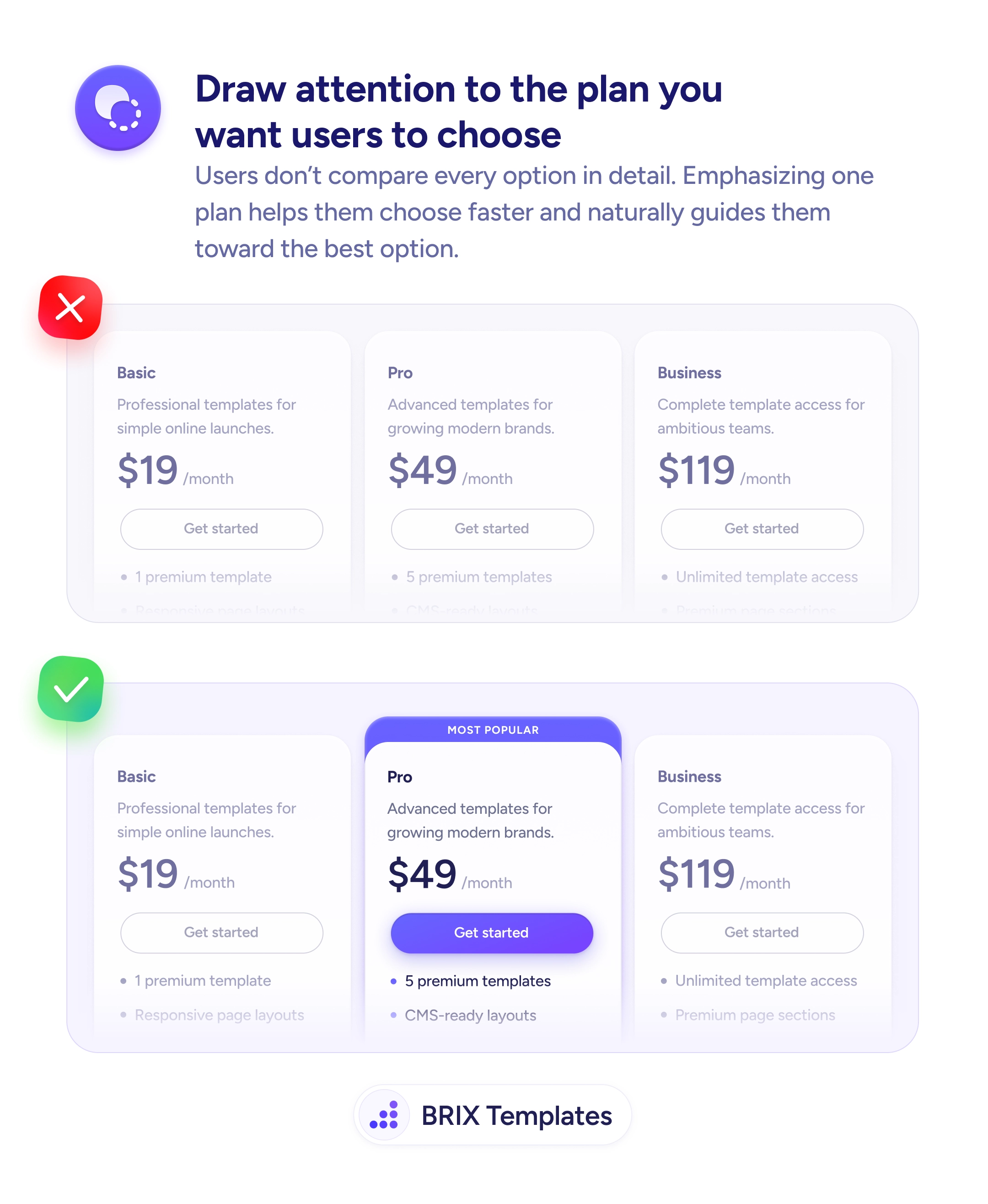
Tie the prompt to genuine need, not a constant sales nudge. When a meter is actually near full, an inline 'Upgrade' option is helpful because it solves a real problem the user is hitting. Showing a hard-sell upgrade banner while someone is at 2 of 50 just reads as pressure. Let the usage state earn the prompt, and the offer feels like assistance rather than marketing.