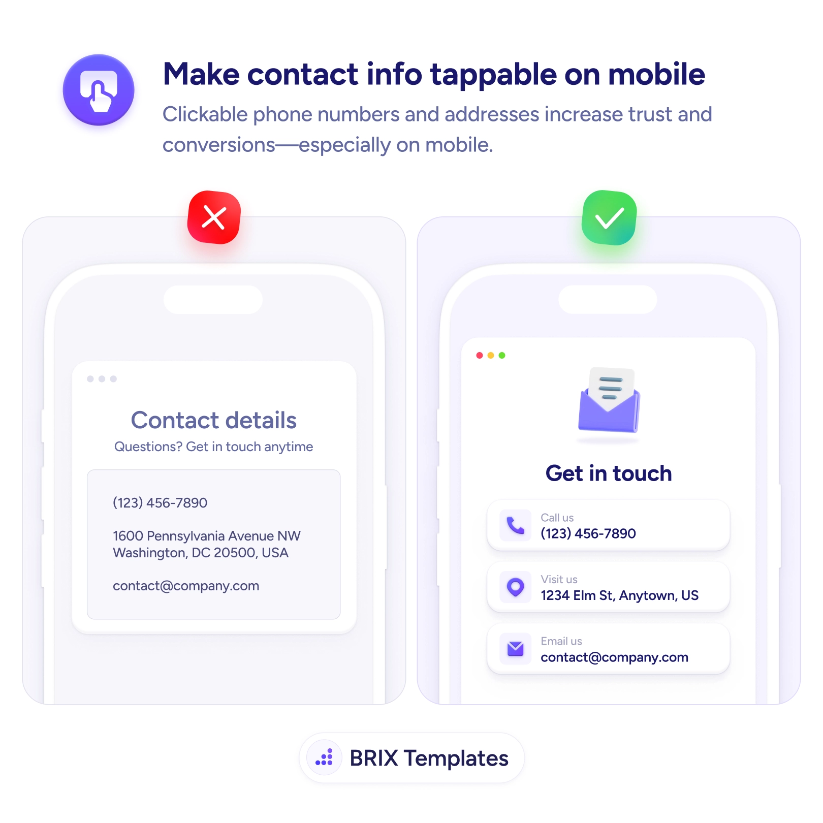
On a phone, contact information that’s only plain text quietly asks the user to do extra work. They see the number they want to call and then have to select it, copy it, switch to the dialer, and paste — or worse, memorize it a few digits at a time. The same goes for an address they’d like to navigate to or an email they want to send. Every one of those is a multi-step chore standing between a motivated visitor and the action they came to take, and some of them give up before finishing it.
The fix is to make every contact detail tappable. A Call us row that dials on touch, a Visit us row that opens maps, an Email us row that launches the composer — each turns a copy-paste chore into a single tap. Presenting them as labeled icon cards also makes it obvious they’re actionable, the same clarity principle behind making buttons easy to tap on mobile. The detail isn’t just shown; it’s wired to the thing the user wants to do with it.
Start by linking each detail with the right scheme — tel: for phone, mailto: for email, a maps link for the address — and making the entire row the tap target, not just the raw value. Give each one an icon and enough spacing so it reads as an action and meets proper touch-target size. And make sure the details themselves are complete in the first place, which is the job of showing full business contact information.
- Link phone numbers with
tel:, emails with mailto:, and addresses with a maps link.
- Make the whole row tappable — icon, label, and value — not just the text string.
- Style each detail as an action with an icon and card so it’s clearly interactive.
- Give rows enough size and spacing so adjacent actions aren’t triggered by mistake.
- Keep the details complete, so there’s a full set of actionable ways to reach you.
Reaching out should take one tap, not a copy-paste detour. Wire your phone, email, and address to the actions a phone can perform, make each clearly tappable, and you remove the small frictions that otherwise stop people from getting in touch.