Help & onboarding
Every unanswered question on your page is a reason a visitor closes the tab
Hesitant visitors stall when their first questions aren't answered. Lay out features and reassurances inline so doubts dissolve before the CTA.
Help & onboarding
Every unanswered question on your page is a reason a visitor closes the tab
Hesitant visitors stall when their first questions aren't answered. Lay out features and reassurances inline so doubts dissolve before the CTA.
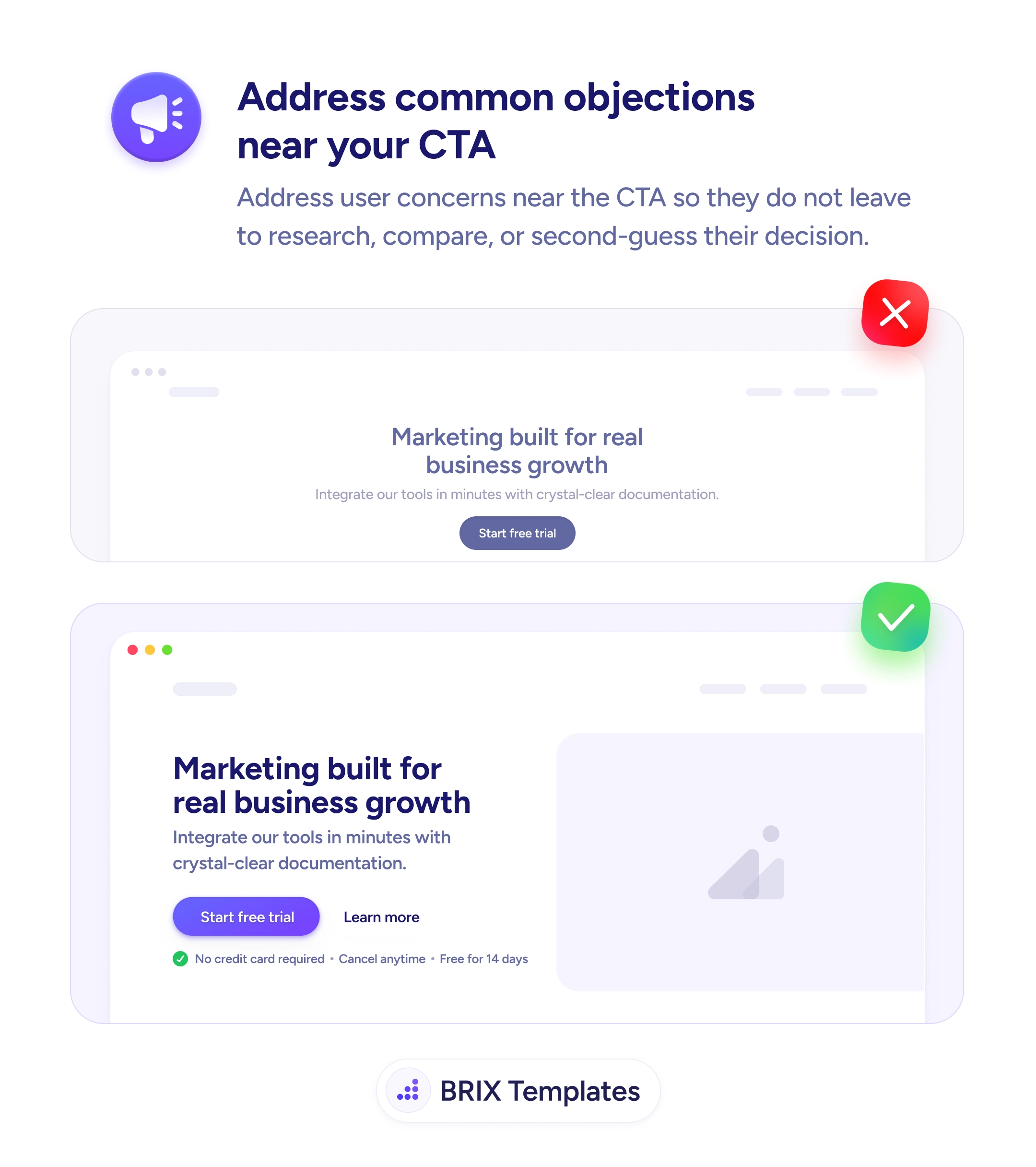
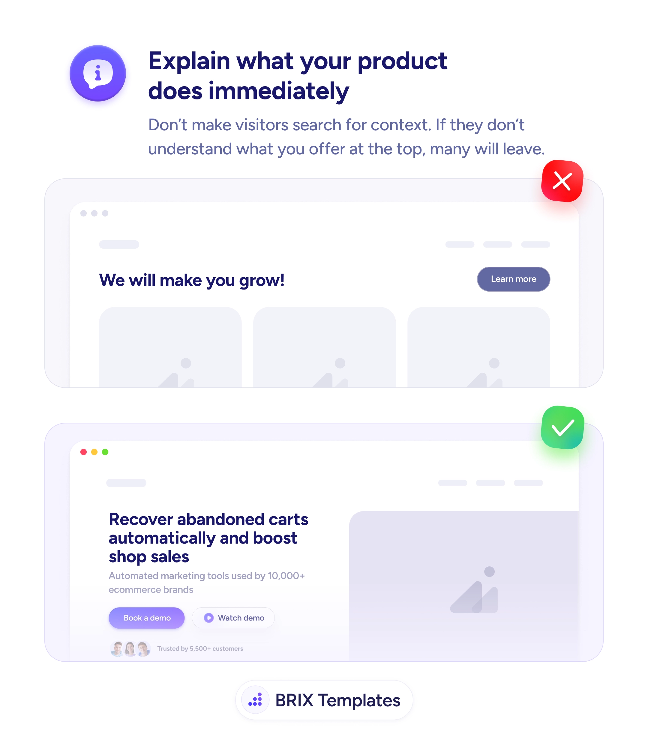
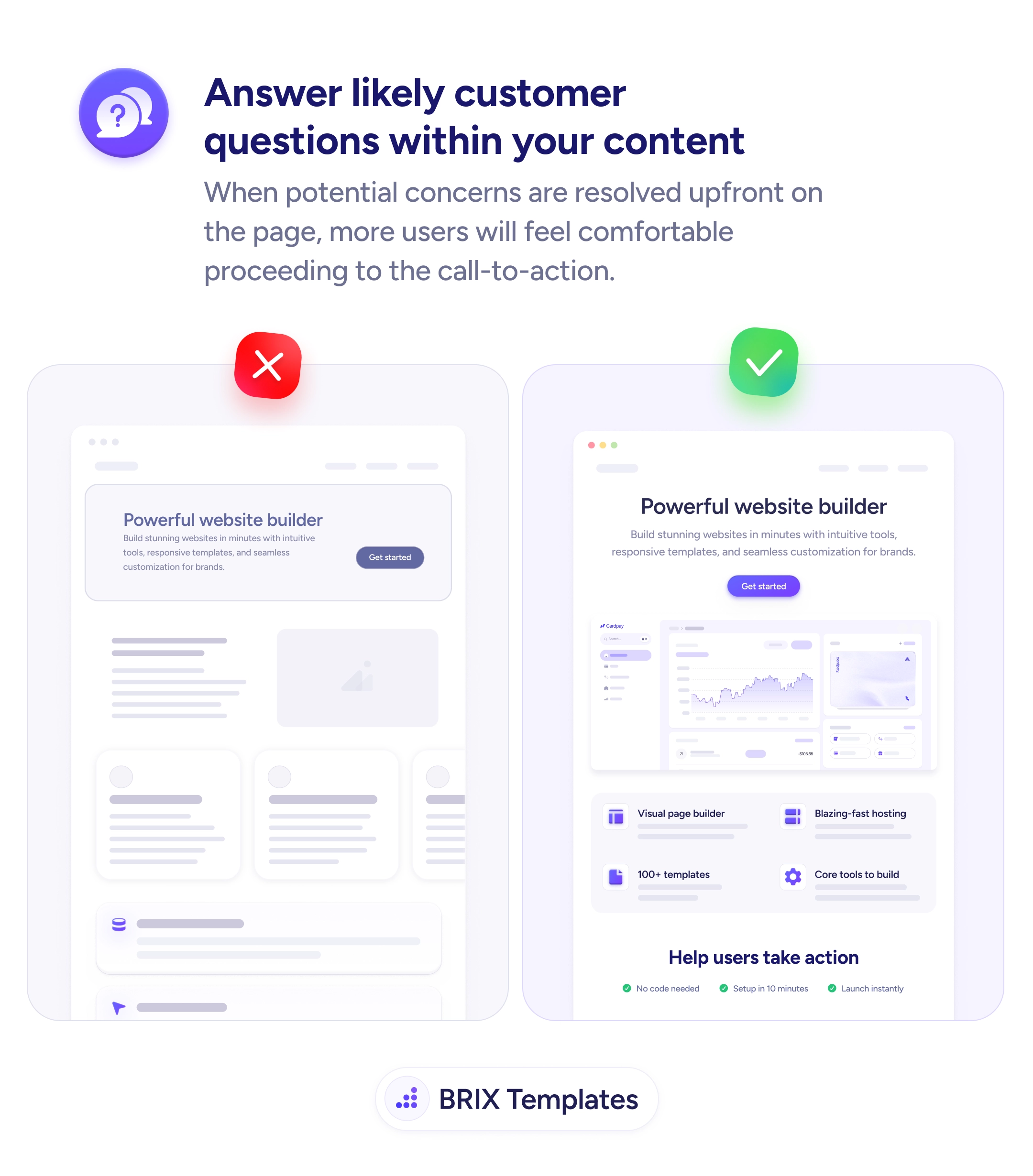
A landing page with a strong headline and CTA but no concrete answers underneath asks the visitor to commit on faith. Most won’t — they’ll scroll for proof, find empty content blocks or generic copy, and leave with the same questions they arrived with: what exactly does this do?, how long does setup take?, what if I’m not technical?. The headline did its job; everything below it failed to follow through, and the click that was almost there never lands.
A stronger pattern is to anticipate the next three or four questions a hesitant visitor would ask and answer them inline. That means feature blocks that name specific capabilities (“Visual page builder”, “Blazing-fast hosting”, “100+ templates”), and a reassurance band right above the CTA that handles the operational doubts (“No code needed”, “Setup in 10 minutes”, “Launch instantly”). Each answer dissolves a small piece of resistance before the visitor has to consciously raise it.
Start by pulling the top five questions from your support tickets, sales transcripts, and onboarding chats. Those are the questions visitors are silently asking on the marketing site. Design feature blocks and reassurance lines around them, and place each answer near the claim it backs up — setup time goes near the CTA, not in a footer FAQ. The page should assemble the value proposition as the visitor scrolls, not after they’ve already decided to leave.
When a landing page pre-answers its own objections, the CTA stops being a leap and starts being a confirmation. Visitors typically convert higher on pages that resolve their unspoken questions before asking for the click, because the doubt that would have stopped them never reaches conscious thought.
The ones a hesitant buyer would ask before clicking: what exactly does this do, who's it for, what does setup look like, what are the limits of the free tier, what happens if it doesn't work for me. If those answers aren't on the page, the visitor either guesses or leaves.
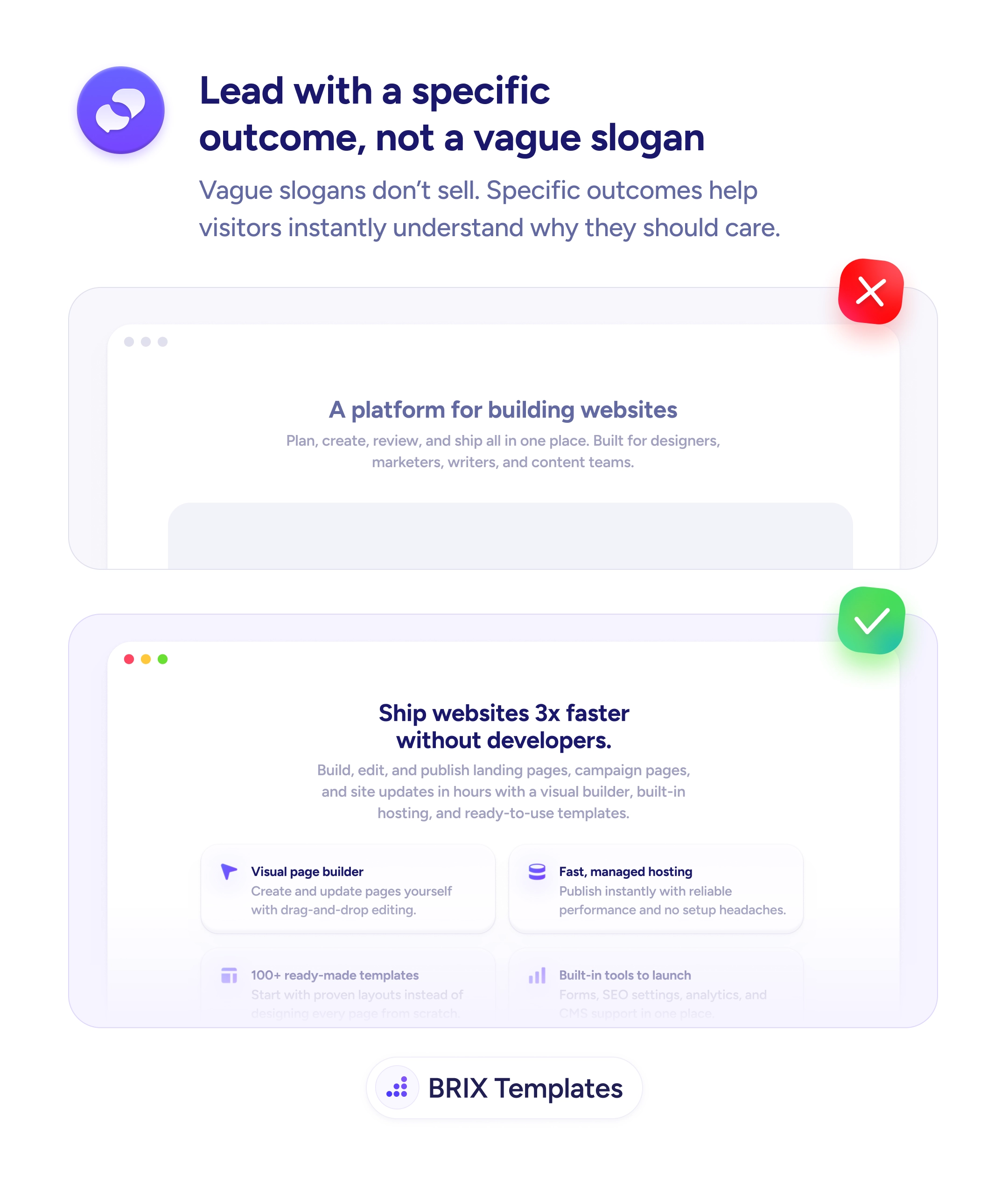
Inline, near the claim they support. Setup time belongs near the CTA, not in an FAQ at the bottom. Feature details belong under the headline that promises them. The visitor shouldn't have to scroll back and forth to assemble the value proposition — it should build linearly as they scroll.
FAQs sit at the bottom and catch leftover doubts. Preempted answers live in the body, woven into feature blocks and reassurance lines so the visitor never has to ask. Both can coexist — but the page that answers the big questions inline almost always converts better than the one that defers them to a FAQ.
Read your support tickets, sales call transcripts, and onboarding chat logs. The questions that repeat in those channels are the questions visitors are silently asking on the marketing site. Pull the top five and design feature blocks around them — the answers are usually already written in your replies.