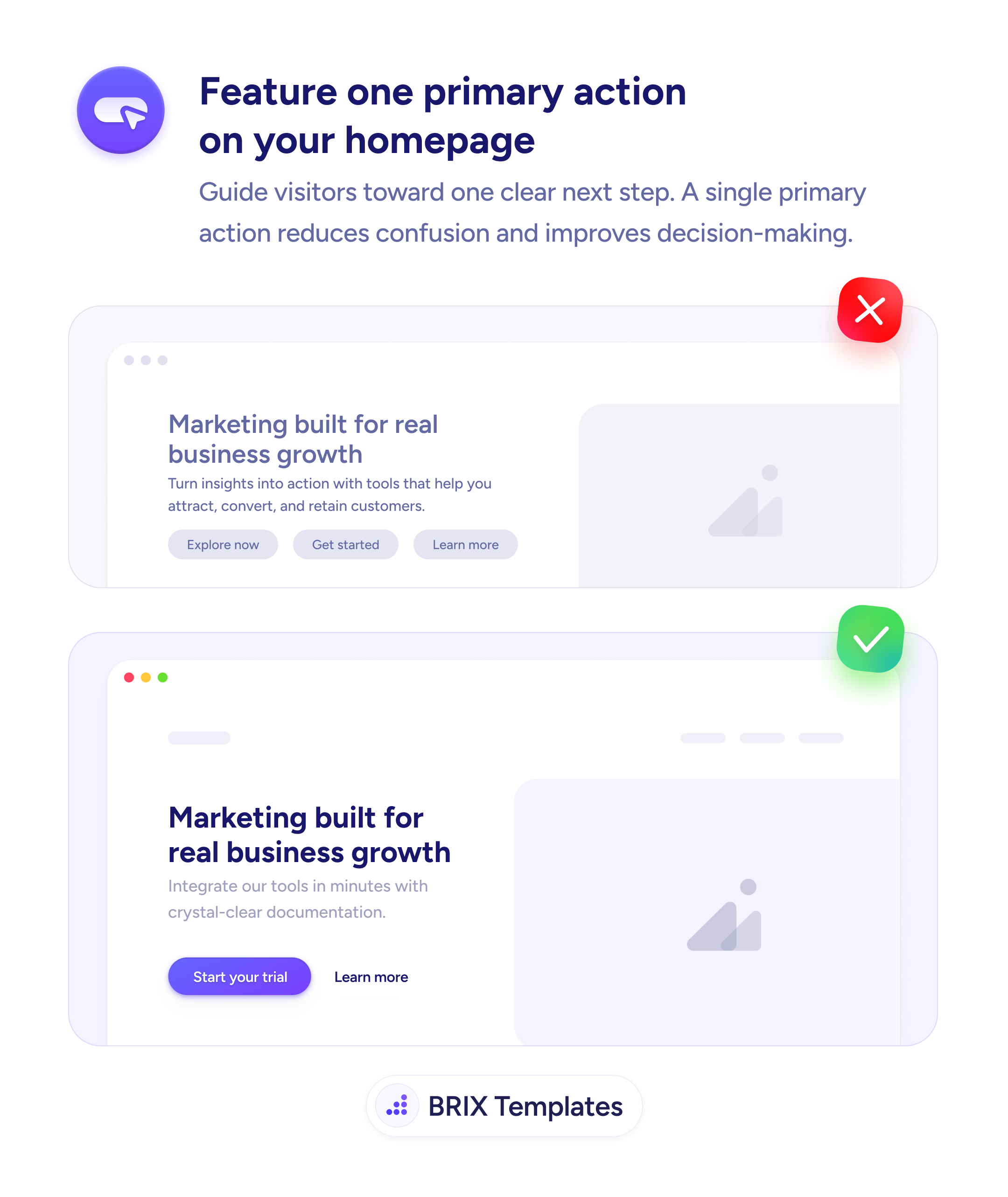
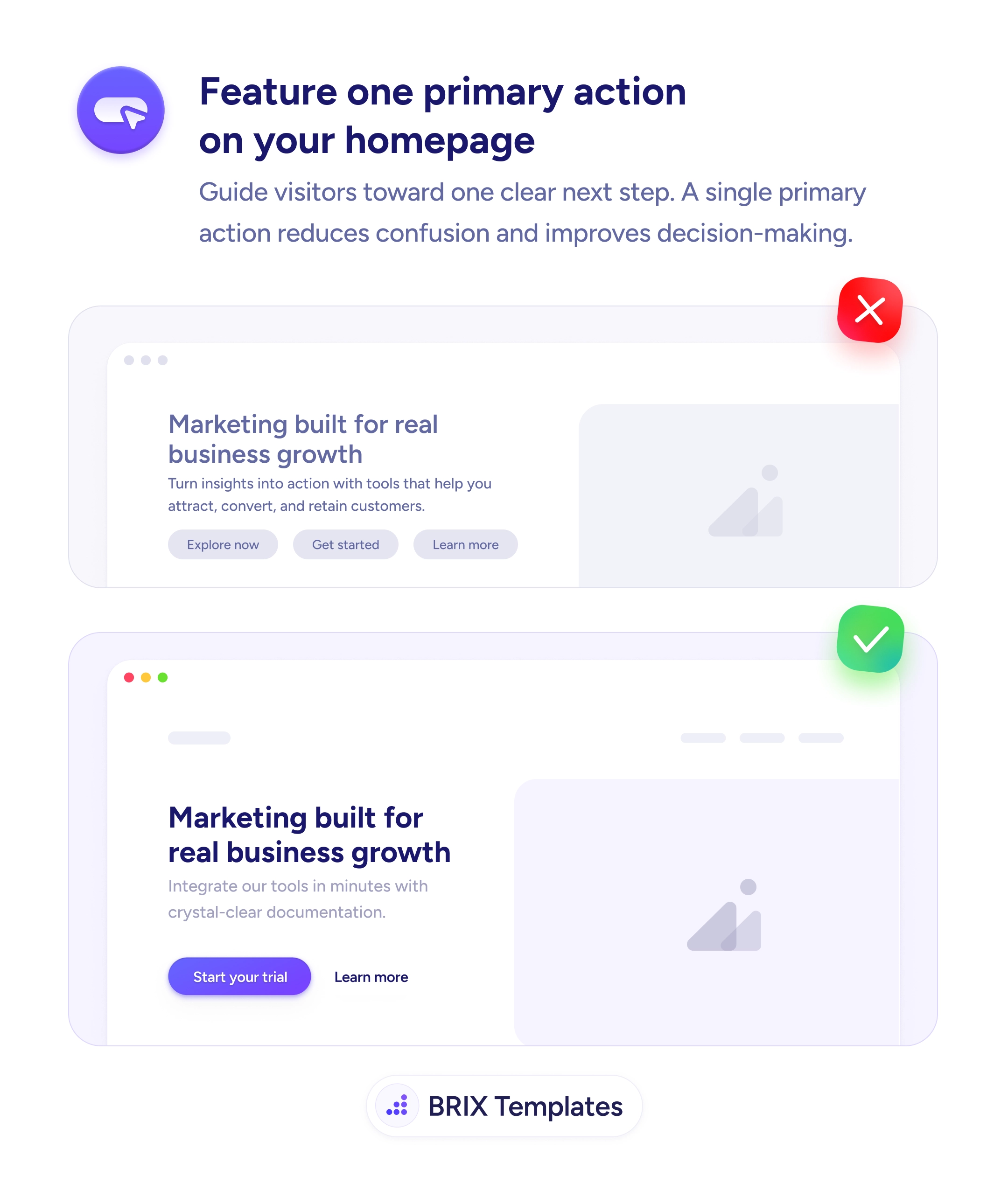
UX tip graphic titled 'Feature one primary action on your homepage.' The top panel marked with a red X shows a hero headed 'Marketing built for real business growth' with three equally-styled grey buttons side by side — 'Explore now,' 'Get started,' and 'Learn more' — giving no sense of which to click. The bottom panel marked with a green checkmark shows the same hero with a single filled purple 'Start your trial' button as the primary action and a plain 'Learn more' text link beside it. BRIX Templates branding at the bottom.

Actions & CTAs

Three equal buttons in a hero don't offer choice — they offer a decision the visitor didn't come to make

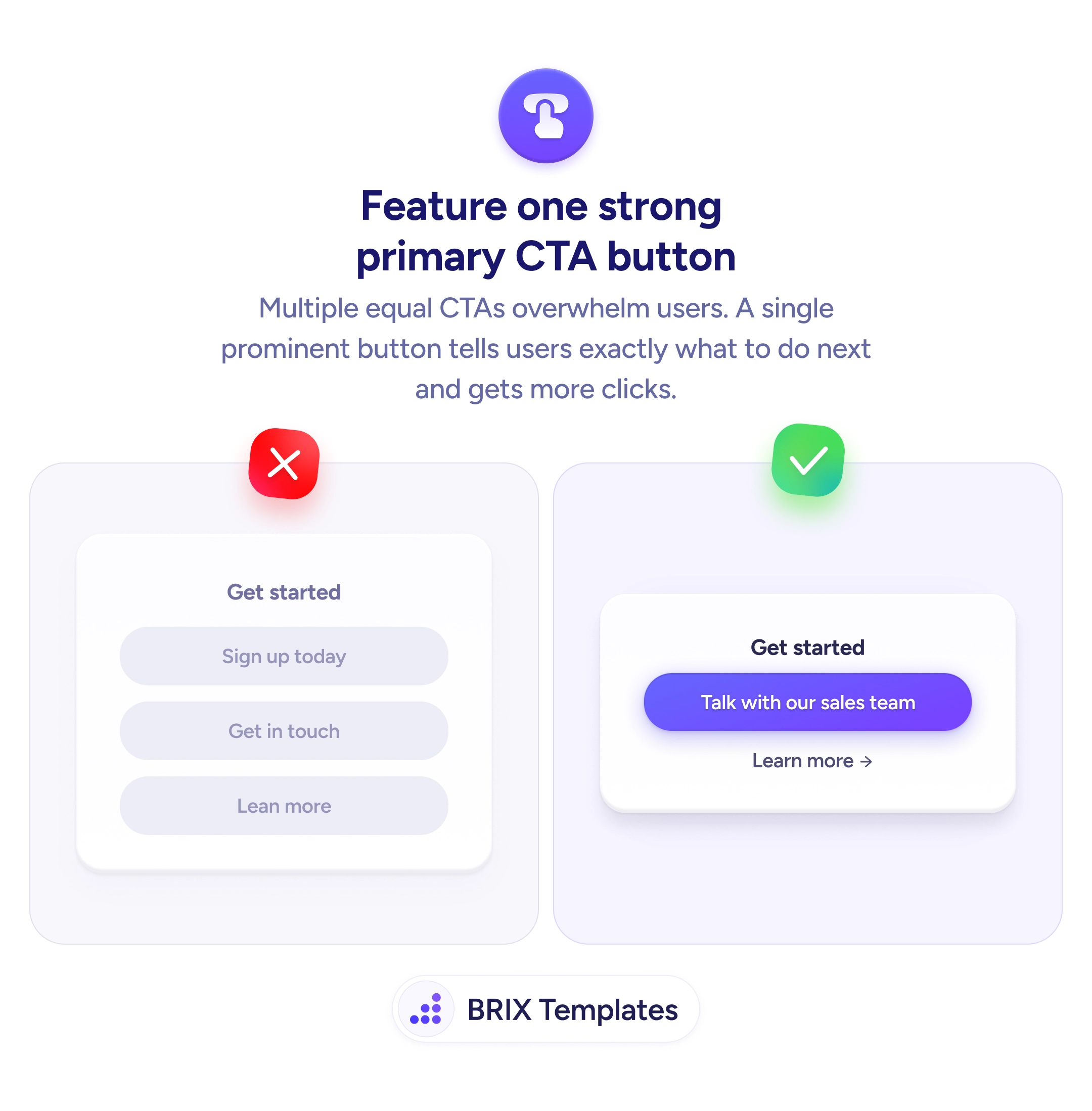
Multiple equal hero buttons split attention and stall visitors. Feature one primary action and demote the rest to reduce confusion and guide the next step.

How to feature one primary action on your homepage

A hero headline over three equally-styled buttons“Explore now,” “Get started,” “Learn more” — looks like it’s offering choice, but it’s really handing the visitor a decision they didn’t come to make. When every option carries the same weight, none of them reads as the next step, so the visitor stops to evaluate instead of acting. Choice presented as three identical buttons is friction dressed up as flexibility.

The fix is to feature one primary action and demote the rest. A single filled “Start your trial” button beside a plain “Learn more” text link makes the recommended next step obvious at a glance, while still leaving a path for visitors who aren’t ready. The design does the guiding: one dominant button answers “what should I do here?” so the visitor moves rather than deliberates.

This is the single-primary-CTA principle applied at the most important decision point on the site, and it’s achieved through button hierarchy — fill for the primary, outline or text for the rest. Keep the secondary route as a lower-commitment link rather than a competing button, and carry the same discipline through every section: one clear action per beat, not a cluster of equals.

  • Make one action visually dominant — a solid, high-contrast fill on the button you want clicked.
  • Demote secondary paths to outline buttons or text links, not equal-weight buttons.
  • Keep a route for the not-ready — a quiet “Learn more” beside the primary, not instead of it.
  • One primary per decision point, in the hero and every section below it.
  • Let the design answer “what next?” so visitors act instead of evaluating options.

Frequently asked questions

Why is featuring one primary action better than offering several?

Because equally-weighted options force the visitor to choose before they've decided anything — and that choice adds friction instead of removing it. Three buttons that all look important give no signal about which to click, so the visitor pauses to evaluate. A single, visually dominant primary action tells them the recommended next step at a glance, reducing confusion and making it more likely they act rather than stall.

What about visitors who aren't ready for the main action?

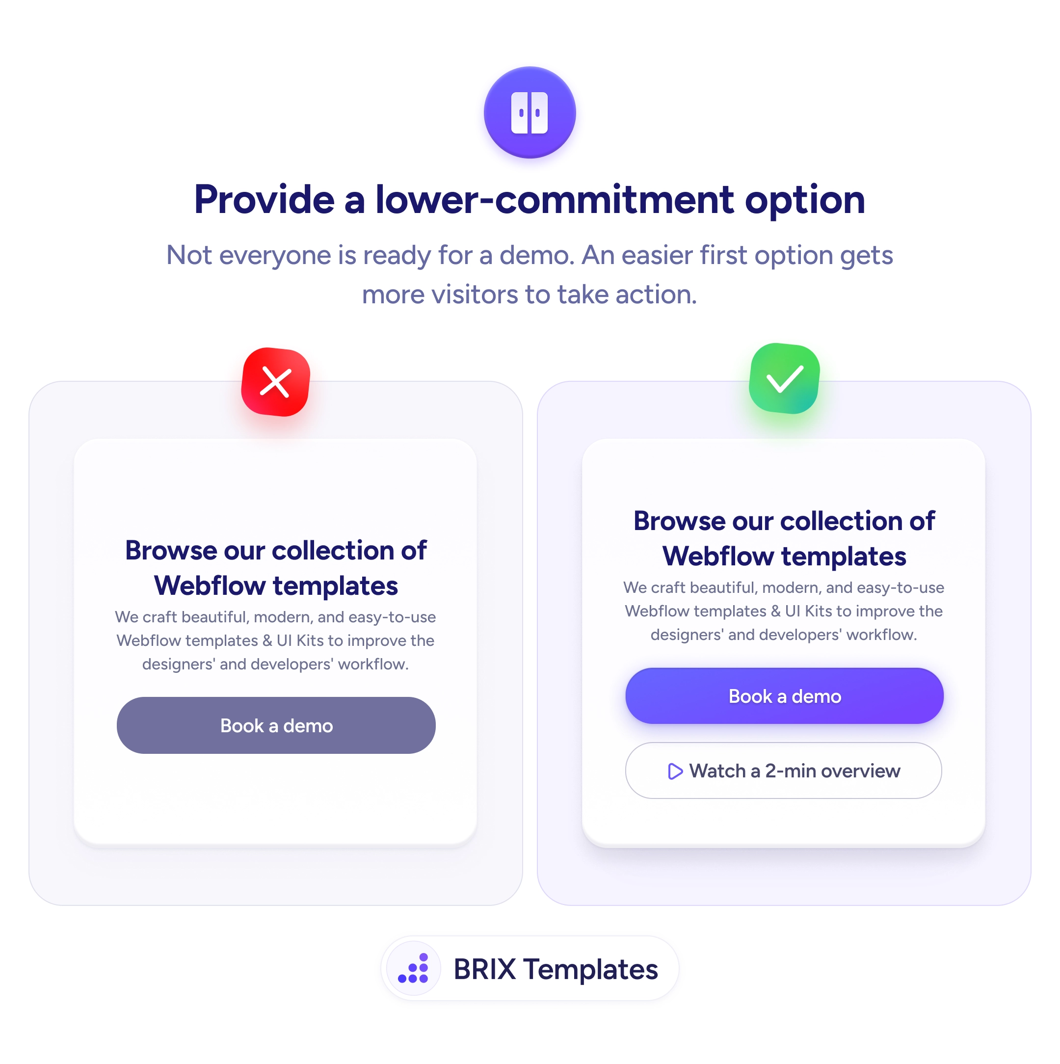
You still serve them — just don't give their path equal visual weight. Keep a secondary option like 'Learn more' as a text link or outline button beside the primary, so the not-ready visitor has somewhere to go without competing for the decided visitor's attention. The goal is one obvious primary action plus quiet alternatives, not a single button that strands everyone else.

Doesn't this only apply to the hero?

The hero is where it matters most, because it's the first decision point and sets the tone. But the same logic holds through the page: each section should have one clear primary action rather than a cluster of equal buttons. Featuring a single action per decision point keeps the whole page pointing the visitor toward the same next step instead of scattering their attention.

How do I make one action clearly primary?

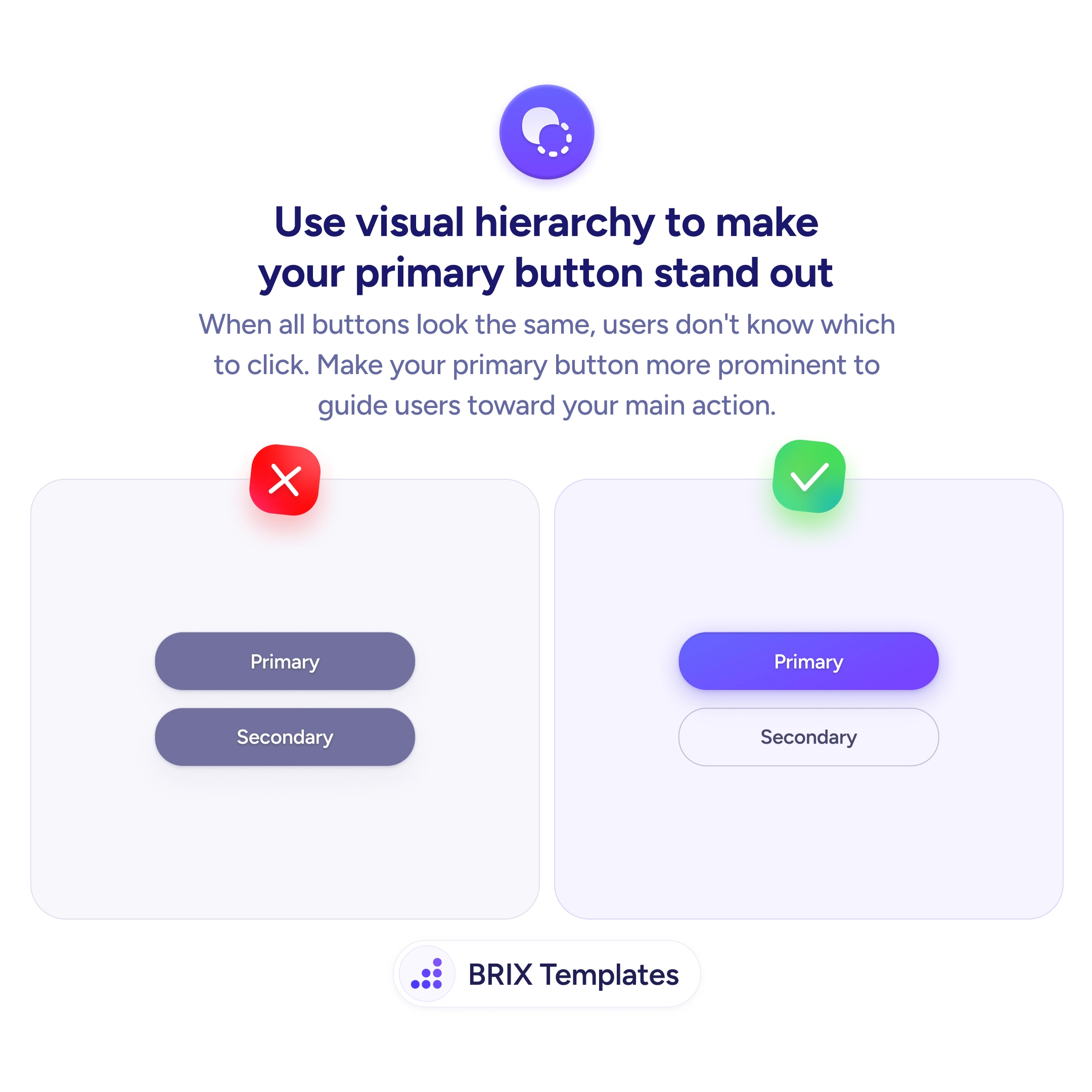
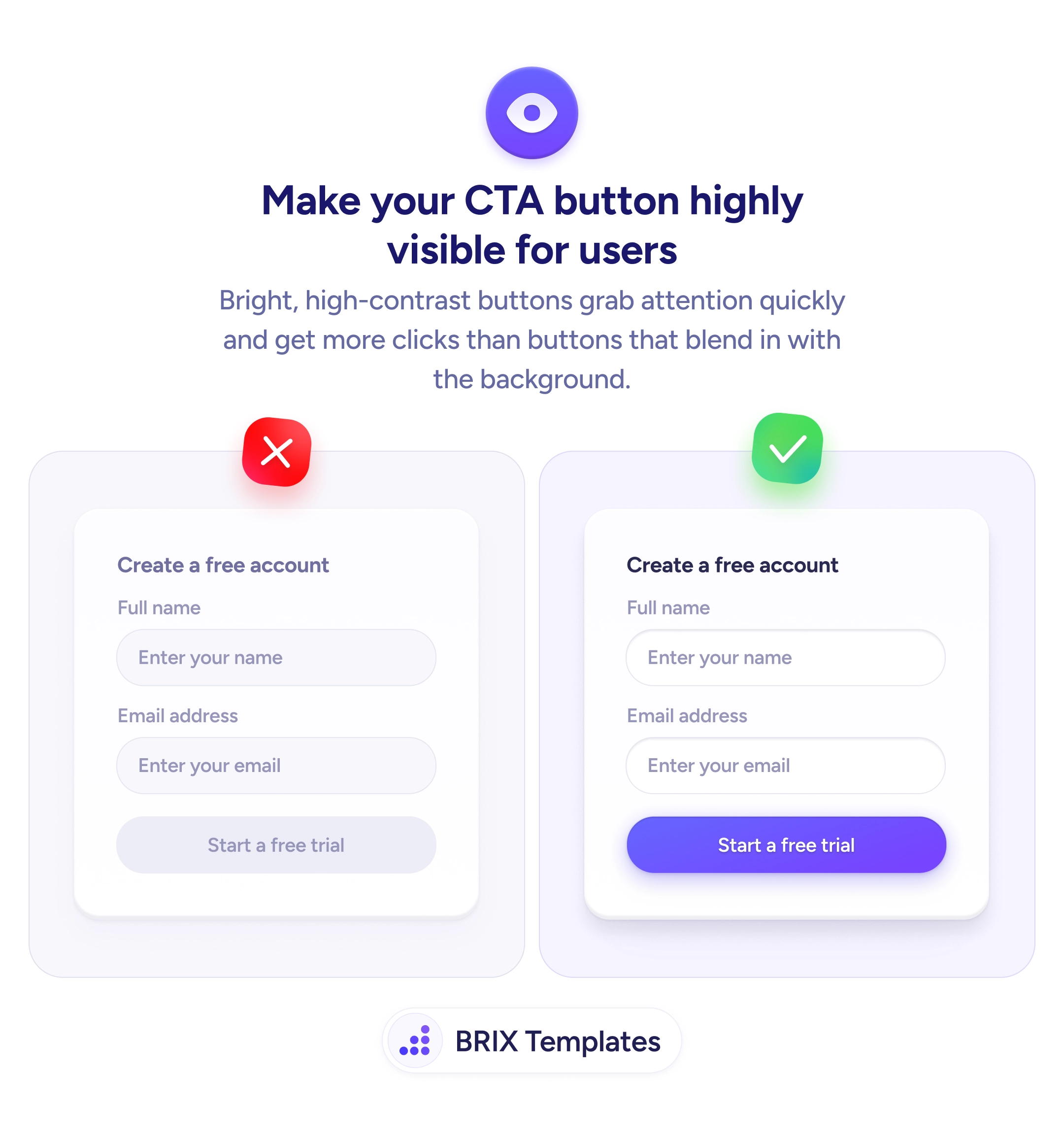
Use visual hierarchy. Give the primary action a solid, high-contrast fill so it's the most prominent element, and render secondary options as outline buttons or plain text links. Size, color, and weight should all agree on which one is the main path. The visitor should be able to tell the primary action from the alternatives in a glance, without reading every label to work out which matters.