

Readability
Specs buried in a paragraph make the reader hunt for the one number they came to check
Specs written as prose force readers to hunt for each number. Format them as a consistent labeled list so buyers find and compare details at a glance.

Readability
Specs buried in a paragraph make the reader hunt for the one number they came to check
Specs written as prose force readers to hunt for each number. Format them as a consistent labeled list so buyers find and compare details at a glance.
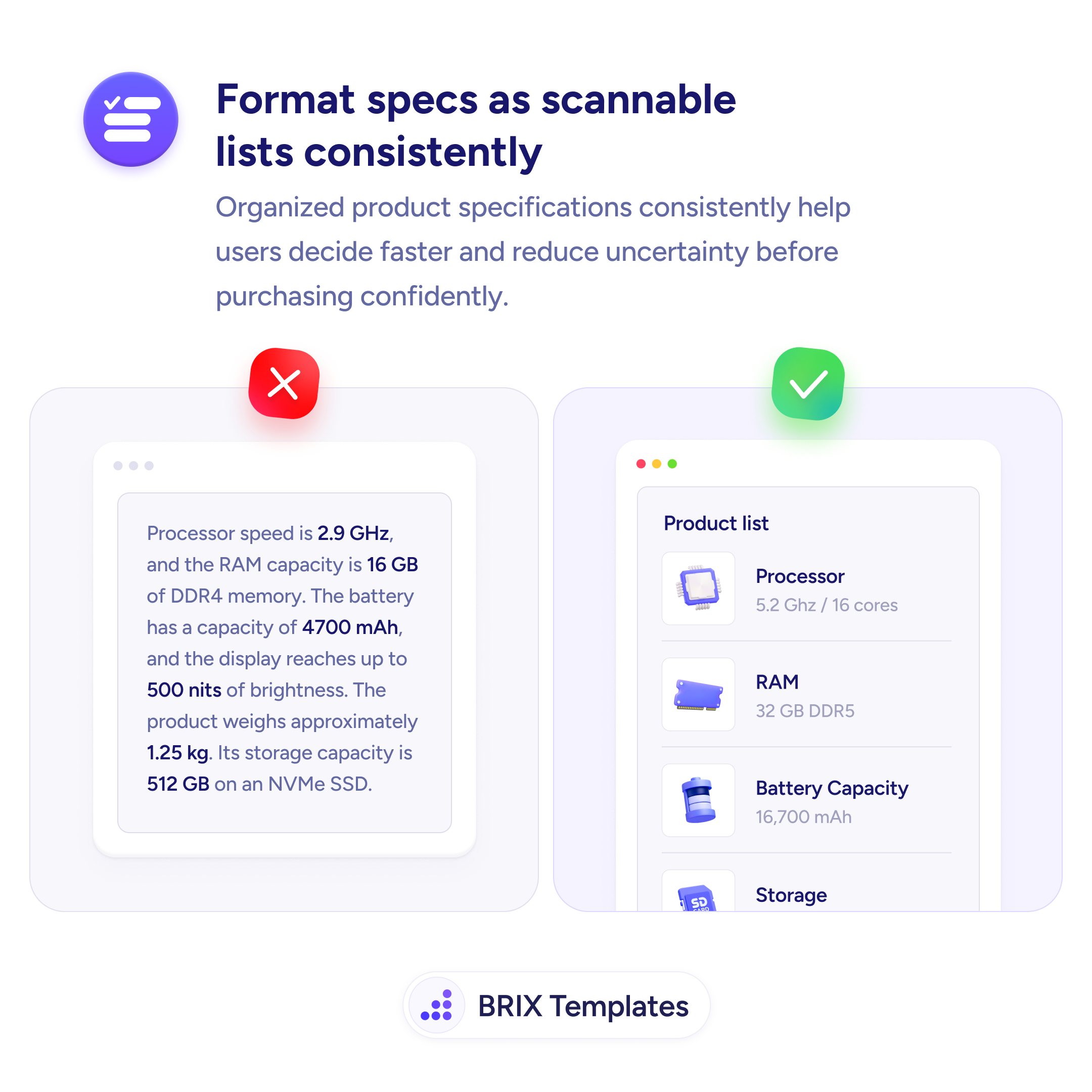
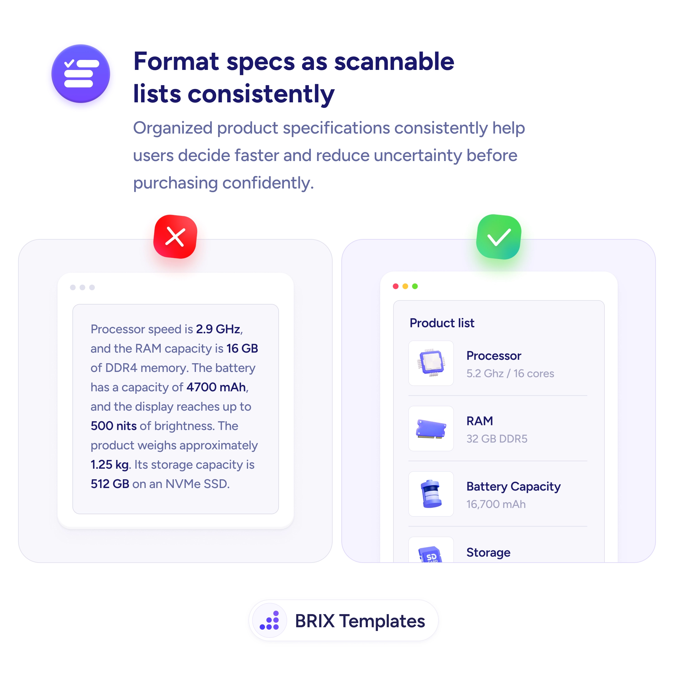
A block of product specs written as running prose — processor speed is 2.9 GHz, RAM is 16 GB, the battery has 4700 mAh, the display reaches 500 nits — forces the reader to do exactly what they didn’t want to: read every spec to find the one they came to check. Bolding the numbers inside the sentence helps a little, but the information is still trapped in a paragraph, and nobody reads a spec sheet like a story.
The fix is to break specs into a consistent, labeled list. A clean label-value row per attribute — Processor: 5.2 GHz / 16 cores, RAM: 32 GB DDR5, Battery: 16,700 mAh — lets the eye jump straight to the detail that matters and skip the rest. The consistency is what makes it work: same pattern, aligned labels, one fact per line, so any single spec is findable at a glance.
This is the same move as replacing feature paragraphs with bullets, applied to technical detail, and it completes the job of surfacing product info from behind a tab — visible prose is still hard to use until it’s structured. A small icon per row speeds recognition further, letting the eye locate “battery” or “storage” before it even reads the label. Keep the format identical across products so buyers can compare in a glance.
Because people don't read specs — they look up the one or two that matter to them. In a paragraph, finding 'battery capacity' means reading through processor, RAM, and weight to get to it. A labeled list puts each spec on its own line with a consistent label and value, so the reader's eye jumps straight to what they're checking. That faster lookup reduces uncertainty and helps buyers decide with confidence.
Consistency and structure. Each row should follow the same label-value pattern — 'Processor: 5.2 GHz / 16 cores,' 'RAM: 32 GB DDR5' — with the labels aligned so the eye can run down the column. Grouping related specs, keeping units consistent, and adding a small icon per row all speed recognition. The goal is that a reader can find and compare any single spec without reading the ones they don't care about.
Use the list for the discrete, factual attributes buyers compare — dimensions, capacities, materials, compatibility. Narrative context that explains why a spec matters can stay as short prose nearby, but the measurable facts belong in the structured list where they're easy to scan and compare. Mixing the two — hard numbers buried inside storytelling — is exactly what makes specs hard to use.
When every product lists its specs in the same order and format, buyers can compare across items almost instantly — battery lines up with battery, storage with storage. Inconsistent formatting forces them to re-orient on each page and re-find each attribute, which is precisely the friction that stalls a confident decision. Formatting specs the same way everywhere turns comparison from work into a glance.