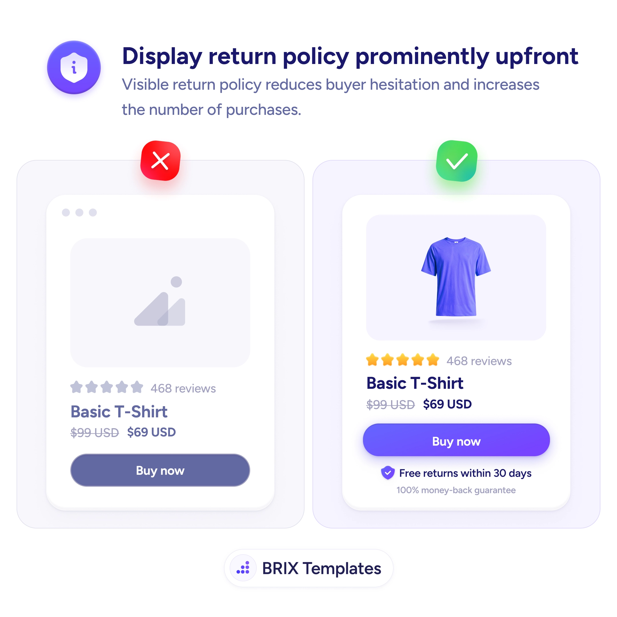
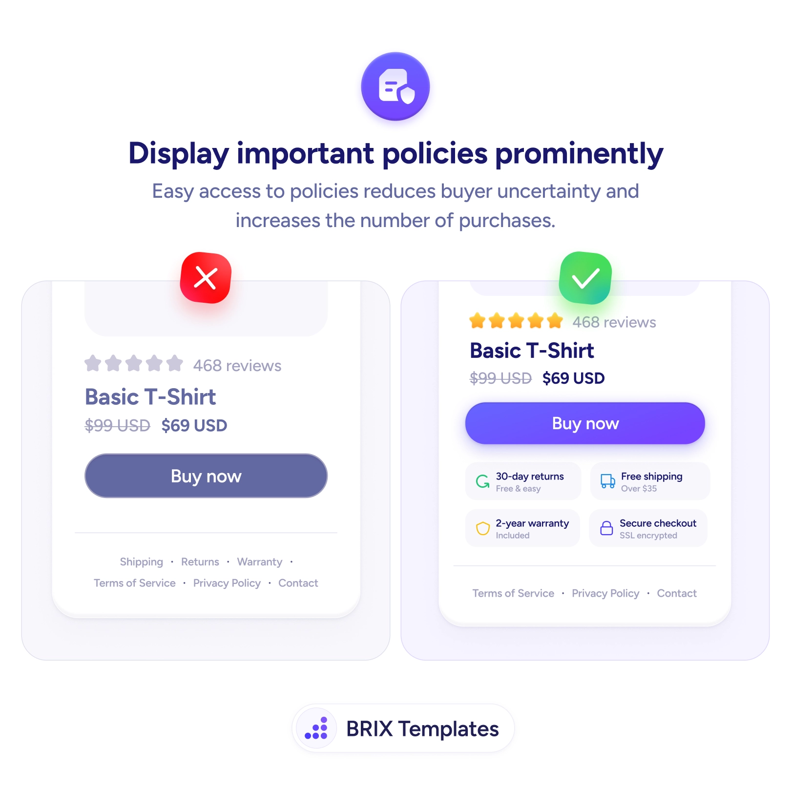
A product card with a “Buy now” button and no word about returns leaves the buyer holding an unspoken question: what if it doesn’t fit, or isn’t what I expected? Online, that risk is real and the shopper knows it. When the return policy is invisible — or stranded on a separate page — the risk stays unquantified, and an unquantified risk is exactly the kind of doubt that stalls a click.
The fix is to state the return terms right where the buyer decides. A short line under the CTA — “Free returns within 30 days,” “100% money-back guarantee” — tells the shopper the downside of a wrong choice is small and reversible. Answering the risk question at the moment it surfaces removes the hesitation that a footer link, however accurate, arrives too late to catch.
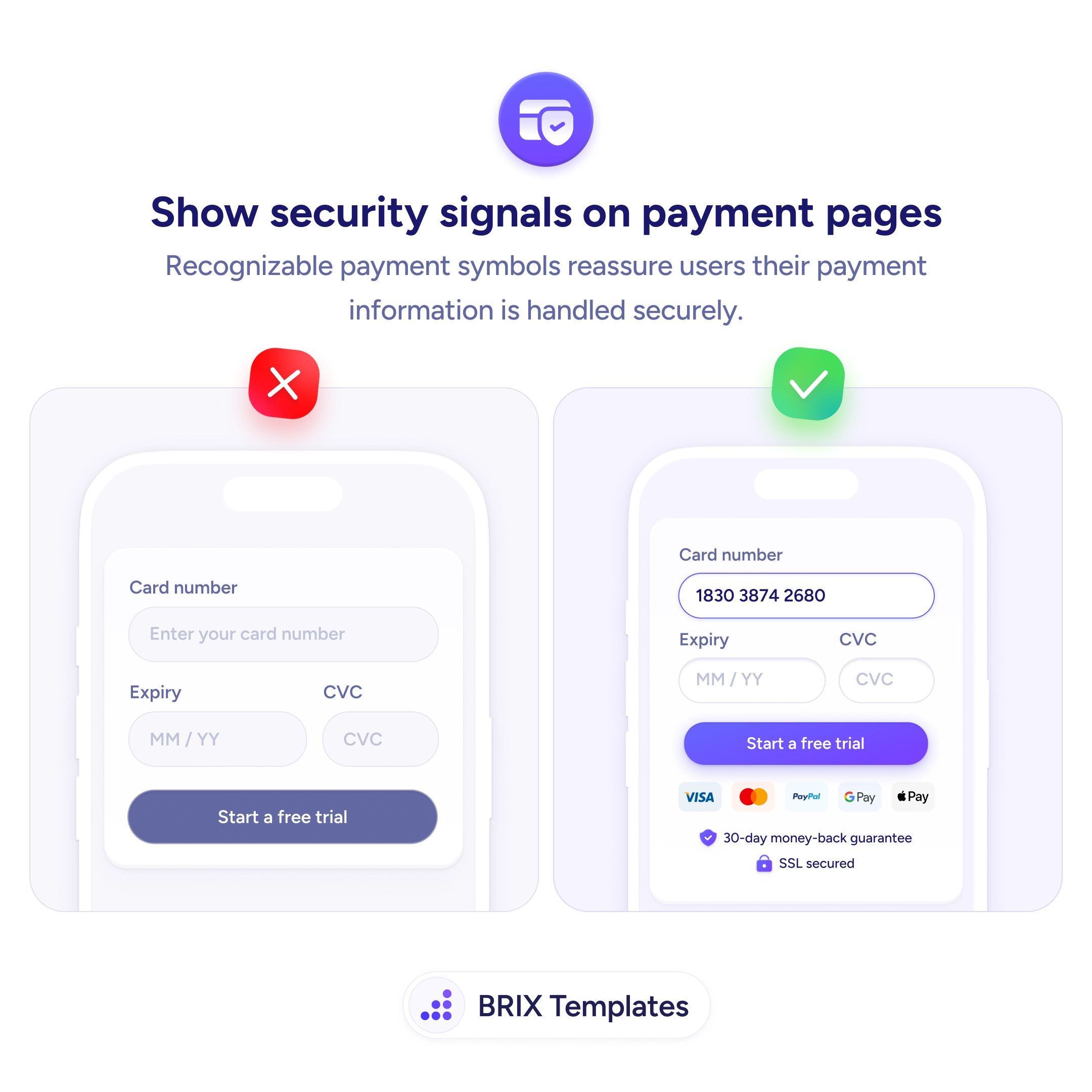
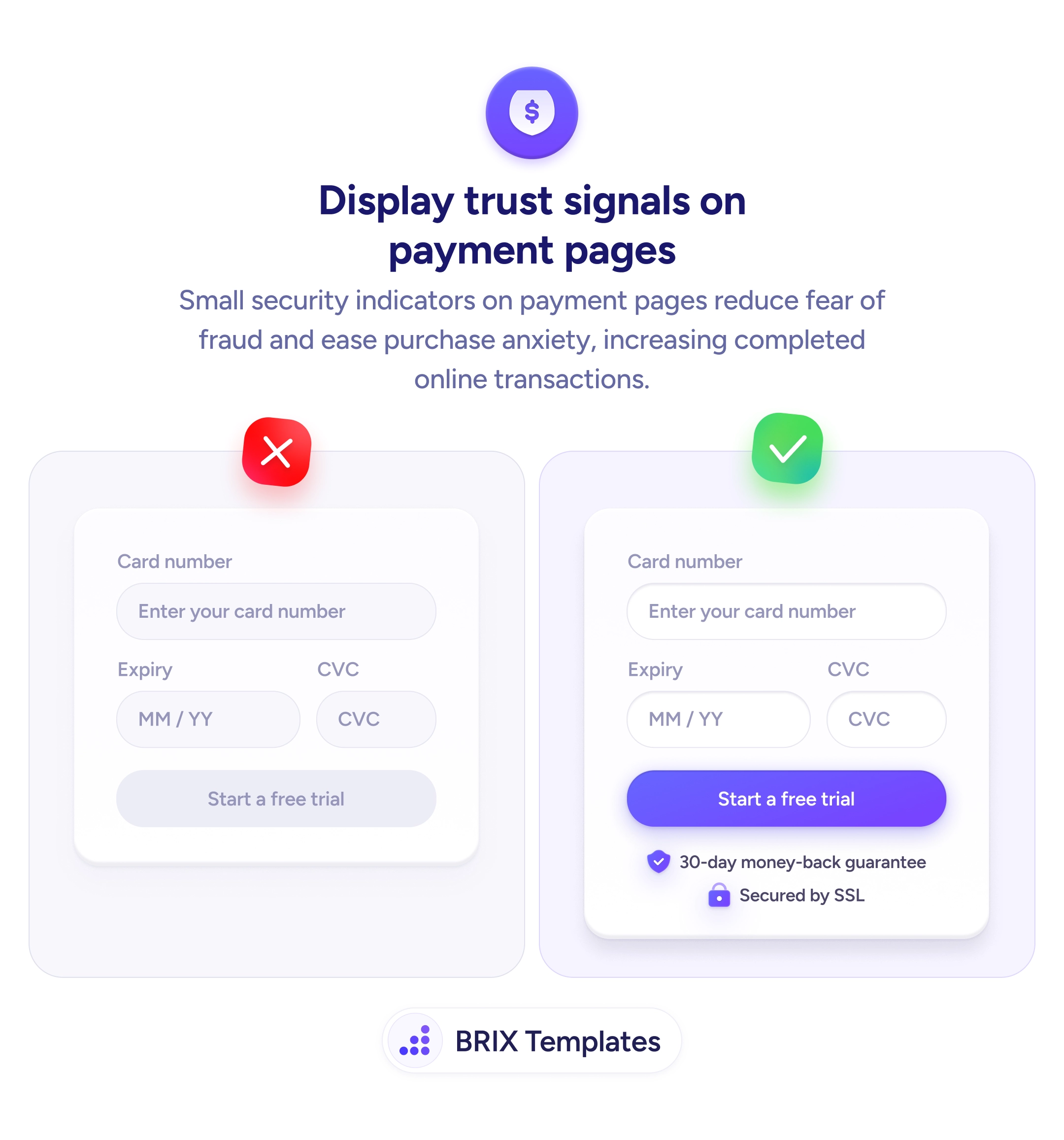
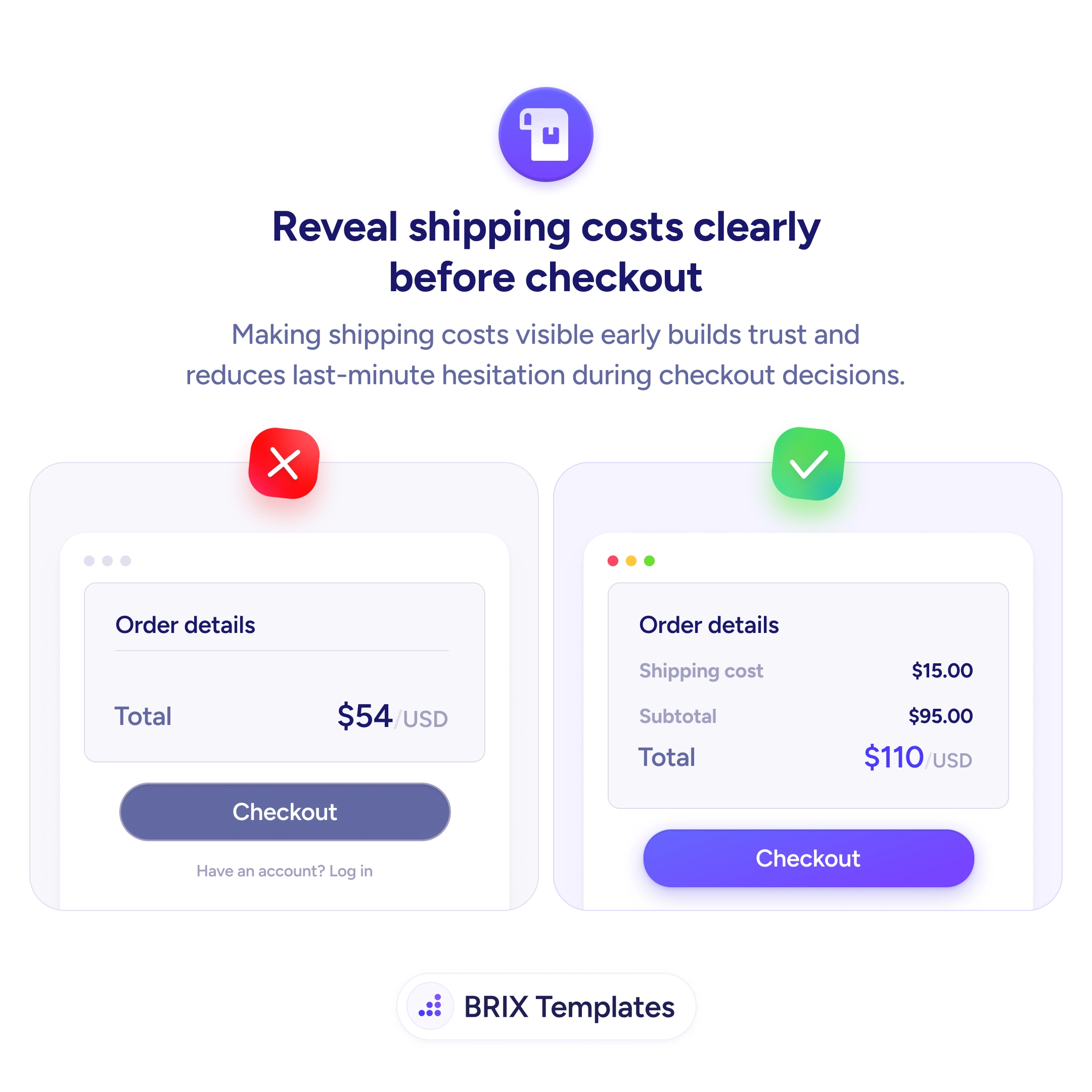
Treat it as one of the reassurances that belong beside the money moment, alongside security cues at the payment step and shipping costs shown before checkout — together they let the buyer commit knowing the full terms rather than guessing. Even a modest policy reassures more stated plainly than hidden: a known limit is less frightening than an unknown one.
- Put the policy next to the buy button, not only on a separate page.
- Keep it short and concrete — “Free returns within 30 days” answers the real worry.
- State modest policies plainly — clarity beats concealment; uncertainty scares more than limits.
- Group it with other risk-removers — security and shipping cues near the CTA.
- Fix high returns at the source — better sizing and imagery, not a hidden policy.