Checkout & payments
The reassurance a buyer needs is worthless if it's hidden in the footer
Returns, shipping, and warranty answers buried in footer links leave buyers hesitating. Surface them next to the buy button so doubt clears before the click.
Checkout & payments
The reassurance a buyer needs is worthless if it's hidden in the footer
Returns, shipping, and warranty answers buried in footer links leave buyers hesitating. Surface them next to the buy button so doubt clears before the click.
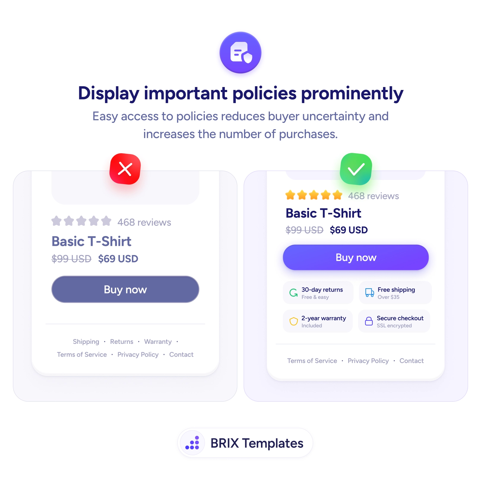
Most stores have the right policies — generous returns, free shipping, a real warranty — and then hide them where they do no good. A buyer reaches the product page weighing “what if it doesn’t fit?” and “is this safe to pay for?”, and the answers sit as tiny grey links in the footer, a full scroll away from the decision. The reassurance exists, but it’s nowhere near the moment of doubt. So the buyer either leaves to hunt for it or, more often, just hesitates and abandons.
A stronger pattern puts the answers right next to the buy button. A compact row — 30-day returns, free shipping, 2-year warranty, secure checkout — clears the exact fears that stall a purchase, in the spot where those fears peak. This is the same dynamic behind trust badges near the checkout button reducing abandonment: proximity is what lets reassurance land before doubt turns into a closed tab.
Start by listing the questions a hesitant buyer asks before paying — returns, shipping, warranty, security — and surface those four near the CTA as short, scannable labels. Keep each to a few words so the strip reads as reassurance rather than fine print, and link every badge to its full policy for the careful shopper. Pair this with shipping costs shown before checkout so the buyer meets no unwelcome surprises later in the flow.
A buyer commits faster when the answers to “what if?” are sitting next to the button, not buried below it. Move your best policies up to the decision point, keep them short and verifiable, and you remove the quiet doubts that otherwise turn into abandoned carts.
The ones that answer a buyer's pre-purchase fears: return window, shipping cost and speed, warranty or guarantee, and payment security. These are the questions that make someone hesitate at the buy button. Less decision-critical policies — full terms of service, privacy details — can stay in the footer, where their job is reference, not reassurance.
Not if they're concise. A compact strip of short labels — '30-day returns', 'Free shipping' — reads as reassurance, not clutter. The clutter risk comes from long policy text or too many badges. Keep each one to a few words, and link the badge to the full policy for anyone who wants the detail.
Directly next to the buy button, where the decision happens. That's the moment doubt peaks, so the answers have to be in view without scrolling or hunting. A footer link asks the buyer to leave the decision point to find reassurance — many won't, and the hesitation itself costs the sale.
Yes. The badge delivers the quick reassurance; the link delivers the proof for skeptical buyers. Let '30-day returns' open the full return policy so a careful shopper can confirm the details. A claim with no way to verify it builds less trust than one the buyer can check in a tap.