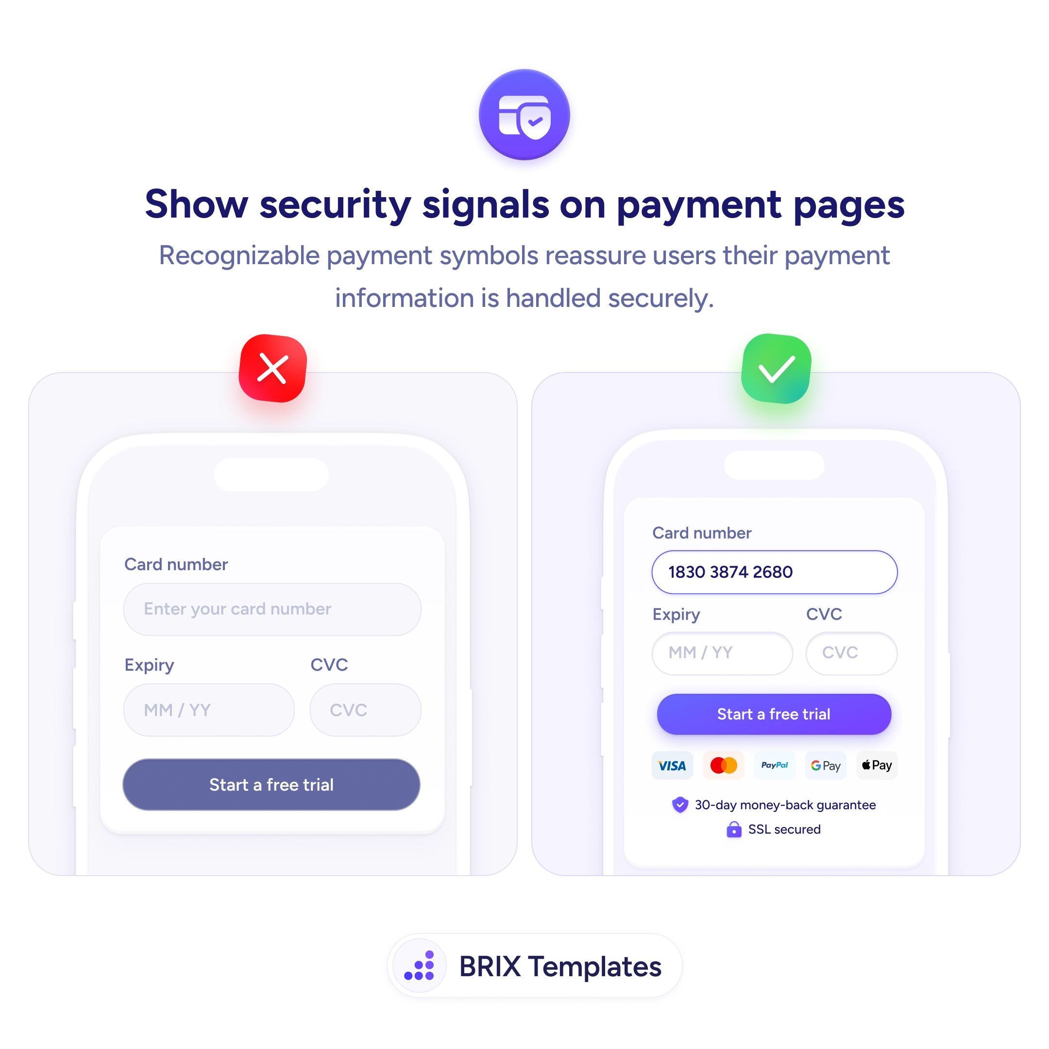
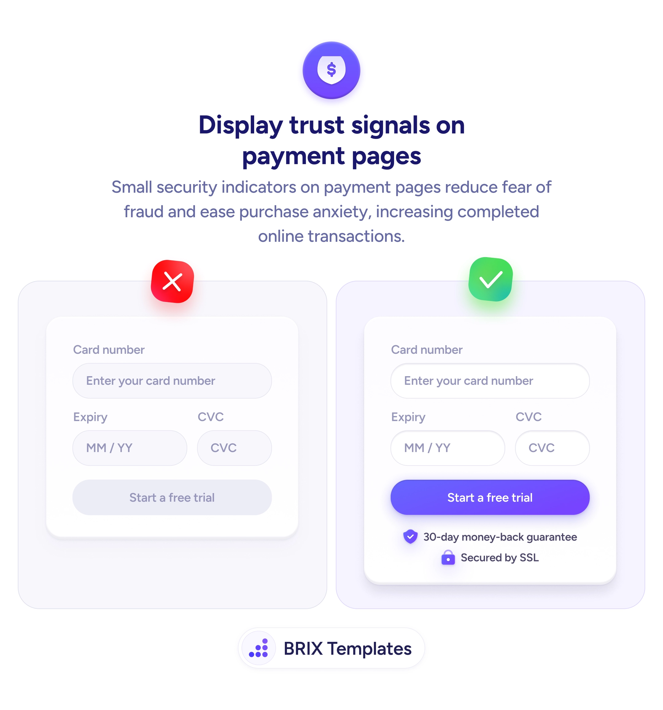
UX tip graphic titled 'Show security signals on payment pages.' Both panels show a mobile payment screen with card number, expiry, and CVC fields and a purple 'Start a free trial' button. The left panel marked with a red X shows the form alone, with no payment logos, guarantee, or security cues beneath the button. The right panel marked with a green checkmark shows the same form with recognizable payment badges (Visa, Mastercard, PayPal, Google Pay) plus a '30-day money-back guarantee' line and an 'SSL secured' padlock label directly under the button. BRIX Templates branding at the bottom.

Checkout & payments

At the payment step, a few familiar security cues answer the question every buyer is asking

The payment step is where doubt peaks. Show recognizable card logos, an SSL padlock, and a money-back guarantee near the button to reassure buyers.

How to show security signals on payment pages

The payment screen is where hesitation peaks. The buyer is about to type a card number, and a form that offers nothing but empty fields and a button gives their doubt room to grow — is this connection secure? who actually receives this data? what if the product’s wrong? An unadorned payment form reads, in that anxious moment, as a risk rather than a checkout.

The fix is to surround the payment action with recognizable security signals. A row of familiar card and wallet logos (Visa, Mastercard, PayPal), an SSL padlock marked “Secured,” and a short money-back guarantee tell the buyer — in symbols they already trust — that their information is handled safely and the purchase is reversible. These cues do the reassurance work exactly where the anxiety lives.

Start by placing the signals in the same visual block as the pay button, not in a page footer where they’re out of sight at the decision. Use symbols people recognize instantly — established payment brands and a padlock beat a generic “100% secure” badge you designed yourself. This is the same anxiety-reducing logic as trust badges near the checkout button, and it pairs naturally with reassurance microcopy under the CTA that names what happens after the tap.

  • Put security cues beside the pay button, in the same block as the action, not in the footer.
  • Use logos buyers already recognize — real card and wallet brands outperform generic badges.
  • Show an SSL or padlock signal so the connection’s safety is visible, not assumed.
  • Add a money-back guarantee to make the purchase feel reversible and lower the stakes.
  • Keep it honest — only display guarantees and certifications you actually honor.

Frequently asked questions

Do payment badges actually reduce abandonment?

They address a specific, well-documented anxiety at the moment of payment, so removing that doubt tends to help — especially for first-time buyers and unfamiliar brands who have no prior trust to lean on. They won't fix a confusing checkout or surprise fees, but as part of a clear payment step they lower the perceived risk of entering card details.

Which signals matter most?

Recognizable payment-method logos and a visible secure-connection indicator (padlock or SSL) carry the most weight because buyers already know what they mean. A money-back or satisfaction guarantee helps by making the decision reversible. Custom 'trust' seals you designed yourself carry little weight — familiarity is what does the reassuring.

Where should the security signals go?

In the same visual block as the pay button, within a glance of the card fields. Anxiety peaks at the moment of entering payment details, so the reassurance has to be visible there — not buried in the footer or on a separate policy page the buyer would have to go find.

Can too many badges backfire?

Yes. A cluttered wall of a dozen seals can look desperate and actually raise suspicion. Show a tight, credible set — accepted payment methods, a secure-connection cue, and one guarantee — and let the recognizable ones do the work. Restraint reads as confidence.