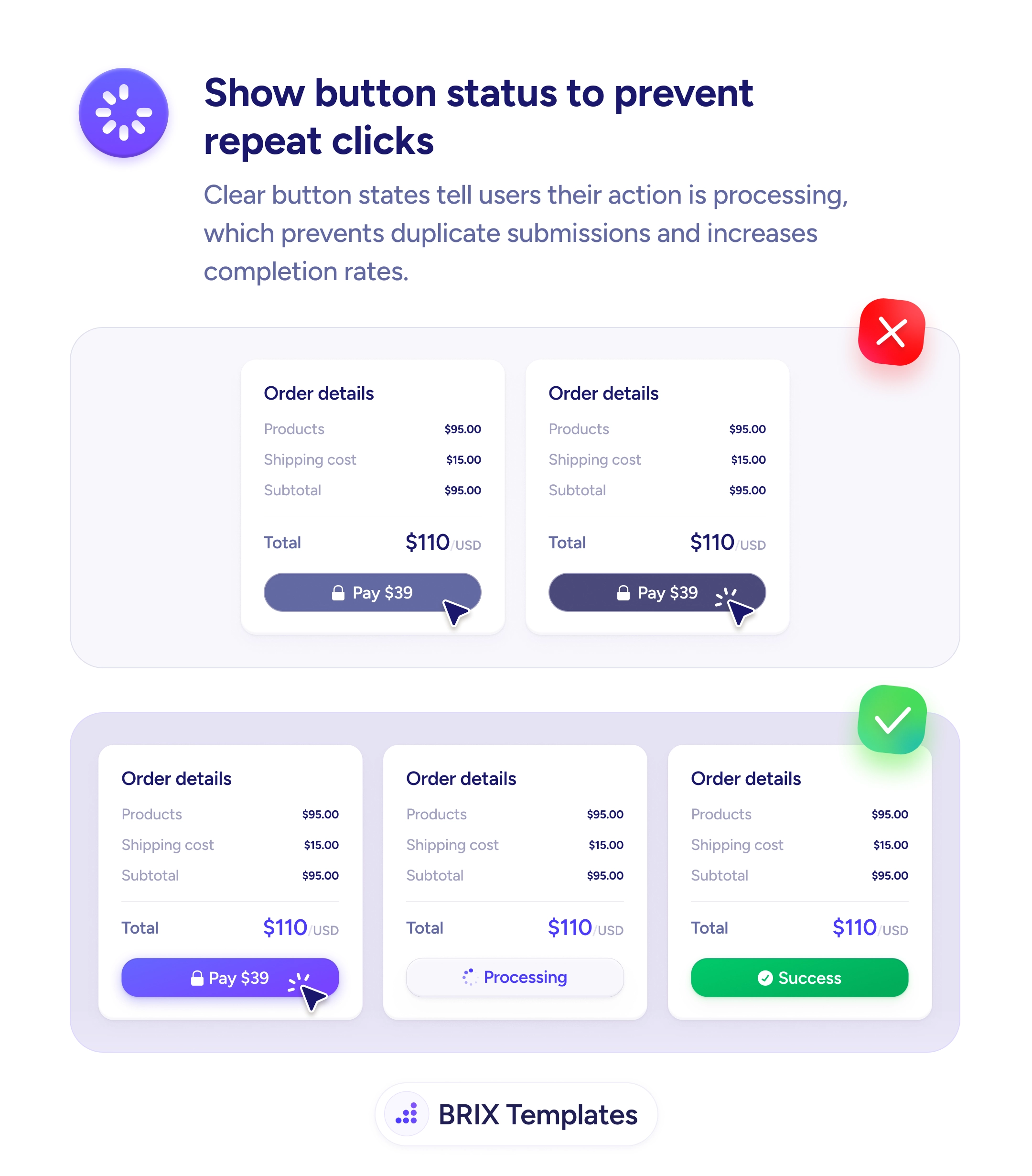
Status & feedback
An irreversible action without context is an action users won't take
Users hesitate when an irreversible action skips the consequences. Spell out access dates, billing, and data safety so confidence replaces anxiety.
Status & feedback
An irreversible action without context is an action users won't take
Users hesitate when an irreversible action skips the consequences. Spell out access dates, billing, and data safety so confidence replaces anxiety.
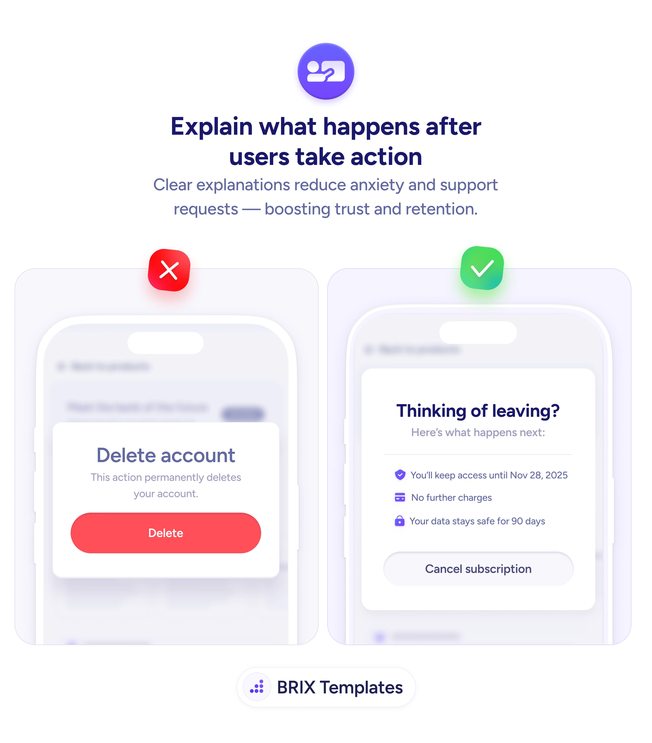
A confirmation screen that says “this action permanently deletes your account” gives the user enough warning to feel anxious and not enough information to feel confident. Vague consequences read like legal disclaimers, which makes people pause, second-guess, and either bounce or fire off a support ticket asking what “permanently” actually means. The hesitation isn’t irrational — it’s the natural response to being asked to commit without knowing exactly what’s about to happen.
A stronger pattern is to replace abstract warnings with a concrete consequence list. Instead of “permanently deletes your account”, show the user the exact access end date, the billing outcome, and the data retention timeline: “You’ll keep access until Nov 28, 2025 / No further charges / Your data stays safe for 90 days”. The user reads three specific facts instead of one ominous adjective, and the decision becomes a clear yes or no rather than a guess.
Start by listing every irreversible action in your product — cancellation, deletion, downgrade, payout, export — and writing the three to five outcomes that follow each one. Anchor every line in specifics: real dates, real money, real timelines. Keep the destructive button visually honest, but let the surrounding copy carry the reassurance. The goal isn’t to soften the action, it’s to make sure the user knows exactly what they’re agreeing to.
Confirmation screens that explain the next 30 days instead of a vague forever typically reduce support load and refund requests, because the user committed with eyes open. The pattern also tends to improve retention indirectly: when the off-ramp is calm and informative, users often pause to reconsider rather than rage-quit.
Anything irreversible or financial — account deletion, subscription cancellation, payment authorization, data export, plan downgrade, permanent settings changes. If the action can't be undone with a single click, the user deserves to see what they're agreeing to before they commit.
Concrete dates ('access until Nov 28, 2025'), billing impact ('no further charges'), and data fate ('your data stays safe for 90 days'). Replace abstract phrases like 'permanently' with the specific timeline. Vagueness here reads as legal language, not as transparency.
Yes, but the surrounding copy should de-escalate the dread, not the warning. Keep the button visually distinct (or use an outlined treatment for cancellations) and let the consequence list do the reassuring. Hiding destructive intent in soft styling is the opposite of consequence clarity.
Anywhere users hesitate over an action: deleting a file, declining an invite, ending a trial, removing a teammate. A short 'here's what happens next' panel reduces support tickets and refund requests because the user knew the outcome before clicking, not after.