UX tip graphic titled 'Display price per unit for easy comparison.' The top panel marked with a red X shows a single plan card displaying just '$49/month' with no breakdown. The bottom panel marked with a green checkmark shows three plan cards side by side — 'Starter $19/month, up to 3 projects, $6.30/project', 'Pro $49/month, up to 10 projects, $4.90/project, Save 22%' marked 'Best value', and 'Business $119/month, up to 30 projects, $3.30/project' — each total broken down into a clear per-project cost. BRIX Templates branding at the bottom.

Checkout & payments

A monthly total hides the question buyers actually ask: what does each one cost me

Plan totals are hard to weigh against each other. Show the cost per project, seat, or unit so buyers can see value and pick the right tier with confidence.

How to show price per unit for easy comparison

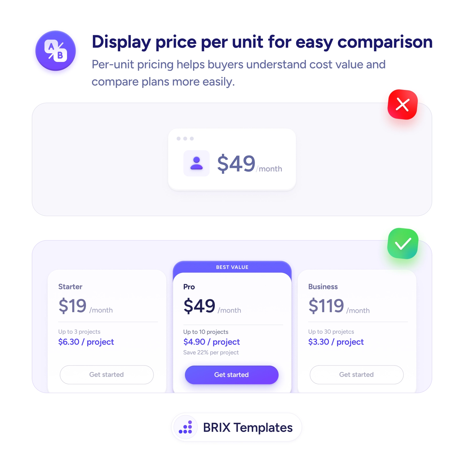
A plan that shows only “$49/month” leaves the buyer doing math you could have done for them. To judge whether it’s a good deal, they have to figure out how much each project, seat, or unit actually costs — and to compare it against the next tier, they have to do that calculation again, in their head, across every plan. Most won’t. They’ll either guess, default to the cheapest option, or stall on the decision entirely, because the totals give them no easy way to see where the value is.

The fix is to show the cost per unit right under the total. When Starter works out to $6.30/project, Pro to $4.90/project, and Business to $3.30/project, the value curve becomes obvious at a glance and the buyer can see why a bigger plan is the better deal per unit. This is the same context-giving move as comparing your price to a familiar cost — both turn a bare number into one the buyer can actually evaluate.

Start by identifying the unit your buyer scales on — projects, seats, storage, calls — and computing the per-unit cost for each tier. Place it as a single supporting line beneath the headline price; keep the total prominent since that’s the real bill. The per-unit math usually makes one tier the clear winner, which pairs well with highlighting a recommended plan and with showing the savings honestly.

  • Price by the unit buyers scale on — projects, seats, storage — not an abstract one.
  • Show per-unit cost beneath the total, keeping the real monthly figure prominent.
  • Use a single supporting line per card so the breakdown clarifies instead of clutters.
  • Let the honest economics show, even when the cheapest plan has the worst per-unit rate.
  • Surface the best-value tier the math points to, without hiding the alternatives.

Buyers commit faster when the page answers “what does each one actually cost me?” for them. Do the per-unit math up front, place it beside the total, and you turn a row of hard-to-compare prices into a clear value story that points to the right plan.

Frequently asked questions

What counts as the right 'unit' to price by?

Use the unit the buyer is actually buying more of as they scale — projects, seats, users, GB of storage, API calls, or contacts. It should be the thing they mentally divide the bill by when judging value. If your plans differ mainly by seats, show cost per seat; if they differ by projects, show cost per project. The unit has to match how the buyer thinks about getting more for their money.

Should per-unit pricing replace the total or sit alongside it?

Alongside. The total is what they'll be charged and has to stay prominent, especially for budgeting. The per-unit figure is the comparison aid that sits just beneath it. Showing only the per-unit cost would hide the real bill; showing only the total hides the value comparison. Together they answer both 'what will I pay' and 'is this a good deal'.

Doesn't a per-unit breakdown clutter the pricing card?

Not if it's a single supporting line. One small figure like '$4.90/project' under the headline price reads as helpful context, not clutter. The clutter risk comes from stacking many derived numbers. Pick the one unit that matters most to your buyer and show that, rather than every possible way to slice the price.

What if the cheapest plan has the worst per-unit cost?

That's common and usually fine to show honestly — it's often what nudges a buyer toward the mid tier. Per-unit pricing surfaces the genuine economics: smaller plans cost more per unit, larger ones less. Let that math be visible. It builds trust and tends to move people toward the higher-value plan on its own, without you having to oversell it.