Status & feedback
'Limited stock!' badges users see everywhere train them to ignore real urgency
Generic 'Limited stock' badges look like marketing tricks. Show the actual remaining count only when inventory is truly low so urgency stays credible.
Status & feedback
'Limited stock!' badges users see everywhere train them to ignore real urgency
Generic 'Limited stock' badges look like marketing tricks. Show the actual remaining count only when inventory is truly low so urgency stays credible.
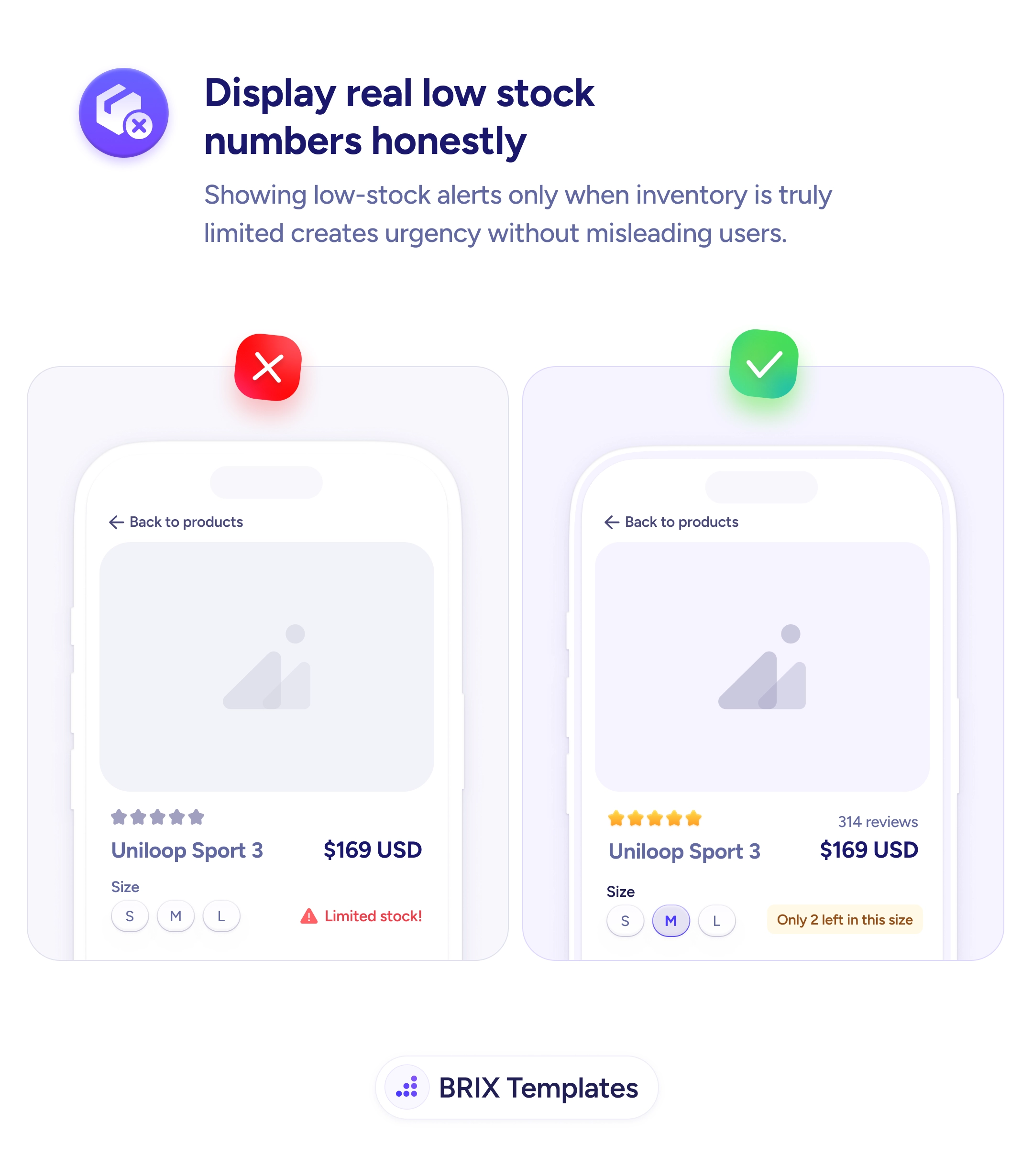
When a product page shows a generic “Limited stock!” badge regardless of how much inventory is actually left, the alert quickly stops meaning anything. Shoppers have seen the same vague label on every ecommerce site they’ve visited, and most of them have learned to treat it as a sales tactic rather than real information. The badge becomes background noise — and worse, it slowly erodes trust in the rest of the page. If the stock label isn’t honest, what else on this page isn’t?
A more credible pattern is to show the actual remaining count, scoped to the specific variant the user is viewing, and only when inventory is genuinely low. A line like “Only 2 left in this size” reads as honest inventory data because it’s specific, verifiable, and tied to the user’s current selection. The same number can carry real urgency without sounding like marketing — because the urgency is grounded in a fact rather than a flag.
Reserve low-stock alerts for genuine low-stock conditions (typically under five to ten units), and remove the badge when inventory is healthy. Scope the alert to the variant — size, color, or configuration — that the user is actively considering. Use specific numbers (“Only 2 left in size M”) rather than vague descriptors (“Limited”, “Almost gone”). Style the alert with a warning color like amber or orange, not error red, so it reads as helpful information rather than a system warning.
Honest low-stock signals can preserve the urgency effect that generic badges have already burned out. When the number is real, specific, and tied to the user’s selection, urgency typically converts more reliably — because the page reads as a partner in the purchase decision rather than a salesperson trying to close it.
Only when inventory is actually low for that specific variant the user is viewing — typically under five or ten units, depending on your sales velocity. Showing 'Low stock' on every product page trains users to ignore it. Reserve the alert for the moments where it carries real information.
Because 'Only 2 left in this size' is verifiable and specific; 'Limited stock!' could mean two units or two thousand. Users have seen the generic version on every ecommerce site for years and rightly treat it as a marketing tactic. A real number reads as honest inventory data, not a sales technique.
Yes — alert at the variant level (size, color), not at the product level. 'Only 2 left' for size M means something completely different from 'Only 2 left' across the whole product. Variant-specific alerts also help buyers make better decisions: they might choose a different size before adding to cart.
Use a warning color (often amber or orange), not error red. Red reads as 'something is wrong'; amber reads as 'something to know about'. Keep the alert visible but not alarming — it's information that supports the buying decision, not a critical system warning.