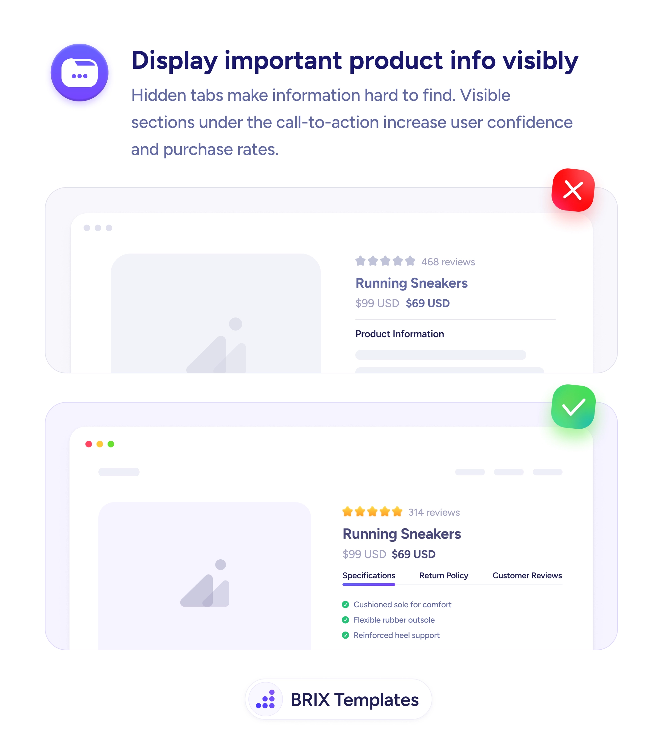
UX tip graphic titled 'Display important product info visibly.' The top panel marked with a red X shows a product page for Running Sneakers ($99 crossed out, $69 USD) with a 'Product Information' heading followed by empty greyed-out placeholder bars — the details are hidden or collapsed. The bottom panel marked with a green checkmark shows the same product with a row of visible tabs — Specifications, Return Policy, Customer Reviews — and the Specifications section already open, listing green-checkmarked details 'Cushioned sole for comfort,' 'Flexible rubber outsole,' and 'Reinforced heel support.' BRIX Templates branding at the bottom.

Readability

Details hidden behind a tab are details most shoppers never open — and never factor into buying

Key details buried in collapsed tabs go unseen. Show specs, returns, and reviews as visible sections under the CTA so buyers get answers without hunting.

How to display important product info visibly

A product page that shows a “Product Information” heading over collapsed, empty-looking placeholders hides the very things a shopper needs to decide. Content tucked behind a tab or accordion is, in practice, unseen — most buyers never open it. So the materials, the fit, the return terms that answer “is this right for me?” never enter the decision, and the shopper either guesses or leaves to find the answer somewhere else.

The fix is to surface the decision-driving details as visible sections under the CTA. A clear row of Specifications, Return Policy, and Customer Reviews with the key section already open — cushioned sole, flexible outsole, reinforced heel — puts answers in the buyer’s path instead of behind a click they have to think to make. Visible information can build confidence; hidden information can’t.

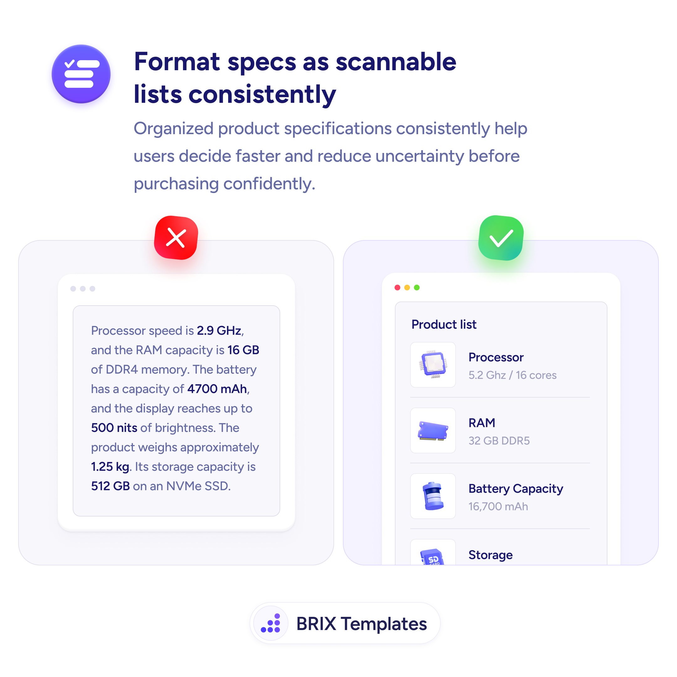
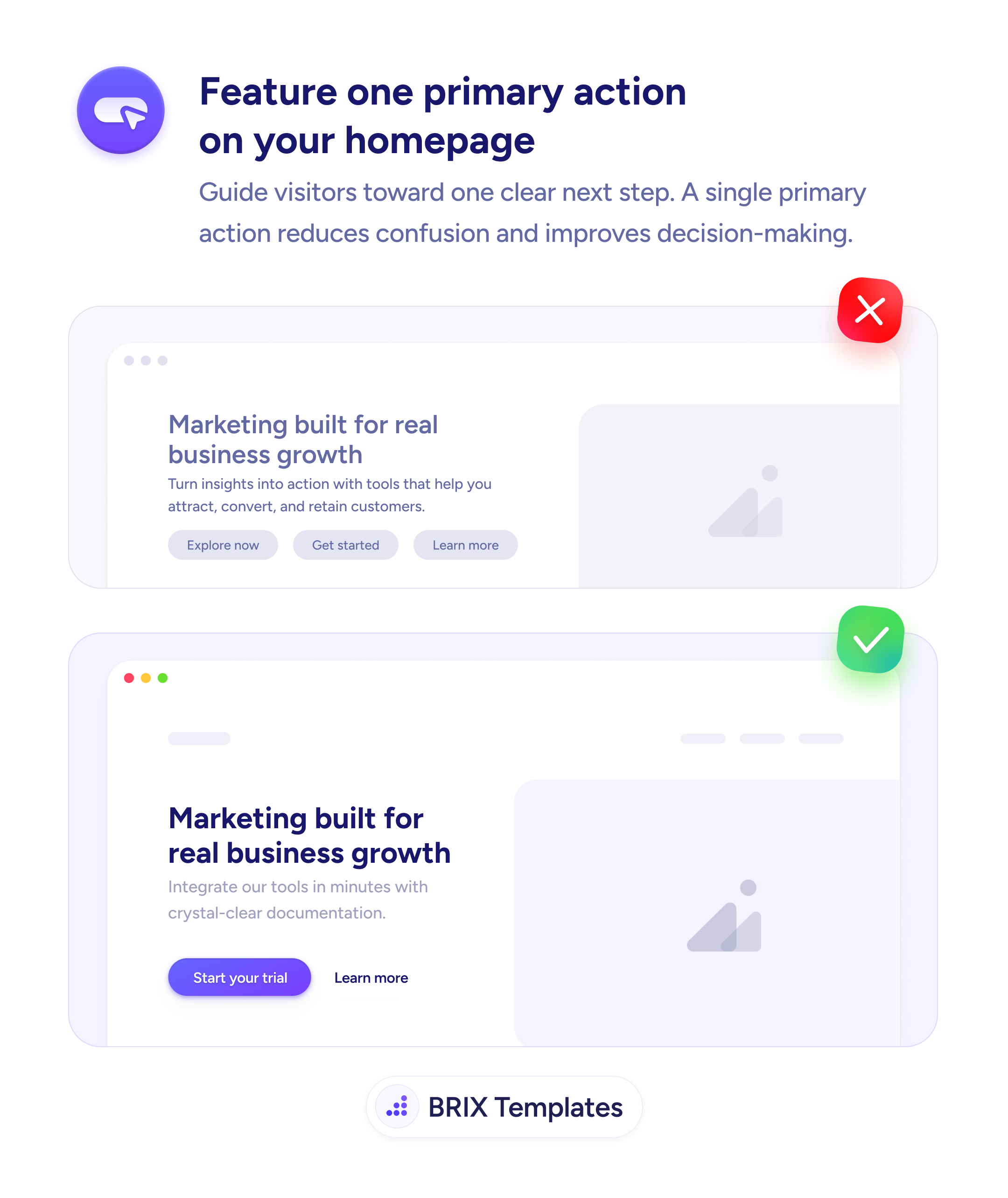
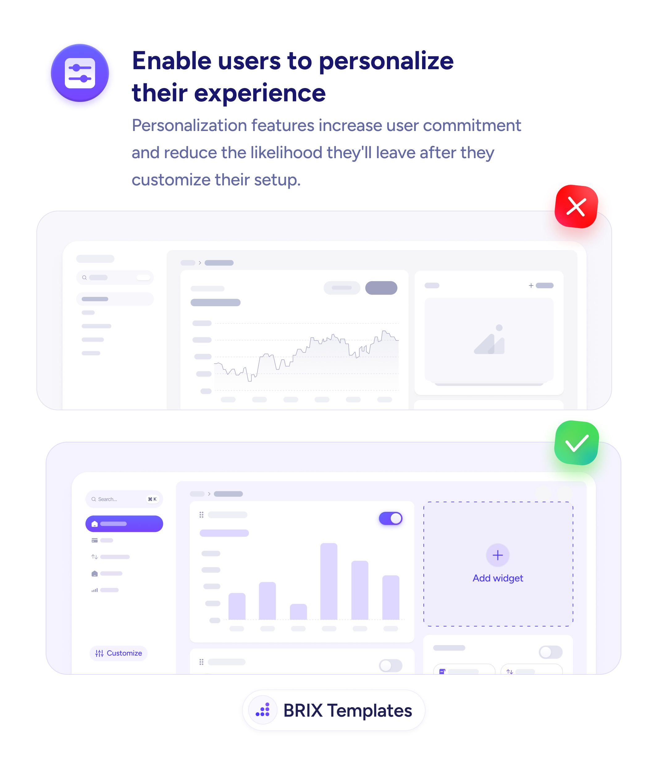
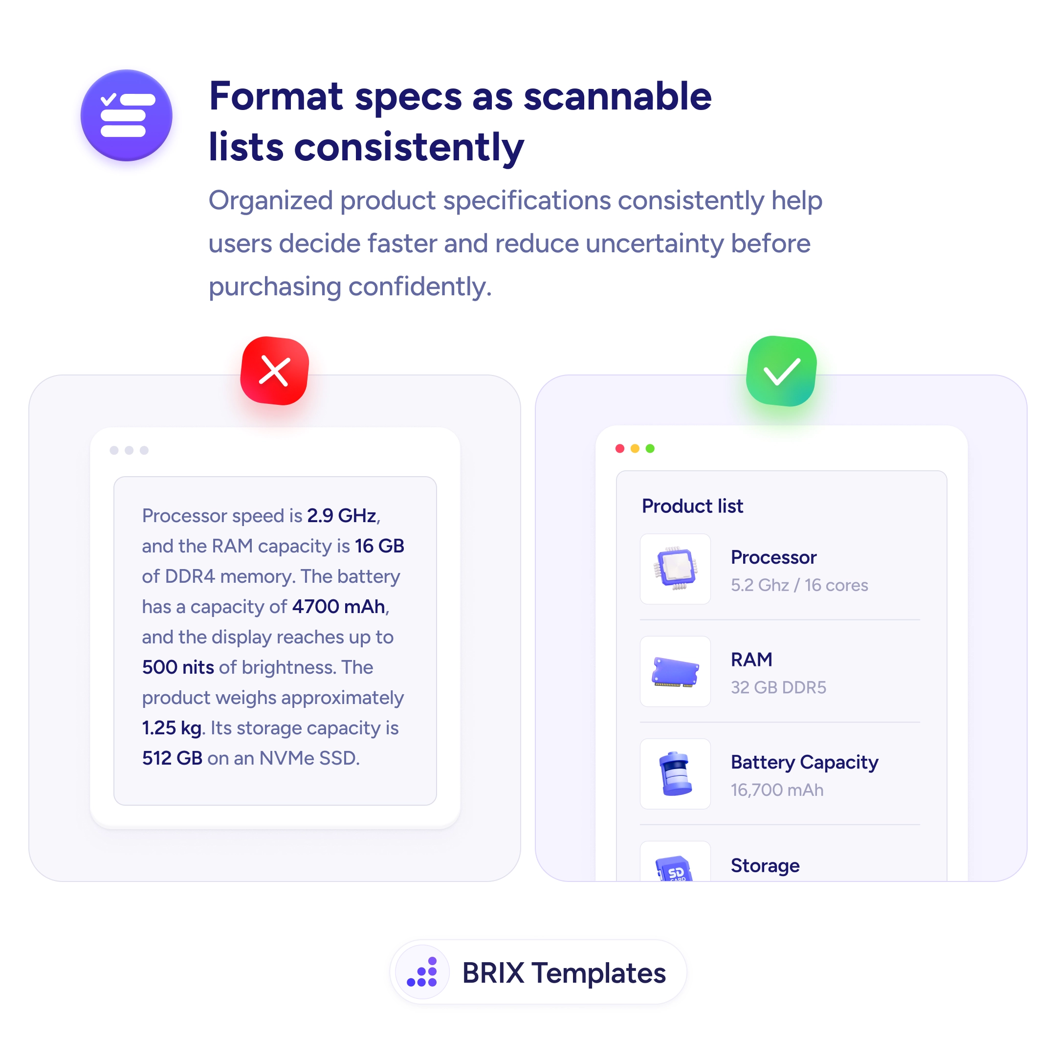
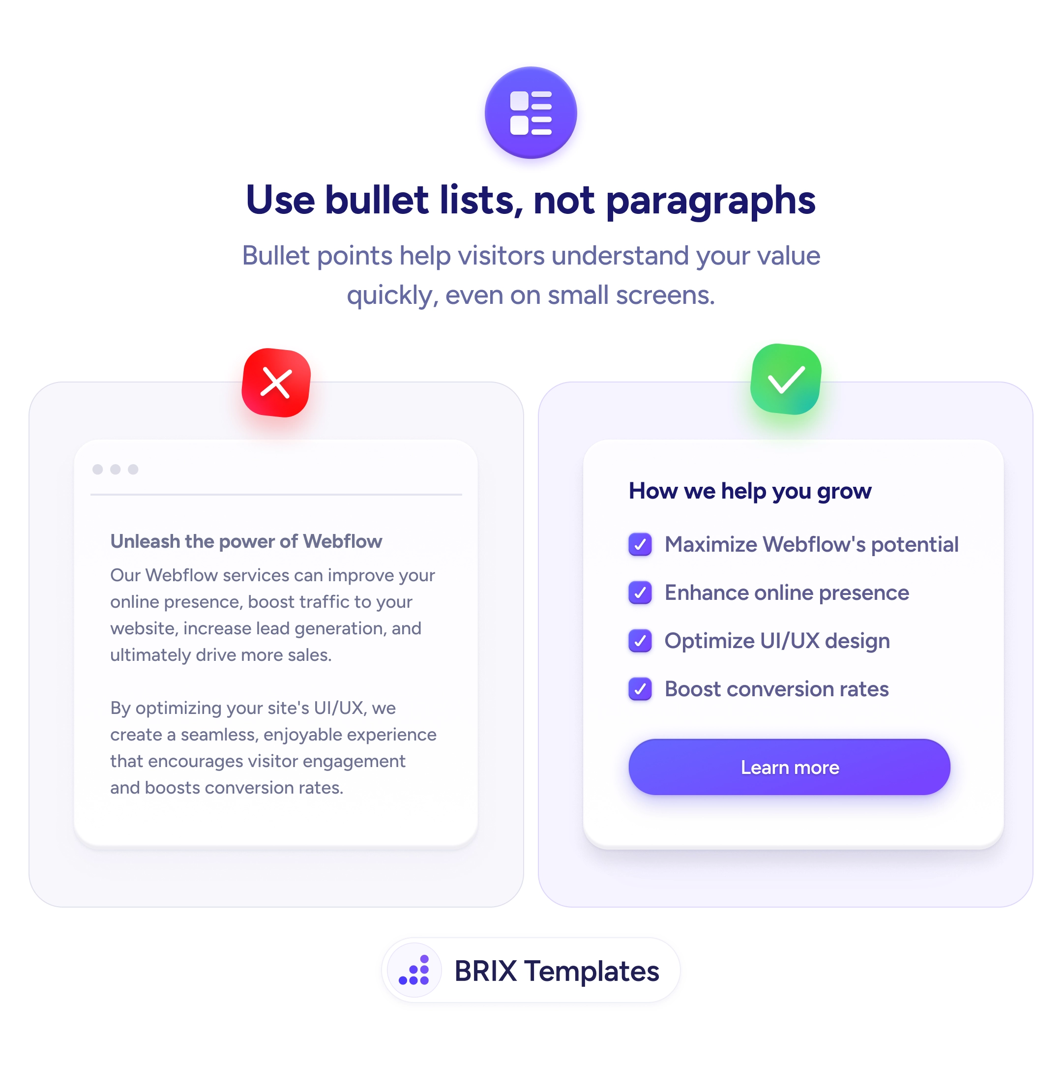
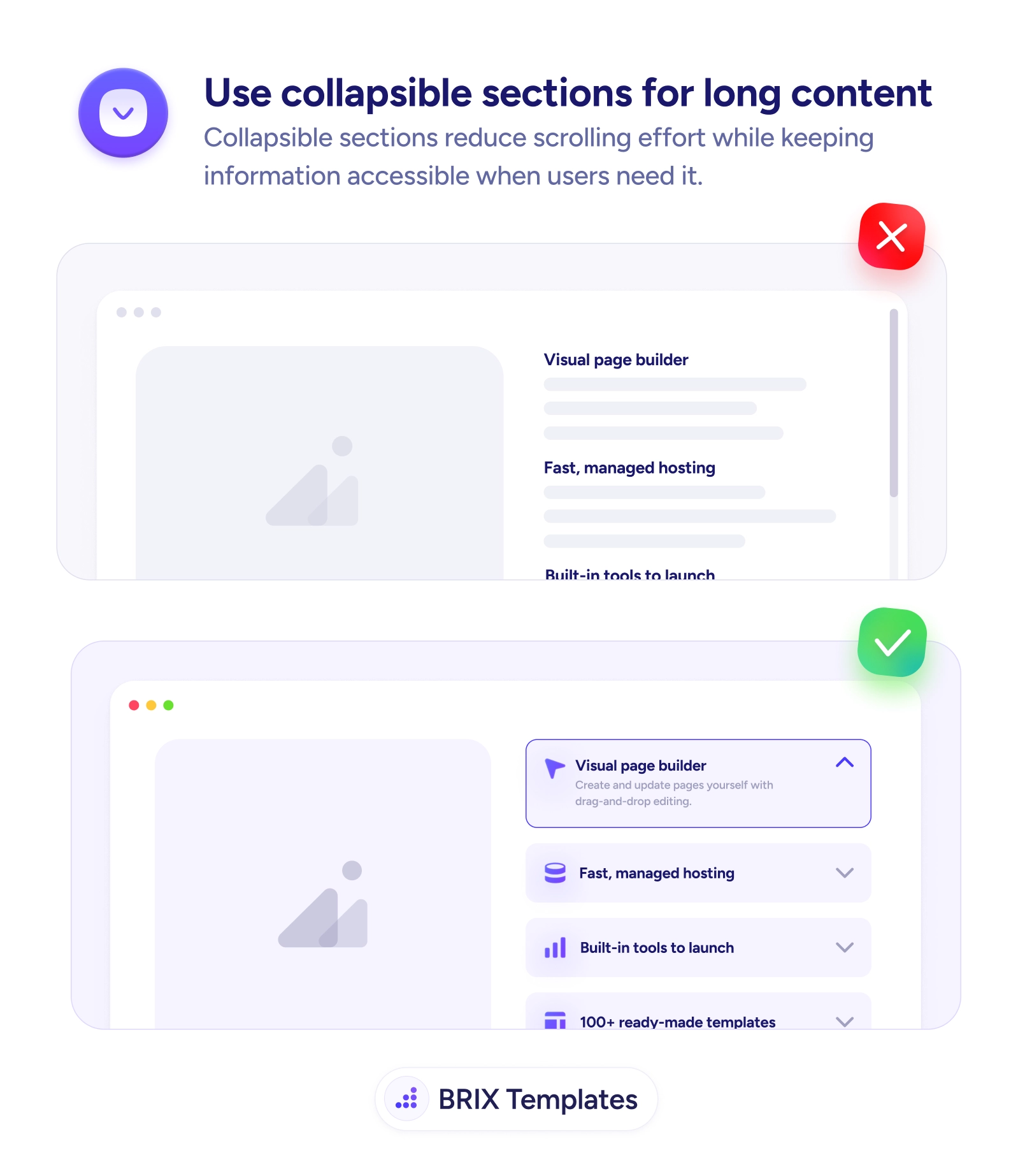
Making the details visible is only half the job — format them as a scannable list so a glance delivers the answer, because a wall of open text is barely better than a closed tab. Reserve collapsing for genuinely secondary material; an accordion is right for long content some buyers need, but not for the specs that decide the sale. Place the whole block directly under the price and CTA, where the last questions get asked.

  • Keep decision-driving details open by default — collapsed content mostly goes unread.
  • Put them under the CTA — answers belong in the buyer’s path to add-to-cart.
  • Lead with the section that matters most so the key info shows without a click.
  • Collapse only secondary material — care guides and edge-case FAQs, not core specs.
  • Structure over brevity — a long, well-organized page beats a short, hidden one.

Frequently asked questions

Why do hidden tabs hurt conversions?

Because content collapsed behind a tab or accordion is effectively invisible — most shoppers don't open it. If the details that answer 'is this right for me?' — materials, dimensions, return terms — are hidden, the buyer either decides without them or leaves to find them elsewhere. Surfacing that information as visible sections lets it do its job of building confidence toward the purchase.

Doesn't showing everything make the page too long?

Length isn't the enemy — disorganization is. A long page that's well structured, with clear headings and scannable lists, lets buyers jump to what they care about while everything stays reachable. The goal is that the details influencing the decision are visible by default, not that the page is short. Save collapsing for genuinely secondary content.

When is it still okay to collapse content?

For long, secondary material that only some buyers need — full care instructions, detailed sizing charts, extended FAQs. Collapsing keeps those from overwhelming the page while staying one tap away. The rule of thumb: if the information commonly decides whether someone buys, keep it open; if it's reference material for a subset of shoppers, an accordion is fine.

Where should the key details sit on the page?

Directly under the call-to-action and price, in the buyer's natural path from 'interested' to 'add to cart.' Specifications, return policy, and reviews placed right below the CTA answer the last questions at the moment of decision. Details stranded far down the page, or behind a tab the buyer has to think to click, arrive too late to affect the choice.