A form field labelled only “Your phone” with a hint to “add your country code” pushes the work onto the user: should there be dashes, spaces, a plus sign, a leading zero? The same guesswork repeats on a company size that might be a number or a range, and a website field that may or may not want https. Every guess that misses ends in a validation error and a correction loop — friction the form created by staying vague.
The fix is to show the expected format at the field itself. A phone input with a country-code selector and a sample like “+1 (555) 356-7832,” a company-size dropdown of ranges, and a website field with a fixed “http://” prefix tell the user exactly what a valid answer looks like — and often make an invalid one impossible to type. A concrete example communicates faster than any written rule.
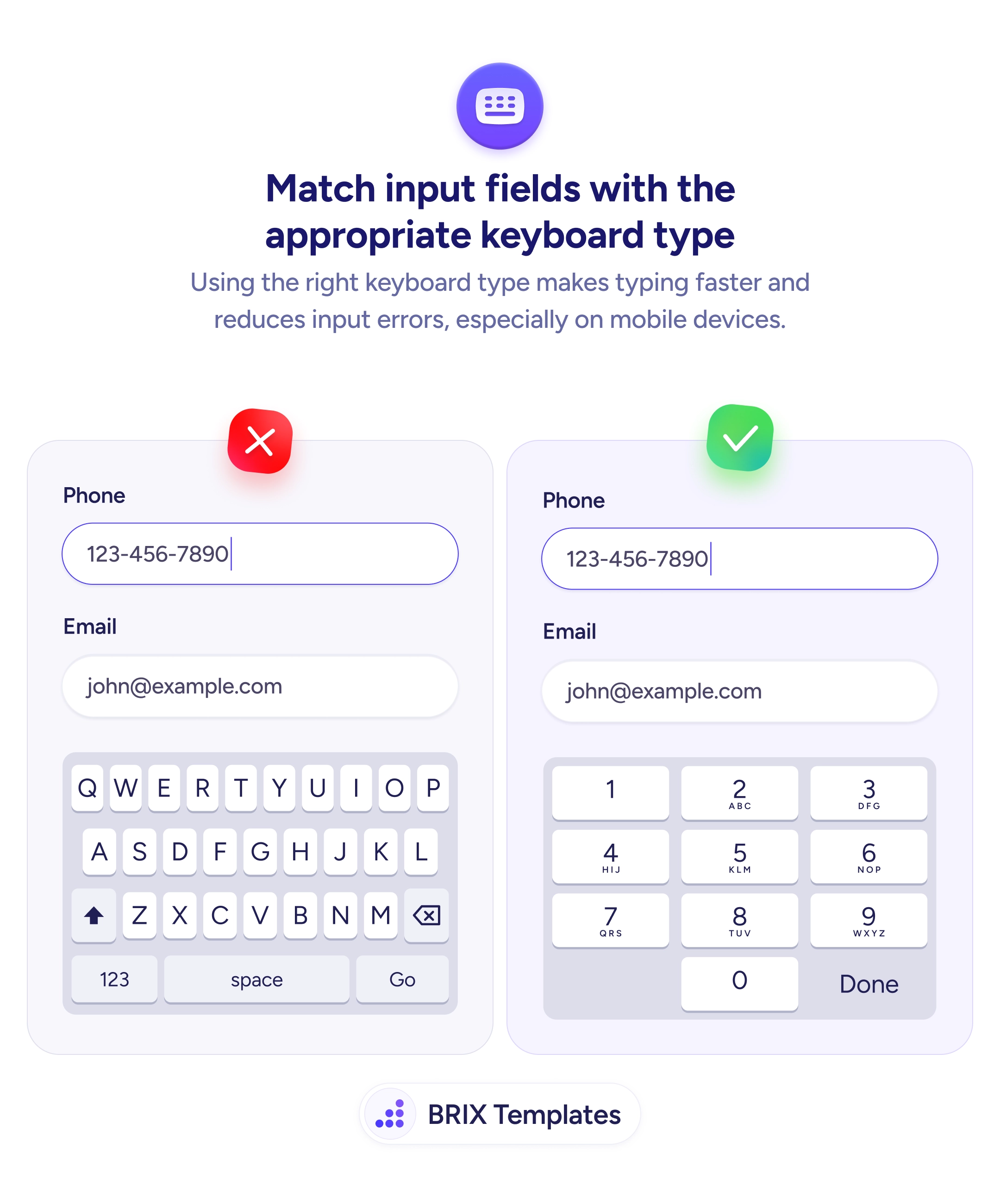
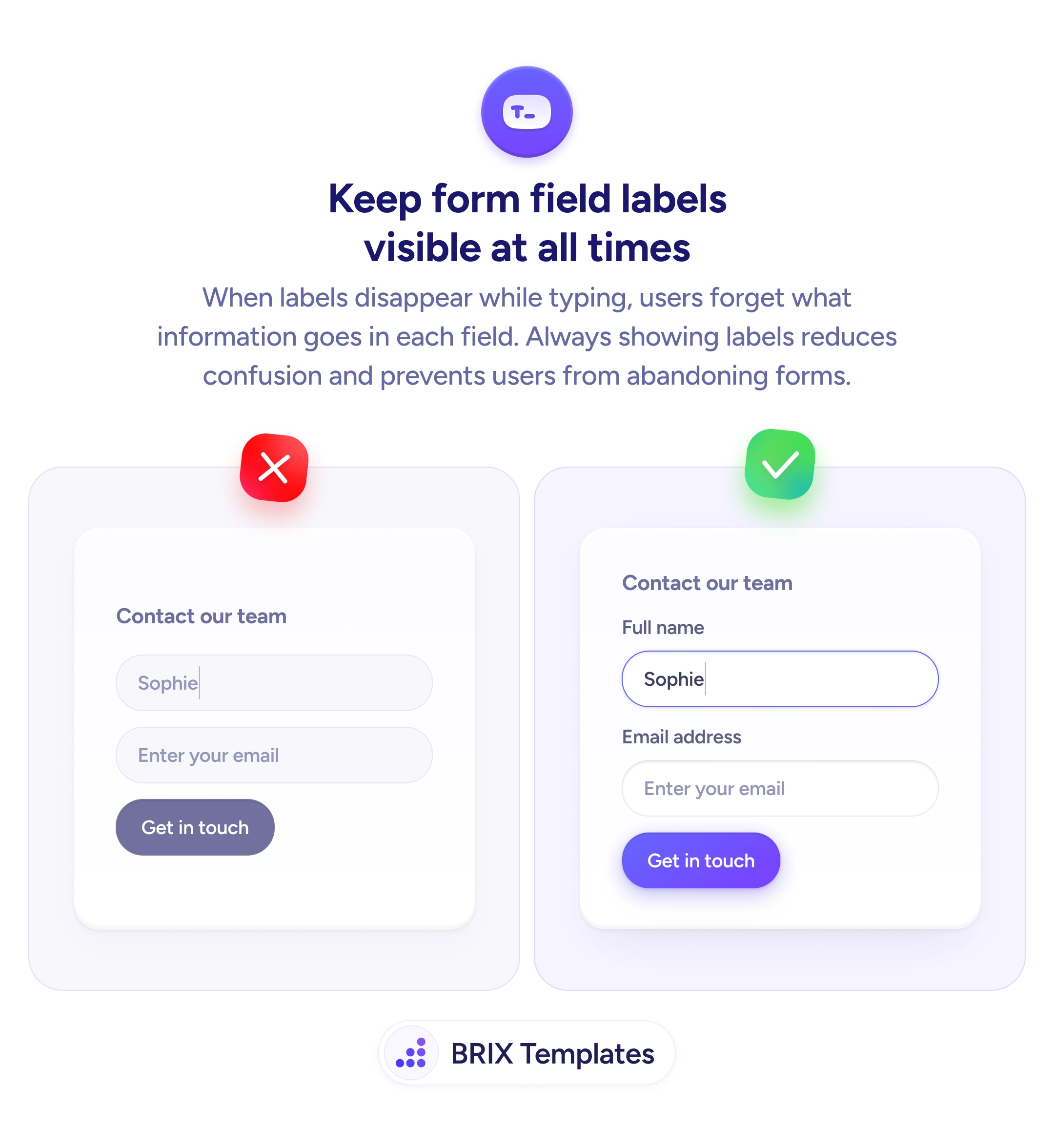
Lean on structure wherever you can, then pair it with the right keyboard for each field type so typing the format is effortless on mobile. Be careful using placeholders as the example — they vanish the moment the user starts typing, so keep a persistent label or move the sample into helper text. For anything that still slips through, the error message should echo the same valid example.
- Show a real sample value — “+1 (555) 356-7832” beats “include your country code.”
- Build the format into the input — pickers, prefixes, and masks make wrong formats hard to enter.
- Don’t rely on placeholders alone — the hint disappears exactly when it’s needed.
- Keep a persistent label so the field’s meaning survives once typing starts.
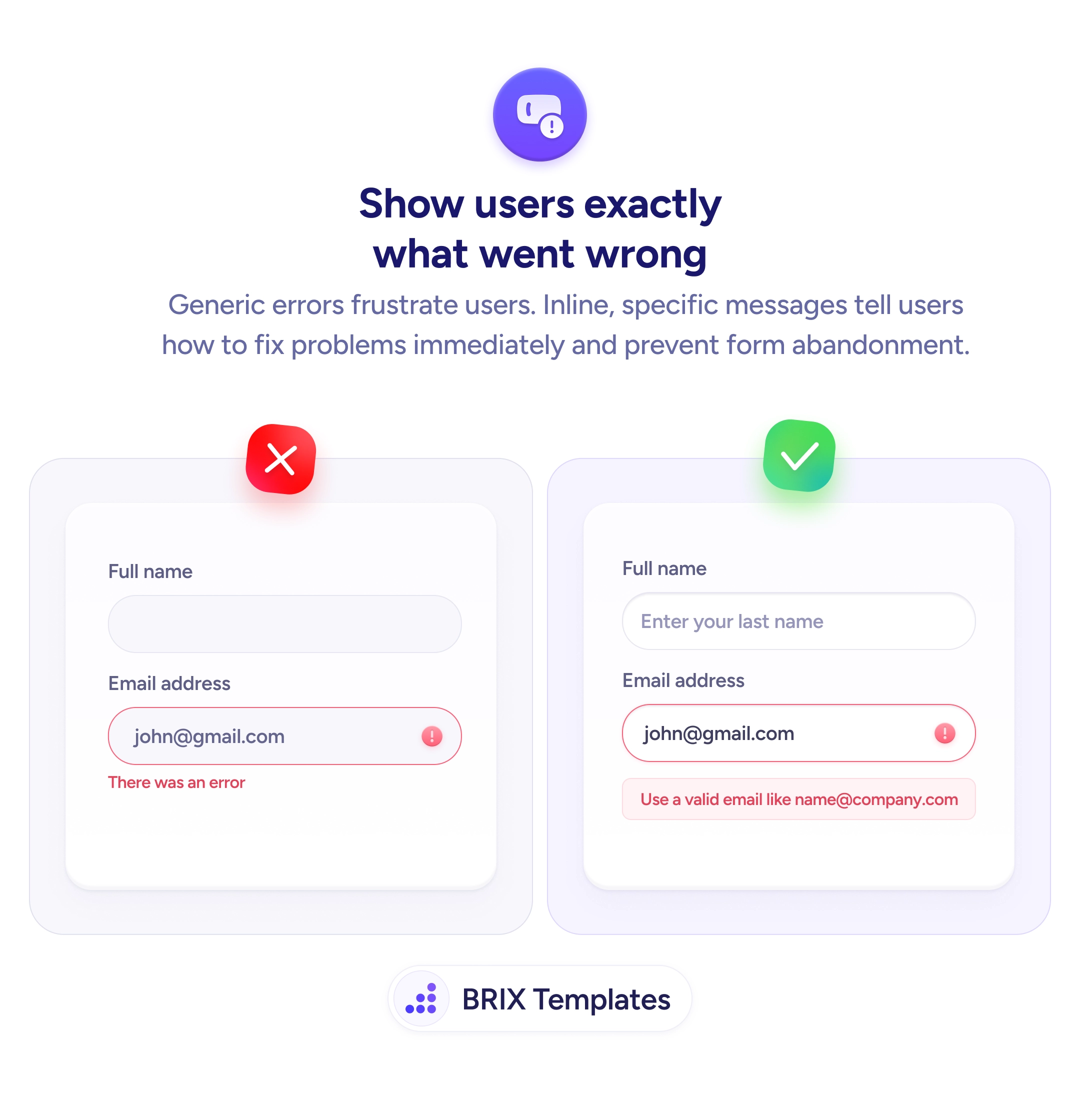
- Echo the example in errors so a correction points at the same target as the hint.