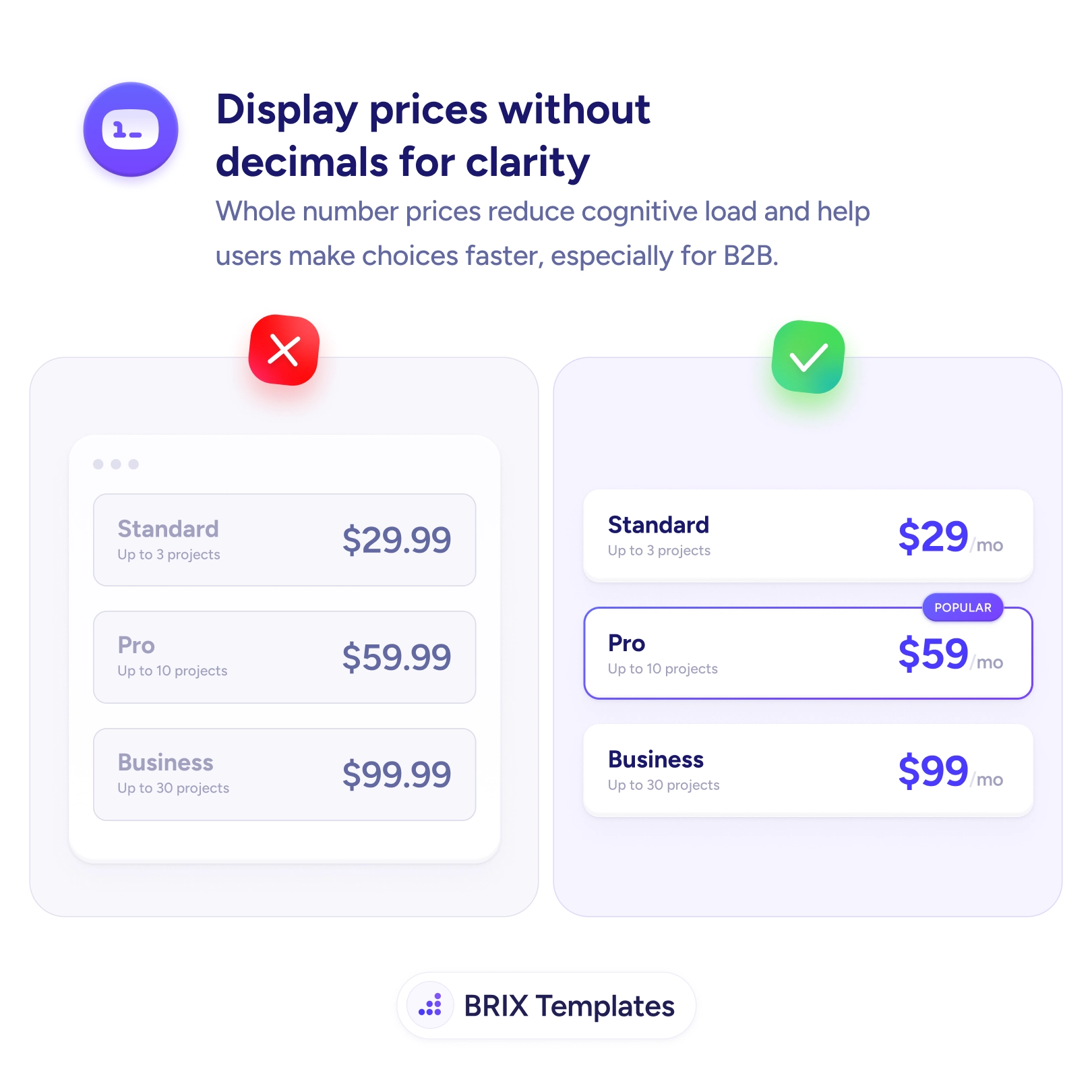
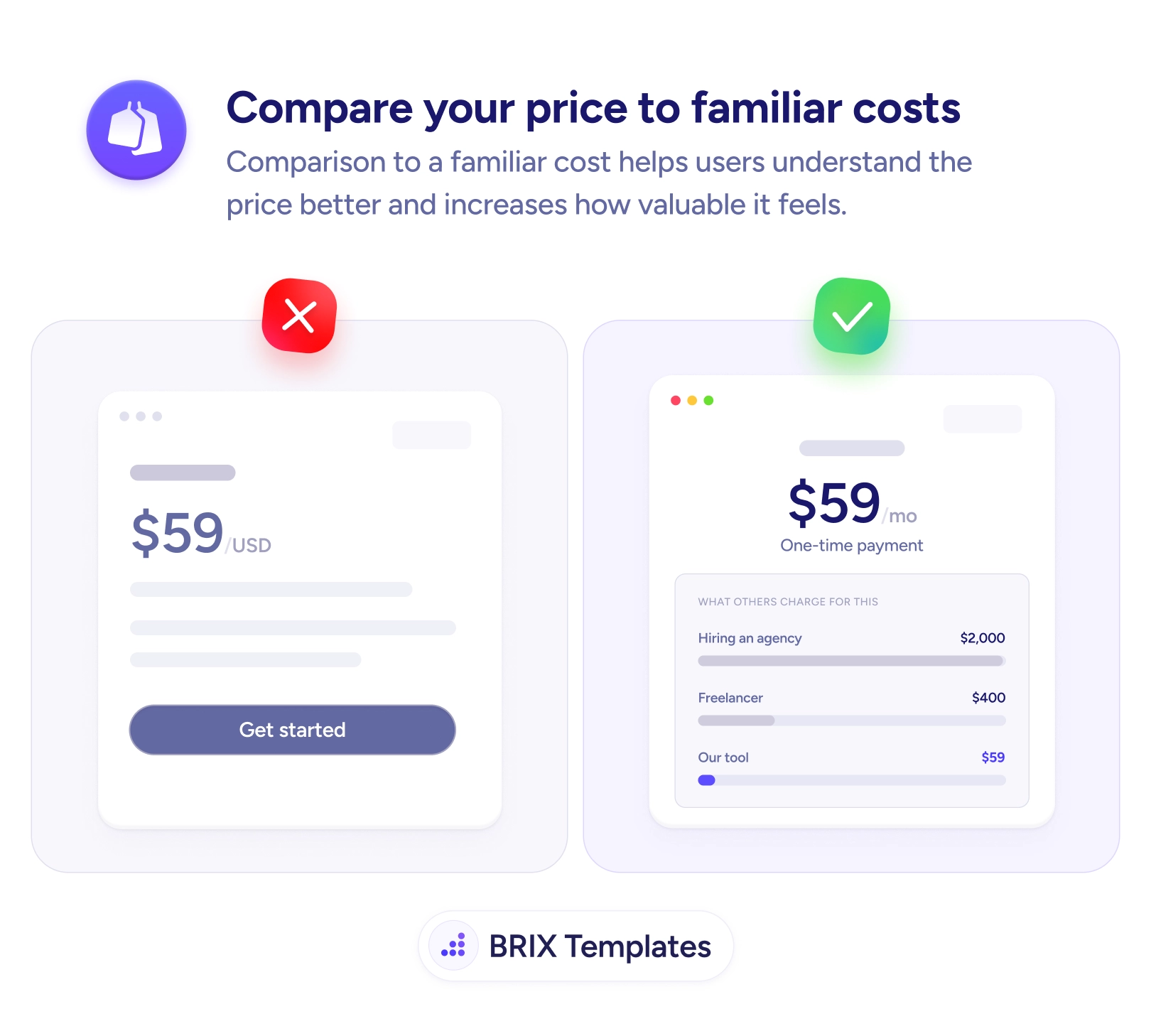
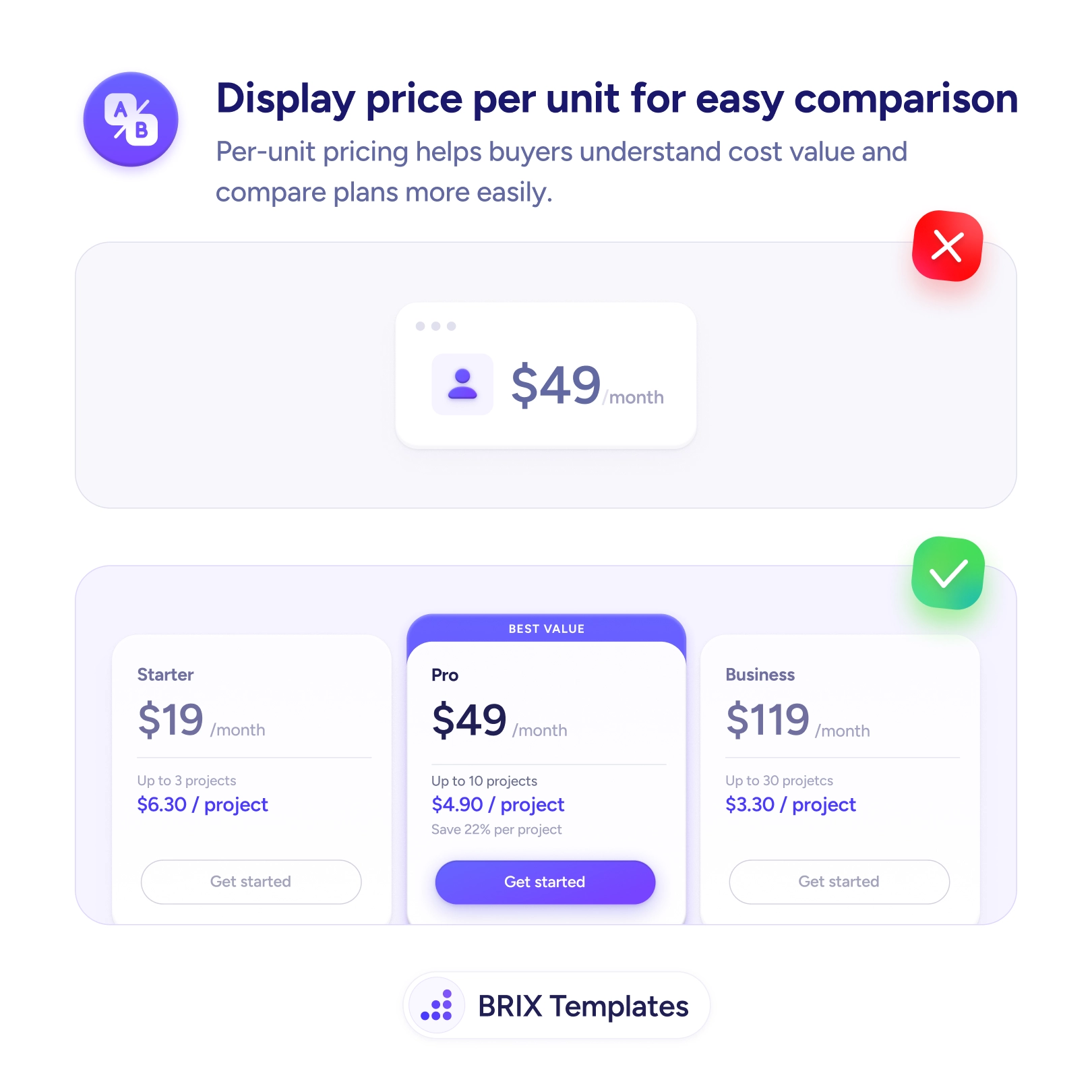
A pricing table full of “$29.99,” “$59.99,” “$99.99” makes the eye read four digits and a decimal to grasp a number that is, for all practical purposes, $29. The trailing cents rarely carry information — they’re a habit borrowed from retail — but they still cost reading effort on every row, and that effort adds up right when the buyer is trying to compare plans and decide.
The fix is to show whole-number prices where the cents don’t mean anything. A bold $29 with a small “/mo” suffix reads instantly, and across a table of plans that clarity compounds into a faster, lighter decision. This matters most for considered purchases like SaaS and B2B, where buyers are evaluating rather than impulse-buying and a “gimmicky” .99 adds clutter instead of the confidence a clean figure signals.
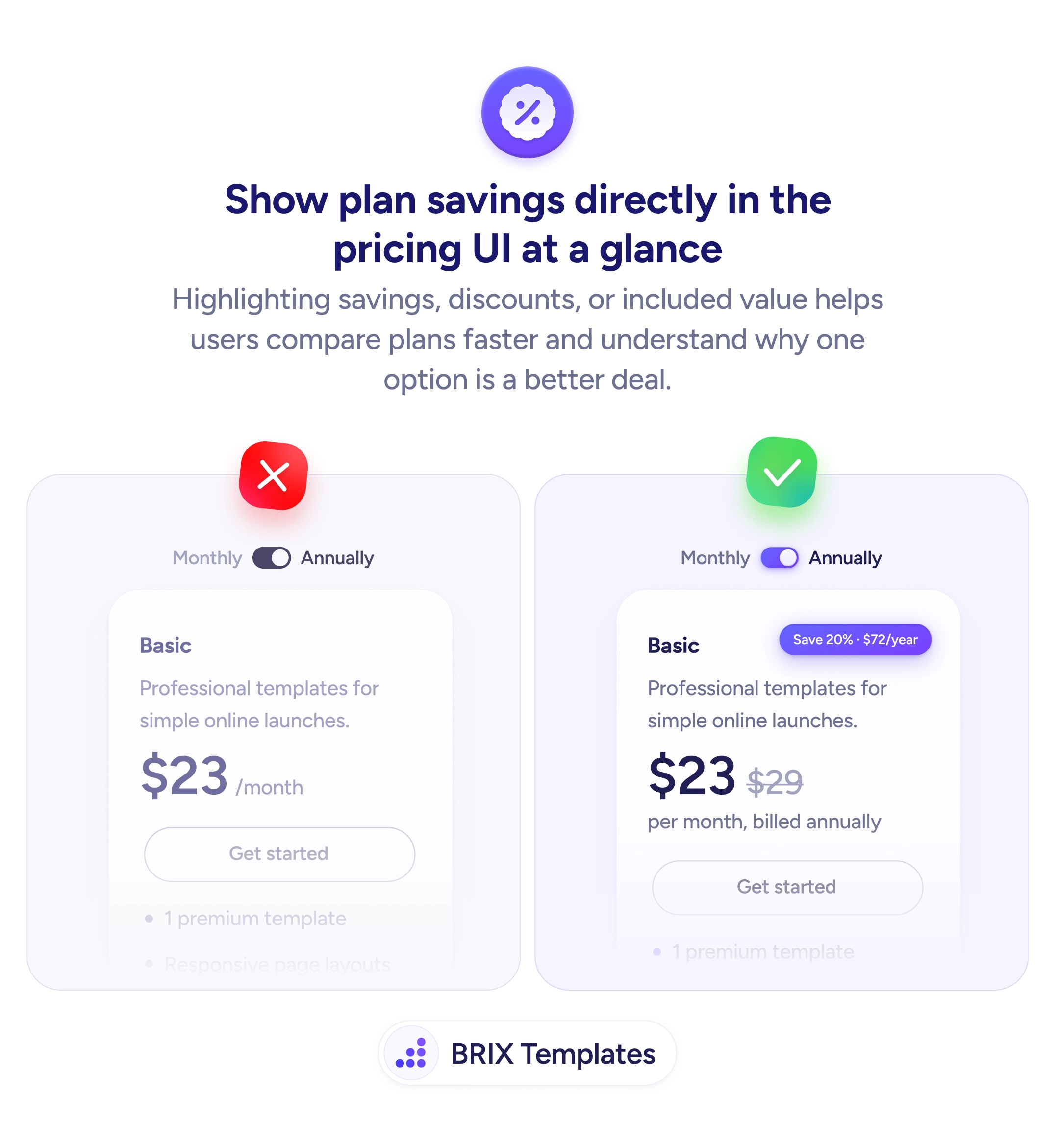
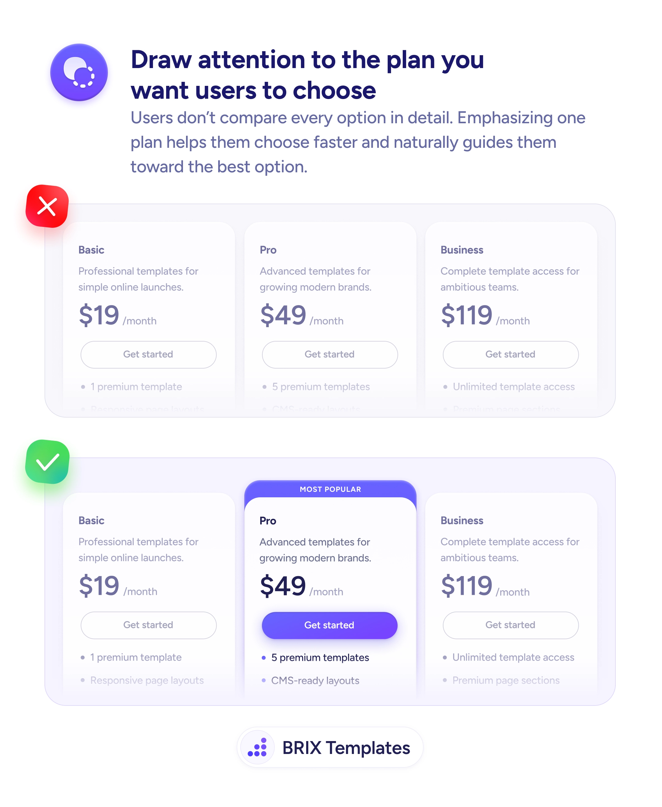
Clean numbers also make room for the cues that actually guide the choice: a highlighted recommended plan and a savings badge for context both land faster when the price itself isn’t noisy. Keep the decimals where they carry meaning — tax lines, exact invoices, per-unit rates — and drop them only when they’re purely decorative.
- Strip decimals when they’re decorative — “$29” reads faster than “$29.99.”
- Favor whole numbers for considered purchases — SaaS and B2B buyers read a clean price as confidence.
- Keep cents where they inform — taxes, invoices, and per-unit rates still need precision.
- Use a small “/mo” or unit suffix so the bold number stays the focus.
- Let the clarity carry other signals — savings and recommended badges pop when the price is clean.