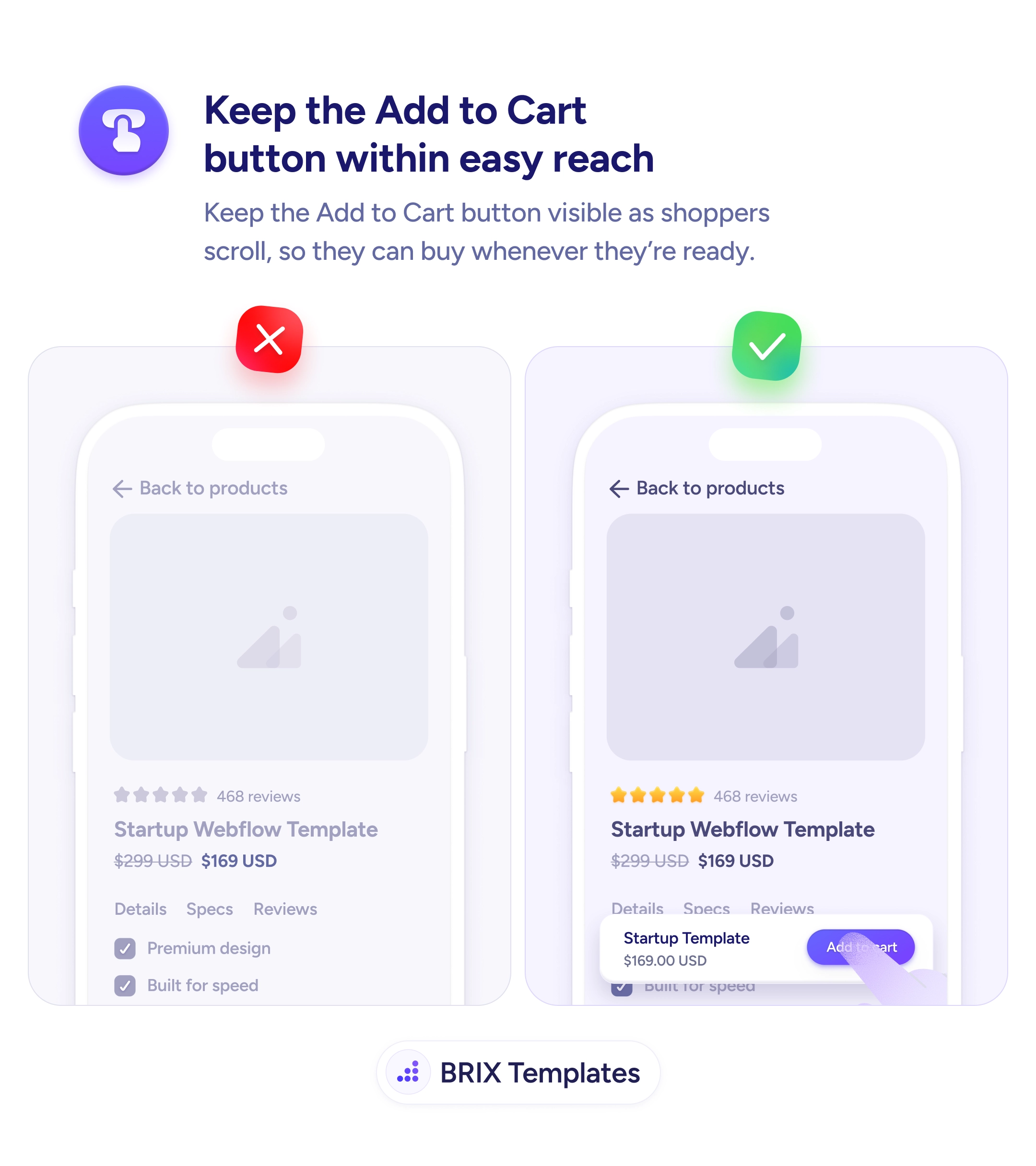
Checkout & payments
A blurry product image makes shoppers guess — and guessers don't buy
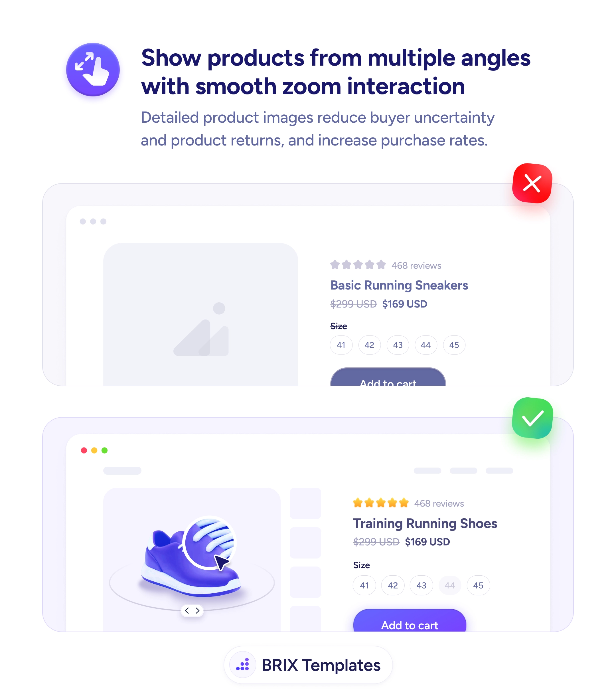
Single low-quality product photos leave shoppers uncertain and returns climb. Use multi-angle galleries with zoom so buyers can inspect every detail.
Checkout & payments
A blurry product image makes shoppers guess — and guessers don't buy
Single low-quality product photos leave shoppers uncertain and returns climb. Use multi-angle galleries with zoom so buyers can inspect every detail.
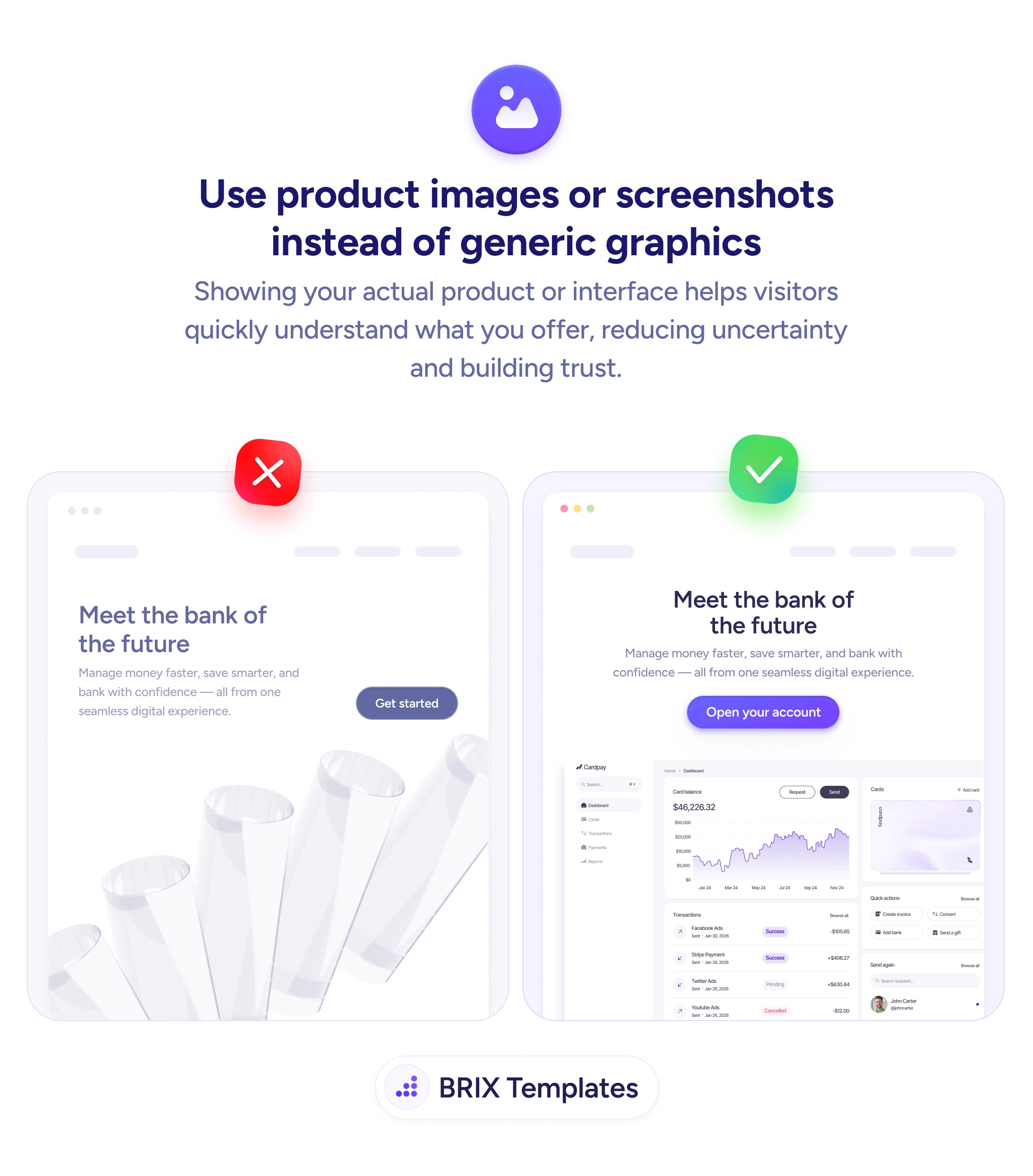
When a product detail page shows a single low-resolution image — or worse, a missing image placeholder — shoppers are forced to guess what they’re buying. They can read the product title, the price, and the reviews, but the actual visual evidence is missing. That gap usually pushes them to one of three outcomes: they leave to find better photos on another site, they buy with hesitation (and return more often), or they don’t buy at all. None of those outcomes work in favor of the store.
A more reliable pattern is to show the product from every angle a buyer cares about, with smooth zoom interaction so they can inspect details on demand. A gallery with multiple thumbnails, a rotatable view, and the ability to pinch or hover into texture-level detail turns the page into a virtual inspection. Buyers stop guessing — they can see the stitching, the finish, the scale, and the proportions before committing. The page does the work that a fitting room or showroom would.
Lead with a clean, high-resolution product shot on a neutral background so the product itself is the first thing the eye lands on. Include multi-angle views or a 360° spin for products where shape and orientation matter — shoes, furniture, jewelry, hardware. Add lifestyle photos after the studio shots so buyers see scale and context without losing the clean reference image first. Make zoom feel native to the platform — hover-to-zoom on desktop, pinch-to-zoom on mobile — so inspecting details doesn’t require leaving the page.
Multi-angle, zoomable product galleries can close the visual uncertainty gap that drives both abandoned carts and returns. When buyers can inspect a product the way they would in a store, they typically buy with more confidence and send fewer items back — because the page already answered the questions they would have asked in person.
Enough to answer every visual question a buyer might ask: front, back, sides, top/bottom, scale (with a hand or object), in-use context, and any high-detail close-ups (stitching, fabric, finish). For most physical products that's five to eight images. Fewer than three usually leaves buyers guessing.
For products where shape and form matter — shoes, furniture, jewelry, hardware — 360° views often reduce returns more than the same number of static images. For products where details on specific faces matter most (clothing, electronics with ports), a high-resolution multi-angle gallery is usually a better investment.
Both, with a clear order. Lead with clean studio shots so buyers can see the product itself, then follow with lifestyle photos for scale and context. Lifestyle-first galleries can hide important details. The two formats answer different questions — what is it, and how does it fit my life.
Zoom matters more on mobile, where the default image is smaller, but the implementation differs. On desktop, hover-to-zoom or click-to-enlarge feels native. On mobile, pinch-to-zoom inside the image (not just opening a lightbox) lets users inspect details with their thumb without losing their place on the page.