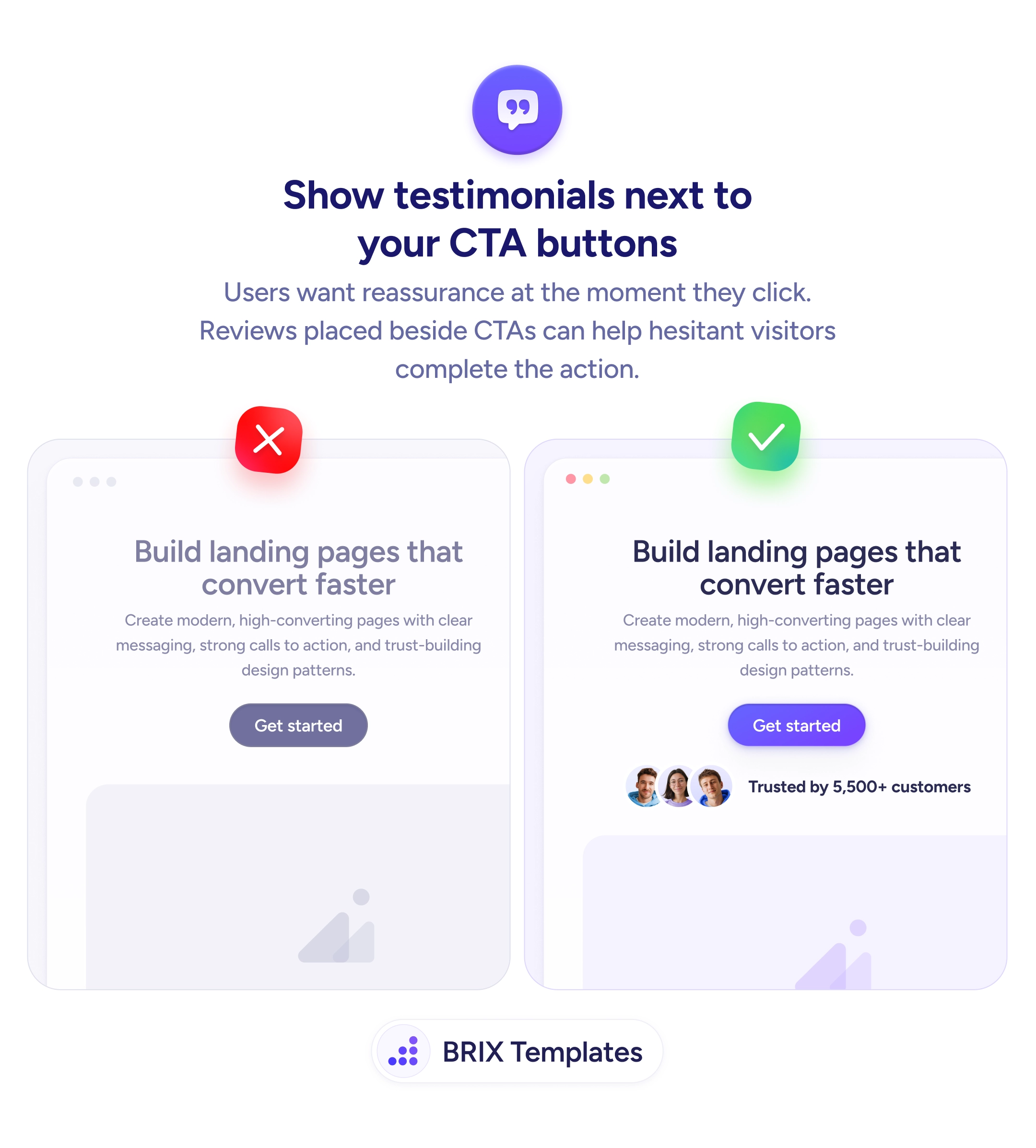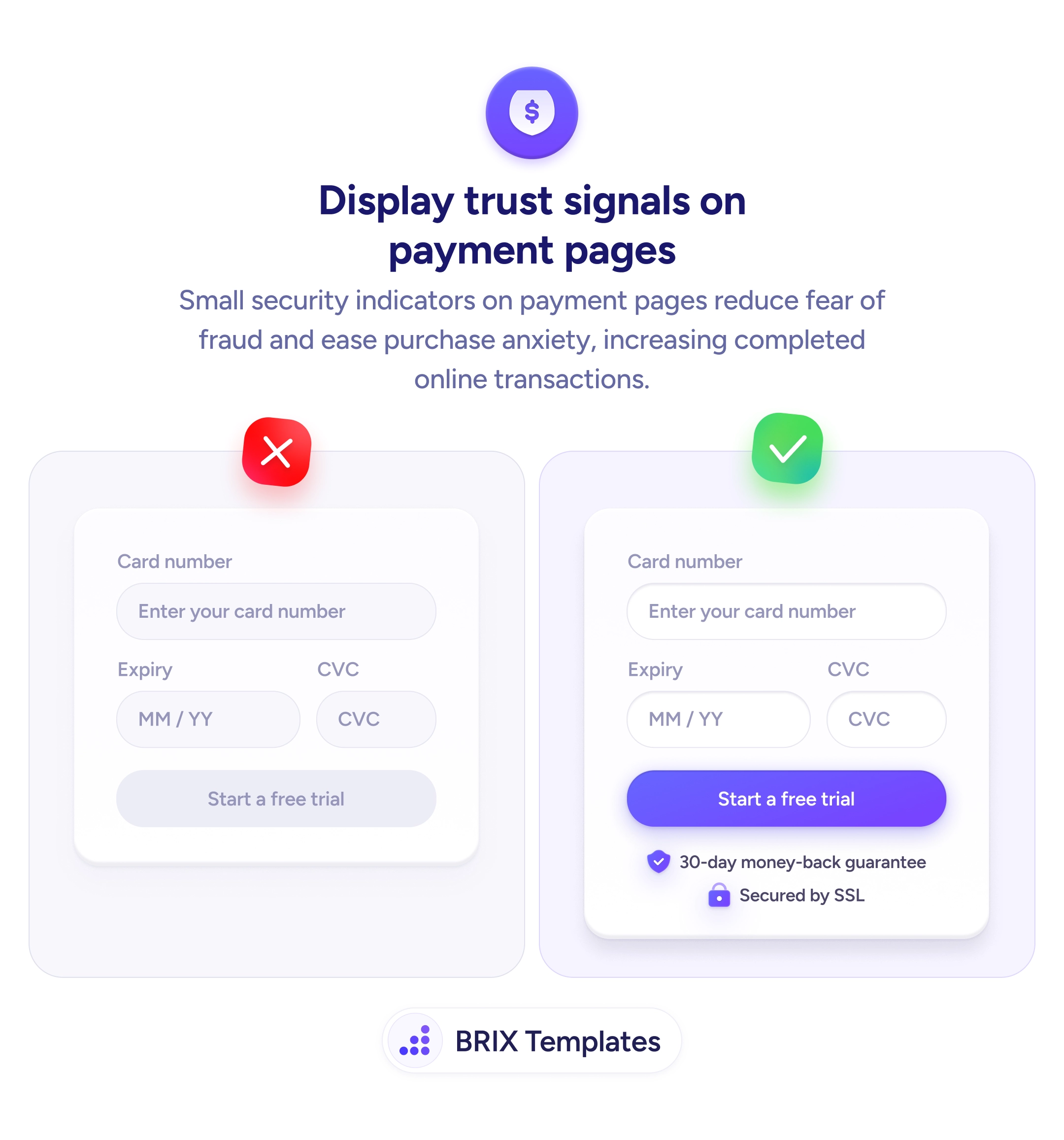
Actions & CTAs
The doubts that stop a click can be answered in the same space as the CTA
Visitors hesitate at the click because of unanswered doubts. Place short objection-handling lines under your CTA so users decide without leaving the page.
Actions & CTAs
The doubts that stop a click can be answered in the same space as the CTA
Visitors hesitate at the click because of unanswered doubts. Place short objection-handling lines under your CTA so users decide without leaving the page.
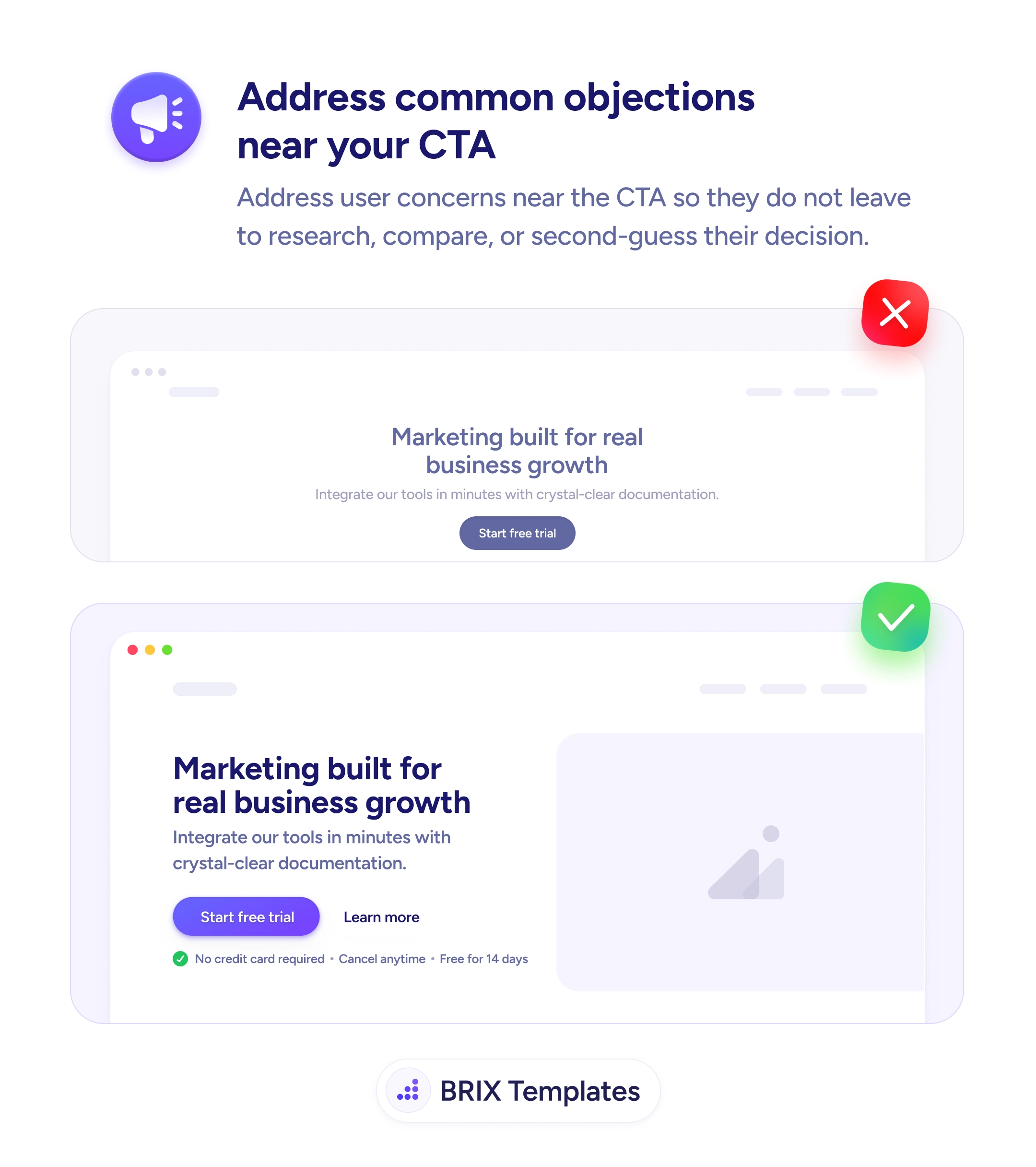
When a hero section presents a strong call to action but leaves the most common doubts unanswered, users hesitate at the exact moment they’re closest to converting. Questions like “Do I need a credit card?”, “Can I cancel?”, or “How long is this free?” often get resolved by tabbing out to a pricing page, a FAQ, or a competitor — and many of those visitors never come back. The objection itself isn’t the problem; it’s the friction of having to leave the page to resolve it.
A more reliable pattern is to answer the top objections right next to the CTA, in a single line of small reassurance text directly underneath the button. Two to four short items, prefixed with checkmarks, can dissolve the most common hesitations in the same visual block where the decision happens. The user reads the headline, sees the button, and immediately sees the answers to the questions they were about to ask — so the next action becomes obvious instead of optional.
Start with the objections users actually voice in support emails, sales calls, and reviews. For a free-trial CTA, the usual three are payment, commitment, and duration — “No credit card required”, “Cancel anytime”, “Free for 14 days”. Keep each line short (six words or fewer is ideal) so the group reads as a quick scan, not a paragraph. Style the reassurance quieter than the button so the CTA stays dominant; the objection text should support the decision, not compete with it.
Near-CTA objection handling can convert hesitant visitors who would otherwise leave to investigate. By keeping the answers in the same visual block as the action, the user typically decides on the spot instead of opening another tab — and many of those extra tabs never lead back.
Directly under the primary CTA, in the same column, in a smaller and quieter typographic style. Visually grouped with the button, not floating in the page. The goal is for the user's eye to land on the reassurance the moment after it lands on the button.
The ones users actually voice in support emails, sales calls, and reviews. The most common are payment-related ('Do I need a credit card?'), commitment-related ('Can I cancel?'), and time-related ('How long is the trial?'). Pull from your real customer language, not generic templates.
Two to four short items. Each one should be a single line — six words or fewer if possible. More than four starts to look like a feature list and dilutes the CTA. If you have more objections to address, move them into an FAQ section further down the page.
Small icons (like checkmarks) help users scan the items quickly without reading every word. Keep them lightweight and consistent — they're scanning aids, not decoration. Avoid mixing icon styles or making them larger than the text they precede.