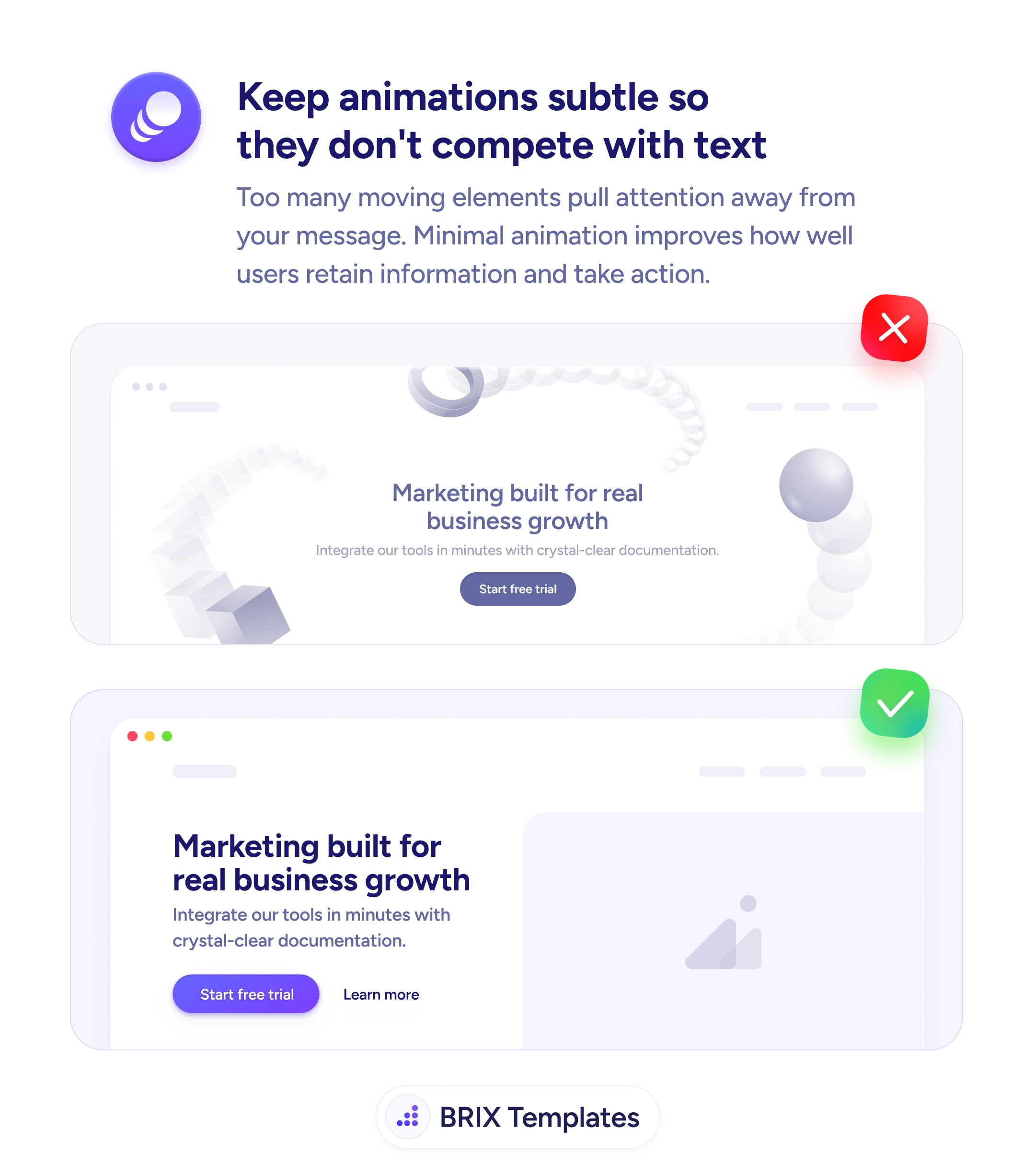
Readability
Every moving element in a hero is competing with your headline
Heavy 3D scenes and looping motion pull attention away from your message. Use restrained animation so the headline and CTA stay the focus.
Readability
Every moving element in a hero is competing with your headline
Heavy 3D scenes and looping motion pull attention away from your message. Use restrained animation so the headline and CTA stay the focus.
When a hero section opens with a busy 3D scene — floating spheres, scattered cubes, looping particle systems — the page is essentially asking the headline and CTA to compete with their own background for attention. Heavy motion in the most important block on the page pulls the eye away from the words that need to land, and the visitor often leaves with a strong impression of the animation and a vague memory of the message. The intent is usually polish; the effect is noise.
A stronger pattern is to demote hero motion to a supporting role and let the headline, supporting line, and CTA own the visual hierarchy. That doesn’t mean killing animation entirely — a subtle reveal, a quiet product demo loop, a small illustrated accent can all add character without contesting the copy. The test is simple: if the eye keeps drifting back to the motion, the motion is too loud. The hero exists to deliver the message in the first second; everything else is decoration that earns its place by staying quiet.
Start by opening the page on a fresh tab and timing how long until your eye lands on the headline. If the motion keeps pulling you off the copy, simplify it — fewer moving elements, slower easing, lower contrast against the text. Wrap any meaningful animation in a prefers-reduced-motion check and serve a static fallback for visitors who’ve opted out. Calm heros often read as more confident than busy ones, because the team behind them trusts the message to land on its own.
A hero that carries its message without visual competition typically holds more visitors through the second scroll, because the headline does its job before the animation has finished trying. Restraint in motion usually reads as confidence, not absence — the visitor remembers what the product does, which is the only thing the hero is there to communicate.
No — restrained motion can support comprehension (a subtle reveal, a small product demo loop). The problem is competing motion: dense 3D scenes, looping particles, or backgrounds that move while text loads. If the eye keeps drifting away from the headline, the animation is too loud.
Open the page on a fresh tab and time how long until your eye lands on the headline. If you keep getting pulled back to the motion, the animation is winning. A useful rule: an animation should make the message clearer or be invisible enough that the reader doesn't register it as motion.
Yes. Wrap any meaningful motion in a 'prefers-reduced-motion' check and serve a static fallback. Vestibular sensitivity is more common than most teams realize, and a static hero is almost never worse than a moving one for the visitor who needed it off.
Usually not — a calmer hero often reads as more confident, not less polished. Brand presence comes from typography, illustration, color, and copy more than from motion. The teams that lean hardest on hero animation are often the ones with the weakest underlying message.