Actions & CTAs
Two short lines under your CTA can answer the doubts that stop the tap
A 'No credit card required' line under the CTA removes the two biggest signup objections — payment risk and lock-in — without slowing the click.
Actions & CTAs
Two short lines under your CTA can answer the doubts that stop the tap
A 'No credit card required' line under the CTA removes the two biggest signup objections — payment risk and lock-in — without slowing the click.
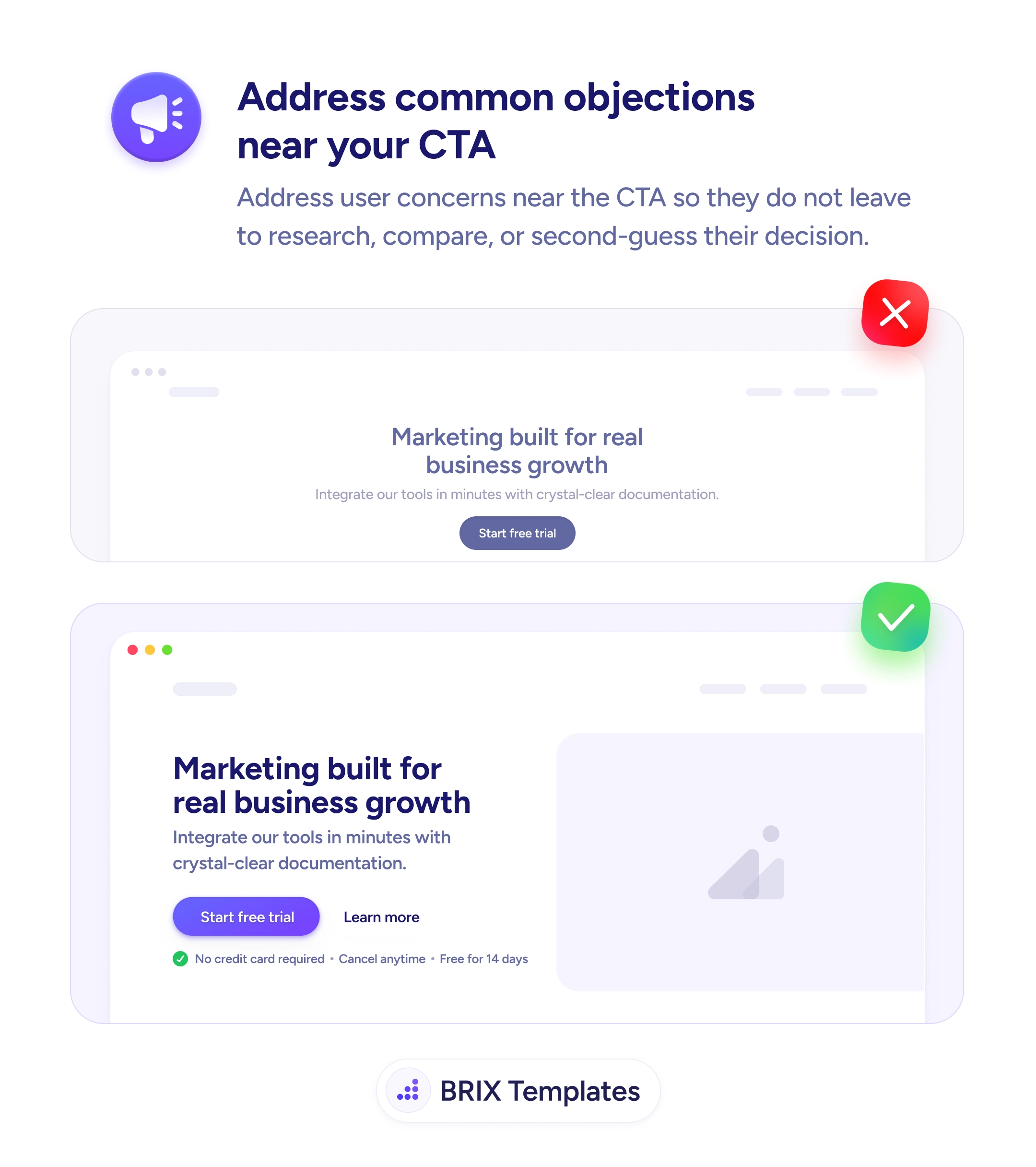
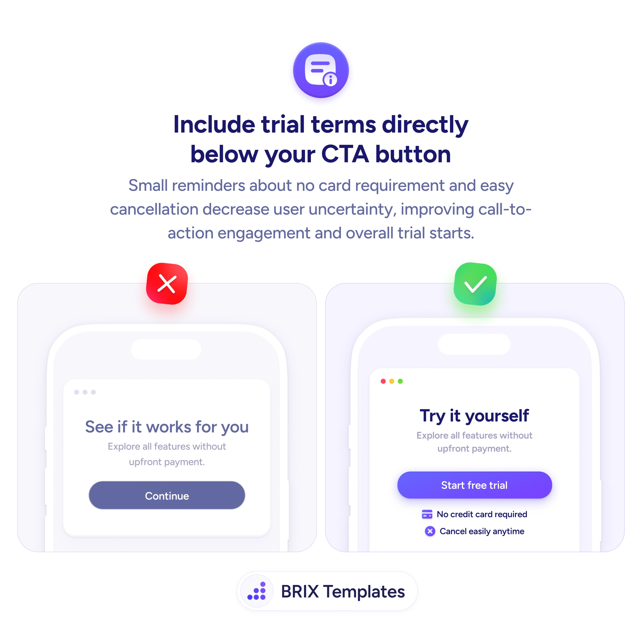
When a signup or trial CTA sits alone on a card — just the button and a vague subtitle — the visitor often hovers, second-guesses, and bounces. The hesitation usually isn’t about the product; it’s about the two unstated risks of clicking: “will they ask for my card?” and “will I be stuck with this?”. Without an answer in the same visual block as the button, the visitor’s brain fills in the worst-case version of both questions, and the click never happens.
A stronger pattern is to place two short reassurance lines directly under the CTA button that defuse the most common objections in a glance. Lines like “No credit card required” and “Cancel easily anytime”, each paired with a small icon, sit in the same block as the action and read as part of the offer rather than as fine print. The visitor sees the button, sees the two terms, and the decision becomes “yes, that’s safe” instead of “I’ll come back later”.
Start by identifying the two biggest signup objections for your product — usually payment and lock-in, sometimes setup effort or data risk. Write each as a short, specific line (under six words is the sweet spot). Place them directly beneath the button with light visual separation so they read as connected to it. If you can link “Cancel anytime” to the real policy, do — verifiable reassurance outperforms a marketing claim every time.
Two small lines under a CTA can do more for signup completion than a full reassurance section elsewhere on the page, because they answer the doubt at the exact moment it stops the click. The pattern typically lifts trial starts without changing the offer — only the visibility of what the offer actually requires.
Address the two biggest signup objections: payment risk ('No credit card required') and lock-in ('Cancel anytime', 'No long-term contract'). Two short lines under the button is the sweet spot. Add a third only if you have a genuine third reassurance — never pad.
Directly beneath the CTA button, in the same visual block, with enough whitespace that it reads as related rather than as fine print. Small icons in front of each line help the eye parse them quickly. Putting the terms elsewhere on the page weakens the reassurance — the doubt and the answer should occupy the same glance.
Yes, if you can. A subtle link or a tooltip with the real policy turns a marketing claim into verifiable trust. Visitors who care will click; visitors who don't will read the line and trust the brevity. Either outcome beats a claim that can't be checked.
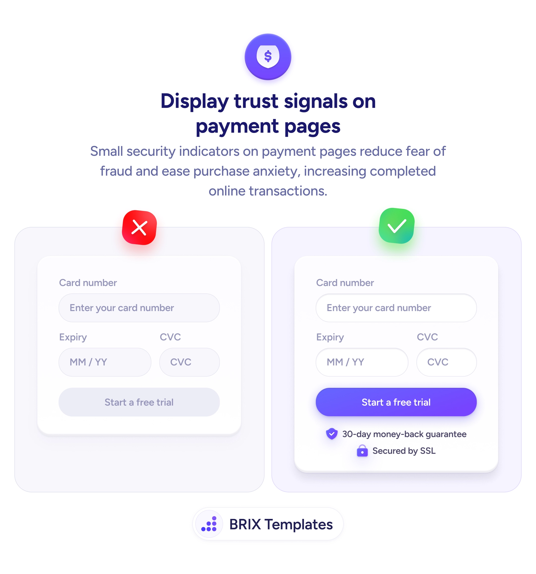
Yes — any high-commitment CTA benefits from microcopy that names the trade-off. Checkout buttons can show 'Secure payment / Free returns'. Demo requests can show 'No sales call required / 15 minutes'. The principle is the same: name the doubt the button triggers and resolve it in the same block.