Actions & CTAs
An 'Ok' button hides the prize — name the value so users tap with confidence
Generic CTA labels like 'Ok' or 'Submit' bury the reward. Replace them with the user's specific payoff so the button itself sells the next tap.
Actions & CTAs
An 'Ok' button hides the prize — name the value so users tap with confidence
Generic CTA labels like 'Ok' or 'Submit' bury the reward. Replace them with the user's specific payoff so the button itself sells the next tap.
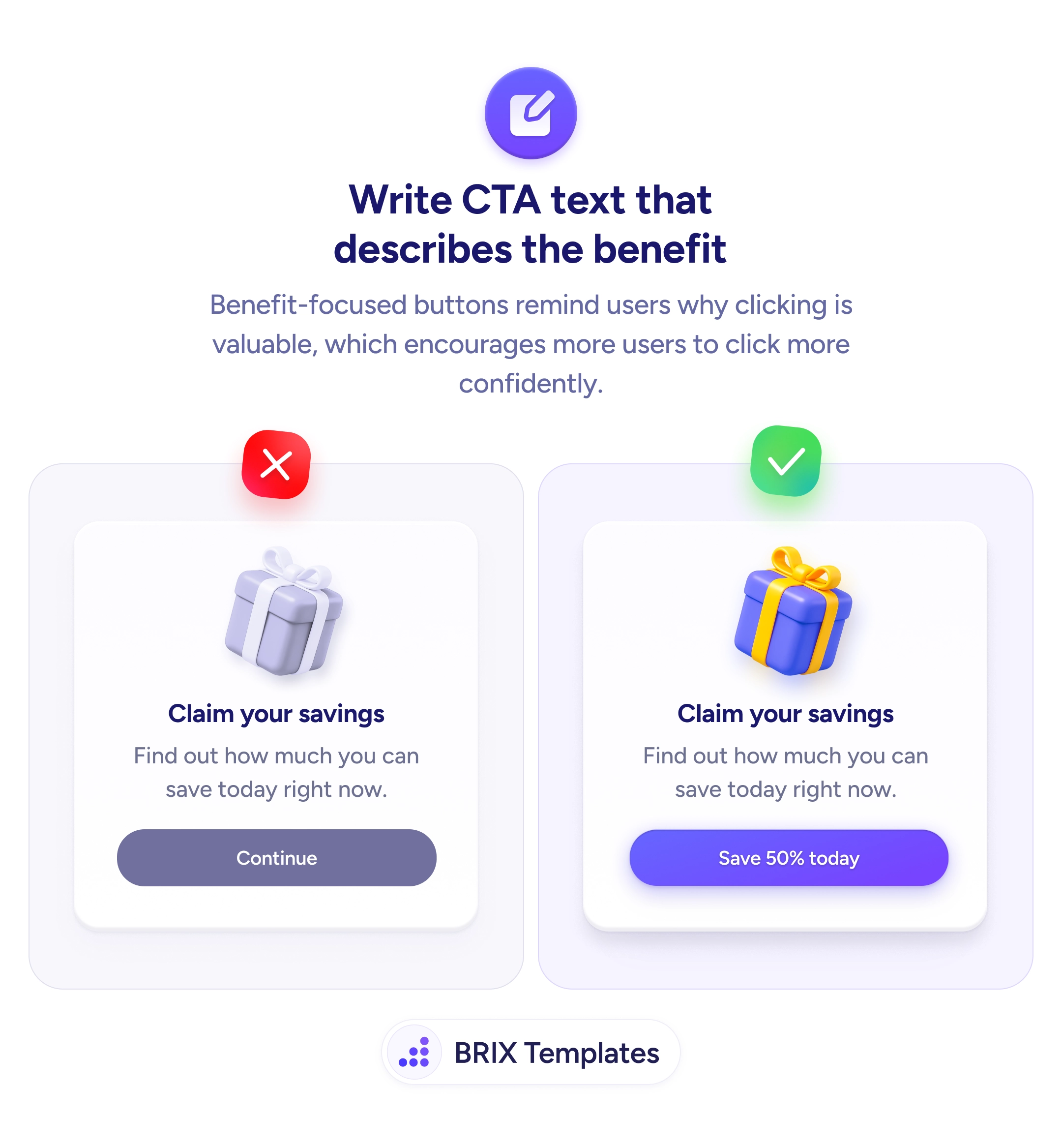
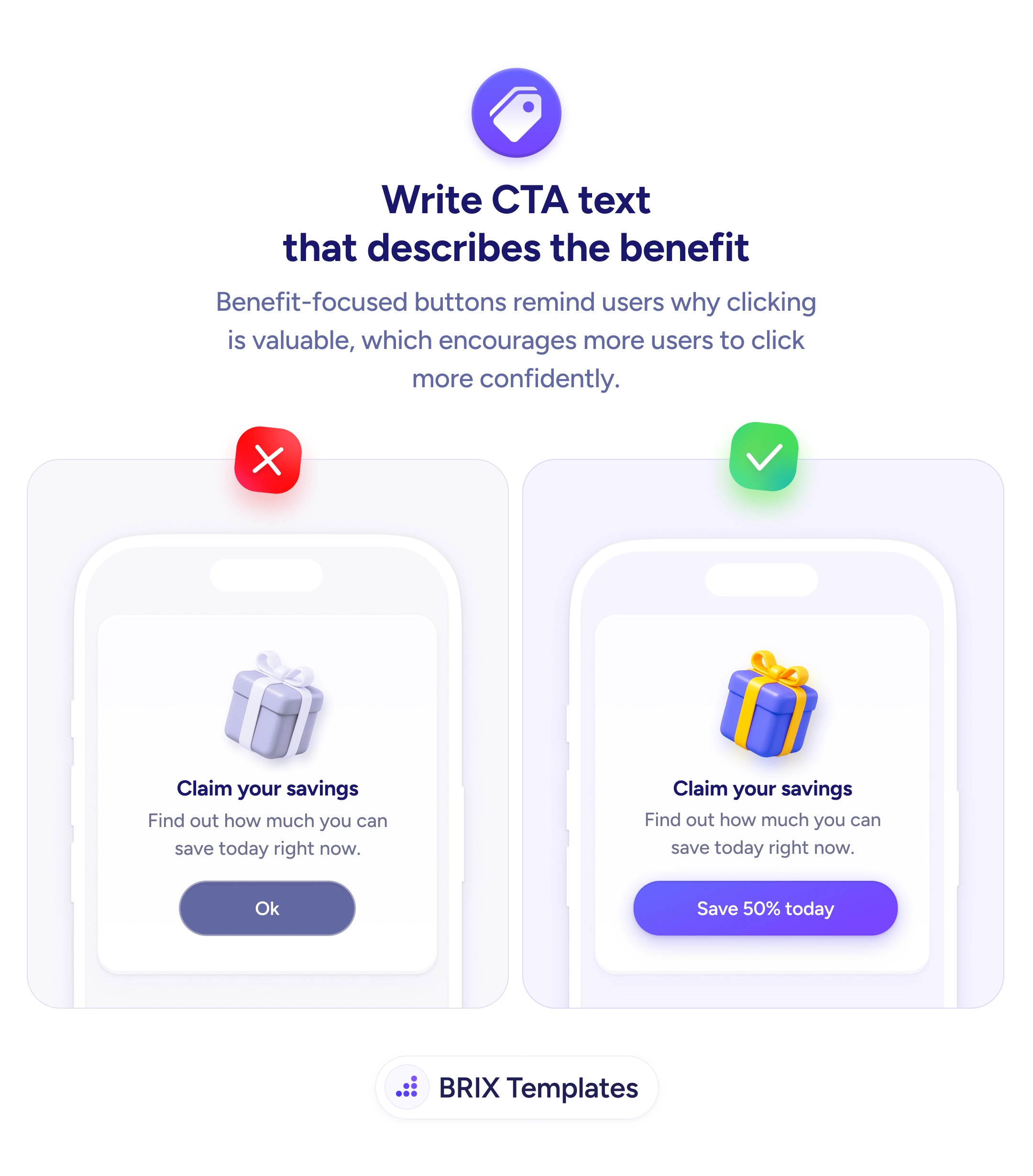
When a call to action is labeled with a generic confirmation word like “Ok”, “Submit”, or “Continue”, the button performs the click but doesn’t sell the click. The headline above might promise “Claim your savings”, and the subtext might tease the offer — but at the moment of decision, the button itself says nothing about what the user actually gets. That mismatch creates a small but real hesitation: the user has to mentally rebuild the value proposition before tapping, and many won’t bother.
A more effective pattern is to put the specific value on the button itself. Replace generic confirmations with value-led CTA copy that names the reward in concrete terms — “Save 50% today”, “Start my 14-day free trial”, “Get my discount”. The button becomes the last and clearest restatement of the offer, so the user doesn’t have to scroll back up to remember what they’re saying yes to.
Start by naming the outcome the user is choosing — not the system action the button triggers. “Submit” describes a form behavior; “Save 50% today” describes a user gain. Use first-person possessives where it fits (“Get my discount”, “Start my trial”) so the button reads as the user’s own decision, not the brand’s command. Anchor the label to a concrete number or term whenever the offer makes one available — specificity reads as proof.
Value-led CTA copy can make the next tap feel like a continuation of the user’s reasoning rather than a separate decision. When the button itself names the prize, users typically click more decisively — because the page no longer asks them to remember why they should.
A benefit describes what the user gets in general terms ('Save more', 'Grow your business'). A value names the specific reward, often with a number or concrete outcome ('Save 50% today', 'Get my 14-day free trial'). Values are sharper because they remove ambiguity about what 'more' or 'better' actually means.
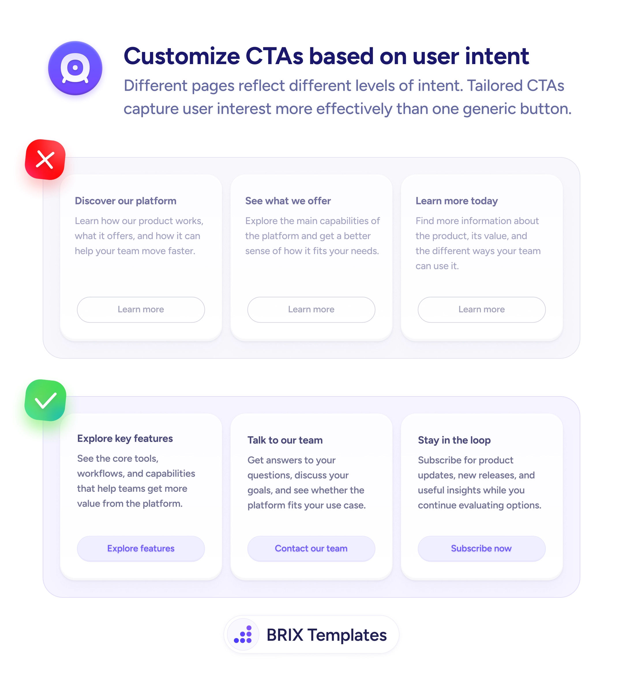
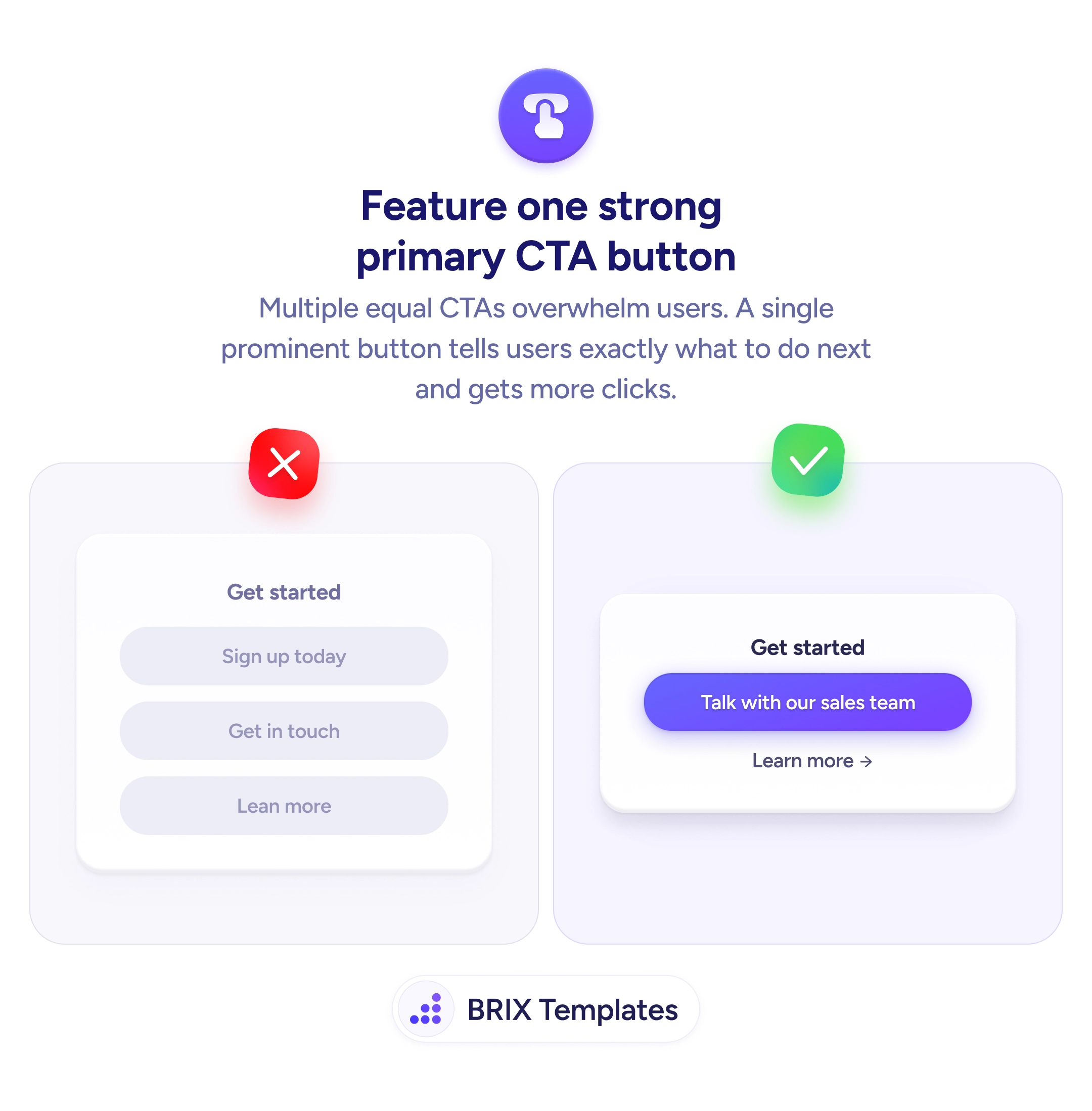
Not every CTA — but the highest-stakes ones (purchase, signup, trial) benefit most from specificity. For navigational or secondary CTAs ('Read the case study'), the action itself is the value. Reserve value-naming labels for buttons where the user is choosing whether to commit.
Use the dynamic value when you can render it accurately ('Save $42 on this order'), and fall back to a strong benefit-led label otherwise ('Apply my discount'). Don't fake specificity — vague specifics ('Save big!') feel less credible than a clear benefit phrase.
More direct, not more aggressive. 'Ok' assumes the user already decided; 'Save 50% today' reminds them why they were about to. Direct CTAs typically read as confident, not pushy, as long as the value is true and the context (price, discount, terms) supports it.