Navigation
When the match is hard to spot, the search feels broken even when it worked
Plain result lists make users re-read every line. Bold the matched words so the relevant hit is obvious at a glance and the right click comes faster.
Navigation
When the match is hard to spot, the search feels broken even when it worked
Plain result lists make users re-read every line. Bold the matched words so the relevant hit is obvious at a glance and the right click comes faster.
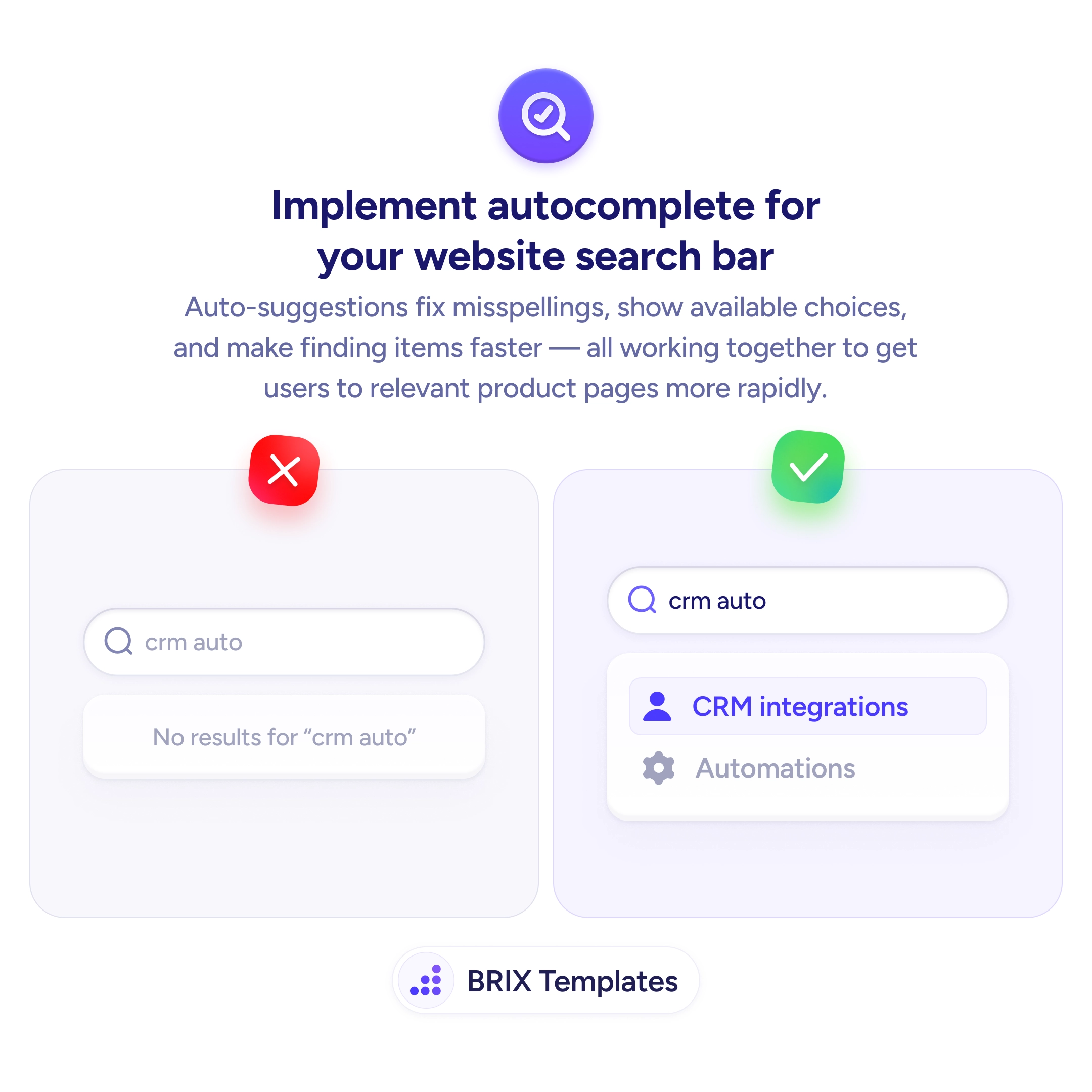
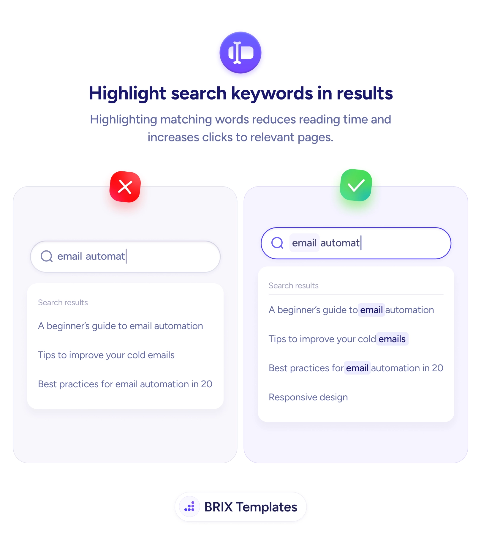
A search can return exactly the right page and still feel like it failed. When every result is set in the same uniform text, the user has to read each line in full to work out which one actually matches what they typed. The information is there, but the match is invisible — buried in a wall of near-identical links. That extra reading effort is where people slow down, second-guess the results, and sometimes decide the search didn’t understand them at all.
The fix is small and immediate: emphasize the matched terms inside each result. When someone searches “email automat” and the words email and automation are bolded in every hit, the eye lands on the relevant line without reading the rest. The user isn’t parsing a list anymore — they’re recognizing a pattern. This works hand in hand with autocomplete that speeds up the query itself: one accelerates typing, the other accelerates recognizing the answer.
Start by highlighting the query terms wherever they appear — titles and snippets alike — using a treatment that’s clearly distinct from both body text and your link color, like bold weight or a soft background tint. Keep it scoped to the actual matched words; emphasizing whole phrases or unrelated text turns helpful contrast into clutter. The result should read as a scannable map of why each item showed up, reinforcing the same clarity as a prominent, easy-to-find search bar.
Search feels intelligent when the user can see why each result was returned at a glance. Bolding the matched terms turns a line-by-line read into a quick scan, and that saved effort is usually the difference between a confident click and a second, frustrated search.
Highlight the words from the user's query wherever they appear in each result — the title, the snippet, or both. Stick to the matched terms; highlighting whole phrases or unrelated words just adds noise. The goal is to let the eye land on the reason this result showed up without reading the full line.
Any treatment works as long as it's distinct from normal text and from your links. Bold weight or a soft background tint are the safest because they read clearly without competing with link color. Avoid using your primary link color for the highlight, or matched terms and clickable text blur together.
Yes. Ranking decides the order; highlighting explains the relevance. Even a perfectly ranked list still makes the user scan each line to confirm it fits — emphasis on the matched terms turns that scan into a glance, which matters most on long or text-heavy result pages.
Only when it's overused. If nearly every word is emphasized, nothing stands out and the page looks cluttered. Highlight just the query terms, keep the styling consistent, and make sure the contrast is strong enough to read but subtle enough not to overwhelm the surrounding text.