Forms & inputs
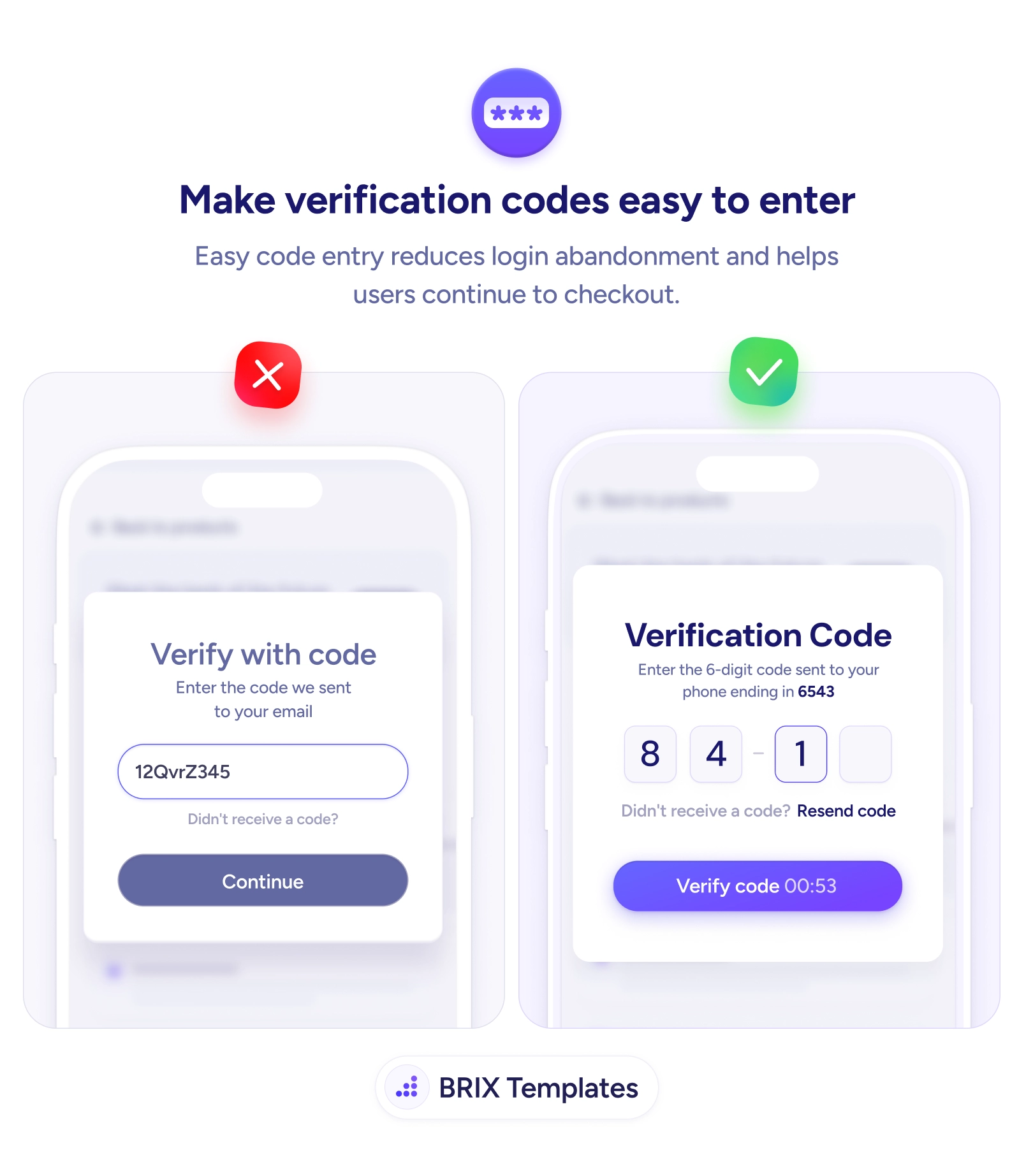
The code step is where a logged-in user can still become a lost one
A clumsy code field stalls users at the last step. Split digits into boxes, trigger the number pad, and confirm where the code was sent to keep them moving.
Forms & inputs
The code step is where a logged-in user can still become a lost one
A clumsy code field stalls users at the last step. Split digits into boxes, trigger the number pad, and confirm where the code was sent to keep them moving.
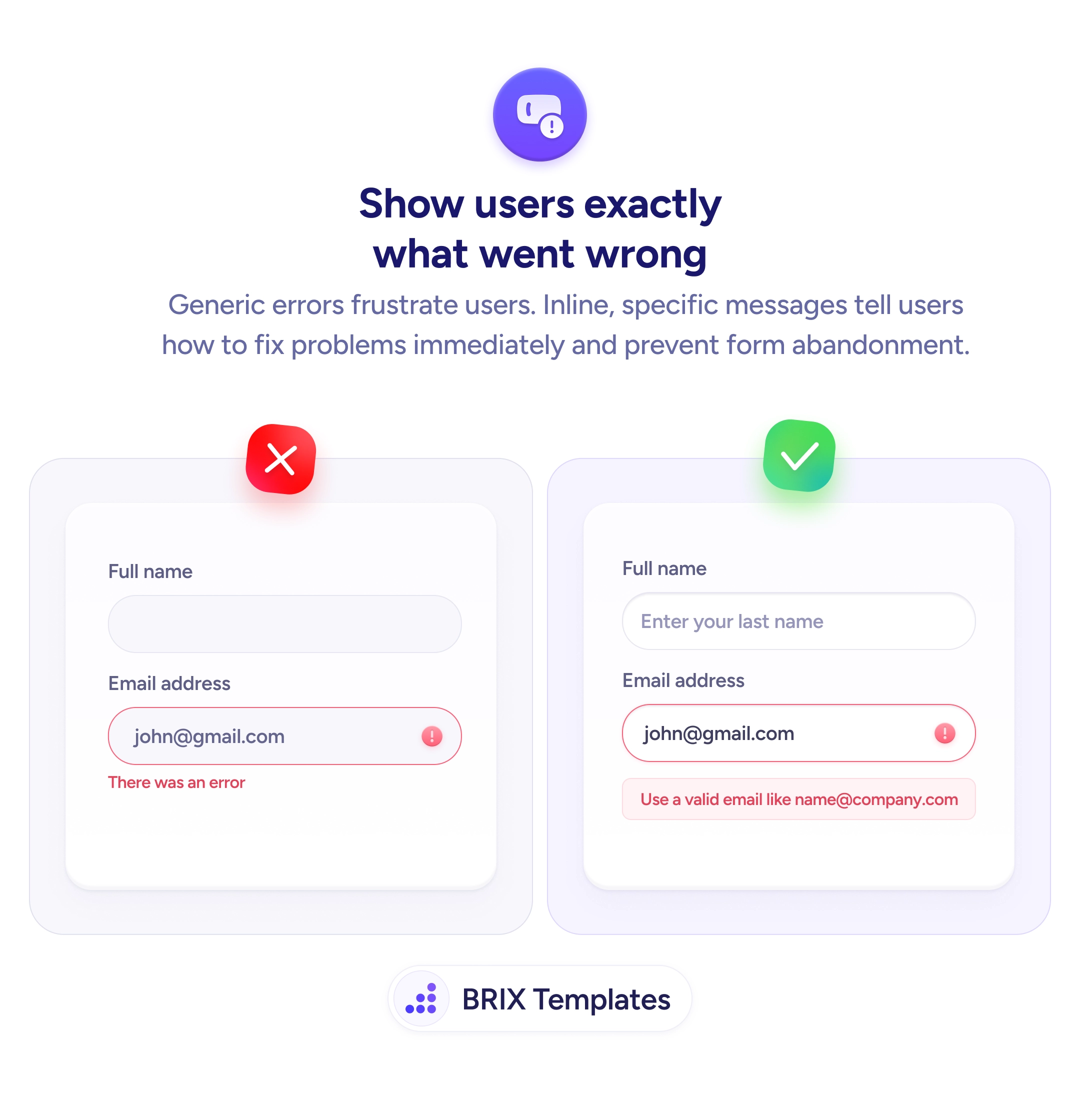
The verification step looks trivial, but it’s where a motivated, already-converting user can still slip away. A single cramped field that mixes letters and numbers, opens the wrong keyboard, and gives no hint of how long the code should be turns a five-second task into a squint-and-retype ordeal. By this point the user has committed — they’ve signed up or reached checkout — so every fumble here is friction at the worst possible moment, right before the finish line.
A better pattern makes the code almost effortless to enter. Split the code into individual digit boxes so its length is obvious and focus advances as you type. Show where the code was sent — “sent to your phone ending in 6543” — so the user knows exactly where to look. Trigger the numeric keyboard automatically, the same input-type discipline that speeds up every mobile field, and offer a clear Resend with a short countdown. The screen does the remembering and the routing; the user just enters digits.
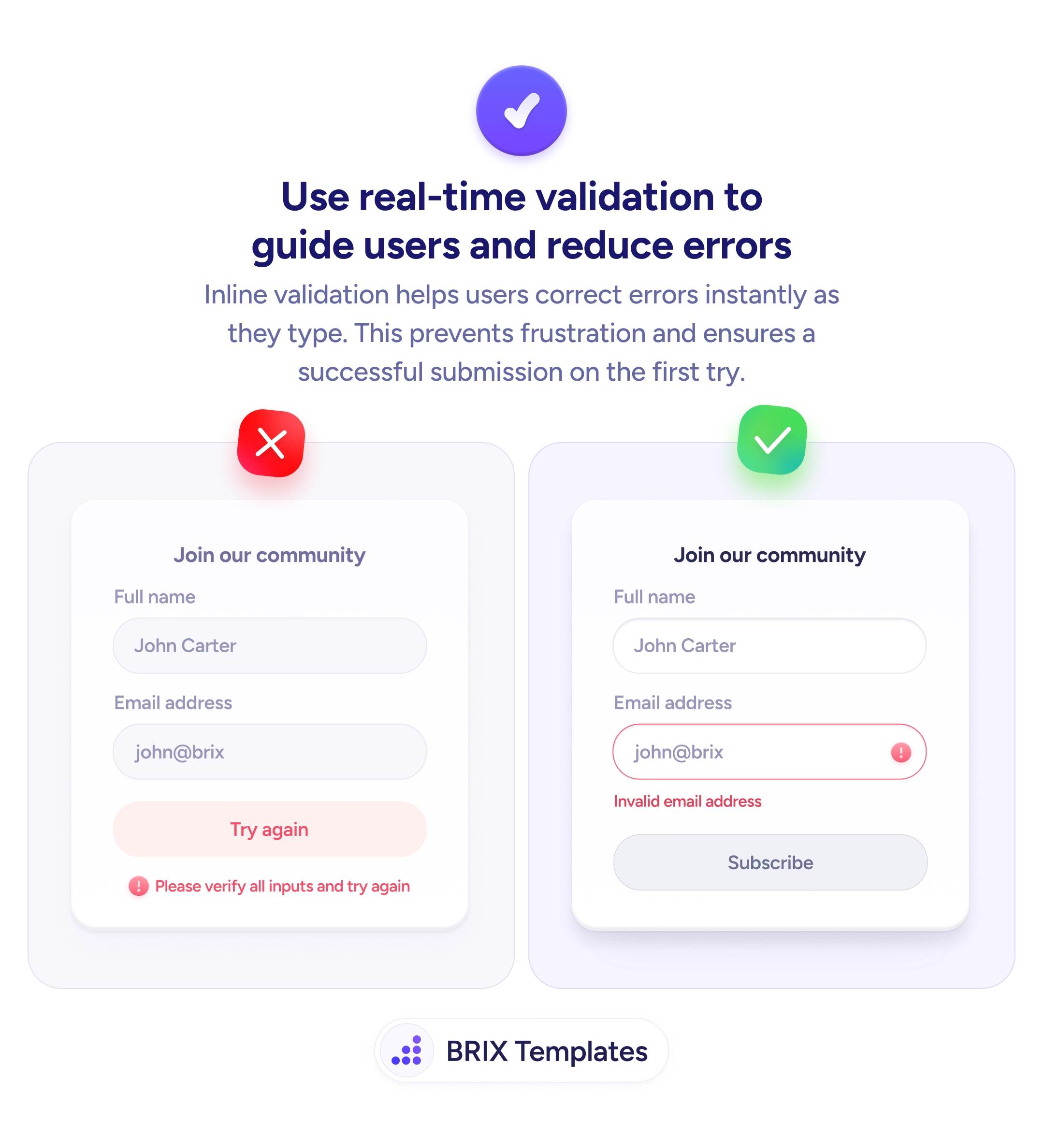
Start by setting the field to a numeric input type and, where the platform supports it, enabling one-tap autofill from the SMS so many users never type at all. Validate the code as it’s entered rather than after submit so a wrong digit surfaces immediately, and keep an obvious recovery path for delayed or expired codes. Every detail here is aimed at one outcome: the user finishes without ever stopping to think.
The code screen should feel like a formality, not a test. When the layout shows the length, the keyboard is ready, and the destination is confirmed, users clear this last step without friction — and the signups and checkouts you already earned actually complete.
Separate single-digit boxes are usually clearer for short codes — they show the expected length at a glance, make it obvious how many digits remain, and let auto-advance move focus as the user types. A single field can work, but it should still enforce length and trigger the numeric keyboard. The key is that the user never has to wonder how long the code is or where their cursor is.
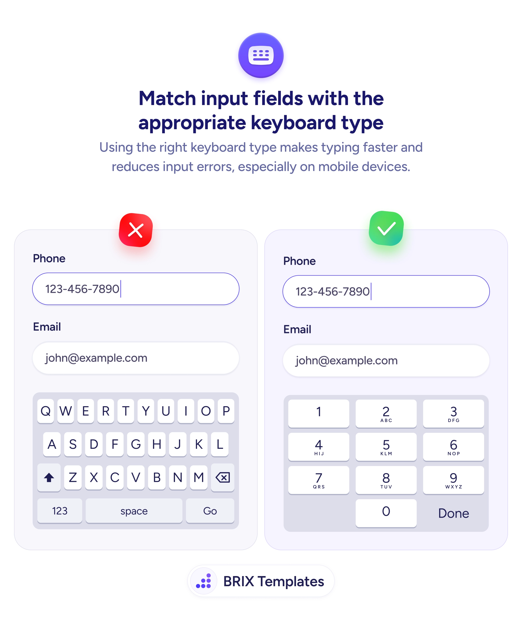
Triggering the right keyboard. On mobile, a code field that opens the full alphabetical keyboard forces an extra tap to switch to numbers. Set the input to a numeric type so the number pad appears immediately, and where the platform allows it, enable one-tap autofill from the SMS so the user often doesn't type at all.
Because users frequently lose track of which email or phone the code went to, especially mid-signup. Showing 'sent to your phone ending in 6543' tells them where to look and reassures them the system targeted the right destination — which cuts the 'I never got a code' support load and the panicked resends.
Make 'Resend code' visible but lightly throttled with a short countdown so users don't hammer it, and state plainly when a code expires. If a code times out, let them request a new one in one tap without re-entering anything else. The goal is an obvious, low-effort recovery path so a delayed SMS never becomes an abandoned signup.