Navigation
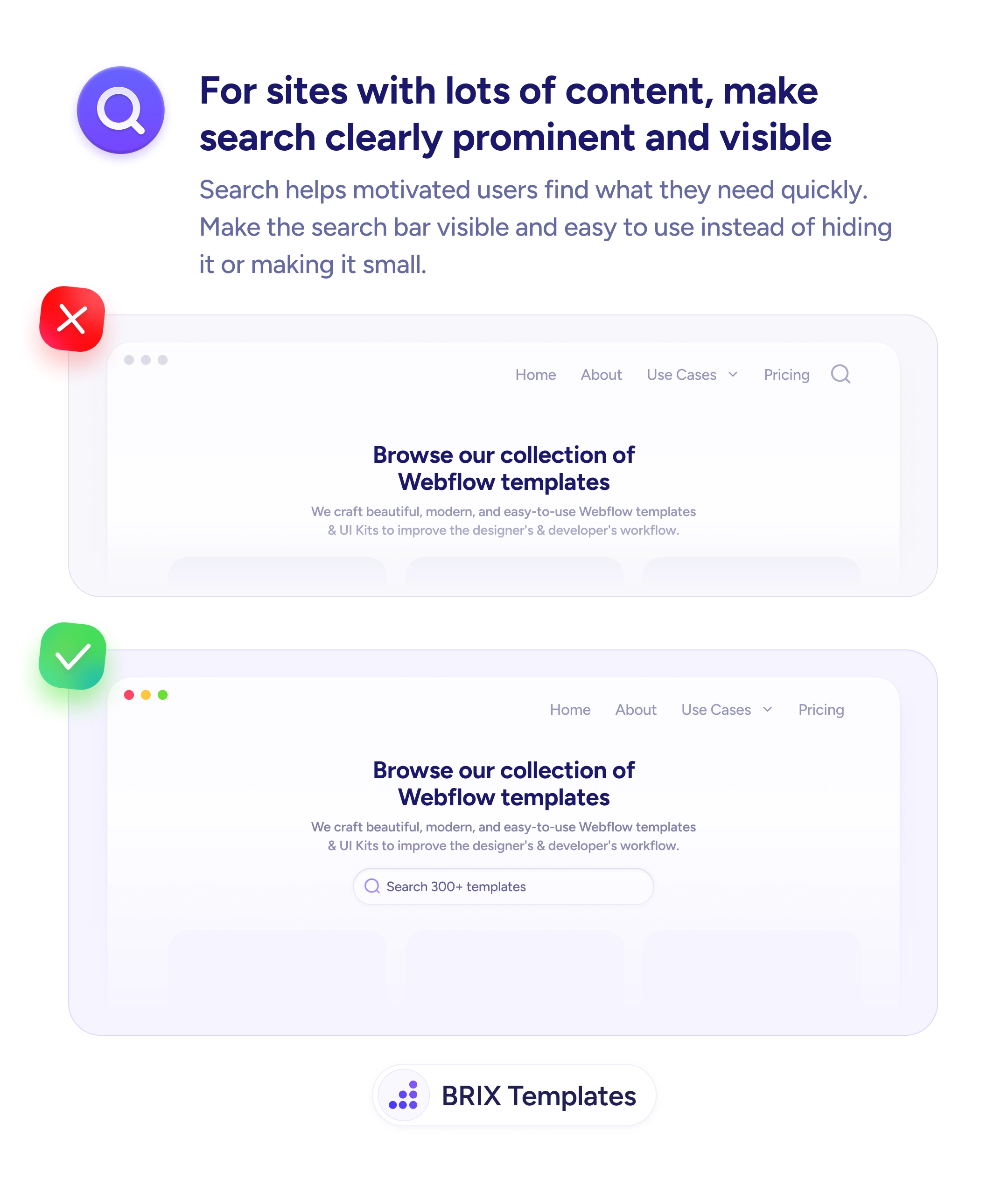
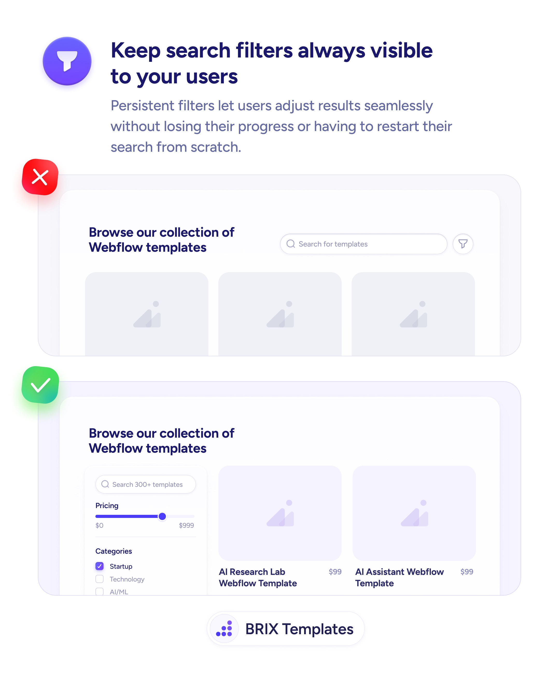
Always-visible filters turn search into direct manipulation
Hidden filter panels discourage users from refining results. Persistent filters let users adjust criteria seamlessly without losing progress.
Navigation
Always-visible filters turn search into direct manipulation
Hidden filter panels discourage users from refining results. Persistent filters let users adjust criteria seamlessly without losing progress.
When search filters are tucked behind a toggle icon or hidden modal, users have to actively open them to narrow their results. Each filter adjustment becomes a multi-step interaction — open the panel, change a value, close it, see the update. This friction often discourages users from refining their search at all, leaving them to scroll through unfiltered results or give up.
A more effective approach is to keep filters persistently visible in a sidebar or top panel so users can adjust them instantly. Always-visible filters let users see current selections, make changes seamlessly, and immediately perceive how each adjustment affects the results. The interaction shifts from “find and configure” to “tweak and see,” which is how users naturally refine queries.
Place filters in a dedicated sidebar on desktop, or a collapsible but easily accessible drawer on mobile. Apply changes in real-time so users see results update as they adjust. Show the current filter state with clear visual indicators — active filters highlighted, count of selected values shown. Make it easy to clear individual filters or reset all without losing the search context.
Persistent, visible filters can make searching feel more like direct manipulation than configuration. Users who can adjust filters without leaving their current view typically explore more options and find better matches — because the cost of trying a different filter combination drops to near zero.
Each click to open a filter panel is friction. Users who would refine results if it took one click often skip refining when it takes two or three. Visible filters remove that friction, so exploration happens more often.
On desktop, no — there's usually room for a 200-300px sidebar without shrinking the result grid significantly. On mobile, space is limited, so a collapsible drawer is more appropriate than a persistent sidebar.
Show the most commonly used filters uncollapsed — typically 3-5 top-level categories. Put less-used filters in expandable sections or below a 'More filters' toggle so the interface stays scannable.
Yes, on long result pages. A sticky sidebar means users can adjust filters without scrolling back to the top. This reinforces the 'direct manipulation' feel that makes filtering fast.