Navigation
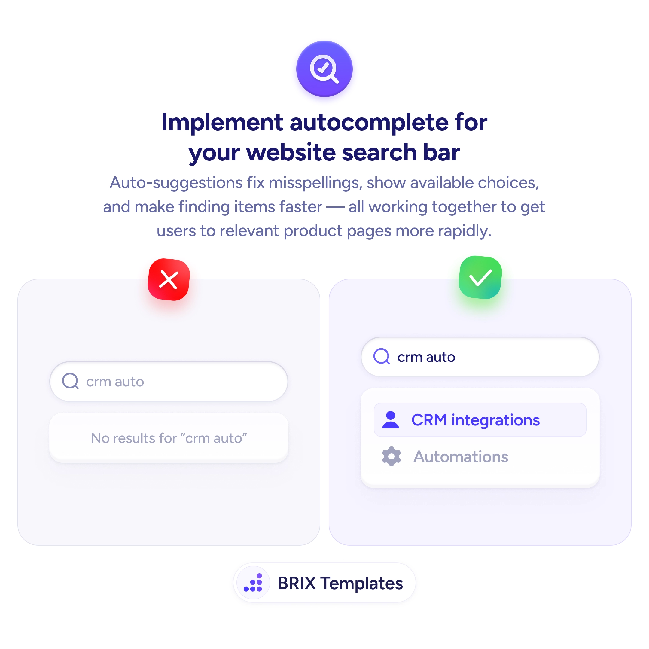
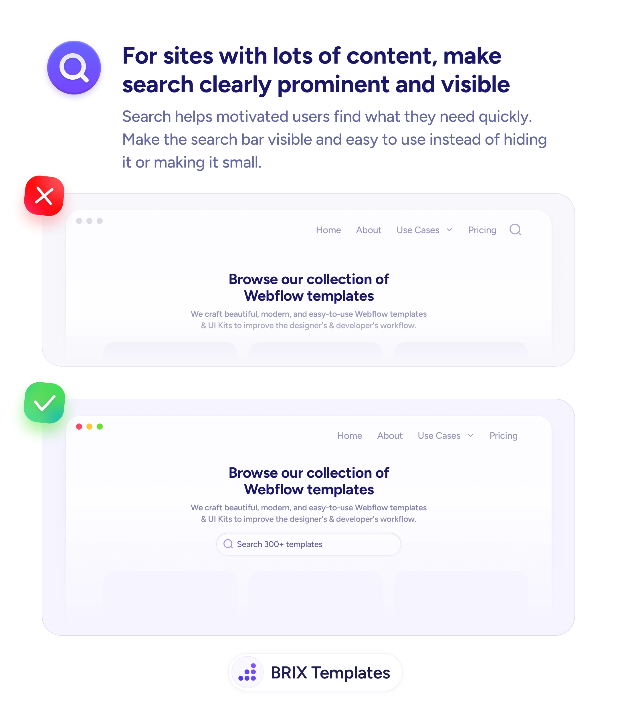
A search feature nobody can find is a search feature nobody uses
Small search icons get missed. Place a visible search input above the content grid so users with specific queries can reach their target in seconds.
Navigation
A search feature nobody can find is a search feature nobody uses
Small search icons get missed. Place a visible search input above the content grid so users with specific queries can reach their target in seconds.
When a website has a large content library — templates, articles, products — but hides its search functionality behind a small icon or nested menu, users who know what they want can’t find it quickly. They end up browsing categories they don’t need or leaving the site entirely. A search feature that isn’t easy to find is a search feature that doesn’t get used.
A stronger approach is to make the search bar visible and prominent on content-heavy pages. A full-width search input placed below the hero or at the top of the content section signals that search is a primary way to navigate the site. Users who know their goal can skip the menu entirely and type directly — which is the fastest path for motivated visitors.
Place the search bar where users can see it without clicking anything. Include a placeholder text that hints at what they can search (“Search 300+ templates”) so the affordance is obvious. Size the search input generously — a small icon in the header is easy to miss, but a full-width bar with visible text can’t be overlooked. Pair it with clear content discovery — recent or popular items below the search reinforce the pattern.
Prominent search functionality can help motivated users reach their goal in one interaction. When search is visible and easy to use, users who know what they want typically skip the menu and go straight to the target — which reduces time on task and increases overall site engagement.
Place it prominently below the hero or at the top of the content section — wherever the user's attention lands when they're ready to browse. Avoid nesting it in the header as a small icon if your audience includes users who arrive with specific queries.
Full-width or close to it on desktop, at least 60-70% of the content area. Small search inputs look like afterthoughts; wide ones signal that search is a primary navigation method.
Descriptive, specific placeholder text like 'Search 300+ templates' tells users both what they can search and what content is available. Generic text like 'Search' misses the opportunity to communicate scope.
You can, as a secondary entry point for users on other pages. But the primary search bar — the one on content-heavy pages — should be visible and prominent. Don't rely on the icon alone.