
Readability
A relevant icon lets the eye recognize an action before it finishes reading the words
A small icon lets users grasp meaning before they read the label. Pair each menu item or feature with a relevant icon to make text faster to scan.

Readability
A relevant icon lets the eye recognize an action before it finishes reading the words
A small icon lets users grasp meaning before they read the label. Pair each menu item or feature with a relevant icon to make text faster to scan.
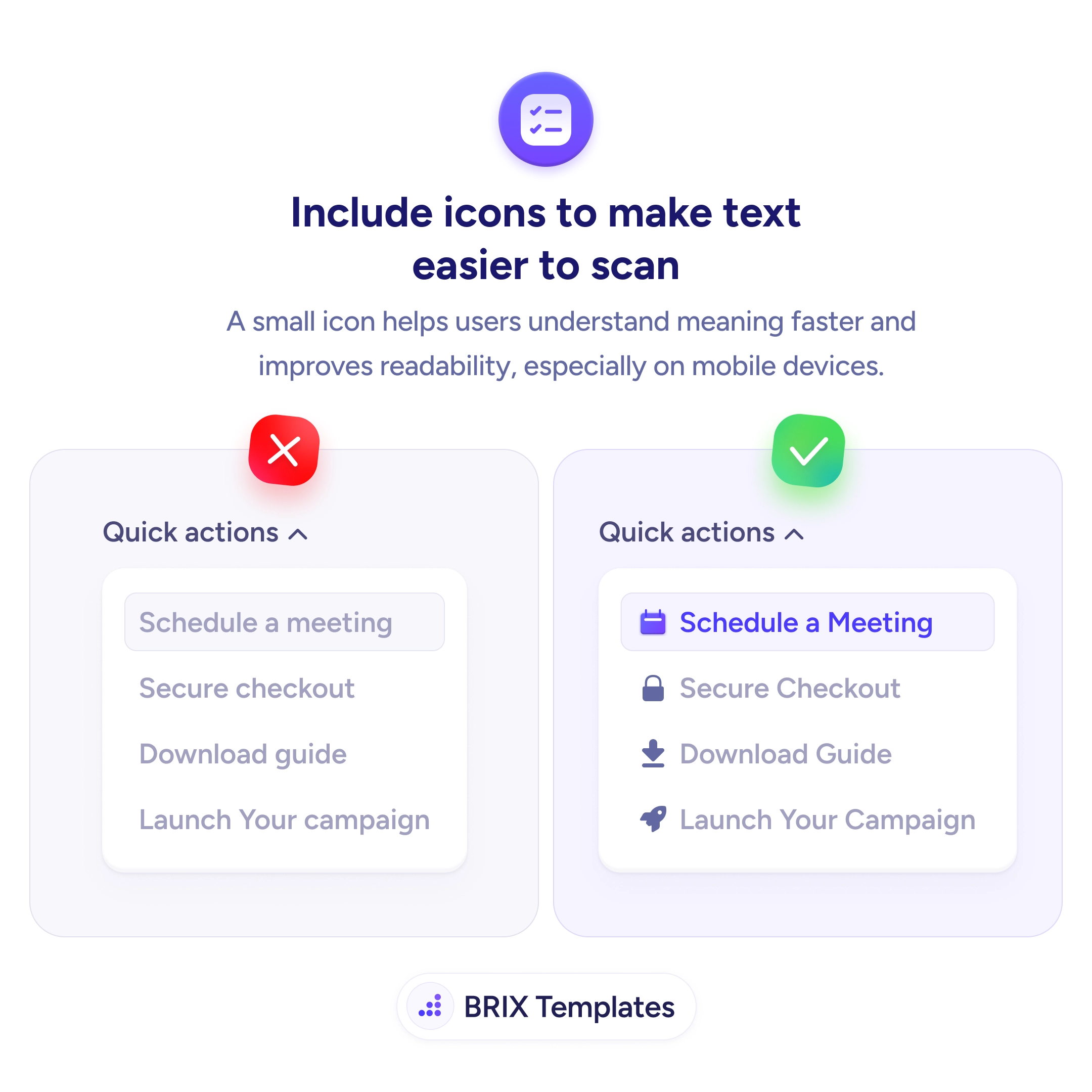
A list of actions rendered as plain text lines makes the eye do all the work. “Schedule a meeting,” “Secure checkout,” “Download guide” — every row looks identical, so the reader has to process each label in full just to tell them apart. On a small screen especially, that uniform wall of text slows scanning and makes a simple menu feel like a paragraph to read.
The fix is to pair each item with a small, relevant icon. A calendar beside “Schedule,” a padlock beside “Secure checkout,” a download arrow beside “Guide” — each gives the eye a shape to recognize before it reads the words. Icons act as visual anchors: they turn a flat list into a set of distinct, glanceable items and let the reader jump straight to the one they want.
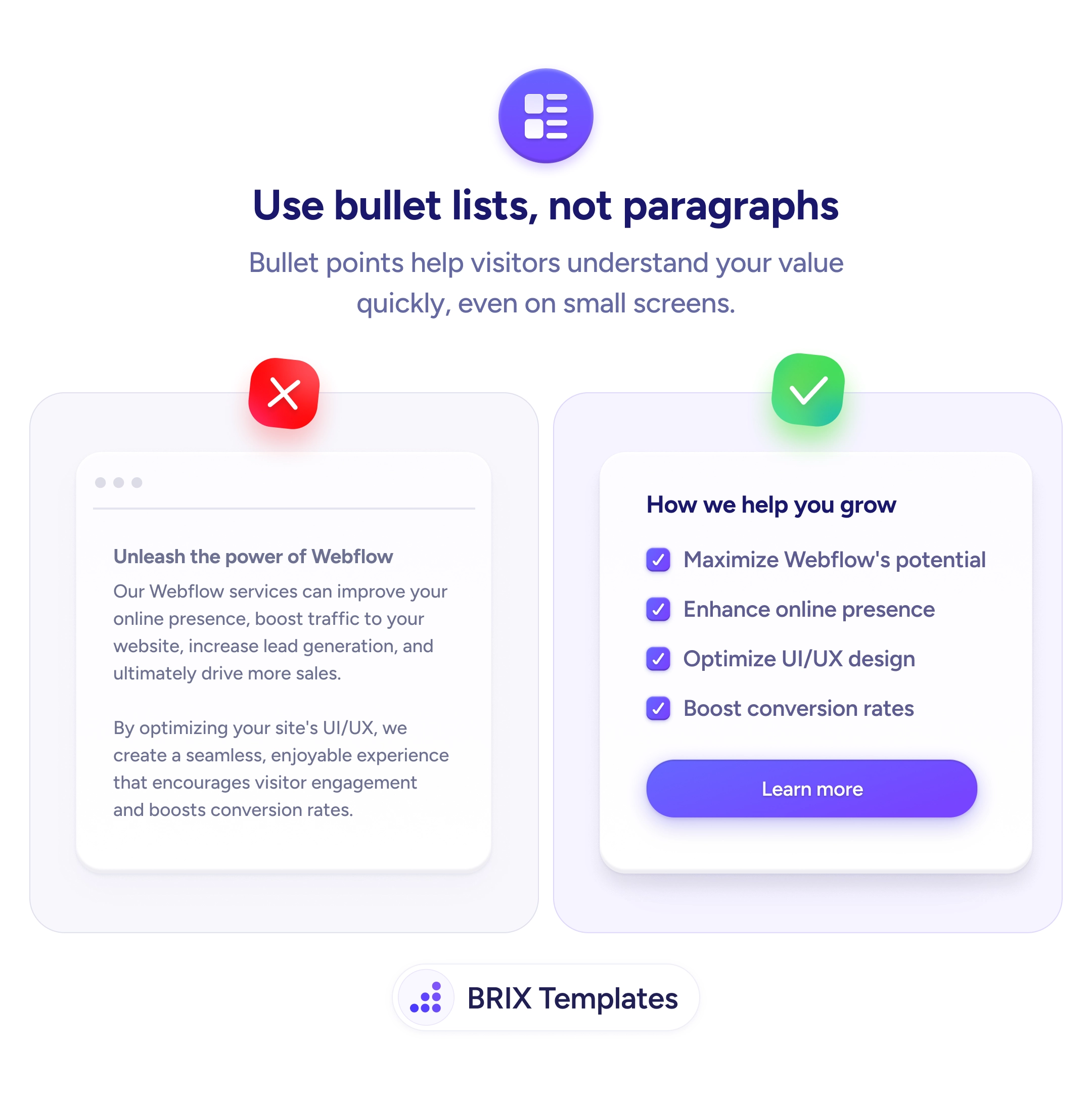
Start by choosing icons that map cleanly to meaning — conventional, unambiguous symbols, not decorative flourishes that add color without clarity. Keep them consistent in size, weight, and style so they read as one system rather than a sticker collection. Use them to reinforce structure, the same scannability win as breaking feature paragraphs into bullet lists, and never let an icon replace a label — pair the two, and keep the text itself legible.
Used well, they improve it — a recognizable symbol is processed faster than a word, so it acts as a pre-reading cue that helps the eye locate and categorize items. Used badly (random, decorative, or inconsistent) they add visual noise and slow scanning. The difference is whether each icon carries a clear, conventional meaning tied to its label.
Only where icons help distinguish items or signal their type. In a short, varied list of actions or categories they aid scanning. In a long list of similar items, or in body prose, they clutter more than they help. If you can't find an icon that clearly represents an item, leave that one text-only rather than force a vague symbol.
Convention and clarity. Use symbols users have seen a thousand times — a magnifying glass for search, a padlock for security, a trash can for delete — so no learning is required. Avoid clever or abstract metaphors that need a caption to decode. If two people would name the icon differently, it's too ambiguous.
For anything but the most universal symbols, keep the label. Icon-only interfaces force users to guess or hover, and the same picture can mean different things in different apps. Pairing icon and text gives the fast recognition of the symbol and the certainty of the word — and stays accessible to screen-reader users.