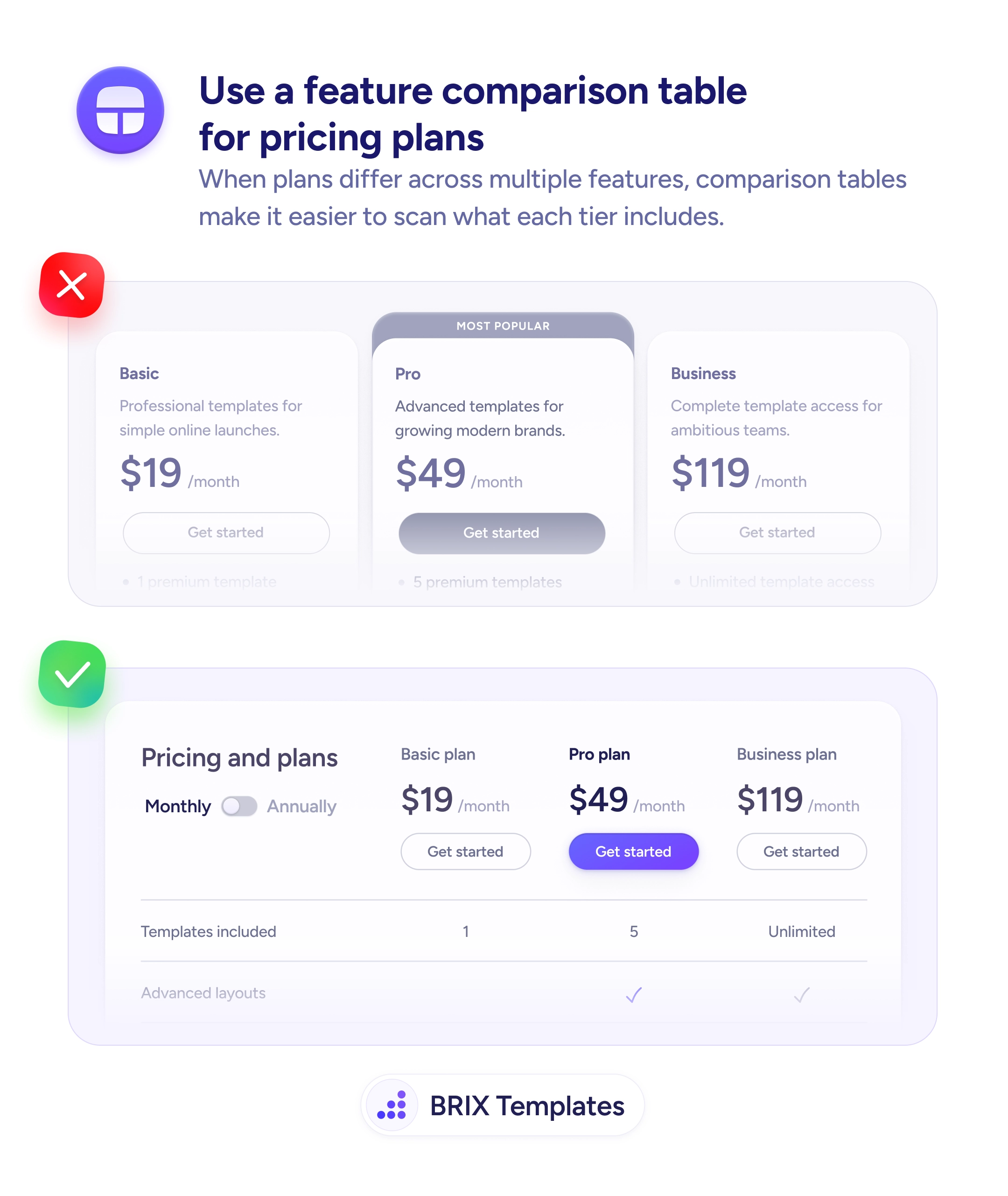
Readability
Most users skim paragraphs but read tables top to bottom
Comparison tables turn a paragraph of features into a one-glance scan. Readers see the difference between 'before' and 'with you' instantly.
Readability
Most users skim paragraphs but read tables top to bottom
Comparison tables turn a paragraph of features into a one-glance scan. Readers see the difference between 'before' and 'with you' instantly.
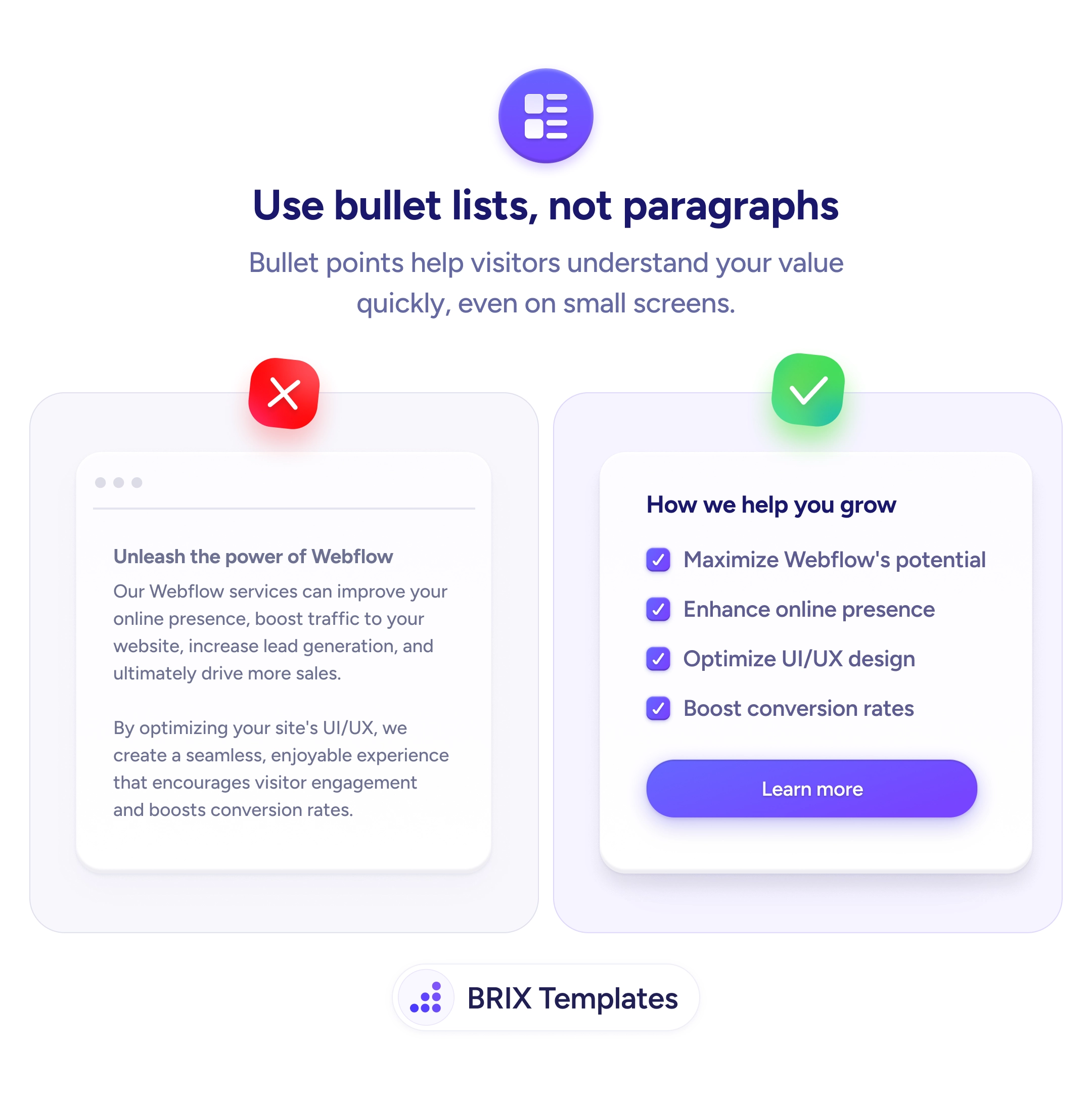
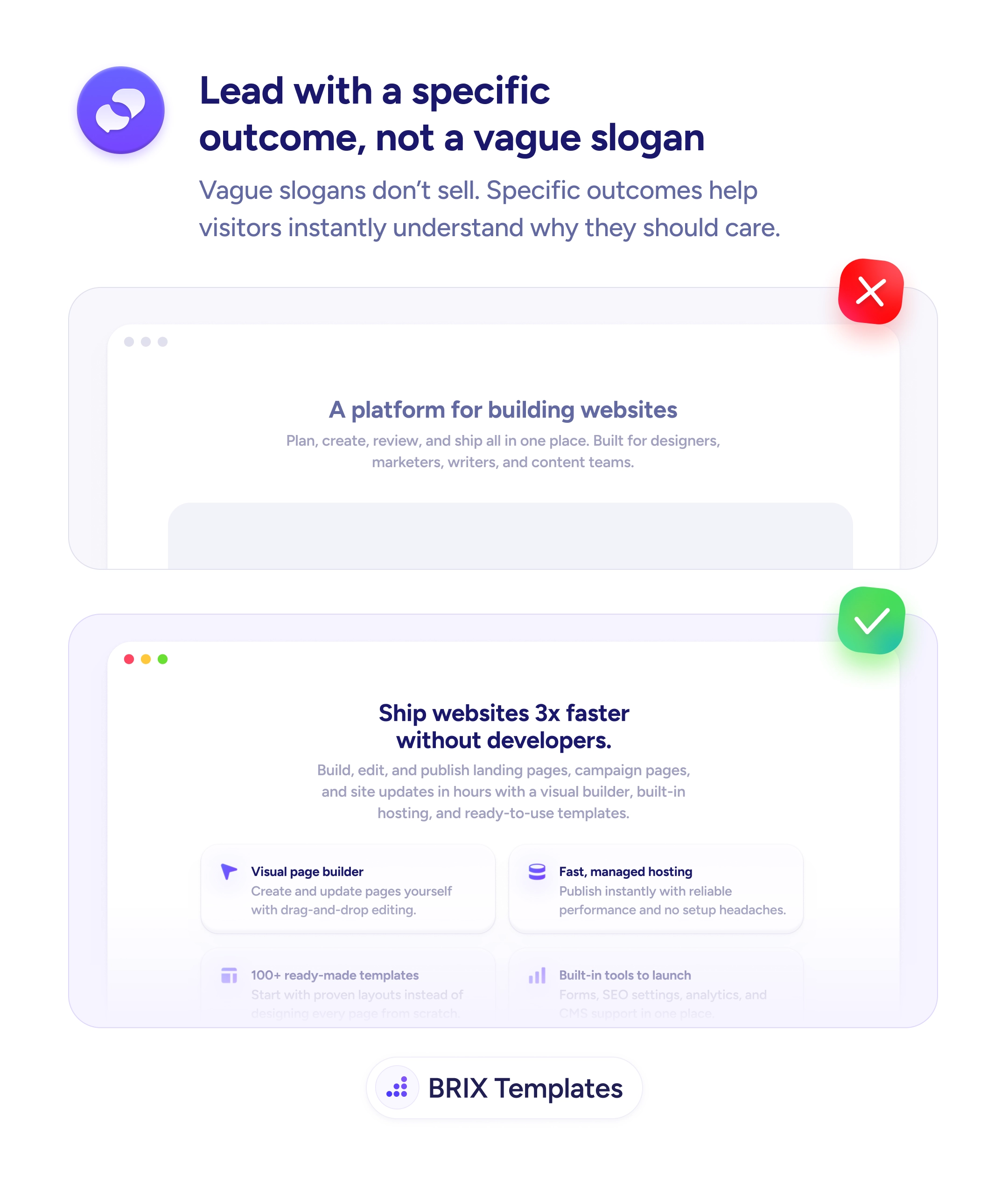
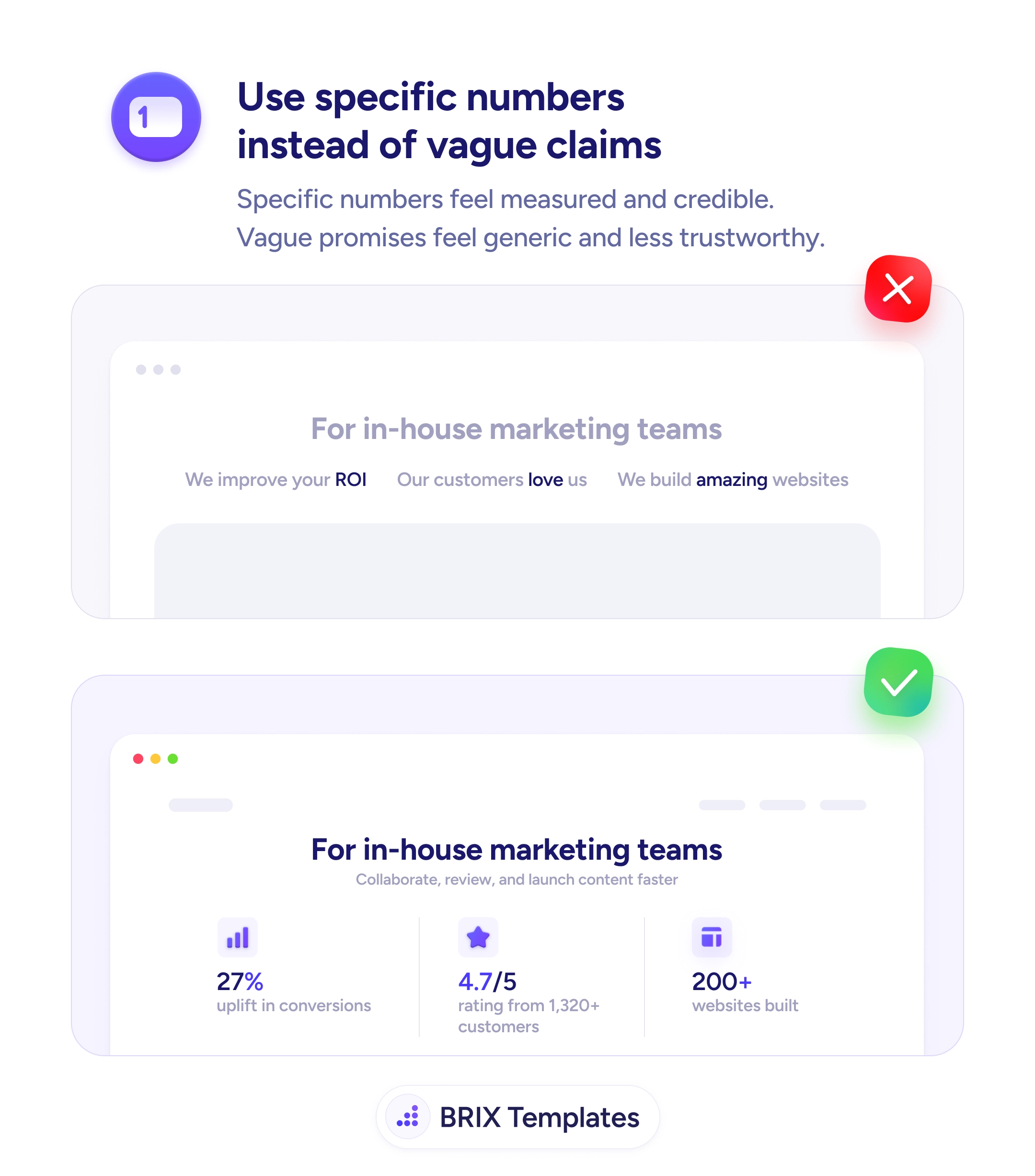
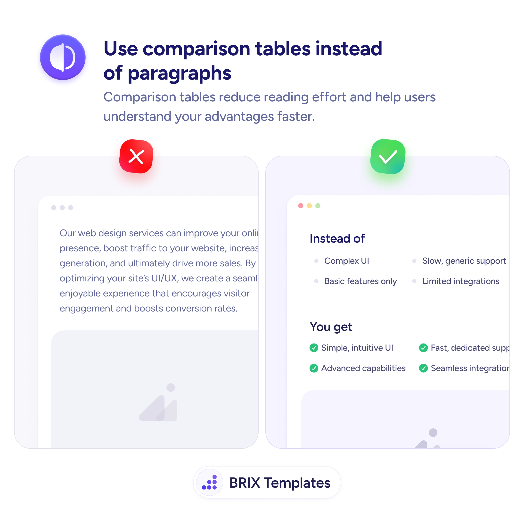
A wall of marketing prose like “Our services can improve your online presence, boost traffic, and ultimately drive more sales” sounds like every other agency page and reads like none of them. Dense paragraphs force readers to extract the contrast on their own — they have to read every line, identify the points being made, and mentally line them up against what they’re using today. Most readers won’t do that work, and the page loses its message somewhere in the second sentence.
A stronger pattern is to convert the paragraph into a comparison table with two parallel columns: “Instead of” and “You get” (or Without you / With you, Before / After). The reader’s eye runs down the left column, sees the pain points, runs down the right column, sees the resolutions, and the value proposition assembles itself without effort. The same content shifts from something to read to something to scan, and scanning is what most landing-page visitors actually do.
Start by finding the implicit contrasts in your current copy — phrases like “unlike legacy tools”, “compared to manual workflows”, “better than the alternatives”. Each one is a row of a table waiting to happen. Aim for four to seven rows, describe the left side in fair, recognizable language (not caricature), and put the strongest contrast at the top so the scan starts with the punch.
A comparison table can do the work of three paragraphs in a fraction of the scan time, which is often the difference between a visitor who absorbs the value and one who bounces. The format also tends to read as more confident — a team willing to put the alternative on the page typically looks more credible than one that only describes itself.
When the message is a contrast: them vs you, before vs after, basic vs premium, manual vs automated. Tables work when both sides have parallel attributes a reader can scan top-to-bottom. If there's no real contrast, a bullet list is usually a better fit.
Four to seven rows is the sweet spot. Fewer feels thin and unconvincing; more loses the scan rhythm and starts reading like a spec sheet. If you have ten differences to show, pick the five that map to the visitor's biggest concerns and demote the rest to a longer page.
Keep the left column credible — exaggerated negatives ('Terrible support, broken UI') make the whole table feel like a sales pitch. Describe the alternative in fair, recognizable language ('Slow generic support', 'Basic features only') so the right column wins on contrast, not on caricature.
Yes, with care. Stack the two columns vertically with clear labels (Instead of / You get), or keep them side-by-side with tight typography and equal column widths. Avoid scroll-locked horizontal tables — readers don't side-scroll voluntarily on a marketing page.