Help & onboarding
Every unfamiliar acronym is a quiet invitation to leave your page
Inline tooltips with plain-language definitions keep readers in your content instead of leaving the page to Google the term you just used.
Help & onboarding
Every unfamiliar acronym is a quiet invitation to leave your page
Inline tooltips with plain-language definitions keep readers in your content instead of leaving the page to Google the term you just used.
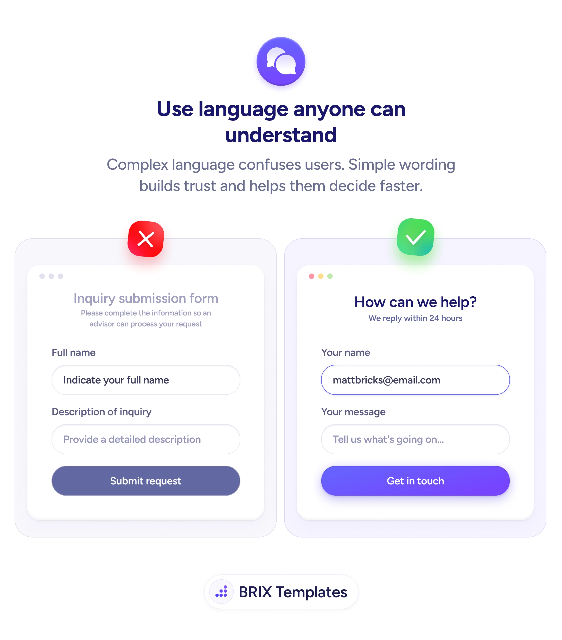
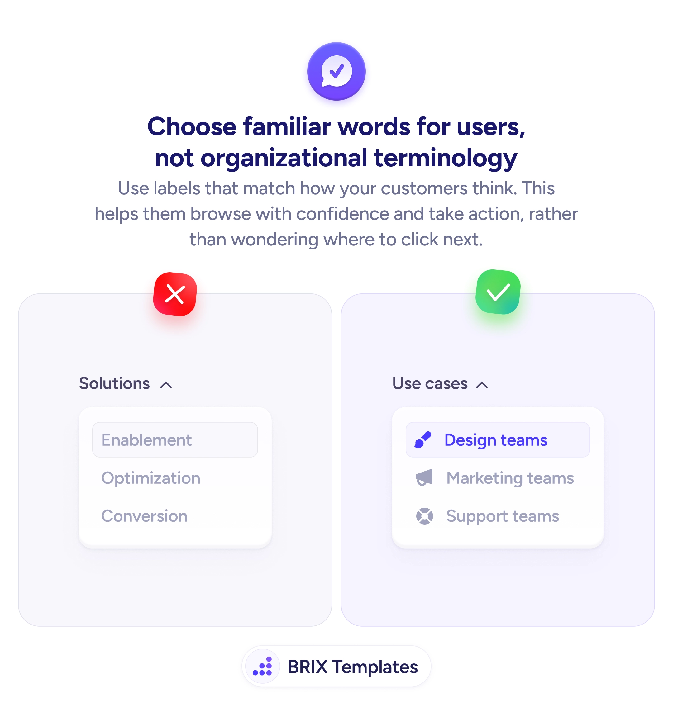
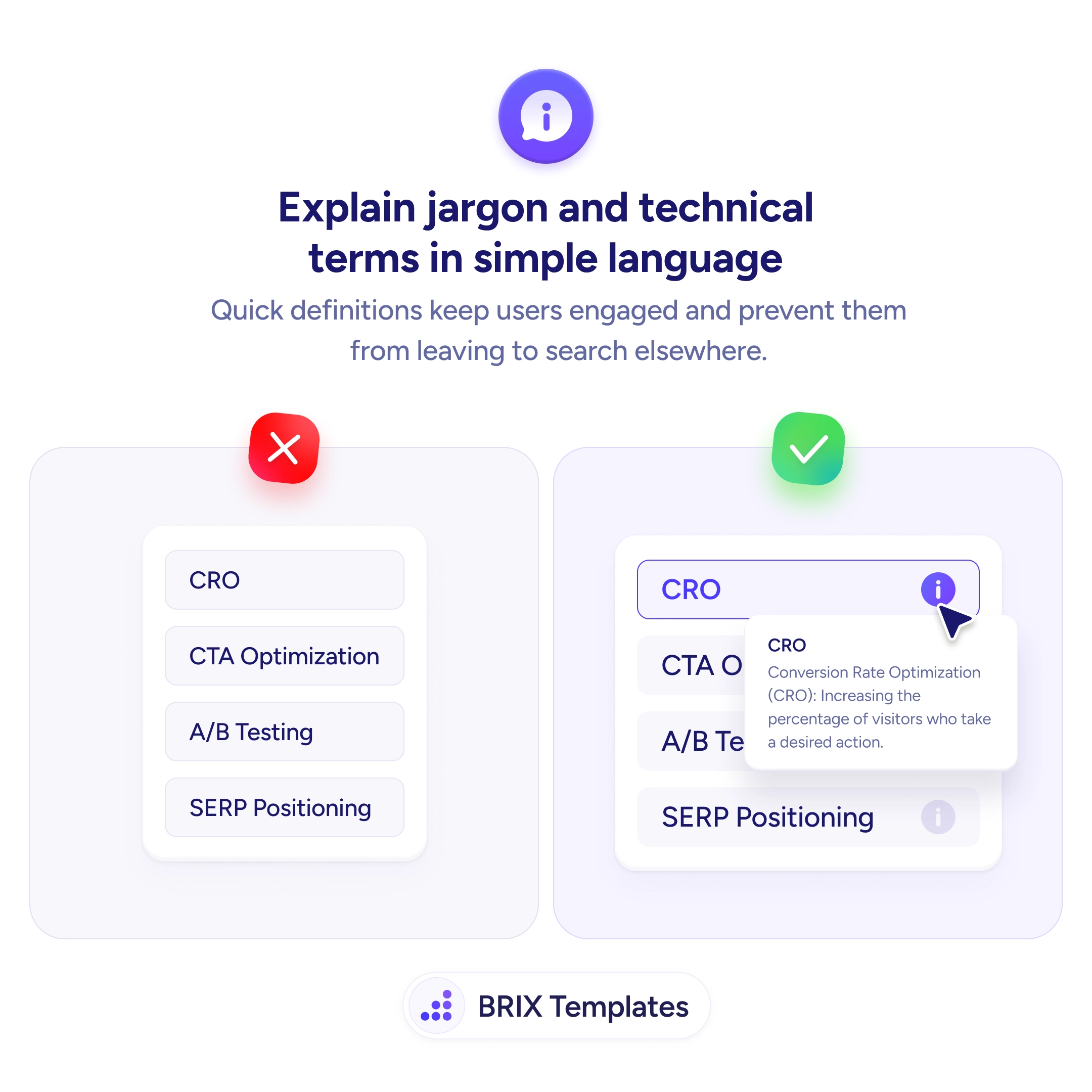
When a page is dense with acronyms — CRO, CAC, SERP, MQL — readers who don’t already speak that vocabulary stop being readers and start being researchers. The moment a visitor has to open a new tab to look up a term, the page has already lost most of its momentum, and that visitor often doesn’t come back. The problem is rarely the topic — it’s that the writer assumed familiarity the reader doesn’t have, and didn’t offer a quiet way to catch up without leaving.
A stronger pattern is to attach a small info icon to every specialist term and surface a plain-language definition in a tooltip on tap or hover. The icon signals “there’s help if you need it” without insisting on it. Readers who already know the term ignore the icon; readers who don’t get the definition without breaking their flow. The whole interaction takes a fraction of a second and keeps the reader on the page where the conversion lives.
Start by running a quick jargon audit of any page where new users land — pricing pages, onboarding screens, landing pages aimed at adjacent audiences. Flag every term that an outsider wouldn’t recognize and wire a tooltip to each one. Write definitions in one sentence of plain language, expanded form first. Keep them under 25 words — anything longer belongs in a docs page, not a popover.
Tooltips for jargon often do more for content reach than rewriting the copy, because they let the page address two audiences at once: people who know the language and people who don’t. When specialist terms become quietly self-explaining, the page reads as confident without reading as exclusionary.
Use a tooltip when the term is essential but the definition would interrupt the sentence. Use an inline definition when the term appears once and the reader needs it to understand the next paragraph. Don't tooltip what most of your audience already knows — it adds clutter without adding clarity.
Lead with the expanded form, then a one-sentence plain-language explanation. 'CRO / Conversion Rate Optimization (CRO): Increasing the percentage of visitors who take a desired action.' Keep it under 25 words. Anything longer belongs in a docs link, not a tooltip.
Yes — on touch devices, tooltips open on tap and close on outside tap, never on hover. A small info icon (i) signals tappability. If the term is critical to understanding the screen, consider inlining the definition on mobile instead of hiding it behind a tap.
Pair the visible info icon with a proper aria-label and ensure the tooltip content is announced when focused. Keyboard users should reach the icon with Tab and open the tooltip with Enter or Space. A tooltip that's invisible to assistive tech is the same as no definition at all.