Forms & inputs
People hesitate to hand over an email when they can't tell what you'll do with it
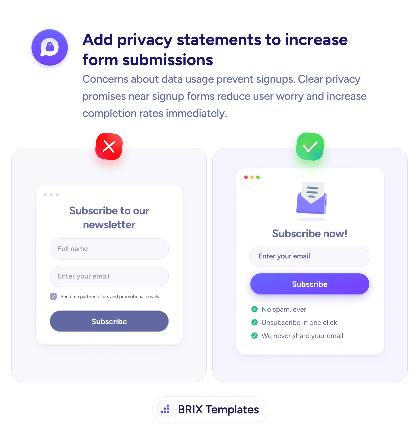
Data-usage worry quietly kills signups. Add short privacy promises next to the form — no spam, easy unsubscribe, never shared — to lift completions.

Forms & inputs
People hesitate to hand over an email when they can't tell what you'll do with it
Data-usage worry quietly kills signups. Add short privacy promises next to the form — no spam, easy unsubscribe, never shared — to lift completions.
A signup form that pairs a name and email with a pre-checked “send me partner offers” box asks the user to trust you while quietly signalling the opposite. The unspoken question at every signup — will I get spammed, will this be sold, can I leave easily? — goes unanswered, and an unanswered worry about data use is one of the most common reasons a form gets abandoned instead of submitted.
The fix is to answer that worry right where the user decides. A few short, specific promises beside the button — “No spam, ever,” “Unsubscribe in one click,” “We never share your email” — address the exact fears that cause hesitation. Concrete lines like these do the reassuring work that a vague “we respect your privacy” never does, and they turn a moment of doubt into a completed submission.
Keep the wording plain and human rather than legalistic — copy that reads like a contract raises suspicion instead of lowering it. Ask for as little as the form truly needs, since fewer fields already reduce the friction before the promise even lands. And drop the pre-checked opt-in: leave marketing boxes unchecked and let the honest privacy line, not an assumed consent, carry the trust.
Because the hesitation before a signup is usually a question the form hasn't answered: will I get spammed, will this be sold, can I get out easily? Concerns about data use are a quiet, common reason people close a form instead of completing it. A short, specific promise placed right at the point of decision answers that question before it becomes a reason to leave, so more people finish.
Name the specific worries and address them plainly: 'No spam, ever,' 'Unsubscribe in one click,' 'We never share your email.' Concrete promises beat a vague 'We respect your privacy,' which reassures no one. Keep it to a few short lines next to the submit button — this is microcopy that removes doubt, not a link to a policy page the user won't read.
Directly beside the form's action — under the email field or right below the submit button — where the user is deciding whether to commit. A privacy promise buried in the footer or hidden behind a 'Privacy Policy' link arrives too late and asks for effort. The reassurance has to be visible in the same glance as the button.
Yes. A pre-checked 'send me partner offers' box does the opposite of reassurance — it signals that consent is being assumed and that extra mail is coming. It also breaks consent rules in many regions. Leave marketing options unchecked, keep the required ask minimal, and let an honest privacy line carry the trust instead.