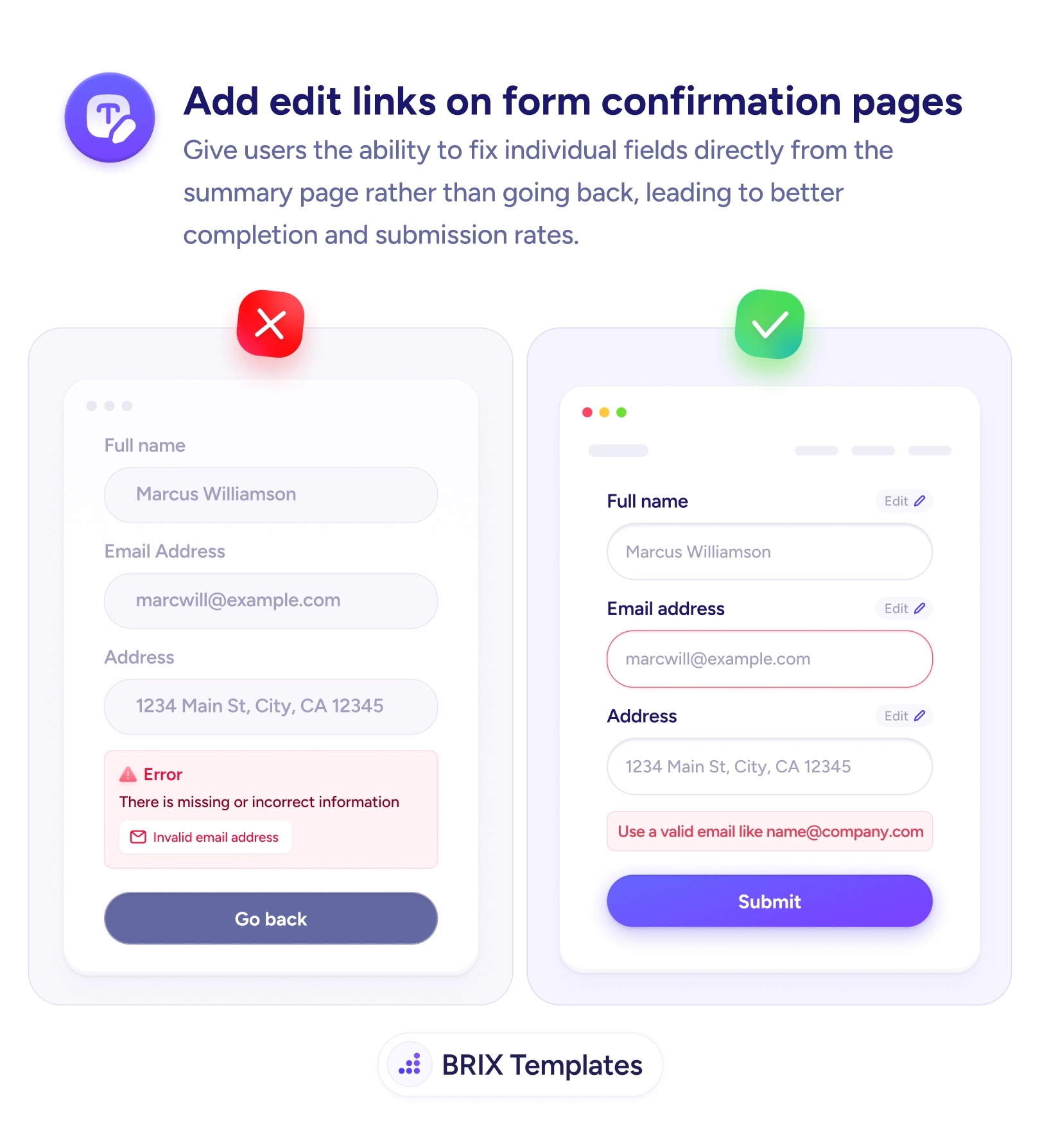
UX tip graphic titled 'Add edit links on form confirmation pages.' The left panel marked with a red X shows a review screen listing Full name, Email address, and Address as read-only text, with a red error box reading 'There is missing or incorrect information — Invalid email address' and only a single 'Go back' button. The right panel marked with a green checkmark shows the same summary where each field — Full name, Email address, Address — has its own small 'Edit' link with a pencil icon; the email field is highlighted in red with inline guidance 'Use a valid email like name@company.com' and a 'Submit' button below. BRIX Templates branding at the bottom.

Forms & inputs

Sending users 'back' to fix one field makes them re-navigate a form they thought they'd finished

A single 'Go back' button forces users to re-find one field. Add per-field edit links on the confirmation step so they fix and submit in place.

How to add edit links on form confirmation pages

A confirmation screen that lists a user’s answers as read-only text and offers a single “Go back” button turns a one-character fix into a chore. When the page flags an invalid email, the user doesn’t want to return to the whole form — they want to change that one field. Forcing them to re-navigate everything they’d already completed adds friction at the worst possible moment: the step right before submit, when they thought they were done.

The fix is to put an edit control next to every field on the summary. A small “Edit” link beside the name, the email, and the address lets the user act on the exact item that’s wrong. Pair it with an inline message that shows what a valid answer looks like — “Use a valid email like [email protected] — and the correction happens in place, without unwinding the rest of the form.

Start by catching what you can earlier, so fewer errors reach this screen at all: validate fields on blur instead of waiting for submit. For the errors that do surface here, write a message that names the field and shows a valid example right where the edit link sits. On a multi-step flow, the edit link should jump straight to the relevant step and focus the field — never drop the user back at the top.

  • Give every reviewed field its own edit link — the user fixes the exact item, not the whole form.
  • Edit in place when you can — reveal the field inline so nothing else on the summary moves.
  • Pair the link with a clear message that names the problem and shows a valid example.
  • Focus the field on arrival so a jump-to-step link lands the user ready to type.
  • Protect the last step — the confirmation screen is the final gate before submit; keep corrections effortless.

Frequently asked questions

Why is a single 'Go back' button a problem on a confirmation page?

Because it collapses a precise task into a vague one. The user knows exactly which field is wrong — the email — but 'Go back' returns them to the whole form, where they have to re-find that field, re-read the other answers, and rebuild the context they'd already let go of. On a long or multi-step form that can mean scrolling past a dozen correct fields to fix one character. Each of those extra steps is a fresh chance to abandon.

Where should the edit link actually go?

Next to the field it edits, on the summary or confirmation screen itself. Each reviewed value — name, email, address — gets its own small 'Edit' affordance so the user can act on the exact item that needs changing. Clicking it should reveal that field in place or scroll directly to it, pre-focused, rather than dumping the user back at the top of the form.

Should I let users edit inline or send them back to the field?

Inline editing is the smoother option when it's feasible — the field becomes editable right there in the summary, the user fixes it, and nothing else moves. If your form's structure makes that hard, the fallback is a link that jumps to the specific field and focuses it, so the user still lands on the one thing they meant to change instead of the whole form.

Does this matter if my form is short?

Less, but it still helps. On a three-field form 'Go back' is survivable. The value grows with length and stakes — checkout, multi-step signups, applications — where re-navigating to one field is real work and the confirmation screen is the last thing standing between the user and a completed submission. Making that final correction effortless protects the conversions you've already nearly earned.