Forms & inputs
A one-line reason beside a sensitive field turns reluctance into a filled-in answer
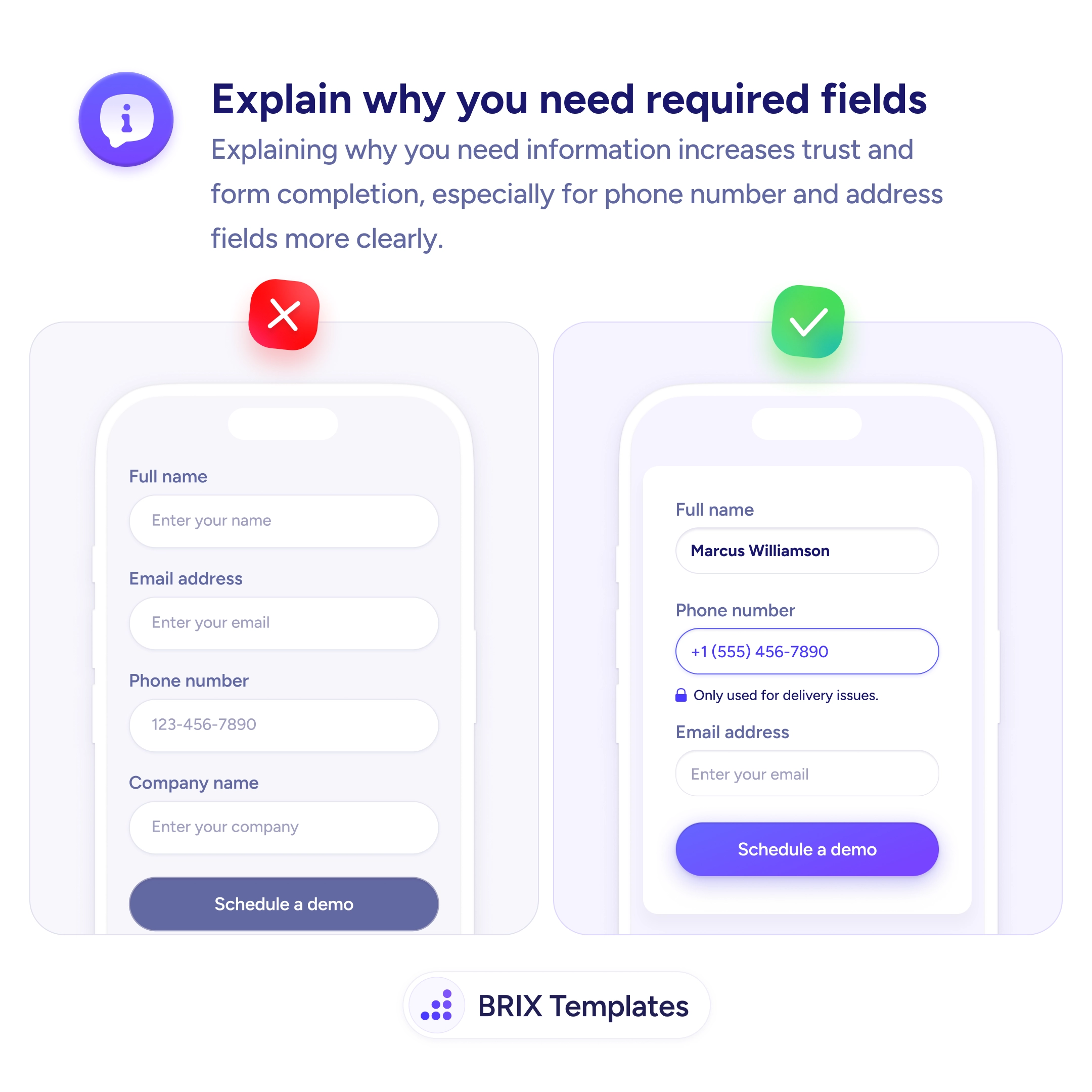
Users hesitate to share a phone number without a reason. Add a short line explaining why each sensitive field is needed to build trust and completion.

Forms & inputs
A one-line reason beside a sensitive field turns reluctance into a filled-in answer
Users hesitate to share a phone number without a reason. Add a short line explaining why each sensitive field is needed to build trust and completion.
A form that demands a phone number or a home address without a word of explanation invites suspicion. The user’s instinct is why do they need this — and what will they do with it? Faced with a required field that feels intrusive and unexplained, many people abandon the form, enter fake data, or stall at the field they’d rather not fill. The silence around the request is what creates the friction.
The fix is to give each sensitive field a short reason. A single line under the phone field — “Only used for delivery issues” — or beside an address — “So we can check availability in your area” — answers the unspoken question in the moment it’s asked. When the user understands the purpose, a request that felt like data harvesting becomes a reasonable, cooperative exchange.
Start by identifying the fields people balk at — phone, address, birth date, company — and writing a plain, specific justification for each. Keep it honest and narrow: name the actual use, not a vague “to serve you better,” and if you can’t justify a field, that’s a sign to cut it rather than explain it. Phrase the reason in plain, human language so it reassures rather than reads like a privacy clause.
The ones users find intrusive or surprising — phone number, physical address, date of birth, income, company details. Standard, expected fields like name and email rarely need justifying. A quick test: if a reasonable person would pause and think 'why do they want that?', add a one-line reason. If the need is self-evident, an explanation just adds clutter.
Directly beneath or beside the field it justifies, so the reason is read in the same glance as the request. A privacy statement buried at the bottom of the form, or on a separate page, arrives too late — the hesitation happens at the field. Inline microcopy answers the doubt exactly when it forms.
It would, which is why you only explain the sensitive ones. Most fields are self-explanatory and need nothing. Reserve the microcopy for the two or three requests that genuinely give users pause. Targeted reassurance reads as thoughtful; a note under every field reads as noise.
For sensitive fields it tends to — because the barrier there is distrust, not effort, and a credible reason lowers it. It also improves data quality, since users who understand why a field matters are less likely to enter fake values to get past it. It won't rescue a form that simply asks for too much; pair the explanation with cutting anything you can't justify.