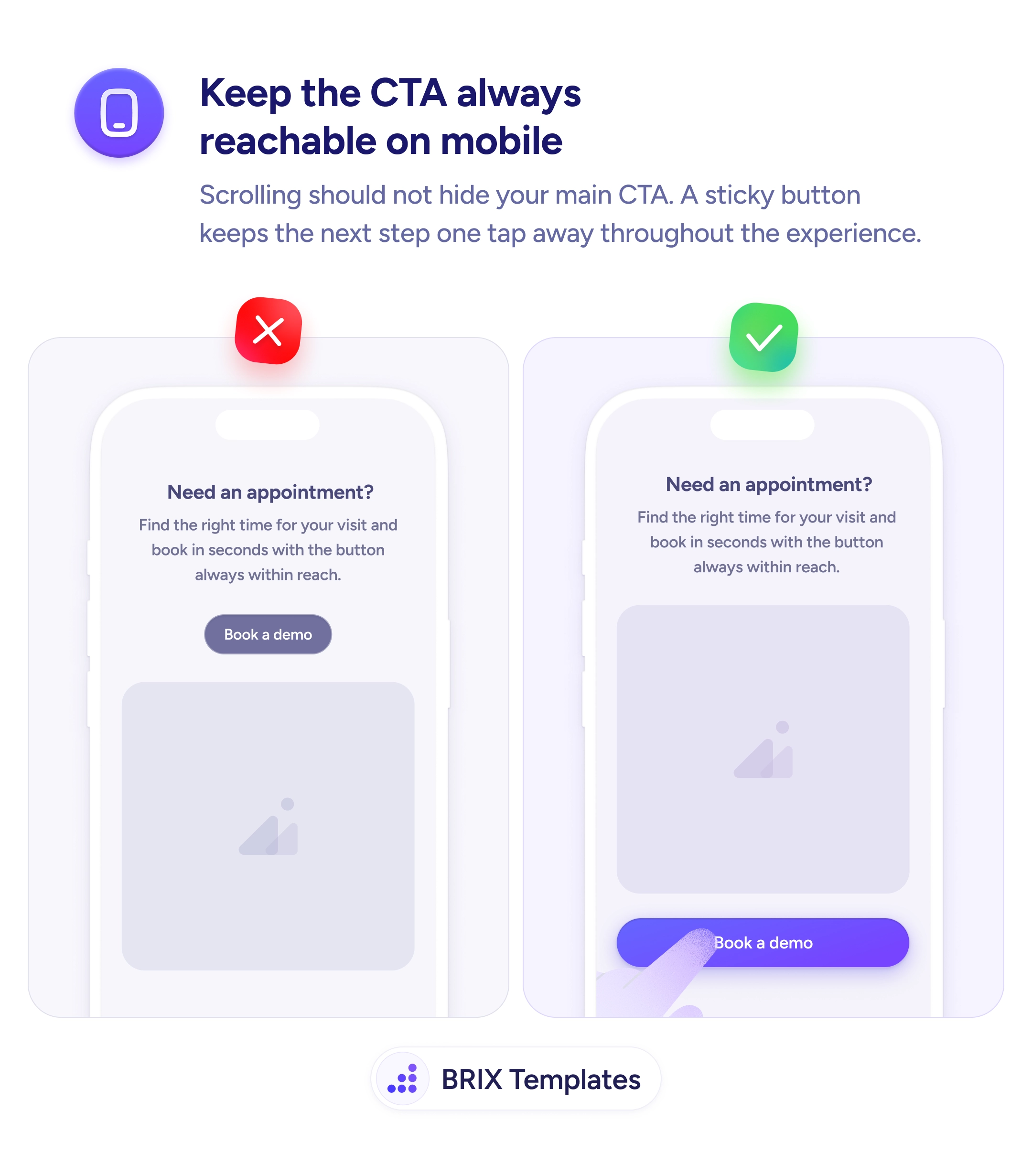
Actions & CTAs
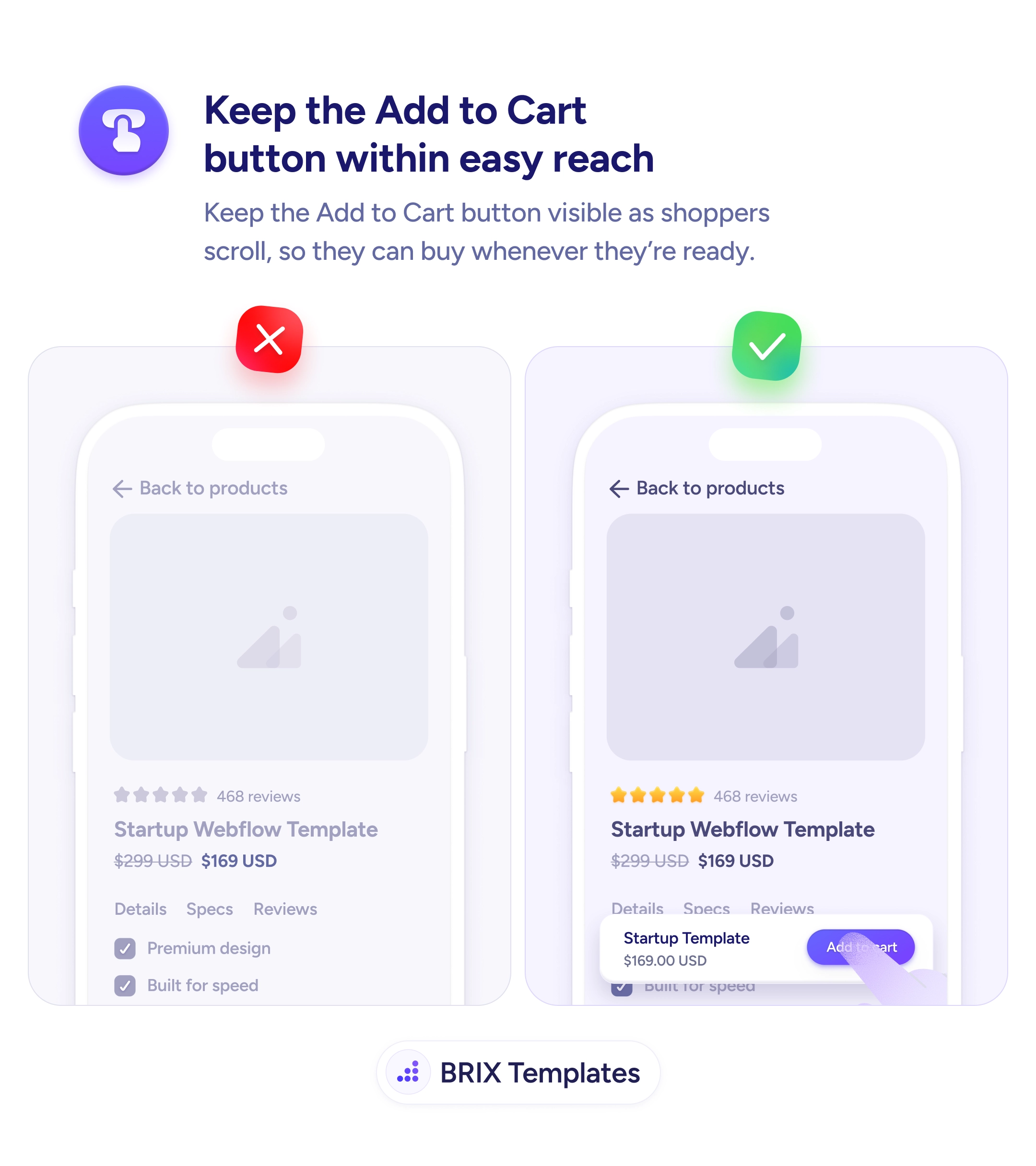
An Add to Cart button shoppers can't see is a sale they'll never close
Add to Cart buttons that scroll out of view miss buyers at their moment of intent. Use a sticky purchase bar so shoppers can buy the moment they decide.
Actions & CTAs
An Add to Cart button shoppers can't see is a sale they'll never close
Add to Cart buttons that scroll out of view miss buyers at their moment of intent. Use a sticky purchase bar so shoppers can buy the moment they decide.
When a product detail page has its Add to Cart button buried in the page flow, shoppers who scroll past it to read specs, reviews, or related products lose the action just as they’re forming their intent. By the time they decide to buy, the button is somewhere above the fold — and they have to scroll back to find it. Many users won’t bother. They’ll move on, get distracted, or close the tab without converting.
A more reliable pattern is to keep the Add to Cart button within reach at every scroll position using a sticky purchase bar. A compact bar pinned to the bottom of the viewport shows the product thumbnail, the current price, and the Add to Cart button — so the buying decision is always one tap away. The user can read every detail of the listing without losing access to the action that closes the sale.
Pin the purchase bar to the bottom of the viewport on mobile, where scrolling reveals less per screen and the original button disappears fastest. Include the price and a small product thumbnail so the bar carries enough context to act on without scrolling back. Make the button visually dominant — use the same primary color and contrast as the main Add to Cart so users recognize it immediately. Trigger it after the user scrolls past the main button if you want to keep the first viewport visually clean.
A sticky Add to Cart button can capture buyers who would otherwise lose access to the action while reading. When the purchase decision is always one tap away, shoppers typically convert more often — because nothing stands between intent and checkout.
Yes, when possible. A small product thumbnail and the current price next to the button keep context attached to the action — users don't have to scroll back up to confirm what they're buying. This is especially useful on long product pages.
Either show it immediately, or trigger it after the user scrolls past the main Add to Cart button. The 'reveal on scroll' pattern keeps the first viewport clean while ensuring the action is always reachable later. Test both with your audience.
It can help on long product pages, but it's less critical than on mobile. On desktop, the original Add to Cart button often stays visible within the hero area. On mobile, where scrolling reveals less per viewport, a sticky bar has higher impact.
Generally no — keep the bar minimal with just the price and the primary action. Variant selection (size, color) should happen on the main page; the sticky bar inherits whatever the user already chose. Cramming selectors into the bar makes it feel cluttered and reduces tap accuracy.