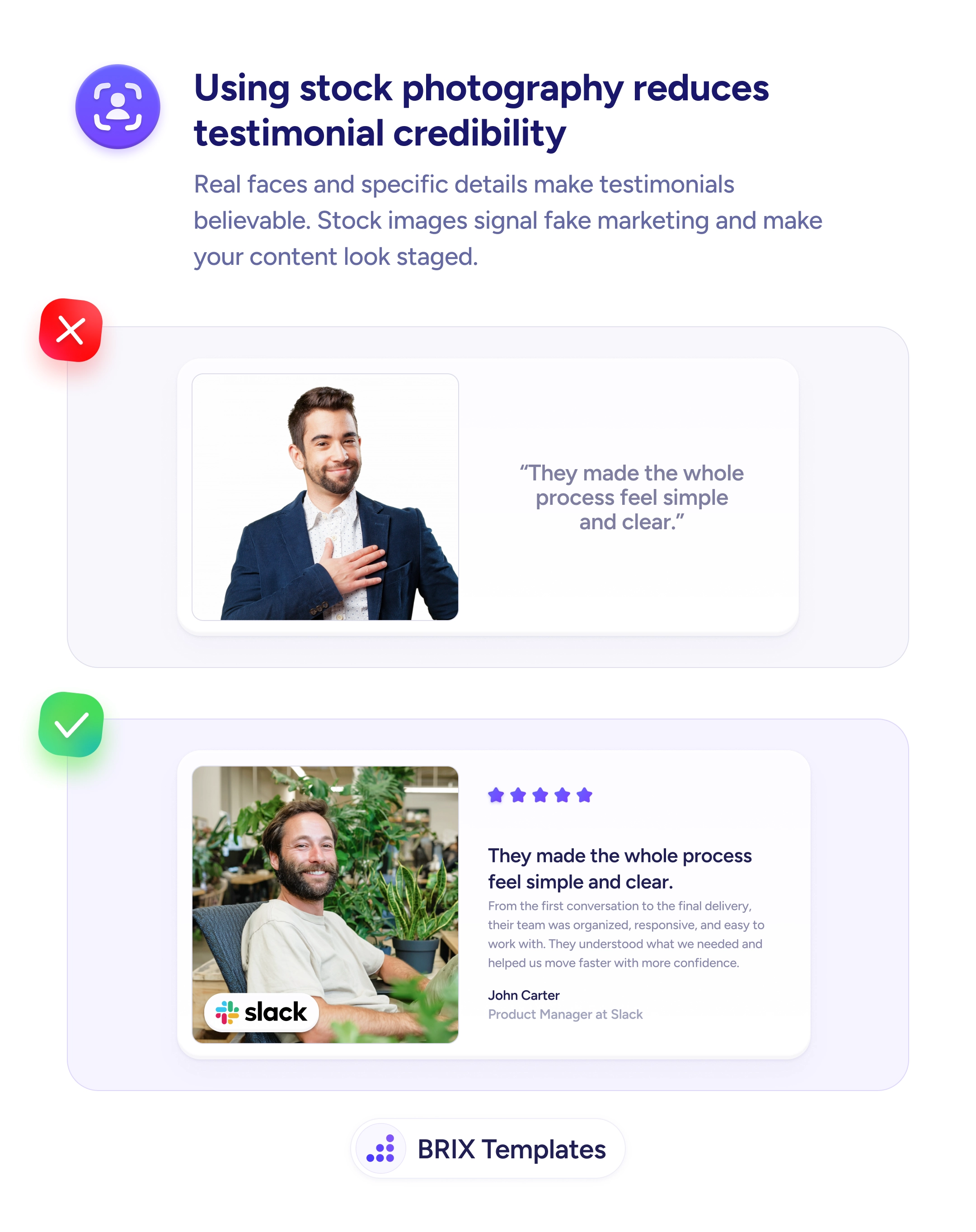
Help & onboarding
Visitors decide faster when they can see what your product looks like
Abstract hero illustrations look pretty but tell visitors nothing about your product. Use real screenshots so users instantly see what they'll get.
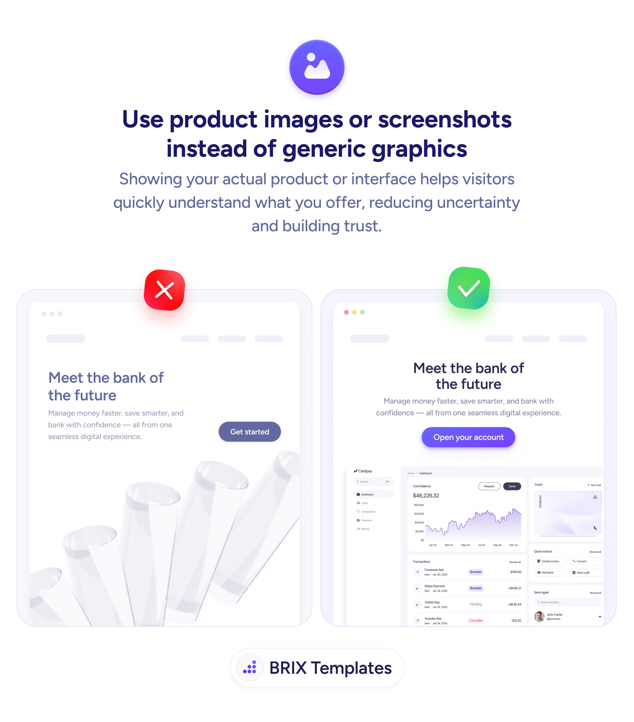
Help & onboarding
Visitors decide faster when they can see what your product looks like
Abstract hero illustrations look pretty but tell visitors nothing about your product. Use real screenshots so users instantly see what they'll get.
When a hero section uses an abstract illustration — floating shapes, gradient blobs, decorative 3D objects — visitors can’t tell what the product does just by looking. The visual is doing aesthetic work but no informational work, which means the headline and subhead carry the entire burden of explanation. In the few seconds most users spend on a hero, that’s a lot to ask of text alone.
A more effective approach is to show the actual product or interface in the hero visual. Product screenshots — a dashboard preview, a key UI screen, or a stylized device frame containing real content — turn the visual into proof. Visitors can see what they’ll be using and immediately recognize whether it matches what they need. The hero becomes a faster conversation: “this is what you get.”
Show the most representative screen — usually the screen users spend the most time on, not the marketing splash page. Use real-looking content (charts, names, dollar amounts) so the screenshot reads as the actual product, not a wireframe. Frame the screenshot with care — a subtle device mockup, a soft shadow, or a clean crop helps the UI feel polished without overshadowing it. Pair the screenshot with a specific headline so the visual and copy reinforce each other.
A hero that shows the product can answer “what does this do?” in a glance. When the visual itself communicates the offering, visitors typically reach a yes/no decision faster — and the ones who say yes have already seen what they’re signing up for.
The screen that best demonstrates the product's primary value — usually the main working state (dashboard, editor, completed flow). Avoid empty states or login screens that don't show the product doing its job.
Either works. A static screenshot loads faster and communicates instantly; a short looping video can show interaction but adds weight. Start with a static image and test video if the interaction is hard to convey otherwise.
Optional. A subtle frame (browser chrome, phone outline) helps the screenshot read as a real product, but heavy 3D mockups can overshadow the UI. Match the frame style to the rest of your design.
Show the artifact the user creates instead — a generated report, an exported file, a dashboard view. If the product produces value through its output, the output is the right thing to feature.