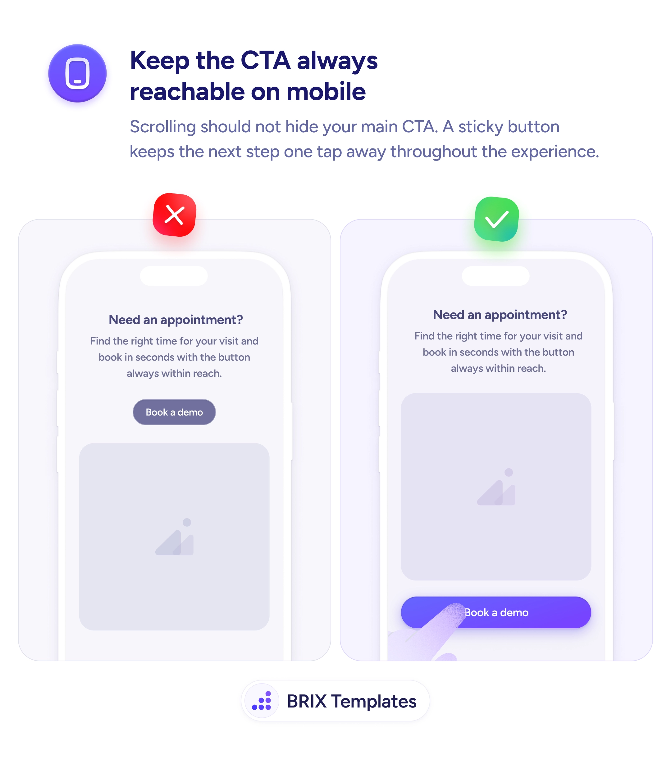
Readability
Every pinned element you add steals room from the thing the user came to read
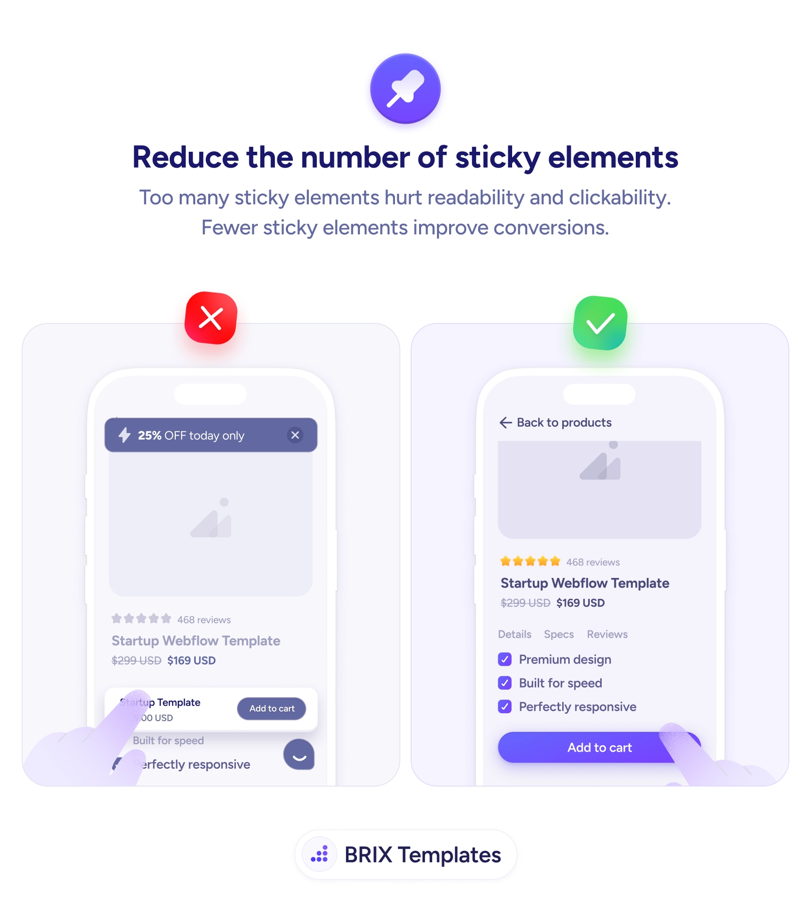
Stacked sticky bars, banners, and widgets crowd the mobile screen and hurt clicks. Keep one persistent element and let the content breathe.
Readability
Every pinned element you add steals room from the thing the user came to read
Stacked sticky bars, banners, and widgets crowd the mobile screen and hurt clicks. Keep one persistent element and let the content breathe.
Sticky elements arrive one reasonable decision at a time. A promo bar to push the sale, a chat widget for support, a sticky add-to-cart so the button is always there — each feels justified on its own. But on a phone they stack, and together they pin the screen from both ends until the actual product details are squeezed into a thin strip in the middle. The user came for the content and instead gets a viewport mostly occupied by things they didn’t ask to see, which hurts both readability and clickability at once.
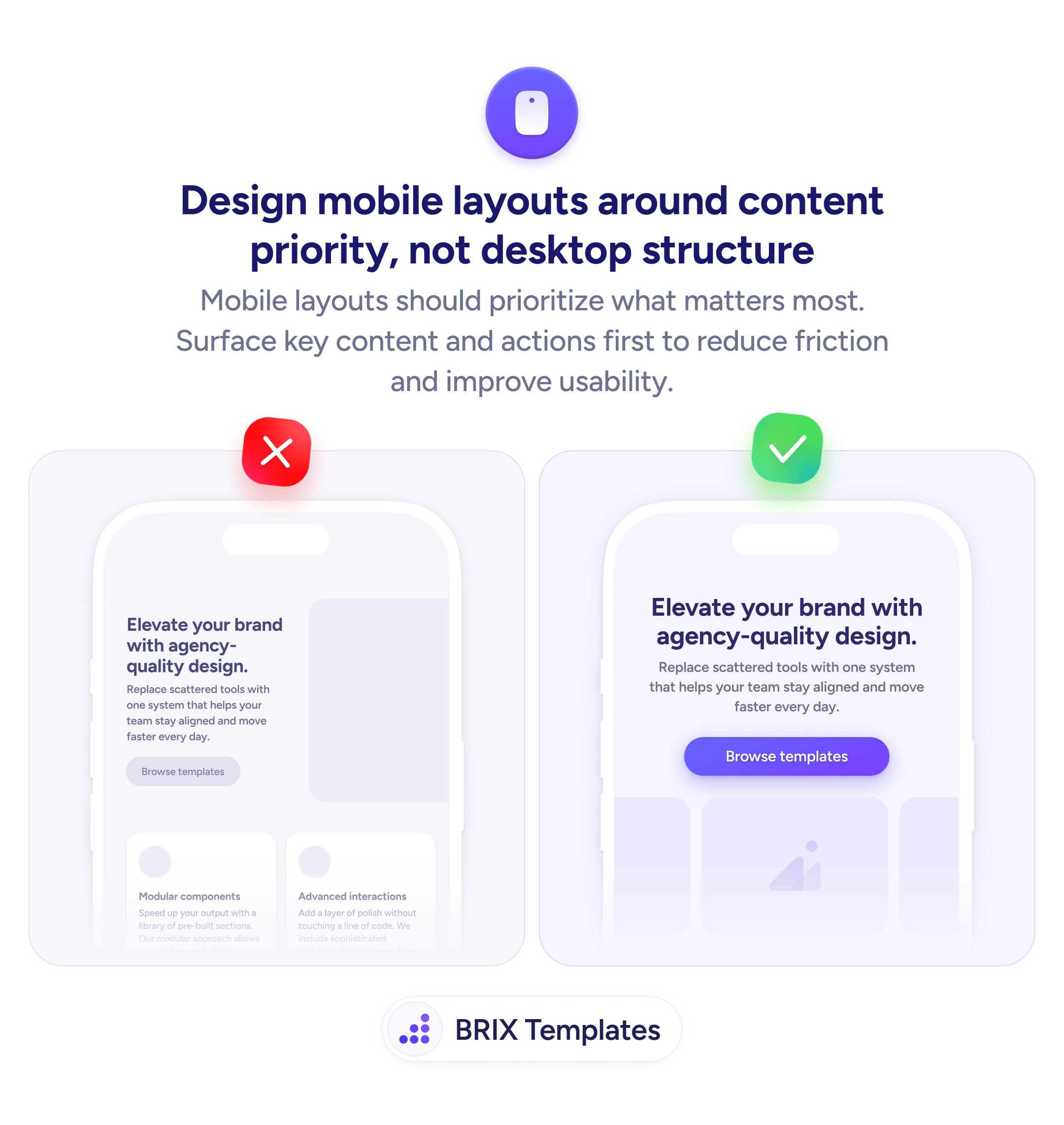
The fix is to keep one persistent element and let everything else go. Decide which single sticky item maps to the user’s main goal — usually the primary CTA — and clear the rest so the content can breathe. This is really a content-priority decision about the mobile layout: permanent screen space is the scarcest resource you have, and most of what’s competing for it doesn’t deserve to be there the whole session.
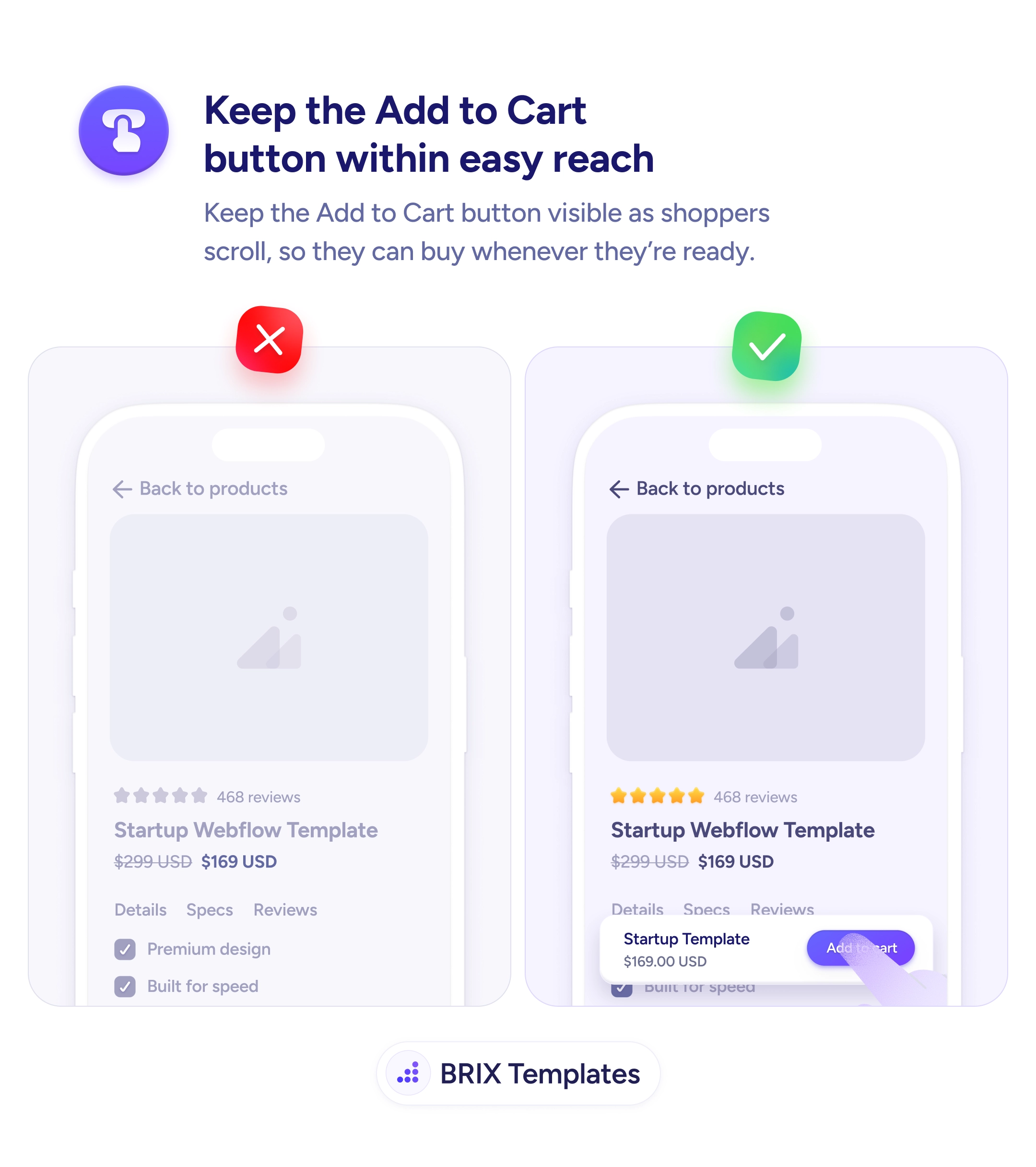
Start by auditing everything pinned to the screen and asking of each: does this need to be visible at all times, or just available? Promos can sit inline or in a dismissible banner that scrolls away; chat can live behind a single small launcher; secondary nav can scroll with the page. Keep the one element that earns it — often the Add to Cart button that stays visible — and remove the rest, the same way you’d cut intrusive popups that crowd out content.
A focused screen converts better than a crowded one. Reserve permanent space for the single element the user actually needs there, send everything else back into the flow, and the content — and the one CTA that matters — finally has room to do its job.
No — a single well-chosen sticky element, like a primary CTA or a compact header, is genuinely useful. The problem is accumulation. Each pinned bar, banner, chat bubble, and cookie notice individually seems reasonable, but stacked together they eat the viewport and bury the content. The fix isn't zero sticky elements; it's deciding which one earns the space and removing the rest.
Keep the one that maps to the user's main goal on that screen. On a product page that's usually the buy button; on a long article it might be a slim progress or nav bar. Everything else — promos, chat, app-install prompts — should either scroll with the page or appear contextually rather than occupying permanent real estate.
They shrink the readable area, so users see less content per scroll and have to work harder to follow anything. They also crowd the tap zones, making accidental taps on the wrong control more likely. The combined effect is lower readability and lower clickability — people both understand less and convert less, which is the opposite of what each individual bar was meant to do.
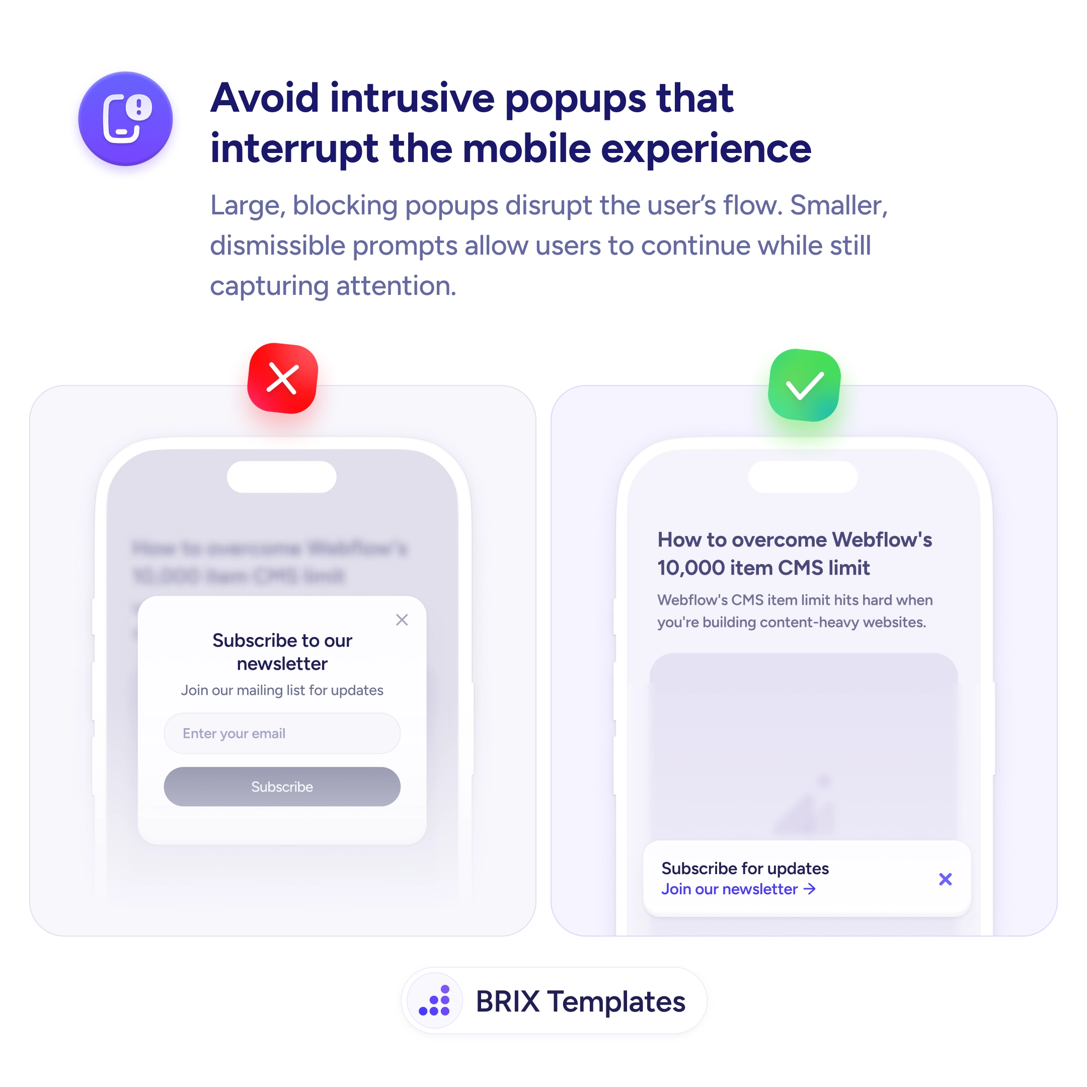
Yes. Place a promo inline near the top of the content or in a dismissible banner that scrolls away, rather than pinning it permanently. The message still gets seen on arrival, but it stops competing for space through the entire session. Reserve permanent stickiness for the single element tied to the primary action.