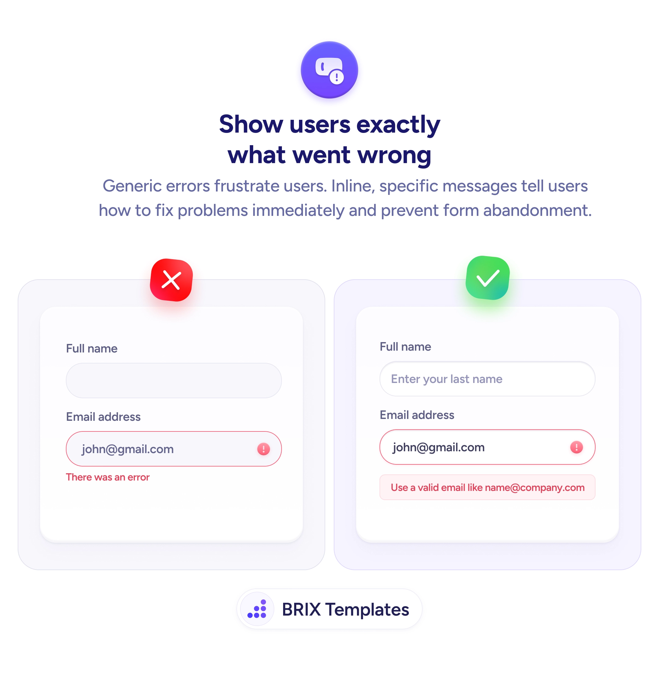
Status & feedback
A button that doesn't react to taps gets tapped again — and again
Buttons that don't show progress invite repeat taps and duplicate submissions. Use loading and success states so users see their action was received.
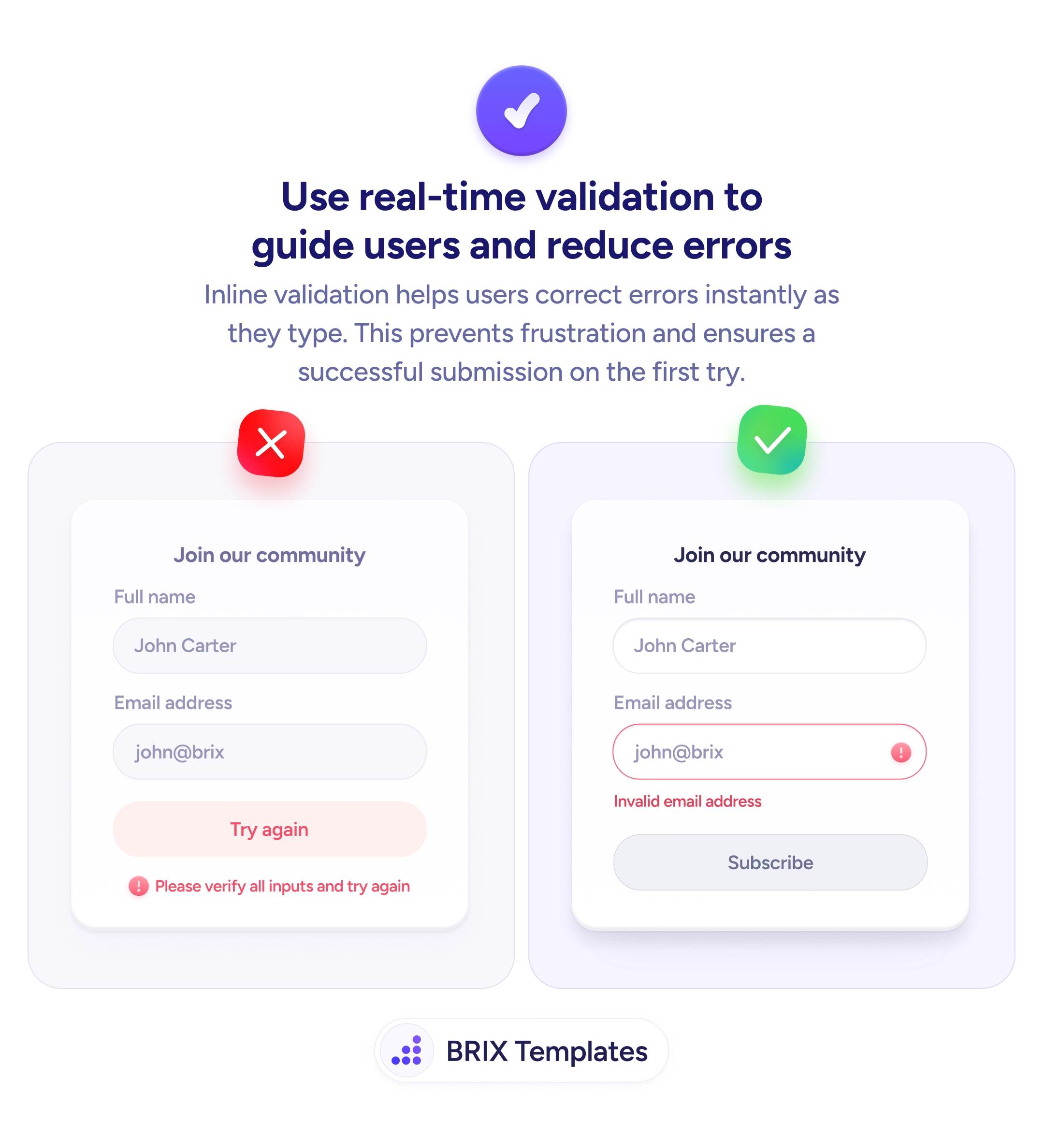
Status & feedback
A button that doesn't react to taps gets tapped again — and again
Buttons that don't show progress invite repeat taps and duplicate submissions. Use loading and success states so users see their action was received.
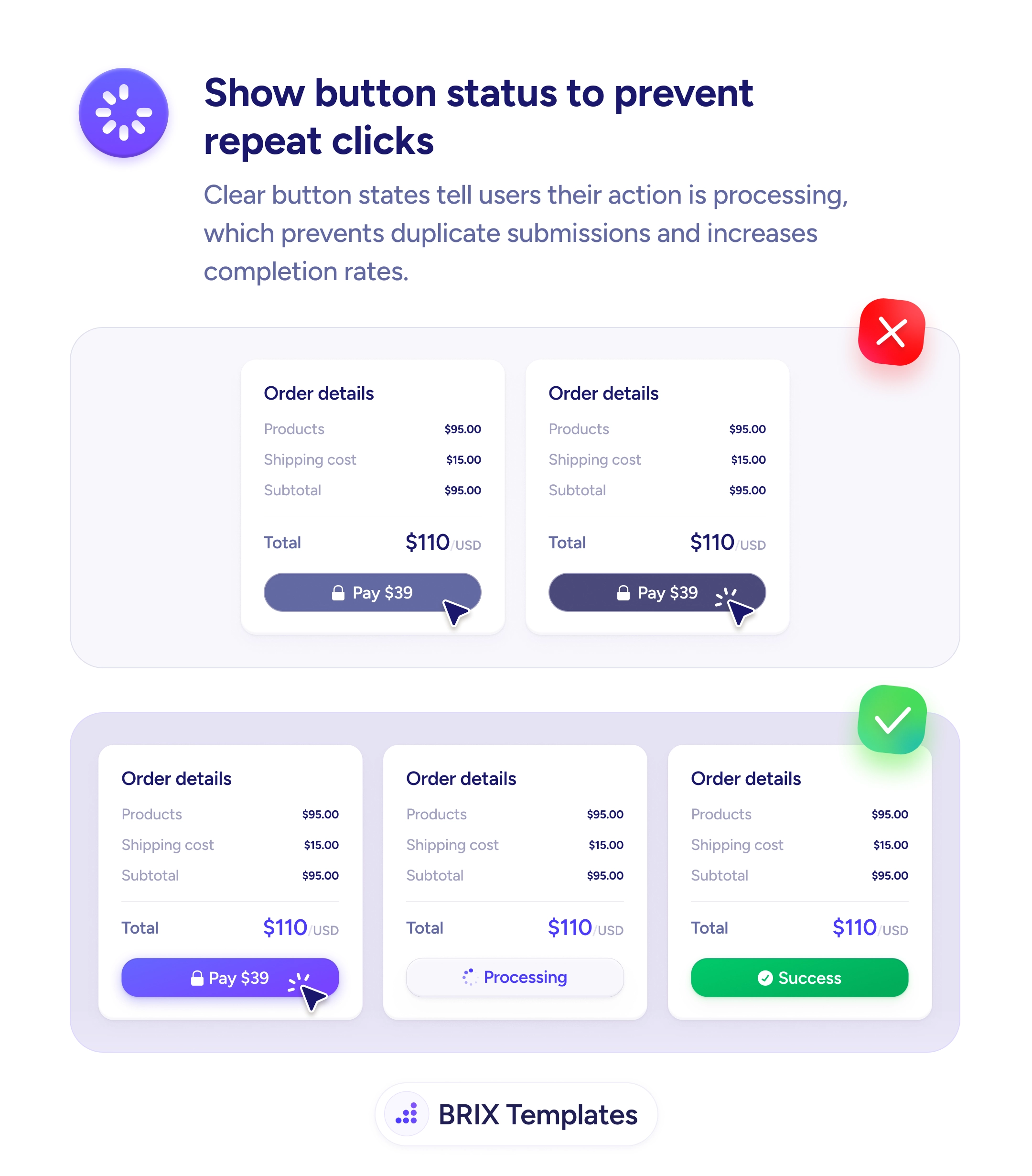
When a submit button gives no visual feedback after a tap — same color, same label, same shape — users genuinely can’t tell whether their action was received. Their natural response is to tap again, sometimes several times, which can produce duplicate submissions, double charges, or repeated form posts. Even when the backend dedupes the requests, the user experience is one of uncertainty: “Did that work? Should I try again?” That doubt frequently turns into support tickets, refund requests, or abandoned attempts.
A more reliable pattern is to transition the button through clear visual states that mirror the underlying action. The default state shows “Pay $39”; the moment the user taps, the button enters a loading state — disabled, with a spinner and a label like “Processing” — and finally resolves into a success state with a checkmark and a confirmation color. The user sees the action’s progress as it happens, so the question “did it go through?” never needs to be asked.
Disable the button as soon as it’s tapped so it can’t fire a second request, and pair the disabled state with an obvious visual change. Show a spinner inside the button during processing — the loading indicator should travel with the action, not float somewhere else on the page. Resolve into an explicit success state for high-stakes actions (payments, account changes) instead of relying on a page redirect alone. Use a different color for the success state — typically green — so the outcome registers at a glance.
Button loading and success states can prevent the duplicate-submission problem and remove the doubt that follows every tap of a high-stakes CTA. When the button clearly shows that an action was received, processed, and completed, users typically stop second-guessing the interaction — because the page is already answering the question they were about to ask.
At minimum: default (idle and tappable), loading (disabled with a spinner or label like 'Processing'), and success or error (a final visual confirming the outcome). For payment and high-stakes actions, an explicit success state is essential — users need to see that something completed, not just that the page changed.
Yes. A disabled state prevents the duplicate-submission problem at the UI layer and pairs with a server-side idempotency check for safety. Make sure the disabled state is visually distinct (lower opacity, no hover) so users see why nothing happens when they tap again.
As long as the action is actually processing. If the request resolves in under 100ms, the spinner can flash and feel buggy — consider showing the success state directly. If it takes more than two or three seconds, show progress text ('Processing payment…') so users understand the delay isn't a hang.
Use it carefully. Optimistic states work well for low-stakes actions like favoriting, liking, or saving a draft. For payments, account creation, or anything users would notice if it silently failed, wait for the server confirmation before showing the success state. The cost of a false success is much higher than the cost of a half-second wait.