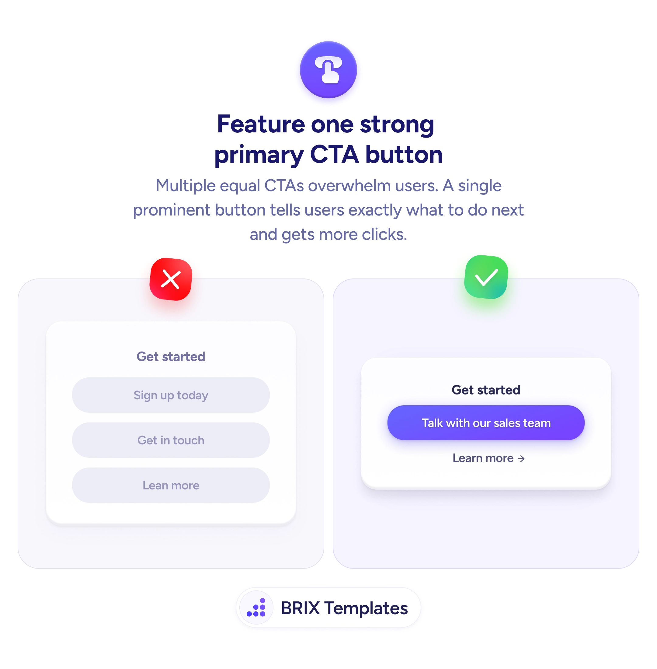
Actions & CTAs
Not every visitor is ready for your main ask — give them a smaller first step
A single high-commitment CTA loses visitors who aren't ready. Offer a secondary option that reduces friction and keeps curious users engaged.
Actions & CTAs
Not every visitor is ready for your main ask — give them a smaller first step
A single high-commitment CTA loses visitors who aren't ready. Offer a secondary option that reduces friction and keeps curious users engaged.
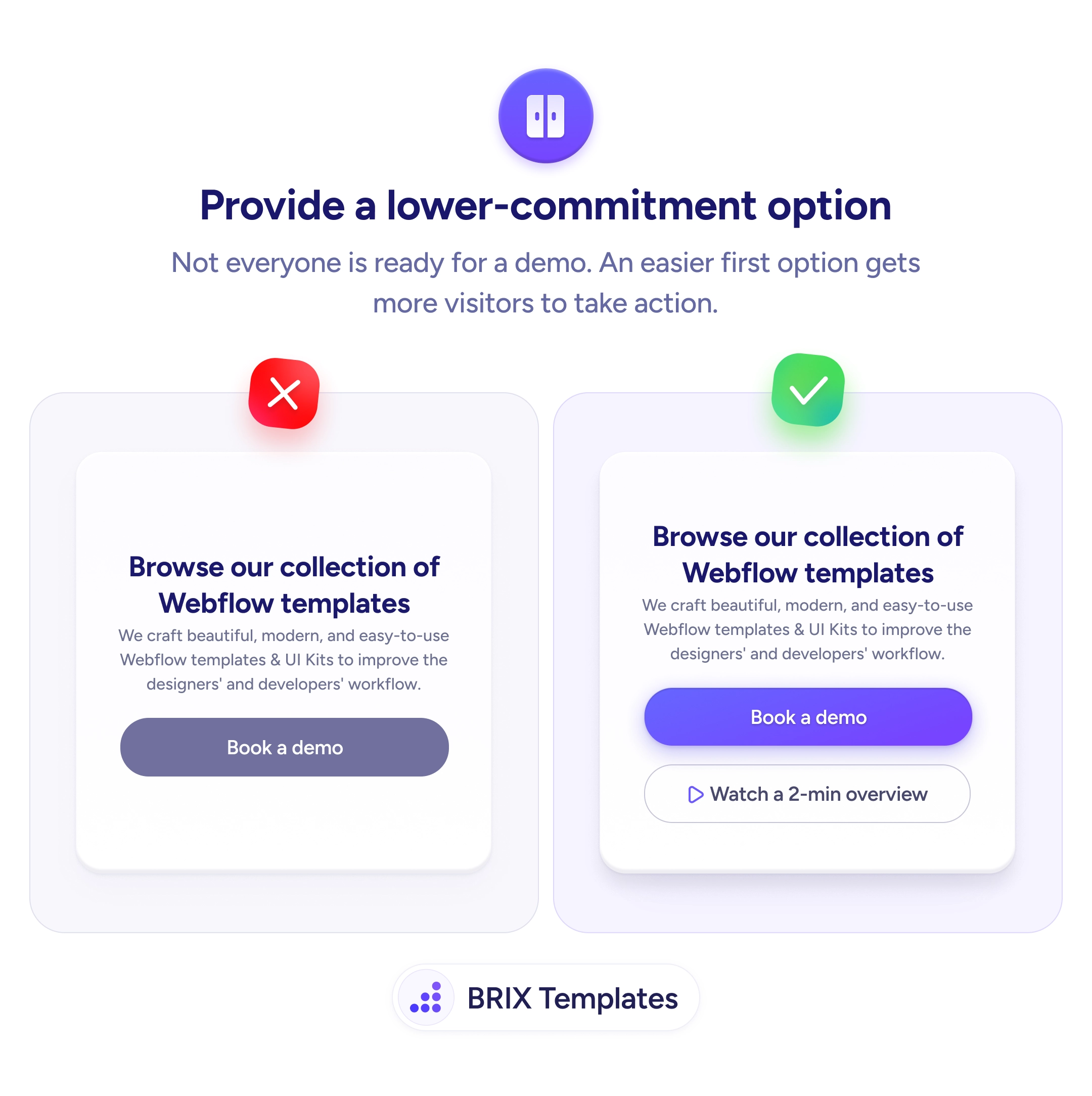
When a page only offers a high-commitment CTA like “Book a demo” or “Start free trial,” visitors who aren’t ready for that level of commitment have no path forward. They either click something they’re not ready for — and drop off — or leave the page entirely. The CTA meant to convert becomes a filter that rejects everyone who isn’t immediately qualified.
A stronger approach is to add a lower-commitment option alongside the primary CTA. Secondary actions like “Watch a 2-min overview,” “See how it works,” or “Download the guide” give cautious visitors a way to engage without committing. The primary CTA still serves ready buyers, while the secondary option captures visitors who need more information before deciding.
Identify what visitors need before they’re ready for the main action. For a “Book a demo” button, that’s often a product video, a pricing summary, or a feature walkthrough. Keep the visual hierarchy clear — the primary CTA stays the most prominent filled button, and the secondary action uses an outline or text link treatment. Label the secondary option to set expectations — “2-min overview” communicates time investment, which reduces hesitation.
Offering a lower-commitment option can capture visitors who would otherwise bounce without engaging. Users who take the easier first step often return later ready for the primary action — because they’ve already invested enough attention to see the value.
Most visitors aren't ready to book a demo on their first visit. A single high-commitment CTA filters out anyone in the awareness or consideration stage — which is a significant portion of traffic. A lower-commitment option captures those users for follow-up nurturing.
Usually not — the primary CTA still serves users ready to commit. The secondary option captures users who would have bounced, so total engagement typically goes up. Test it to confirm with your audience.
A short product video or interactive demo works well. It demonstrates value in minutes, doesn't require scheduling, and often warms users up for the demo request. Content downloads also work but require an email gate that adds friction.
Track them as micro-conversions. They're not the primary goal, but they indicate engagement and often precede higher-commitment actions. Use them to segment users for retargeting or follow-up campaigns.