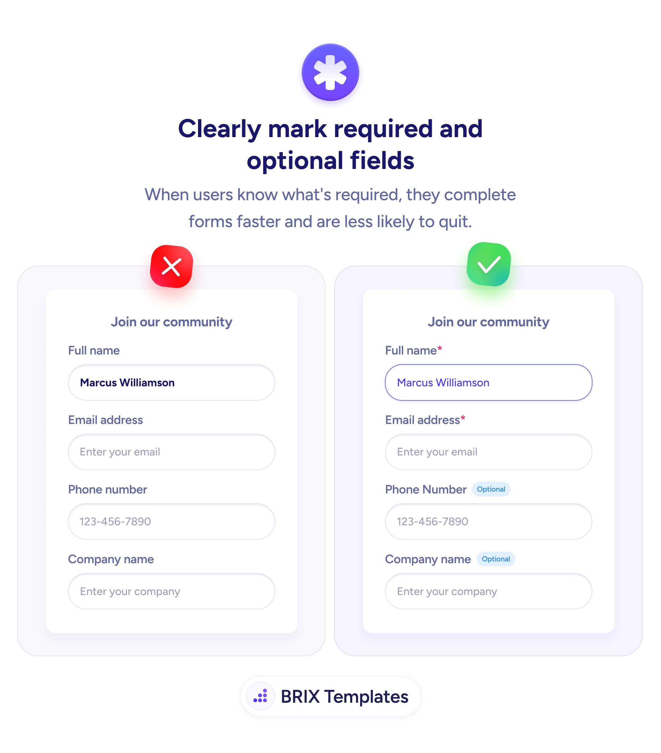
UX tip graphic titled 'Clearly mark required and optional fields.' Both panels show a 'Join our community' signup form with four stacked fields: Full name, Email address, Phone number, and Company name. The left panel marked with a red X leaves every field unmarked, so all four look equally mandatory. The right panel marked with a green checkmark adds a red asterisk to the required fields (Full name*, Email address*) and a small blue 'Optional' badge next to the non-essential fields (Phone Number, Company name), so users can tell at a glance what they must fill in. BRIX Templates branding at the bottom.

Forms & inputs

When users can see what's required, they fill the form in instead of second-guessing it

Unmarked form fields make every input feel mandatory. Mark required fields with an asterisk and tag the rest 'Optional' so users complete forms faster.

How to clearly mark required and optional fields

A signup form where nothing is marked quietly forces the visitor to treat every field as mandatory. Faced with a phone number and a company name they’d rather not hand over, they stall — is this required, or can I skip it? — and some abandon the form rather than share information they weren’t sure they needed to. The ambiguity itself is the friction, before a single character is typed.

The fix is to label the status of every field explicitly. A small asterisk (or the word “Required”) on the fields you truly need, and a quiet “Optional” tag on the rest, turns a wall of unknowns into a clear, skimmable contract. The visitor sees at a glance what the form actually costs them and moves through it without weighing each line.

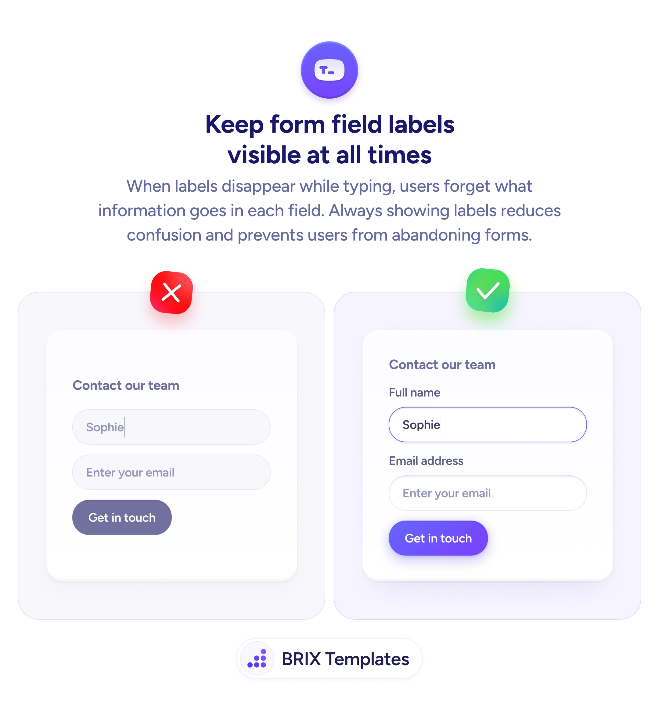
Start by cutting the required set to what you genuinely need — the shortest required list is the easiest to finish, which is why every field you ask for is a hurdle worth questioning. Then mark status consistently: choose one convention and apply it to every field so the pattern is learnable at a glance. Keep the labels visible above each input rather than hiding cues in placeholder text, the same durability behind labels that stay put while users type.

  • Mark required fields with one clear cue — an asterisk or the word “Required,” used everywhere.
  • Tag the rest as “Optional” so skippable fields read as a choice, not an obligation.
  • Keep the required set short — fewer required fields means less to weigh and fewer drop-offs.
  • Apply the convention consistently across the whole form so the pattern is learnable.
  • Pair the marking with visible labels so status and purpose are both obvious before typing.

Frequently asked questions

Should I mark required or optional fields — or both?

Mark whichever set is smaller so the form stays uncluttered, but never leave status ambiguous. If most fields are required, tag the few optional ones and note that unmarked fields are required. If most are optional, asterisk the required ones. The goal is that a visitor never has to guess about any single field.

Is the asterisk enough on its own?

An asterisk is a widely understood convention, but pair it with a plain-text legend ('* Required') near the form so it's unambiguous — especially for first-time or less technical users. Relying on the symbol alone leaves some people guessing. Screen-reader users also need the required state exposed in the field's markup, not just a visual star.

Why not just make every field required?

Because every extra required field is a reason to abandon. Fields users consider intrusive — phone number, company, birthday — cause the most hesitation. Making them optional, or cutting them, removes that friction while still letting willing users share the detail. Reserve 'required' for information you genuinely cannot proceed without.

Where should the required or optional indicator sit?

Next to the label, so status is read in the same moment as the field name — 'Email address *' or 'Phone number (Optional)'. Putting the cue far from the label, or only inside a tooltip, breaks the connection. The status should be part of the same glance that identifies the field.