Checkout & payments
Hidden size guides push shoppers to other tabs — and often other stores
Buried size guides increase returns and abandoned carts. Place a Size guide link right next to size options so shoppers check fit without leaving the page.
Checkout & payments
Hidden size guides push shoppers to other tabs — and often other stores
Buried size guides increase returns and abandoned carts. Place a Size guide link right next to size options so shoppers check fit without leaving the page.
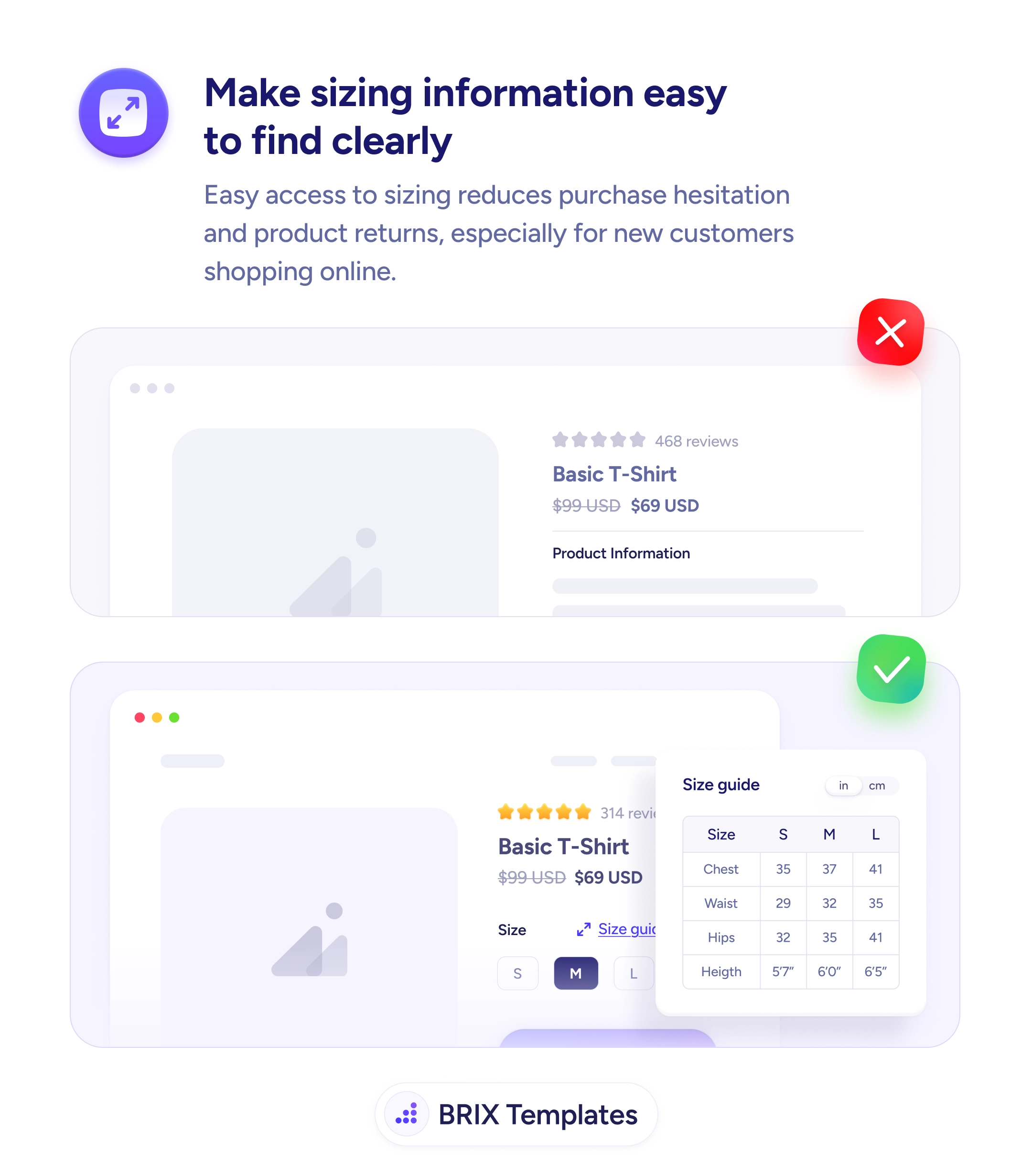
When a product page hides its size guide behind a small footer link, a separate tab, or a generic “Sizing” page elsewhere in the site, shoppers have to leave the listing to figure out whether the item will actually fit. Many of them tab out to check the brand’s sizing chart elsewhere, compare with a competitor’s chart, or close the page entirely. Even the ones who come back have often lost their place — and the doubt seeded during that detour can be enough to abandon the cart.
A more reliable pattern is to place a “Size guide” link directly next to the size selector, opening an inline popover or modal with the measurement table for that exact product. The shopper sees the size buttons, taps the link, and reviews the chart in the same visual block — without leaving the page. A small unit toggle (in/cm) lets buyers measure in their preferred system. The fit question gets answered where it was asked.
Place the size guide link in the same row as the size selector so it’s visible at the moment the user is choosing. Open the guide inline, not on a separate page, so the listing context stays intact. Make the table specific to the product — a tailored chart reads faster than a sprawling site-wide one. Include a unit toggle, defaulting to the visitor’s likely preference based on location but easy to switch. Use clear labels (Chest, Waist, Hips, Height) so buyers know exactly what to measure on themselves.
Easily accessible size guides can prevent the doubt that drives both returns and abandoned carts. When fit information sits where the size decision is being made, buyers typically commit with more confidence — because the question of “will it fit?” gets answered before it becomes a reason to leave.
Prefer an in-page popover or modal that opens next to the size selector. Sending users to a separate page breaks the flow and often loses them. The size guide should feel like a glance, not a navigation event.
Directly next to the size selector — in the same row, in the same visual block. Users look for sizing help at the moment they're choosing a size, not at the top of the page. Placing the link anywhere else forces them to hunt for it.
Yes, with a clear unit toggle. Many shoppers default to one system but verify in the other. Showing both — or offering a fast toggle — removes the conversion step that often sends buyers off-site to a unit converter.
Then show only the relevant table inline. A generic site-wide guide that lists every category is harder to scan than a focused one. The best size guides answer the buyer's question for this product, not every product the store sells.