Help & onboarding
Doubt forms in the first scroll — answer it before it sets in
Visitors decide whether to keep reading in seconds. Surface proof — metrics, ratings, counts — high on the page so credibility lands before doubt does.
Help & onboarding
Doubt forms in the first scroll — answer it before it sets in
Visitors decide whether to keep reading in seconds. Surface proof — metrics, ratings, counts — high on the page so credibility lands before doubt does.
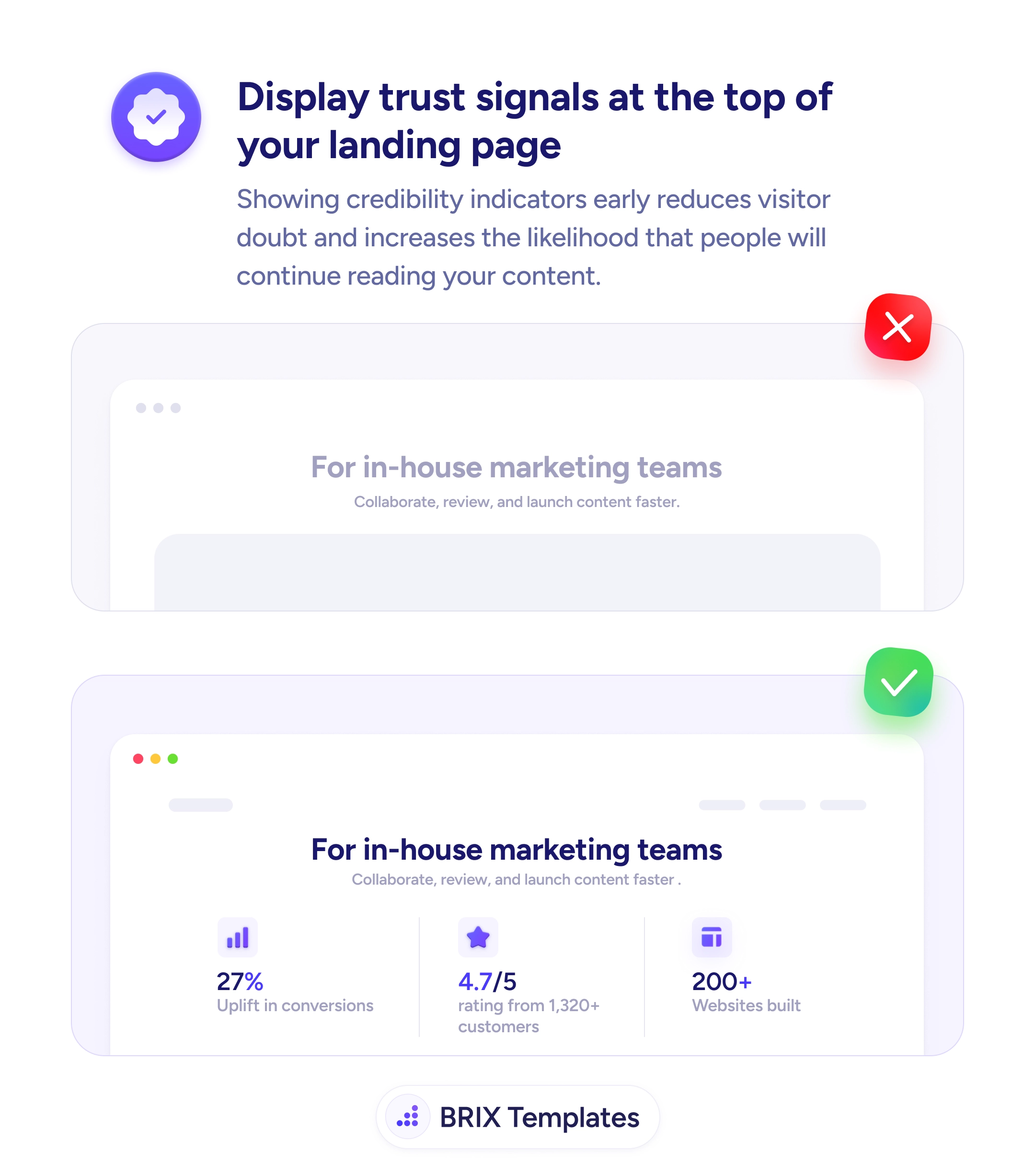
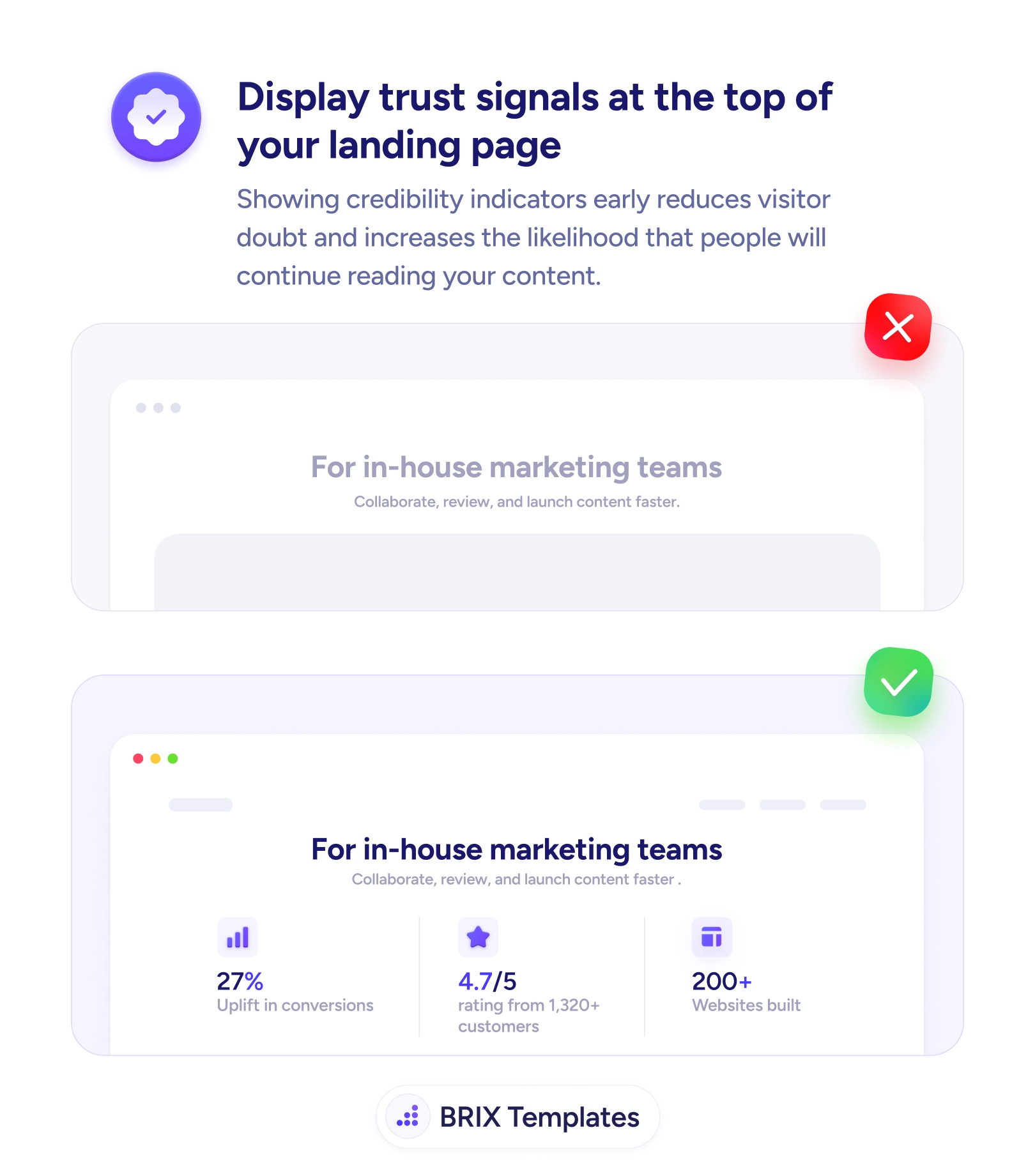
When a landing page opens with a headline and nothing to back it, the visitor’s first reaction is usually quiet skepticism. They’ve seen the same promises on a dozen other sites, and without any evidence in view they start scrolling to judge for themselves — or they leave. The problem isn’t the claim; it’s that the proof arrives too late. By the time a stats section or testimonial block appears halfway down the page, doubt has already shaped how the visitor reads everything above it.
A stronger pattern is to put credibility in the first scroll, right under the value proposition. A compact row of specific signals — “27% uplift in conversions”, “4.7/5 from 1,320+ customers”, “200+ websites built” — answers the unspoken “can I trust this?” before it hardens into a reason to bounce. The headline still leads, but now it arrives with receipts attached. This pairs naturally with the work of adding credibility stats to your hero section, where the numbers themselves do the early persuading.
Start by identifying the single most convincing piece of proof you have, then place it where it’s visible without scrolling. Add one or two supporting signals beside it, keep them quieter than the headline, and make sure each one is real enough to stand behind with a verifiable source. Resist the urge to crowd the top with every badge you own — a focused strip reads as confidence, a wall of logos reads as noise.
A page earns attention faster when the evidence shows up before the doubt does. Visitors who see credible proof in the opening scroll read the rest of the page as confirmation rather than scrutiny, which usually means more of them reach the CTA still believing the promise.
Lead with the proof your specific audience cares about most: a conversion or outcome metric, an aggregate rating with a real review count, customer or logo counts, or a recognizable client name. One or two strong, specific signals beat a crowded row of weak badges, because a single verifiable number is easier to absorb in the first scroll.
It only clutters if the signals compete with the headline. Keep the value proposition as the largest element and place the trust row as a quieter supporting line beneath it. The goal is a glance-able strip of evidence, not a second headline fighting for attention.
Use the proof you do have honestly — a strong rating, named customers, years in business, or a concrete result from one case study. A modest but specific number reads as more credible than an inflated claim, and an honest signal early still beats no signal at all.
On mobile, 'the top' is the first viewport — what shows before any scroll. Reserve that space for the headline and one compact proof element, then let the fuller trust row appear just below. Don't push all credibility cues past the fold where most visitors never reach them.