Help & onboarding
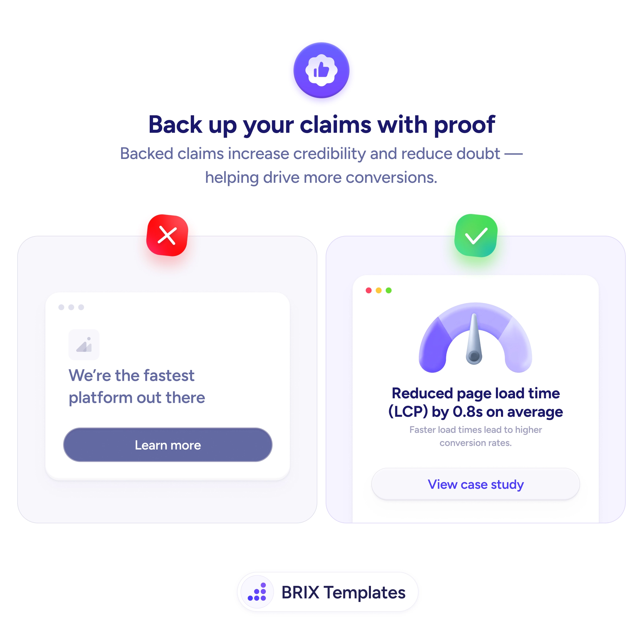
A claim without proof is a claim users decide to doubt
Bold claims read like marketing. Pair every promise with a measurable result and a verifiable source so users feel confident clicking.
Help & onboarding
A claim without proof is a claim users decide to doubt
Bold claims read like marketing. Pair every promise with a measurable result and a verifiable source so users feel confident clicking.
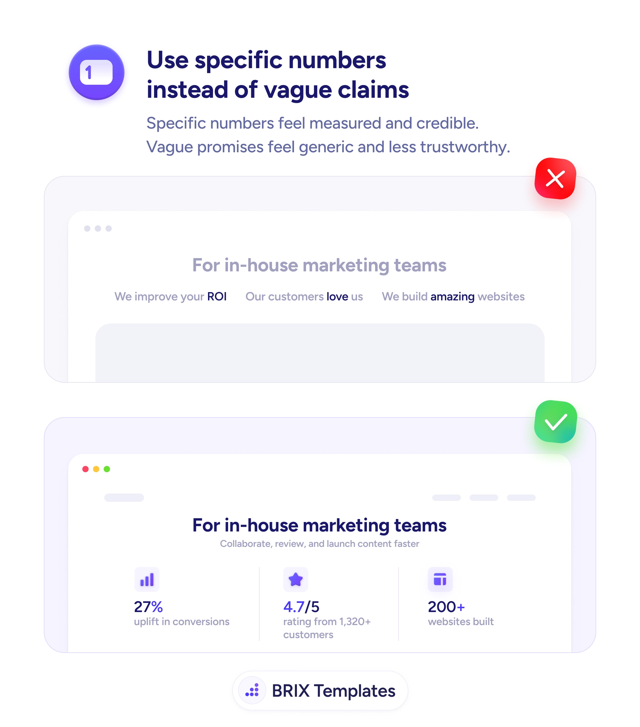
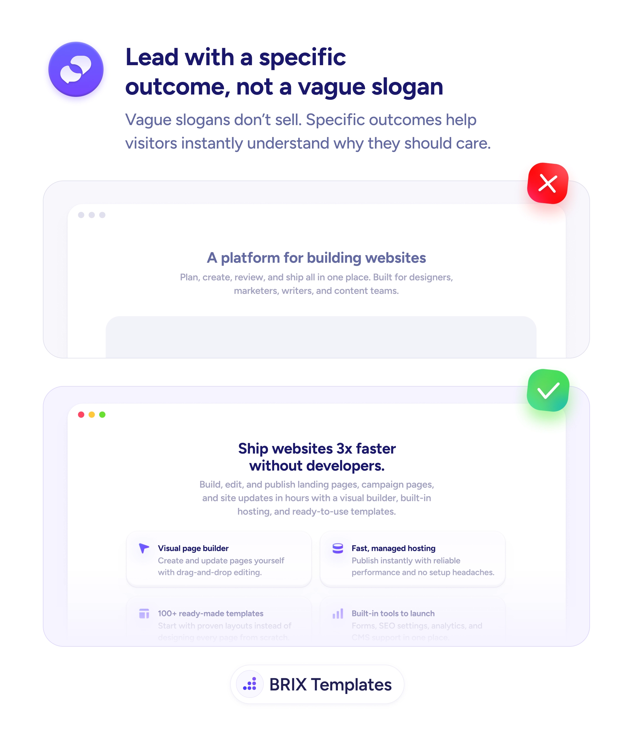
When a landing page leans on vague superlatives — “the fastest”, “the best”, “the leading” — most visitors read them as marketing and quietly move on. The problem isn’t ambition; it’s that the claim gives the reader nothing to verify. There’s no number, no source, no way to push past skepticism. A page full of unsupported promises usually loses more trust than it earns, because every claim looks like every other site’s claim.
A stronger pattern is to replace each adjective with a measurable result and a verifiable anchor. Instead of “we’re the fastest platform out there”, write “reduced page load time (LCP) by 0.8s on average” and link to a named case study, audit, or benchmark. The reader gets both the specific metric and a way to confirm it on the spot. The page stops reading like a brochure and starts reading like a record of work the team can stand behind.
Start by auditing every claim above the fold and rewriting each adjective into a measurable outcome. Pair the result with a proof anchor: a case study link, a customer quote with attribution, a third-party badge, or a public benchmark page. If you can’t back a claim with verifiable evidence, cut it rather than leaving the visitor to disprove it. A shorter, harder-to-doubt page typically converts better than a long one full of promises.
A page reads as evidence rather than persuasion when every claim is attached to a number and a source. Visitors can often skip the persuasion step entirely once they see the receipts that back the promise, which typically shortens the path from headline to click.
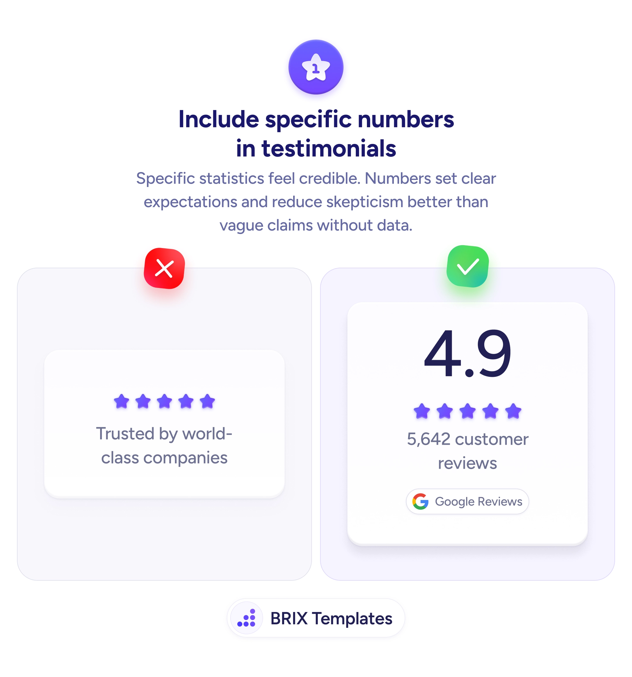
Specific numbers, named case studies, third-party data, customer logos, and public benchmarks all work better than adjectives. Anything a visitor can verify quickly tends to build more trust than a superlative, because it stops reading as marketing and starts reading as evidence.
Place each proof point next to the claim it backs up. A speed metric belongs near the speed promise; a satisfaction number belongs near the experience promise. Proximity makes verification effortless — the reader doesn't have to hunt the page for the evidence.
Yes. Use anonymized aggregates ('average improvement across 50 SaaS clients'), public benchmarks, or get explicit permission for named case studies. Either way, link to the source so visitors can verify. Proof that can't be checked is closer to a claim than to evidence.
One strong, specific proof point usually outperforms a long row of weaker ones. Pick the single number that maps to the visitor's main concern and keep secondary proof further down. Above-the-fold space is too valuable to fill with stats the reader won't connect to the offer.