Actions & CTAs
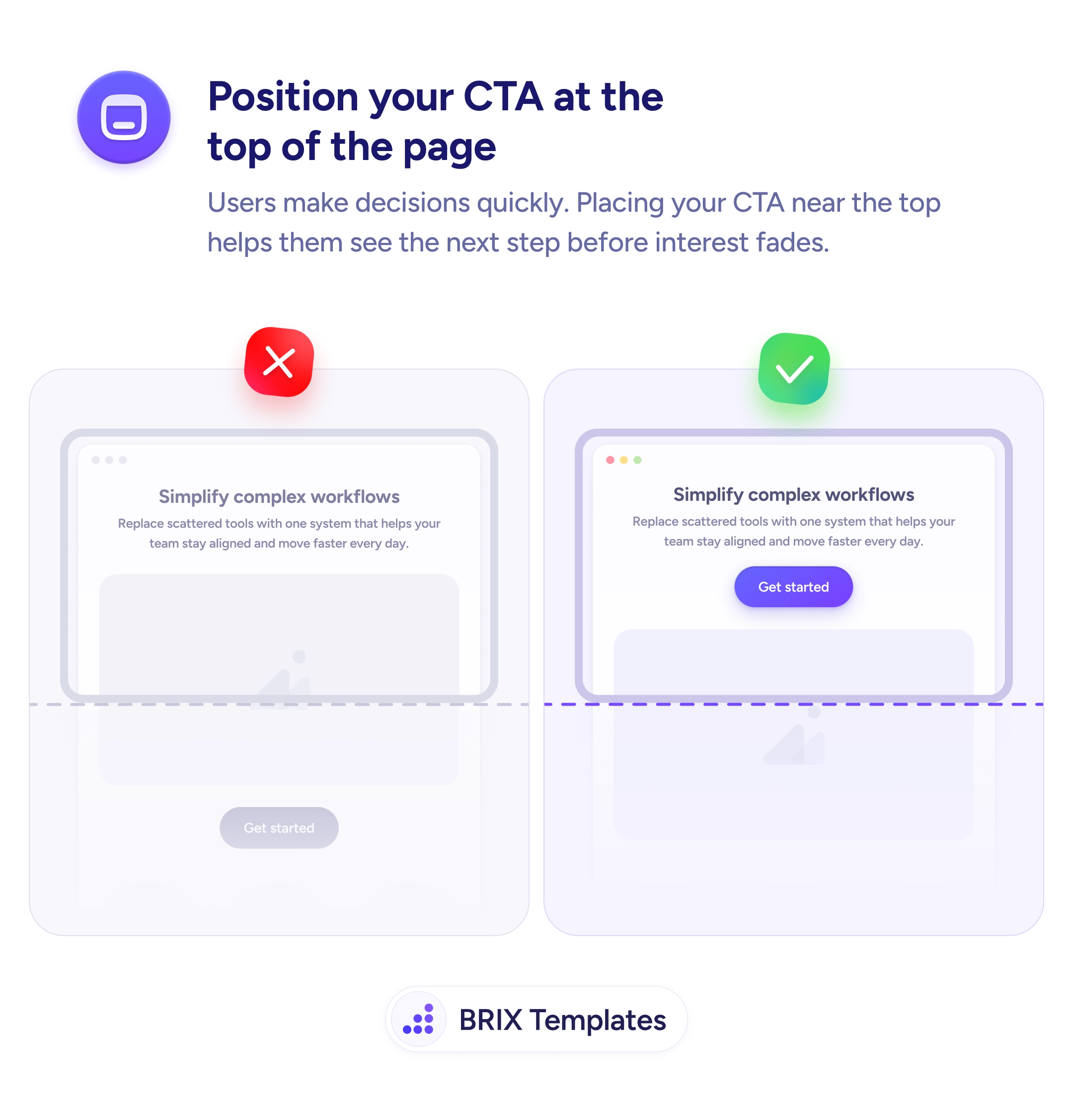
A single CTA at the top only catches the visitors who were ready at the top
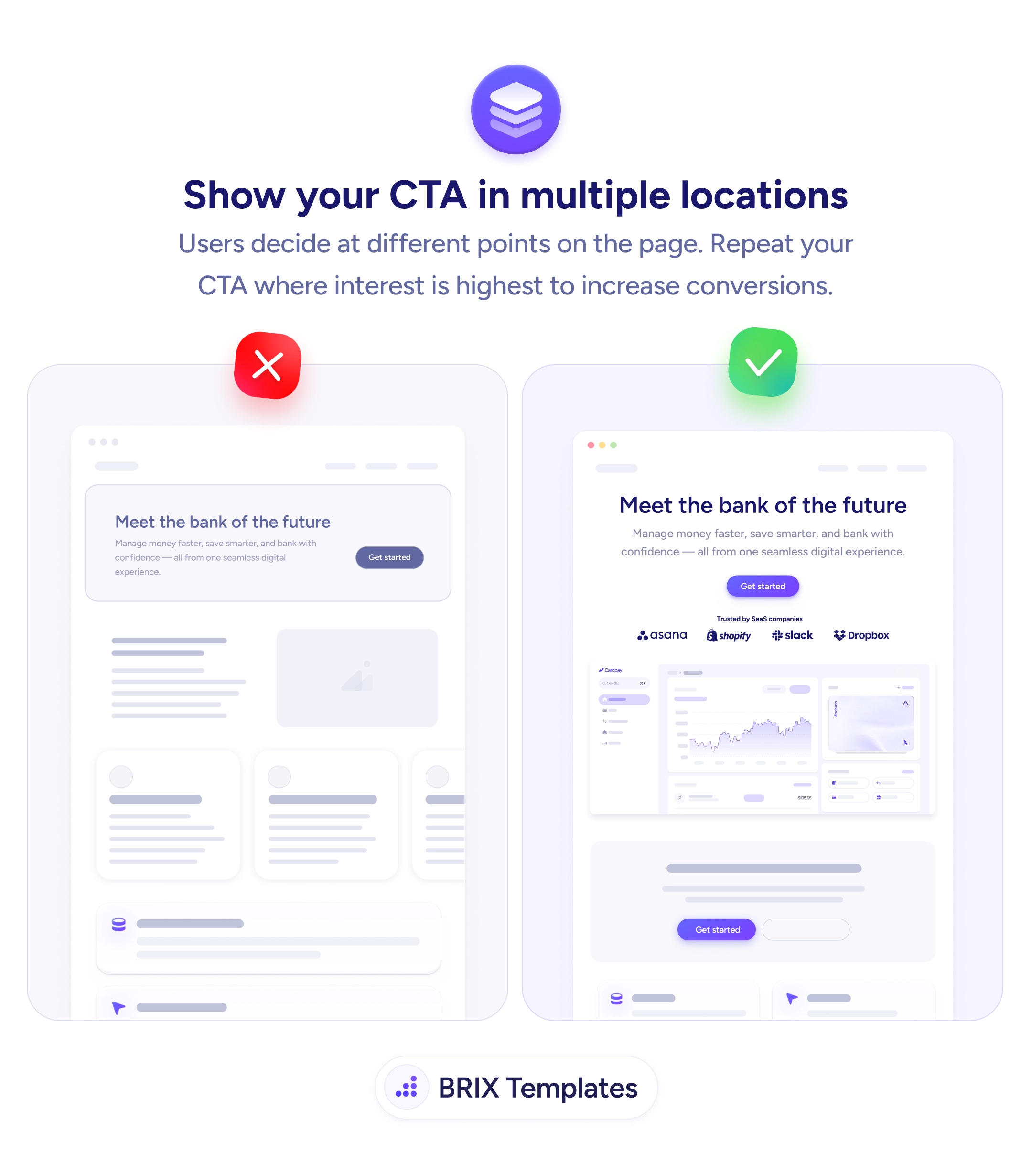
Visitors decide at different scroll depths. Repeat your primary CTA after the hero, proof, and features so no one has to scroll back to act.

Actions & CTAs
A single CTA at the top only catches the visitors who were ready at the top
Visitors decide at different scroll depths. Repeat your primary CTA after the hero, proof, and features so no one has to scroll back to act.
A landing page with one CTA at the very top quietly assumes every visitor is ready to act in the first few seconds. Most aren’t. People scroll to read the proof, scan the features, and weigh the offer — and by the time they’re convinced, the button that would let them act is three screens up. Asking a decided visitor to scroll back and hunt for it adds friction at the exact moment you’ve earned the click.
The stronger pattern is to repeat the primary CTA at each point where interest naturally peaks. The same “Get started” action after the hero, again below the social-proof logos, and once more at the close of the features means the button is always within reach the instant conviction arrives. You’re not nagging — you’re meeting the decision wherever it happens to land.
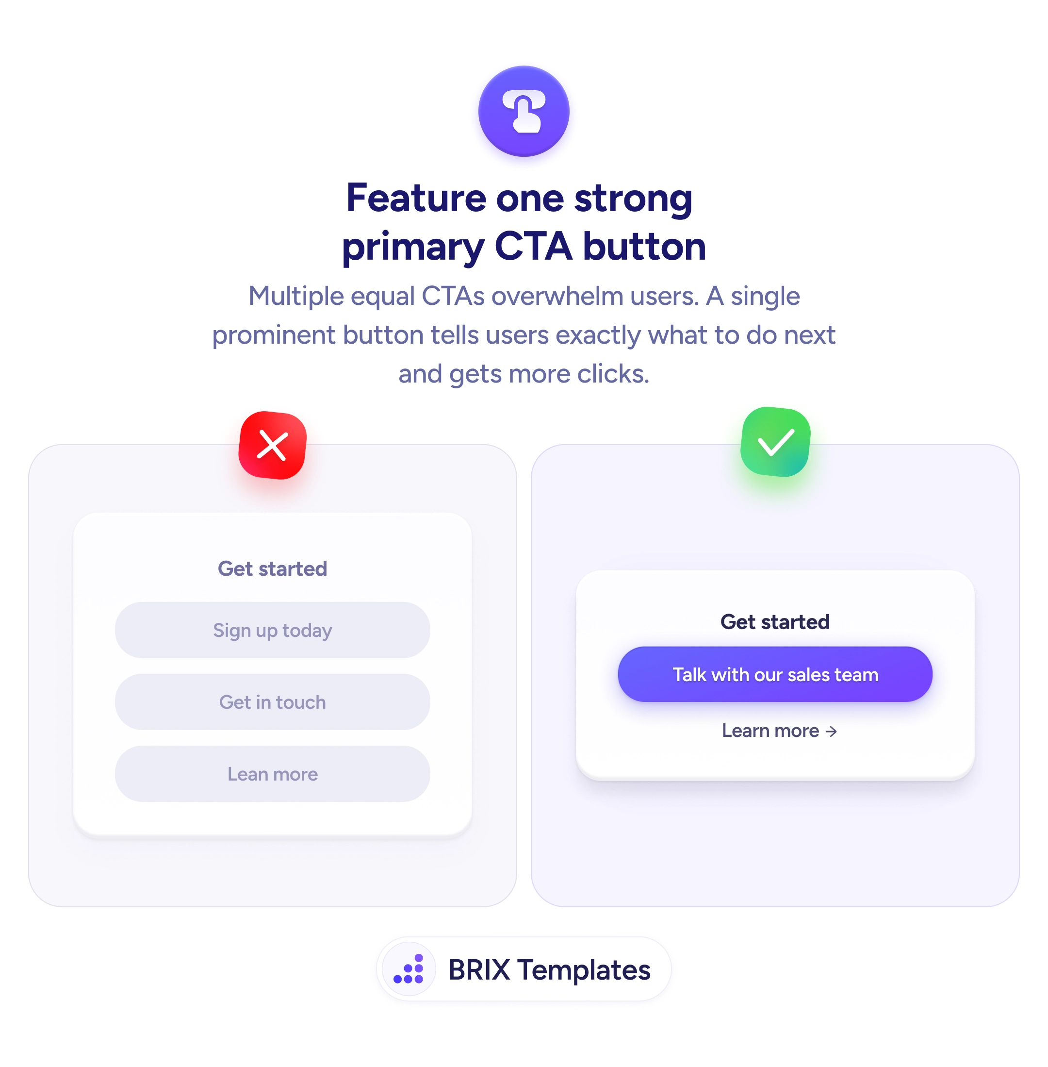
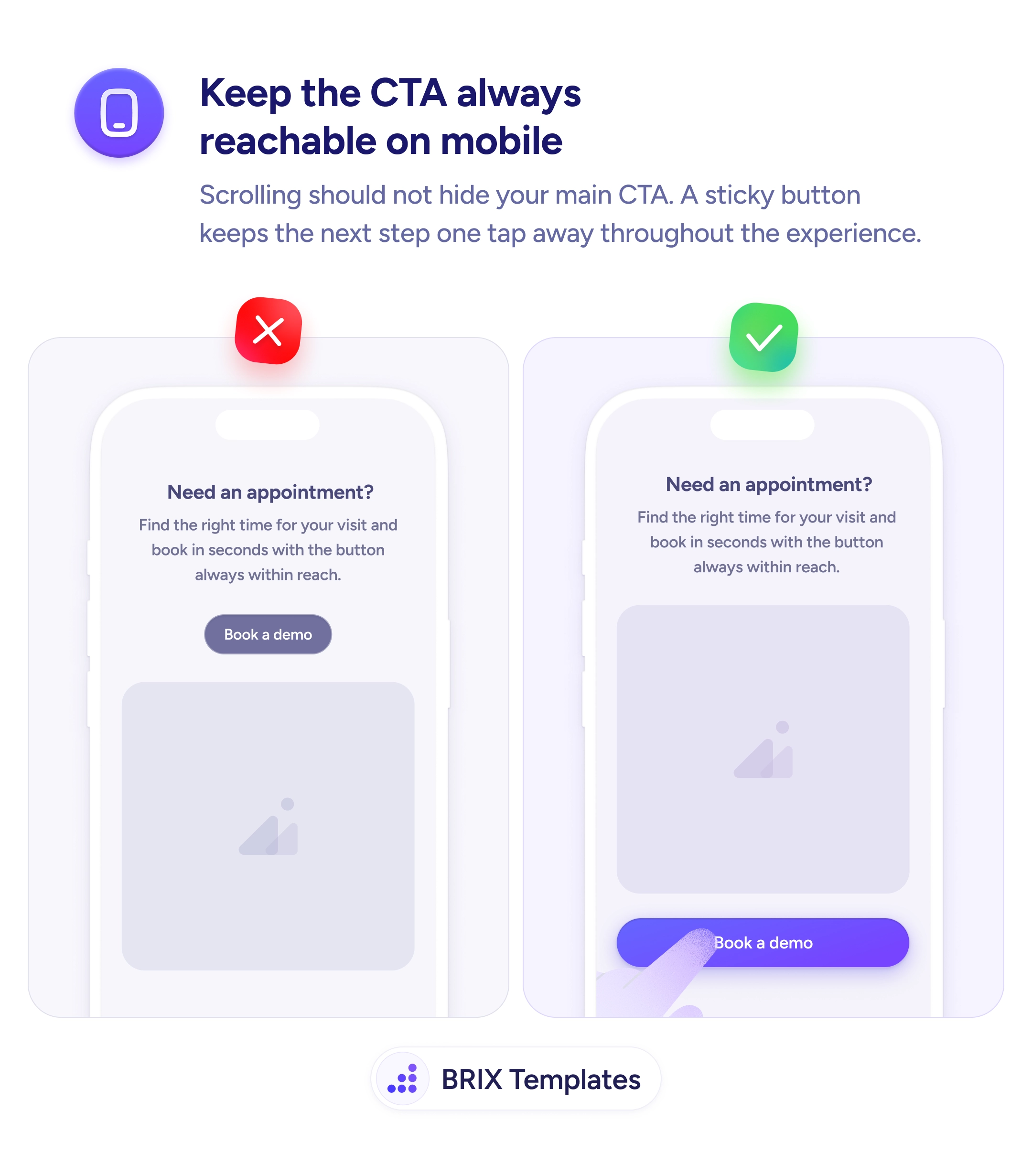
Start by mapping the page’s persuasion beats — hero, proof, key benefit, pricing, closing — and placing a CTA at the end of each. Keep the label and destination identical so the repetition reads as consistency rather than clutter, and lean on one clear treatment so a single primary button stays visually dominant. On mobile, where the page runs longest, the case for repetition is strongest — the same logic behind a sticky CTA that follows the scroll.
There is no fixed number — tie it to the page's length and its persuasion beats. A short page may need two (hero and close); a long-form sales page might justify four or five, one after each major section. The test is whether a decided visitor always has a button within a screen's reach. Repeating past that point just adds noise.
Not if the label and destination stay identical and the styling is consistent. Repetition reads as pushy when the asks escalate or multiply into different offers. The same calm 'Get started' reappearing at natural decision points reads as availability, not pressure.
The primary action should be — same label, same destination, same style — so it is unmistakably one path. You can vary the surrounding context (a benefit line above one, a testimonial beside another), but the button itself should stay constant so visitors never wonder whether it leads somewhere different.
They solve overlapping problems and work best together. A sticky bar guarantees reachability on mobile; inline repeats tie the ask to specific persuasion moments on the page. Use inline CTAs to catch interest at each beat and a sticky one as the always-available fallback.