UX tip graphic titled 'Organize testimonials by customer type.' The left panel marked with a red X shows three stacked testimonial cards with grey placeholder avatars and small generic names, presented as one undifferentiated list. The right panel marked with a green checkmark shows the same testimonials behind a row of filter tabs — 'SaaS', 'Ecommerce', 'Agencies', 'Tech' — with real customer photos, five-star ratings, bold headlines, and company logos like Slack and HubSpot. BRIX Templates branding at the bottom.

Status & feedback

People trust reviews from someone who looks like them, not from everyone at once

A single testimonial wall makes visitors hunt for someone like them. Let them filter reviews by industry or role so the relevant proof surfaces instantly.

Organize testimonials by customer type

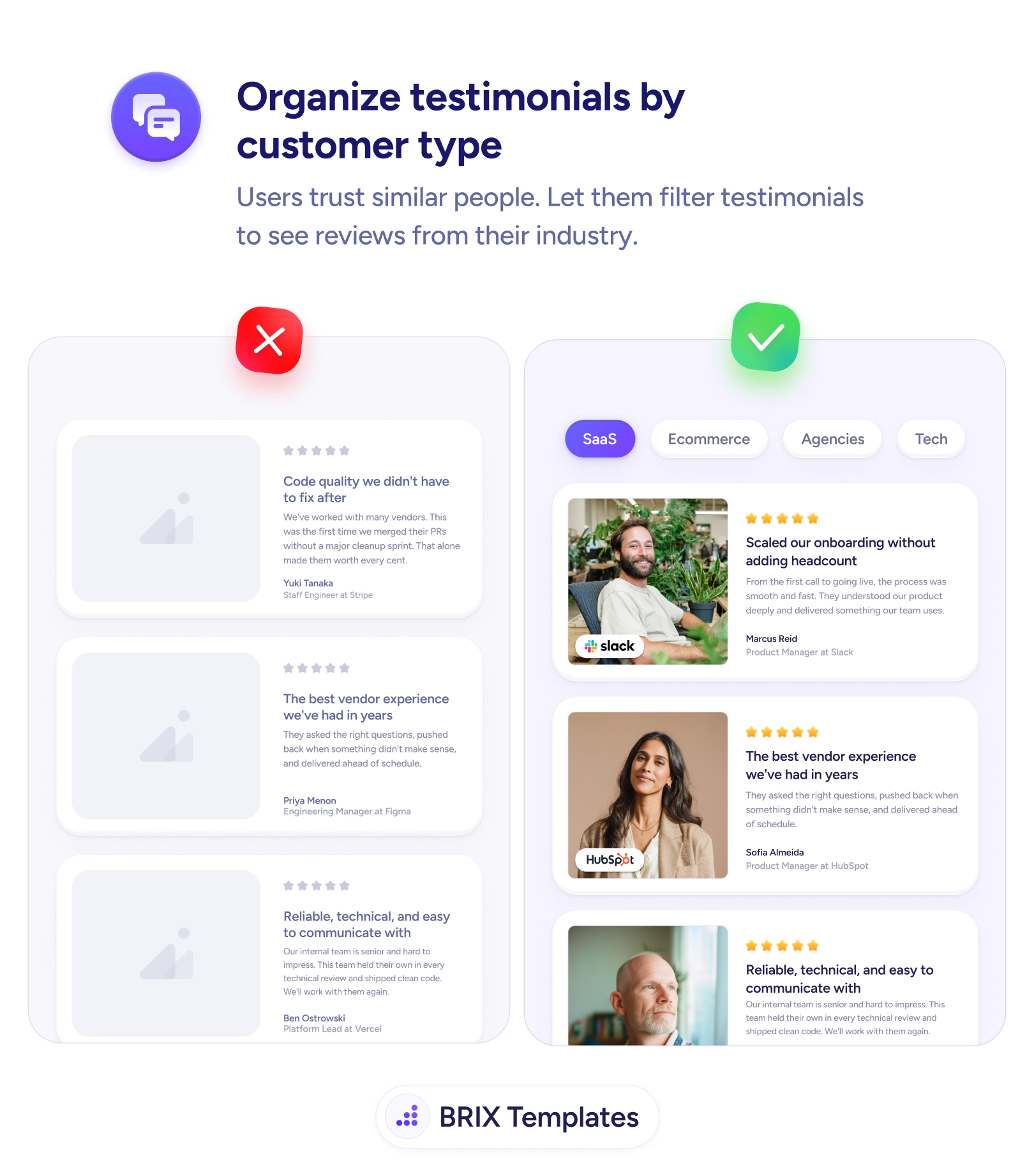
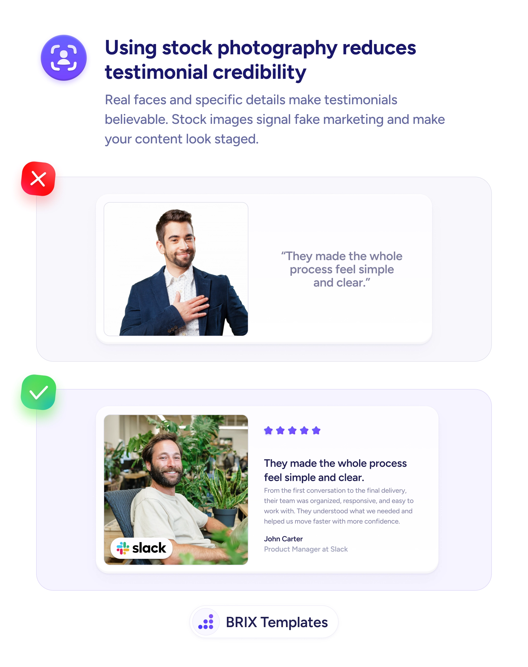
A long, undifferentiated wall of testimonials asks the visitor to do the sorting. They land on the page wondering “does this work for a business like mine?” and are met with a stack of quotes from people who could be anyone — grey avatars, generic names, no signal of industry or role. To find someone like themselves they’d have to read every card and infer the context, and most won’t. The proof is there, but it’s pointed at everyone, which means it lands squarely on no one.

A stronger pattern lets the visitor filter testimonials by who they are. Tabs like SaaS, Ecommerce, Agencies, and Tech let a reader pull up reviews from their own world in a single tap, so the social proof they see is from peers facing the same problems. Relevance is what makes a testimonial persuasive, and it multiplies when each card carries a real photo that makes the reviewer believable and a name and title that show exactly who’s speaking.

Start by choosing the dimension your buyers use to identify themselves — usually industry, role, or company size — and tag each testimonial accordingly. Only build filters for segments you can genuinely fill; an empty tab reads as an absence of customers. Lead the unfiltered view with your strongest, most recognizable proof so it convinces the many visitors who never touch a filter, then let the rest narrow down to their segment when they want to.

  • Filter by how buyers self-identify — industry, role, or company size — not by internal categories.
  • Only show segments you can populate; an empty tab signals you have no customers like that.
  • Tag testimonials across every segment they honestly fit so relevant proof always surfaces.
  • Make the default view strong on its own for users who never apply a filter.
  • Pair each card with a real face, name, and title so the matched reviewer reads as credible.

Testimonials persuade hardest when the visitor recognizes themselves in the reviewer. Let people pull up proof from their own industry or role, and a generic praise wall becomes a mirror — one that answers “this works for companies like mine” before they reach the CTA.

Frequently asked questions

How should I group testimonials?

Group by whatever dimension your buyers use to decide 'is this for someone like me' — usually industry, company size, role, or use case. Pick the one or two segments that map to how your audience self-identifies. If your buyers think in industries, filter by industry; if they think in job titles, filter by role. The grouping only helps if it matches how visitors already categorize themselves.

What if I don't have enough testimonials to fill every segment?

Only create filters for segments you can genuinely populate. An empty 'Enterprise' tab is worse than no tab, because it signals you have no enterprise customers. Start with two or three well-stocked categories and add more as your testimonial library grows, rather than splitting thin proof across many half-empty groups.

Should one testimonial appear under multiple types?

Yes, when it honestly fits more than one. A review from a SaaS agency could reasonably appear under both 'SaaS' and 'Agencies'. Tag each testimonial with every segment it truly belongs to so visitors find relevant proof regardless of which filter they pick — just don't stretch a tag to pad a thin category.

Which testimonial should show by default before any filter is applied?

Lead with your strongest, most broadly recognizable proof — a well-known logo or a result that resonates across segments — so the unfiltered view is still convincing. The filters are there to help visitors narrow down, but the default state has to stand on its own for the many users who never touch a filter.