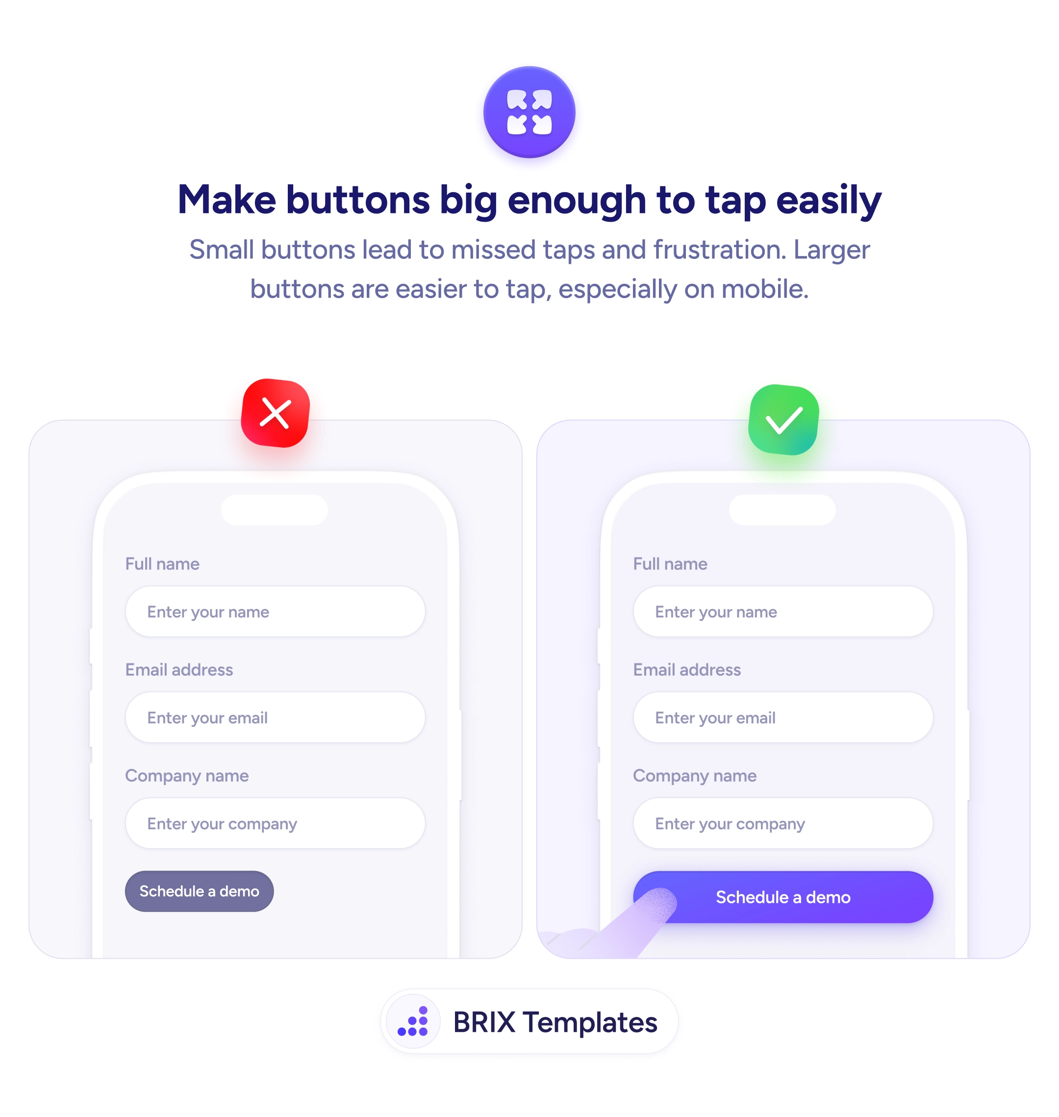

Actions & CTAs
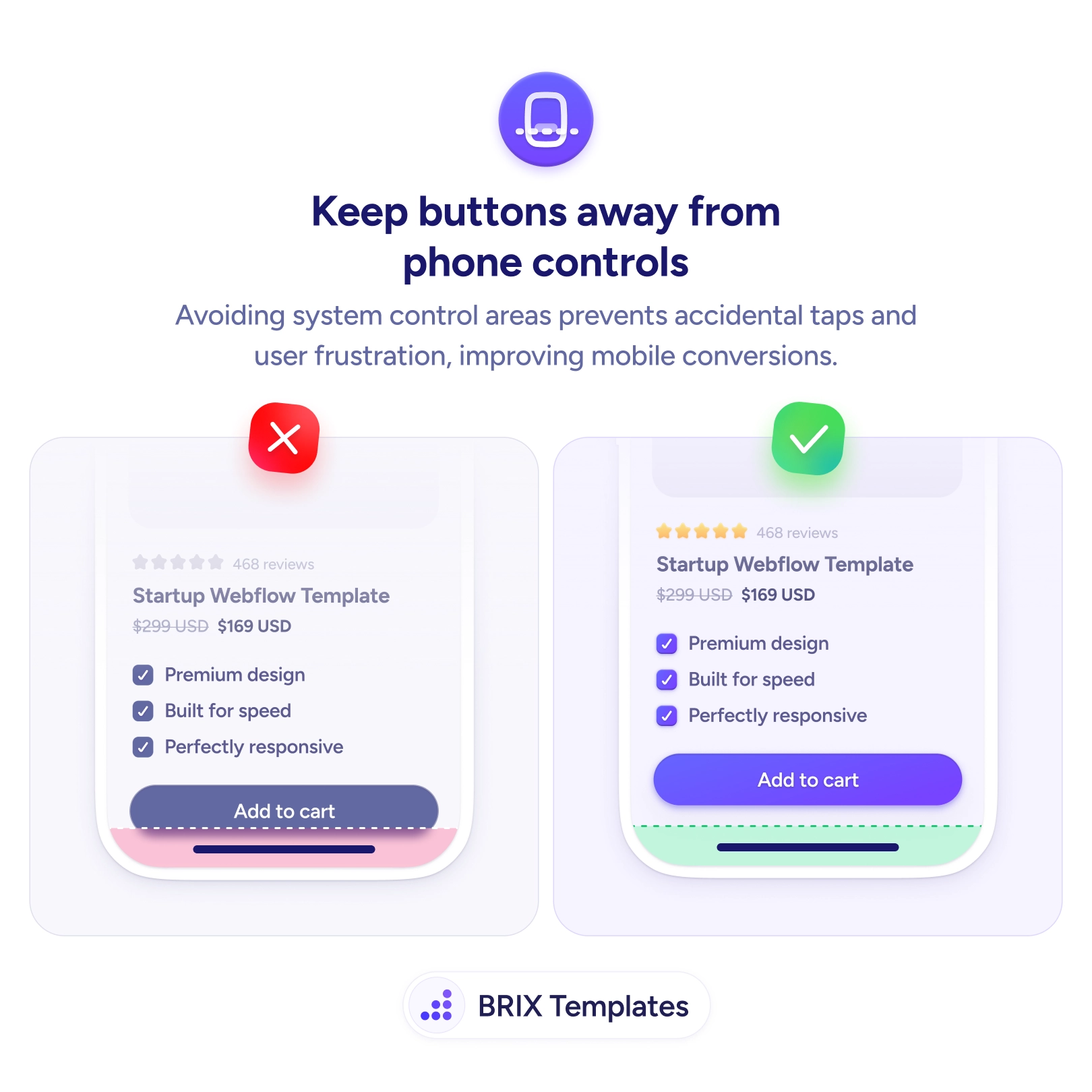
A button that sits on the home bar gets the wrong tap or no tap at all
Buttons crammed against the home bar trigger accidental swipes and missed taps. Add safe-area spacing so your mobile CTA stays reliably tappable.
Actions & CTAs
A button that sits on the home bar gets the wrong tap or no tap at all
Buttons crammed against the home bar trigger accidental swipes and missed taps. Add safe-area spacing so your mobile CTA stays reliably tappable.
On modern phones the bottom strip of the screen belongs to the system — it’s where the home indicator lives and where the swipe-up gesture is read. When a button gets pushed all the way to that edge, it ends up sharing space with a system control. The user goes to tap Add to cart and instead triggers the home swipe, or their thumb lands just below the target and nothing happens. The button looks fine in a design mockup, but on a real device it sits in the one zone where taps are least reliable.
The fix is to keep interactive controls inside the safe area. Lifting the button up with clear spacing above the home bar means every tap registers as a tap, with no competition from the phone’s own gestures. This is the natural companion to making buttons easy to tap on mobile: one ensures the target is big enough to hit, this one ensures nothing else is fighting for the same pixels.
Start by respecting the device’s safe-area insets rather than hard-coding a bottom value — on the web, the safe-area-inset environment variables give you the right padding per device, and native platforms expose equivalent layout guides. Add a little breathing room beyond the inset so the control feels intentionally placed. This matters most for sticky and fixed bottom CTAs, the same pattern behind keeping the Add to Cart button always visible, where the button is permanently anchored to the danger zone.
A button only converts if the tap actually lands. Keep your mobile CTAs out of the phone’s control strip, give them room above the home bar, and you trade accidental swipes and missed taps for clicks that reliably do what the user intended.
The safe area is the part of the screen guaranteed to be free of system UI — the notch, rounded corners, and the home indicator at the bottom. Modern phones reserve the bottom strip for the swipe-up home gesture. Anything you place there competes with that gesture, so a button parked on the home bar gets swiped instead of tapped, or missed entirely.
Respect the device's safe-area inset rather than guessing a fixed pixel value, since it varies by phone. On the web, the safe-area-inset environment variables give you the correct padding for each device; in native apps, the platform's safe-area layout guides do the same. Add a little breathing room beyond the inset so the button feels deliberately placed, not jammed against the limit.
Sticky and fixed-position bottom buttons are the most common offenders because they anchor to the screen edge, but any control that ends up in the bottom strip — a floating action button, a bottom sheet's primary action — has the same problem. Scrolling content is usually fine because it isn't pinned to the gesture zone.
Test on a real gesture-navigation phone, not just a desktop emulator. Try to tap the button quickly several times near the bottom edge; if you trigger the home swipe or miss occasionally, it's too low. Pay special attention to the largest and smallest devices you support, since the safe area differs across them.