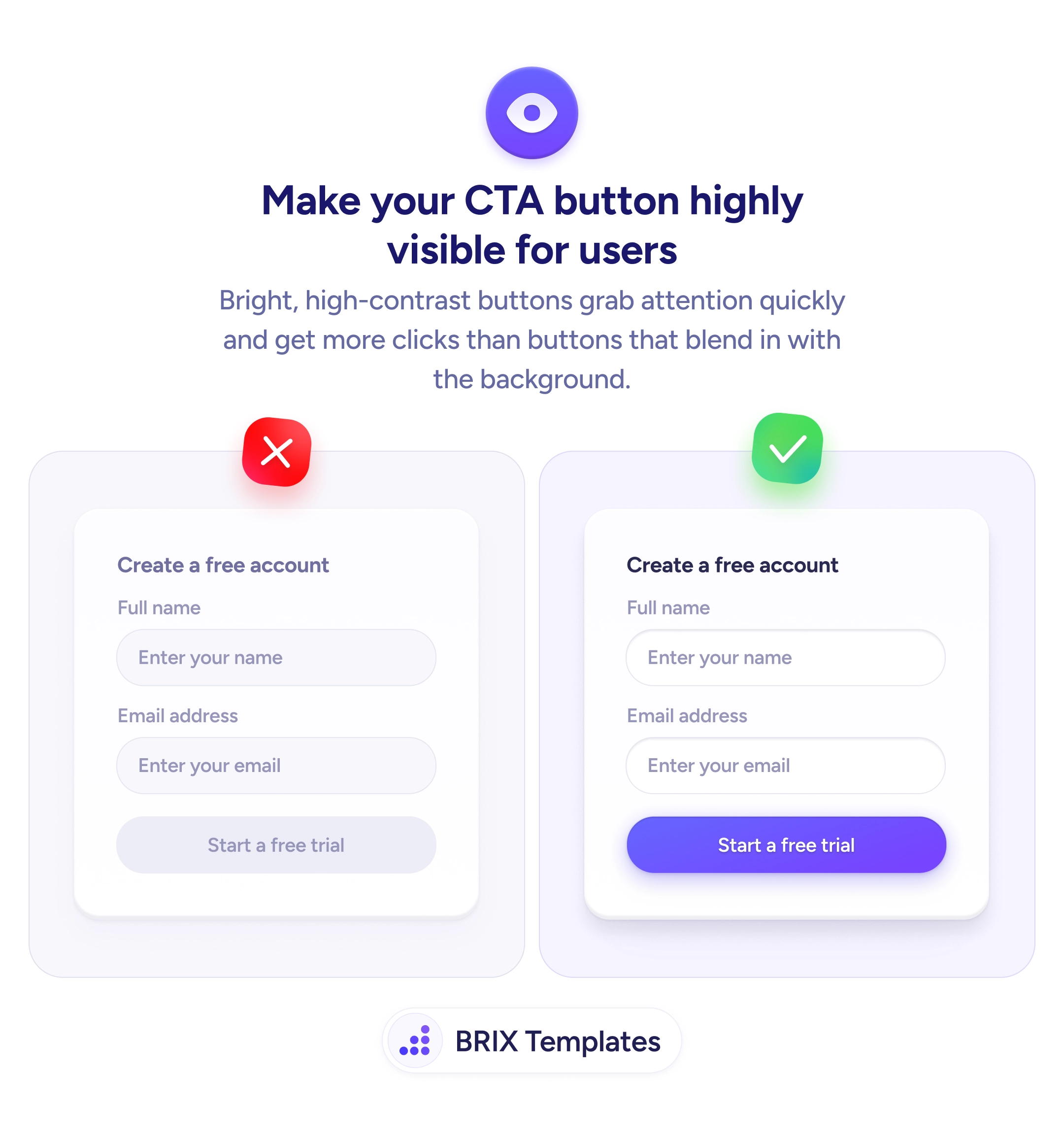
Bright, high-contrast buttons tell users exactly where to click
A low-contrast CTA blends into the page and gets ignored. Apply a bold, high-contrast fill color so the primary action is the first thing users notice.
Weekly product growth insights
Discover practical ideas for navigation, forms, onboarding, trust, and checkout so your team can ship better user experiences and grow faster.